Featured

Part 3. Portrait and Figure.

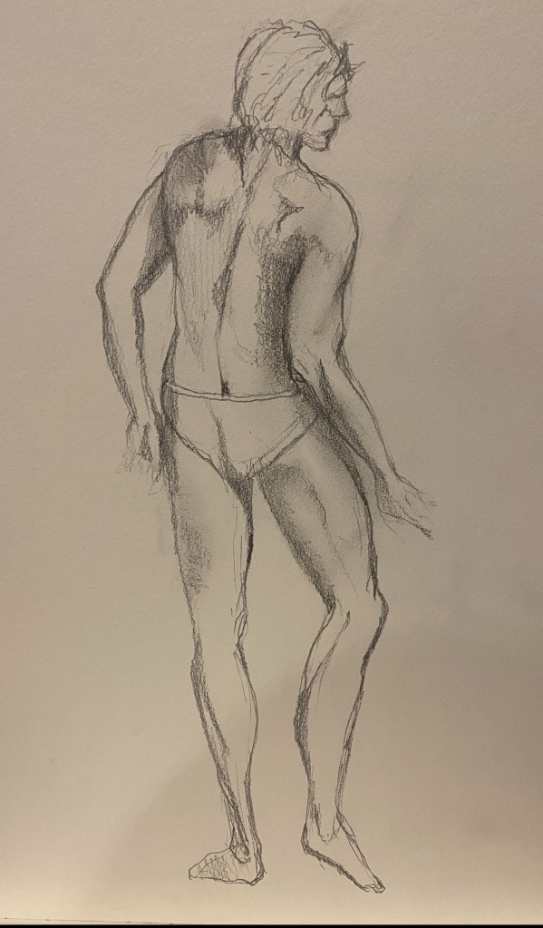
I spent a long time on this Part for Drawing 1 Part 4, doing life drawing classes with Kieran Stiles (with whom I have done many life drawing classes before starting the degree course, as well as other local artists) as well as working through Brague plates. During the life classes I learnt to use an interesting range of media in life drawing, including chalk, candle wax (as a way of resisting watercolour), acryllic and gouache, oil sticks, charcoal and graphite, as well as pencil. I definitely improved greatly during this time – this topic being perhaps my weakest before starting to draw – but I can see that continual practice is needed to maintain any sort of capacity to represent the human form, which is surely the most difficult genre of painting.

Project. Observing the Human Figure

This time I approach this topic in national lockdown, so I am not going to be able to do life drawing classes, and as we are literally not allowed to have anybody in the house, it looks as if I will be restricted to painting from photographs or videos, myself, or my partner Pedro, who featured heavily in my work for Drawing 1. During that course I was also able to use my teenage son as a model, but he is away at university now. I can continue to paint Pedro of course, and it is true that I did not consider any of the results last time very satisfactory, but he has a very distinctive form (slightly stereotypical for a Spanish man of his age) and I will clearly need to seek more variation than that. So I will need to be imaginative in locating subjects from digital media.

Exercise. Linear figure study.

For this Exercise, I started with a figure from the New Masters Academy channel on YouTube. This organisation provides streaming services for people wishing to learn to draw and paint, which are quite expensive and not what I want to do on top of my course fees, but they do (as I discovered during Drawing 1) provide some timed poses with models for free. This time I worked out how to get them onto a large screen in my office, which was very helpful for drawing although less so for painting. The various poses are timed to mimic a real life drawing class, but I paused the one I wanted to use as below, for the purposes of this Exercise.

This is the drawing. It was strange to be drawing again, and reminded me of all the challenges of life drawing. The video image on the last screen worked alright, in that it was bigger than life size so that you still had to measure – and that is where I went wrong, indeed it reminded me that wherever you think you can dispense with measuring, you cannot. The legs are too long, the torso too short, and the whole figure is not wide enough. As a reminder of how difficult it is to draw the human figure, it was useful, however.

Next I worked on the same image, but this time I painted it in heavily diluted acrylic paint, burnt umber. Here it really felt like starting from scratch, because although I had done many life drawing classes using paint media, it was usually with a pencil or charcoal drawing to start with, so I don’t know that I have ever attempted a line drawing with paint before. I have done painting classes with the artist Josephine Lyons with models – but here the idea was to build up a complete painted image, so again different.

The form is better than the last one, in that the relation between torso and legs is more balanced, but it is still too narrow (his feet are too small). I need a rule of thumb for working this out. I don’t like the way there is a hard line around the figure, which once there was impossible to eradicate – I realised only afterwards that I should – of course – have painted the paper first, even if in white, so that I could have eradicated the line or lightened it to indicate where the skin is indeed paler to the edge. This is not something that is necessary with pencil and paper.

Next I tried a female figure lying down, also from the New Masters YouTube channel. the women figures on this channel are quite often impossibly thin and striking incongruous poses, so I wanted someone who was more well rounded and in a more habitual sort of position. This is the result.

I am quite pleased with this image – not because it is a good drawing, because it wasn’t – also, I have tried to make her fatter than she actually is, which hasn’t always worked, although the foreshortening of the legs is not too bad. Looking back at this for the blog I realise that the floor to the left is sloping off to the left, which makes it look as if she is on a sort of hill. I also dislike the too sharp brown edge, from an initial outline in brown, which I have tried to remove but I realise still shows through. What I really like here though is the blueish wash (this is acrylic paint, heavily diluted – the colours were naples yellow, cobalt blue, burnt umber and raw sienna – on an A3 moleskine sketchbook for oil painting) that I used. The model has a slightly blueish tinge to her skin anyway, which I have exaggerated. I do really like the effect this has created, which has also made the belly shine out and appear more three dimensional, although this is spoilt by the shadow across the groin being too dark. The problem that I realised with the diluted acrylic wash is that it has all the disadvantages of water colour, particularly in that you can’t go back to something lighter (if as, once again, you have not painted the background which of course I now wish I had, although I like the way that the paper of my sketchbook shows through). Reading the course introduction, I realise that I should get some flow improver and also experiment with gesso.

Exercise. Tonal Figure

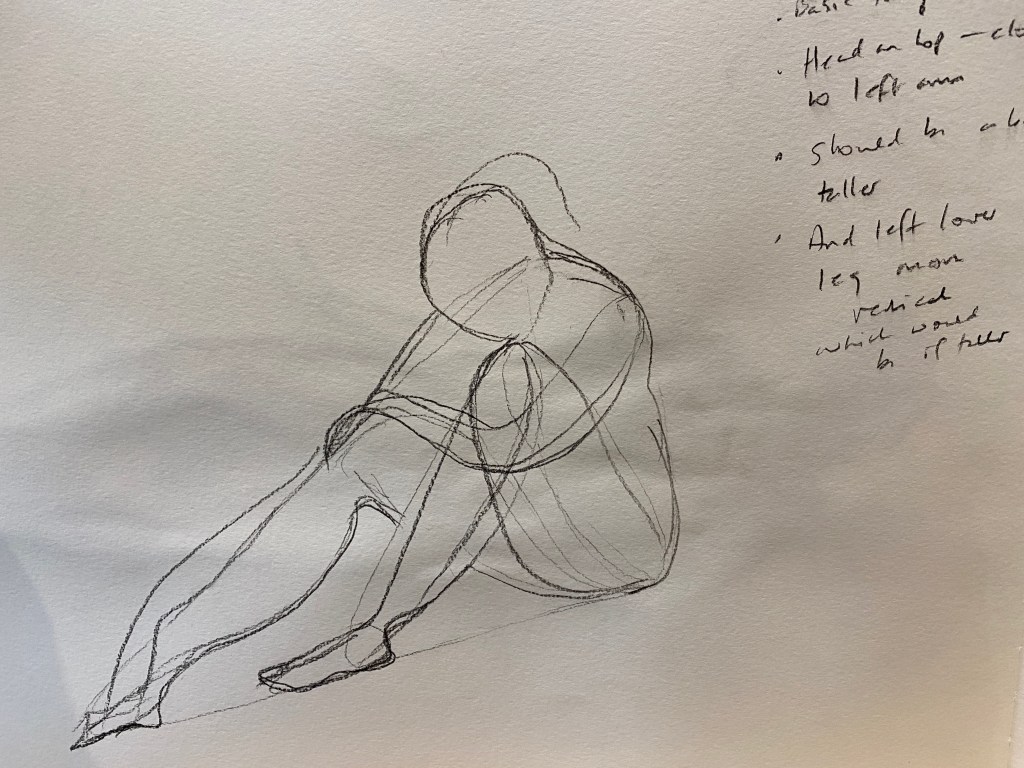
For this Exercise, I chose another figure from the New Masters Academy videos, trying out a couple of the poses in charcoal before settling on a different woman who was this time seated on the ground, half hugging her knees but with the other arm extended along her leg all the way to her feet. One of the things that I liked about this image – other than that the pose is vaguely believable, in that it doesn’t look as if it would be agony to maintain – is that the woman looks like a real, modern day woman – her face and upper arms are somewhat brown and weathered, whereas her legs and lower body are ghostly white. It also had light and dark areas and a sense of shadow and light in the image and background, which The videos are timed so that you can do lightening sketches or longer poses as you please – but of course you can pause it. So this woman was on one of my tabs for four days, available at any point at which I could snatch some time to work on it, not something you would have the luxury of in a life drawing class, I suppose.

I tried to do this exercise as instructed, drawing the figure in soft pencil in my sketchbook first, and also trying to indicate the main shapes in another drawing, as below. I was reasonably pleased with the drawing at the time, but looking back on it her torso looks rather overly rounded, and her right leg in particularly looks tiny. And there isn’t the same sense of her leaning into her knees that I feel like you get from the original image. It has also got rather confused by the charcoal reflection of the drawing on the opposite page. However, it felt like a reasonable start for moving towards the painting.

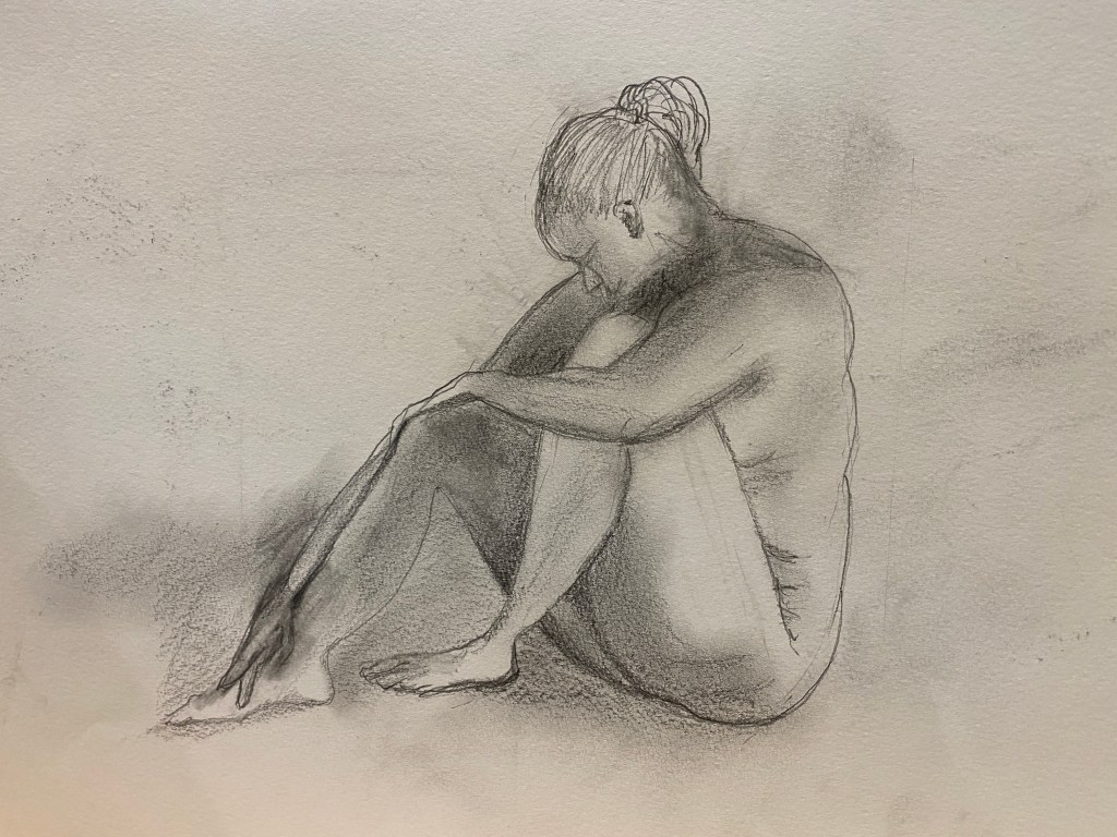
I then moved onto a painting on A4 board. I prepared the board by painting it a murky purple (combination of burnt umber, cobalt blue and titanium white). I know that the instructions say a mid-tone earthy colour, and I see that this is often a good thing to do. However, in this case looking at the figure I decided that this was quite a cold image. The woman looks rather despondent, hiding her face (so you cannot see what her mouth is doing), hunched up against herself on one side, and appearing limp on the other (rather than some kind of positive relishing of her elegant limbs). Her skin is a kind of pearly white or cold pink, with dark. bluish shadows (under the thighs, for example), and there are no trappings here which suggest warmth or positivity.

I drew the figure in a pale diluted naples yellow, to avoid the problem I had in the two previous images of a harsh outline. I then started to build up the colour, using cobalt blue, burnt umber, naples yellow, pale terracotta, a cadmium yellow (which didn’t get used much I think), raw sienna and titanium white. As I worked came the growing realisation that the right leg (and most of all arm) was impossibly long, so I brutally reduced it. I painted a darker shade of purple in areas where there were shadow, and tried to capture both the darker shade of skin on some parts of the body, and the areas where it was in shadow.

Unfortunately I forgot to take a photo graph in the earliest stages, so this is after major foot/leg surgery, on the right leg. I tried to measure this time, but somehow it always went wrong – I think perhaps both the image and the painting were too small for measuring proportions really to work well. The face is too dark here, and also the lower part of the face (which you cannot see in the video) is all wrong, too shallow. The painting also looks very yellow, which it didn’t look like in real life – too much naples yellow showing through I suppose, and there is some coagulated paint on the thigh which is out of line with the smoothness of the skin. Something has gone extremely wrong with the neck, and both feet, and the lines around the image are rather fuzzy, due to low quality brushes and too-thick paint.

In this version I have tried to correct these mistakes. I have replaced yellow with very pale terracotta. and darkened the shadows. I have given a little more detail to the feet and tried to correct the neck, with a more mystery in the face as in the video. I diluted some paint to give a smoother outline and inserted a hair band.

I am more pleased with this image. The colour is better, although the left knee and right leg still seem to be too white to me, or somehow jarring. I think a pale grey could have been better for the lighter areas of the skin, with a touch of blue as well as the pale terracotta. ,Overall I think the naples yellow had a pervasive and not necessarily beneficial effect, although it is the case that it looks better in real life than it does here in the photograph. The hair is not good – I need to learn how to paint hair. The horizon line is not straight and the shadows could be dark I think, especially between the legs. I am reasonably happy with the face, and the upper arm on her left side, which has a pleasing three dimensional appearance (the area under the arm is not too bad either). Overall, in spite of its very many faults, there is a pleasing flow with the shapes within the image – the triangle that I drew to start with really helped here I think. The horizon line till looks crooked, but I think this is the photograph rather than the actual painting – and either way I will make one more attempt to correct it.

Project. Looking at Faces.

I looked forward to this part of Part 3, because – like most people – I love looking at people’s faces. It is fascinating to think about what they tell you – and do not tell you – about a person – such as where they come from, how old they are and what kind of life they lead, or have led – and how they change in response to mood or exogenous events, or of course to time. Perhaps faces have an even greater interest for any of us who work online during these days of the pandemic, because it is all that we see of people these days, in the little boxes of Zoom. I am often trying to draw them during meetings – the paradoxical problem being that the larger the meeting (and the greater the chance that you will get time between speaking to be drawing) – the smaller the boxes, whereas in small meetings where people take up a large proportion of the screen in nice clear detail, you have little opportunity to stay silent for long enough to draw them.

What is sad about embarking on this part of the course is that in spite of having various friends who would probably put up with sitting for a portrait – in these lonely days of the pandemic I will be mostly relying on my own image – a very different story in terms of how I feel about portraits – or digital images (which of course, is also reflective of real life in these strange times).

Research Point 1. Artists’ Self Portraits.

I started this research point with Lucian Freud, a painter that I did not used to like so much, but really started to admire rather obsessively after going to an exhibition of his work at the Royal Academy in 2020, in those halcyon days when you could still go to exhibitions (in fact the exhibition was extended, and I went a couple of weeks before lock down).

Lucian Freud, 1963, Man’s Head (Self Portrait I) Oil on canvas, 53.3×50.8 cm, The Whitworth, The University of Manchester.

I love this image – I like the way that the face is depicted as a series of planes, in almost a sculpted, cubist style. I like the colour frame – the uniformity of colour for background and face (an earlier version of the portrait I did above was like this with the background almost the same shade of orange-y brown as the face, and in retrospect I should have left it like that). I like the haughty image (actually I think Freud was quite haughty), which you realised upon visiting the exhibition was because he was looking down on a mirror – he used to keep lots of mirrors in his studio to place at odd angles to his face and paint. I copied this image in Part 4 of Drawing 1, which was relatively easy, and then tried to draw my own face in this way – which I found impossible. I do not suppose that it is any easier to paint my own image like this, but I am going to try, I think.

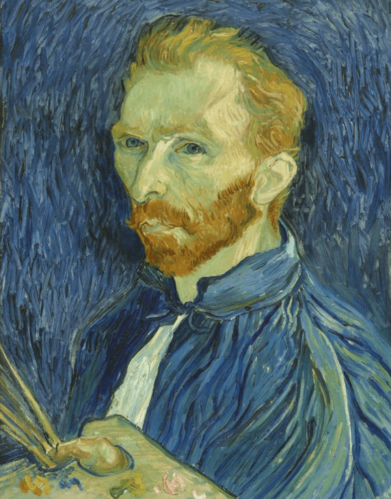
Another self-portrait that also illustrates the planes in the face really well is this rather different image by Van Gogh, which I saw in the exhibition Van Gogh and Britain at Tate Britain, 27th March – 11th August, 2019.

https://www.tate.org.uk/whats-on/tate-britain/exhibition/ey-exhibition-van-gogh-and-britain

Vincent van Gogh Self-Portrait Autumn 1889 National Gallery of Art, Washington. Collection of Mr and Mrs John Hay Whitney, 1998.74.5

This is a lovely painting, . Again the planes in the face show clearly – also the angles – and you see what an angular face he must have had. The skin has an almost translucent appearance – there is a raw, vulnerable quality that you feel – at least if you combine this image with the knowledge we have of his state of mind – is reflected in his own character and mental vulnerability indeed, checking the dates reveals that this was painted shortly before his death. Apparently he painted over 30 self-portraits in his life – this seems to me one of the most interesting. I like the way the background – reminiscent of Starry Night and other paintings – is a finer version of his coat, while also picking up the colour of his eyes. These seem almost to be staring inwards, rather than at his own external image. It is not a calm image at all, in fact disturbing – but at the same time there are many details that draw you towards it – the attractive blue colour and the complementary orange of the hair and beard, the strange angle of the palette and his thumb, so that you have to work out what it is. I also like the green tinge of the skin – some people’s skin does have a green tinge indeed, which always looks as if it reflects ill health but I am not sure that it does, exactly. When you look closely at the jacket and the background you realise that there is green interwoven here too, so the colour adds to the general attractiveness of the image.

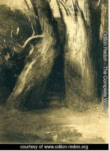
The third self portrait is by one of my favourite painters, Odilon Redon (1840-1916). When I looked at this I had already started on the second of my attempts at a self-portrait below, and I thought of Redon because of the blue and orange of the shirt, and the mystical painting of a boat with a burst of blue and orange (I think it is called flower clouds). Also the looming head over on the right made me think of his strange disembodied heads in some of his paintings, something to think about for the rest of this Part.

This self-portrait, however, is quite straight and simple. It is brilliant though – I love the dark light contrast on the two sides of the head, and the clearly shown planes at the front and to the side of his face. You can barely see the face on the left side or the mouth yet you feel like you know what it looks like. For the shoulders and chest – you hardly know if there is anything painted at all – but again you feel you know what is there. Of course it may be that looking at the real version you can see more – the lighting in reproductions often creates quite different images. But still, it is a very dark image and the more I look at it, the more I like it. It reminds me of those drawings of Picasso’s where he would draw (for example) just the minimal line for the head and then a plait of hair hanging down the girl’s back, and you would suddenly realise you had seen the back even thought it was not drawn ( I remember having this experience in Bristol art gallery as a student, but I don’t know if it was an exhibition or the permanent collection, I have never been able to find it since). The way that the face is presented makes the viewer focus in on the accuracy of the nose, the depth of the eye, the few simple lines that give some indication of the age (the wrinkle on the eyelid for example) and appearance of the subject.

https://www.odilon-redon.org/

Finally, this self-portrait is by an artist whose name I don’t know, although I am trying to find out. I saw his exhibition in Rio de Janeiro when I was there for work for a few days, several years ago, and this was the image used for the poster of the exhibition. Although I took many photographs there which I have found on my phone, but stupidly I did not photograph the description labels, as I always do these days since I started this degree course. I liked much of his work but this one in particular – the way that the image appears almost sculpted out of the thick paint, the penetrating stare of the eyes and the strange angle of the face. It is in fact a monochrome painting, in that it is just red and green/black, yet the effective use of colour contrast means that it leaps out of the frame.

Exercise. Self-portrait.

I did this self-portrait from Zoom, in a meeting by myself, which seemed an easier way to do it than a mirror, especially as I don’t seem to have the right sort of mirror that can be easily propped up to look into. I captured an image looking slightly to the side, to avoid a full frontal image and after several experiments with different expressions, tried for a sort of wry smile which is what I think I quite often have on my face.

I used a wooden board, and painted it Naples yellow to start with. I had the intention at first to go for the Lucian Freud look in the self-portrait above, but in the progression of images below you can see that this slowly degenerated in a more careful attempt to capture the image – too careful indeed, and I am not at all happy with the final result.

Looking at this image I realised that several things had gone wrong. The eyes were too high up, too close together and the right one too high, however hard I tried to argue to myself that it was the angle of the head. The chin was too deep and the face too asymmetrical and distorted on the right of the image. The eye brows were too heavy. I painted over the eyes completely, and started again with those and kind of chiselled away at the shape of the face. I painted in the shirt a bit, and deepened the terracotta colour of the background.

So here is the final image, for now at least.

It is better than it was before, but I was deeply dissatisfied with this image, after spending what felt like quite a long time on it. The eyes are a bit better now, but there is something wrong with the nose which I need to correct. I believe that the forehead is too deep and not wide enough, although I had tried to correct this during the painting. The eyebrows are still too dark, although that is rather easily fixed. I kept thinking I had the mouth right at last, but looking at it now it looks sadder than the image. And the whole thing has a rather dead feel, it is not a lively or even somehow living picture at all. That is it is just too flat, not three dimensional at all.

The only thing I was satisfied with were the colours. I like the combination of terracotta (the only thing I managed to bring through from the Freud image) background and blue shirt, and I like the way that both colours are picked up in the skin of the cheeks and the neck. It has got a little heavy on the face (actually part of the image I was using does have very dark shadows, but it is hard to portray these as distinct from the hair without going too light).

I showed the image to my partner as suggested in the Exercise, and he said that I didn’t look very happy and that sometimes was it better to start again? This was not a very sympathetic analysis of my efforts, but I decided it was more or less right, and that I should try again.

Research Point 2. Mood and Atmosphere

I looked here at Michael Borremans, an artist that I didn’t know before starting the course, but had been recommended by my tutor in Drawing 1. I was particularly drawn to this ghostly image:

‘Michaël Borremans 2008, oil on canvas
42.1 x 36.5 cm (16 5/8 x 14 3/8 in.)
Image taken from https://www.phillips.com/detail/michael-borremans/UK010120/28

It is apparently a girl lying down, wearing a mask – except, you are not quite sure if it is a mask, seems too realistic for that, and yet you can see the edge. It may possibly be an idea developed further in his 2013 painting The Angel. I love the angle of this, and the way the head comes out of the pillow and the general eerie unreality of it. It reminds me a bit of the paintings I looked at by Bo Ritson. Like many of his images, it is somewhat unsettling, but you are drawn into its technical brilliance and enigmatic narrative; as Herbert (2015) put it ‘The archetypal Borremans painting is a seductive enigma, a bouillabaisse of specificity, obscurity, anxiety, humour and great technique’ and as such, even though in real life a small image, this is archetypal.

In a completely different way, Redon also painted enigmatic paintings, from dark spiders with tearful human faces to beautiful explosions of flowers. As Redon himself put it: ‘My drawings inspire and are not to be defined. They place us, as does music, in the ambiguous realm of the undetermined.’ Various of his paintings depict strange faces floating in the air, apparently something to do with dreams, representing either the dreamer or the dreamt. I love this haunting image Closed Eyes, with the simple beauty of contrasting colours – it should be peaceful, but somehow it is very sad.

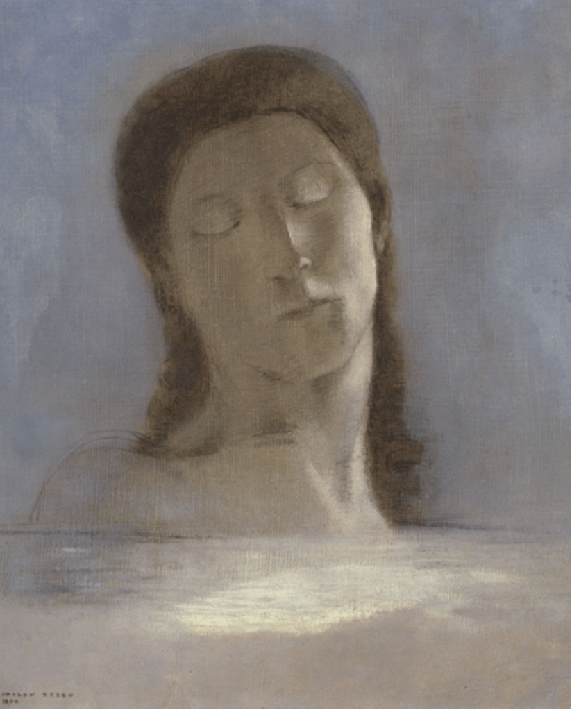
Odilon Redon (1840-1916) Closed Eyes1890Oil on canvasH. 44; W. 36 cmParis, Musée d’Orsay.

Or this even darker image where a winged head floats over the sea.

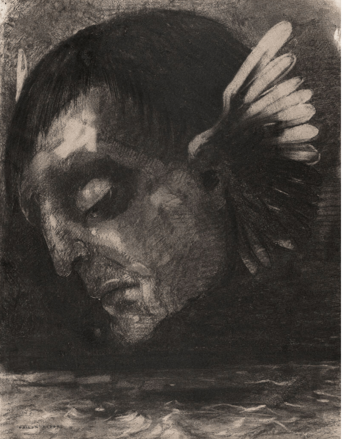
Redon, 1878, Tears. See https://arthistoryproject.com/artists/odilon-redon/

This latter painting was apparently painted on his return from the Franco-Prussian war ‘with a headful of bad dreams’ . This is an extremely unsettling image, and makes one think immediately of death and misery, particularly with the grim face of the winged head (see https://arthistoryproject.com/artists/odilon-redon/, .The faces we see in our dreams’.)

Exercise. Creating Mood and Atmosphere

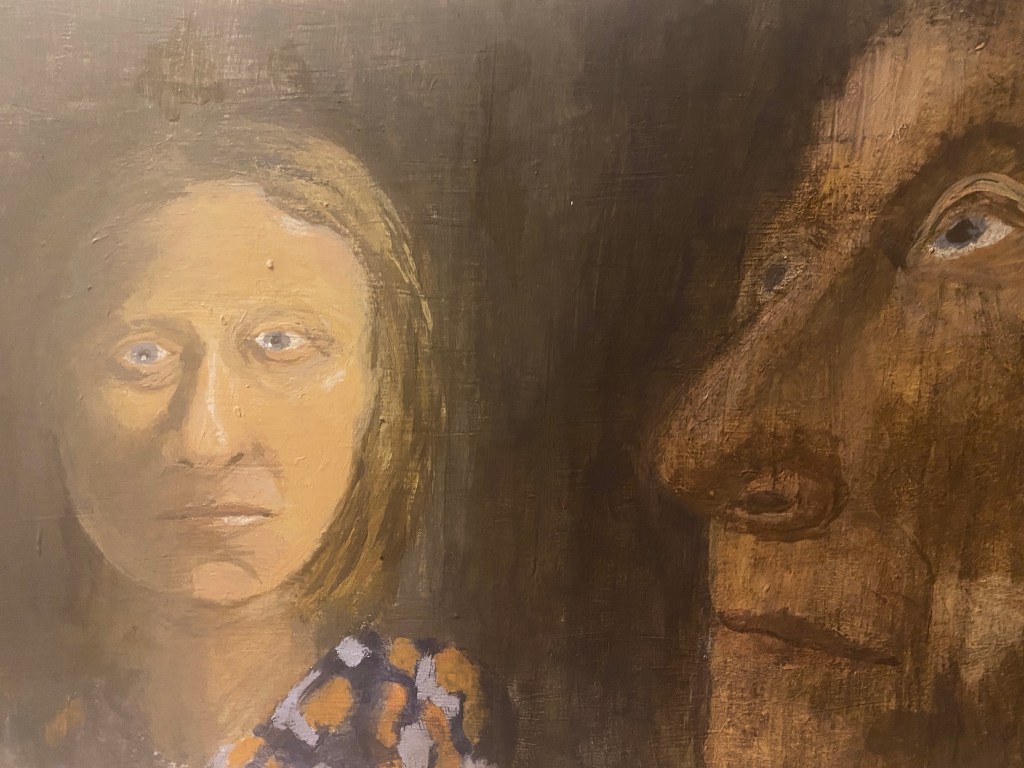
For this exercise, I took the image by Michael Borremans above as a starting point. I wanted to paint myself lying down with this kind of mask like appearance. I took some photographs lying down from the front and the side, with a strong light from above/to the side. I wanted to get something of the dark light contrast as in the self portrait by Redon above. I also wanted to have some kind of other image as a kind of alter ego or judgemental conscience in the painting too. So on the right in the image below, I painting a sideways version of my image, from the side. The idea was that sometimes when one can’t sleep and lies awake in the dark worrying about things that didn’t feel so bad during the day, it is like there is another version of oneself looking on and reminding one of disturbing things. Such disturbed thinking might be exacerbated, as some psychologists have pointed out, our current online existence, particularly on Zoom where the default is to stare at oneself at the same size as everyone else during a meeting which in real life would be like carrying a life size mirror around all day at work. The version of oneself that one carries around inside, however, has I believe a more powerful effect.

This is the first attempt – or at least it isn’t, but I am afraid that I took no photographs during the early stages. I painted a wooden board (MDF I think) with two coats of white gesso, and started to paint the images, using acrylic paint and highly diluted acrylic for the background and the darker parts. I struggled a lot to get the dark side of the face look actually present, and to avoid the shadow not being just a dark line across the face which somehow it isn’t in the photograph. What I have really not achieved here is the three dimensionality of the Borremans masked figure – and when I look at the photograph I realise that I wasn’t actually lying properly – seems as if my head is propped against the cushion. For the alter ego, I used another photograph of myself, closer too, from the side, although this started wrong, I can see now – the nose is too long, even for mine – although I guess alter egos do not need to be exactly representative.

I continued in this vein, although looking back I feel this might have been one of the higher spots of the painting. The next one I have at least corrected the mad eyes, and toned down the disproportionality of the alter ego. I quite like the dark veiled effect of the diluted acrylic on the gesso surface which feels a little like darkness, although that is about all I do like. Also, I am wondering if I have used the gesso correctly, as it seems quite hard to paint on and gets very wet, almost spongy.

Finally, the next two images represent the final stage of the process, or at least at the stage at which I gave up. I include them both only because the alter ego is better in the second (I have corrected the nose) whereas the person is better here – more waxy and artificial looking and a good contrast with the other figure, whereas at the end I went too dark. Quite why I did not notice the mad eyes (the right lower than the left) before is a mystery to me.

I do think that I learnt something in this process, mostly about what not to do. For once. I had thought about it in advance and had some ideas about what I wanted to achieve. But I think it was far too ambitious for this exercise – and if I was going to attempt it, I should have thought a lot more about how I wanted to achieve them before putting brush to board.

Exercise. Conveying Character.

I have tried to paint a portrait to portray a character once before, long before I started the OCA course, indeed it was the first human face that I painted outside of an actual class. This is the result (please forgive the reflections on the glass, it is framed, not because it is good but because it was the first – which actually create a really interesting effect, something to think about for the future!):

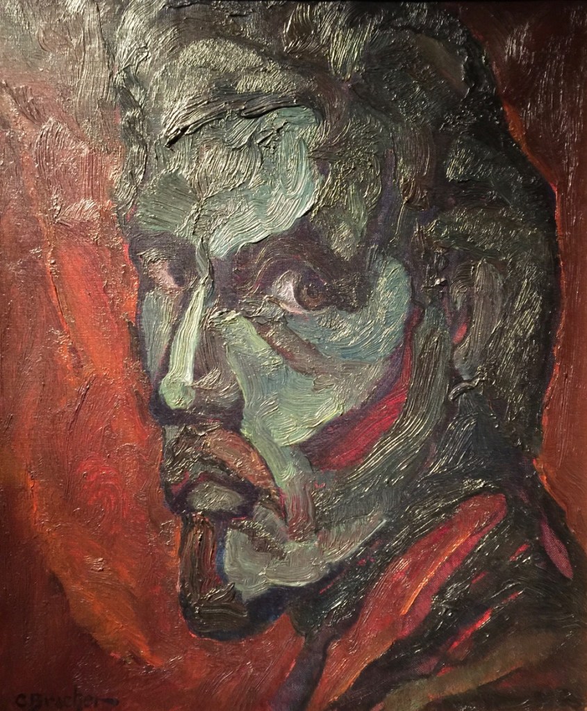
It is interesting to look back at this. This is Joselito, my partner’s brother’s ex-wife’s father (which in a village in rural Murcia is quite a close relation). He grew up in Franco’s Spain in a rudimentary house built out of a cave, with 12 siblings, mostly brothers and had no education (he still cannot really read or write). His first job was making baskets from reeds at the side of the river, and he gradually worked up a kind of business empire, via a bar and fruit orchards and various other dealings. When his wife Rosario died in the late 1990s, he established a new liaison with a woman (Mercedes) from Blanca, the local small town. It seemed at the time that she was good for him, although he had to smarten up and wear formal clothes and buy a flat in Blanca overlooking the square. But in the end she got sick with cancer and died, and it turned out that she and her sisters had managed to arrange things so that quite a bit of his fortune went to her sisters on her death (although he was the savviest person you could imagine for business dealings, it was quite easy to fool him on legal matters due to his illiteracy). Endless legal wranglings followed, and this is him at this time. I was trying to capture his look – the normally strong, even powerful (he was by some way the richest man in the village) ‘king of his domain’, overlaid with confusion and worry, possibly hurt – although I am not so sure about that – his capability for this kind of emotion was probably constrained by his brutal upbringing. Clearly the painting is poor, I had no idea what I was doing really but I feel like something of that look is there, he looks a little lost.

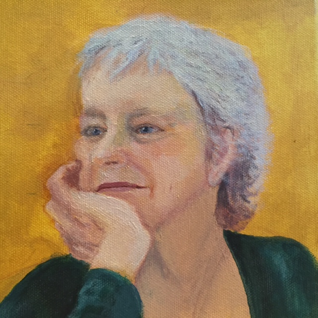
For this exercise though, I am presenting a portrait I painted of a friend of mine as a present for her birthday, during the course but not explicitly for this exercise. It is however the most sustained attempt I have ever had at painting a portrait. It is from a photograph – it was supposed to be a surprise – and inevitably, given that it was a present – it is a little flattering. That is, it was taken from a photograph from a few years before that was in itself a particularly nice photograph. Although clearly I thought a lot about it at the time, because I wasn’t doing it for an exercise or an assignment, I have never actually reflected on the experience from an artistic, painterly point of view so I thought it would be useful to do so here.

In spite of the obvious weaknesses of the image (particularly the hair ) – and most importantly, the lack of any attempt to tackle light (and to some extent, tone) I do think this conveys character. Joni is a very, very strong character; an American academic, a professor of gender and politics. She is a mixture of so many contradictions. For example, she holds strong political views and is a fierce defender of women’s rights yet is very much the sybarite, a connoisseur of good food, good wine, beautiful houses, expensive clothes, and gardening. She is hugely gregarious, a great initiator and cultivator of friendships with people of all ages – nothing gives here greater pleasure to collect a group of them around her dinner table, at least this was so when she was younger. She has an incredible sense of fun and mischief. Yet she can be somewhat challenging, bitter, bullying and irritable – her behaviour with staff in restaurants is particularly forceful (it isn’t helped by her increasing deafness). She is interested in everything – yet can be very dismissive of others’ views and interests.

All that made painting her a challenge, although I had my decision made for me to some extent; clearly I wanted to stress the positive side, given that it was intended to make her happy as a present rather than not.

I don’t have photographs of the earliest stages (I think I do but I just cannot find them) – this is the first. But looking at this makes me realise what I learnt from doing this; whatever else is wrong with it – the ears, the hair, the forehead is too high – the mouth is somehow right. It may not be exactly her mouth but the generosity and shape of it and the corners on the verge of an upturn is giving the effect I wanted. I thought it would be the eyes – and I worked hard on these – that gave the defining expression, but it isn’t. Indeed although I repainted and indeed redrew (with paint) the nose, the area underneath – really everything – several times in the early stages, I painted the line of the mouth early on and took great care to leave it – it felt right when nothing else did – and I feel it is vital to the painting.

As so often for me, I feel this early version should maybe have stayed as it was, perhaps it was the high spot (although clearly the hair and ears are really awful and there are key corrections to make and the yellow background is showing through). I like the dislocated face and hand – this is all that is needed to get across what I wanted. Since looking at Lucian Freud’s ‘unfinished’ self-portraits – where he paints in great detail just part of the face – or indeed the local artist Kieran Stiles with whom I sometimes take classes, and has been using this technique lately, I increasingly like this kind of effect. However, as usual I carried on regardless and here are the later stages.

I don’t know what came over me with this background, to some extent I think it has ruined the image. It is trying too hard (which, incidentally, is how I quite often feel when I am with this friend on our own – I think she bullies me a bit). Less is more, for backgrounds at this stage. However, despite all the weaknesses, and the flattering nature of the enterprise, I think it has something of her brave spirit, it shows one side of her personality. This is the cheerful, interested, gregarious, fiercely intelligent, determined side, with a wicked sense of humour. It has left aside her somewhat cantankerous, forceful, aggrieved side. I have realised for the first time that this is what portraits can do. They can convey whatever the artist wishes, maybe one dimension of a person at a time, which is of course how we see people in real life? When you are with a friend demonstrating a certain facet of their personality that you love or like, you forget about those sides which you find difficult or hate. And likewise, when they are being really rude to a waiter in a restaurant you literally just sat down in, you find it hard to remember why you are there. Perhaps, indeed portraits can only do this – it is not possible to encapsulate everything, particularly if you know someone well, which is also come to think about it why self-portraits are so, so difficult. As Graham Sutherland said to Winston Churchill at the first sitting for his portrait (well, reputedly, I am using the Netflix series the Crown as my reference here) ‘I am sure there are many Mr Churchills. I can only paint one of them’, and, when Churchill offered to put himself in some kind of pose to represent himself – ‘I find that in general people have very little idea of who they are’ (another reason why self-portraits are so hard). The portrait he painted of course emphasized the age, frailty and weakness of Churchill around the time of his 80th birthday and at his point of – reluctantly – standing down, and he hated it so much his wife had it burnt a few months later, tragic to think of when you look at images of it, it is a masterpiece.

Research Point 3. Figures in an Interior.

For this exercise, I had decided to paint my partner, Pedro (the only person around during these unsociable times) in the sitting room. This room, with its red carpets, red sofa, curtains and so on reminds me of one of the 1930s Bloomsbury (I think) paintings, indeed perhaps it was arranged (by me) with some distant memory of such a painting in my mind. A friend once pointed out to me that whenever I moved house it still looks the same, and I fear that may indeed be the case, and it is because of a predilection for the kind of colours that grace those Bloomsbury interiors, or at least how I remember them.

So it was interesting to actually look for the paintings and read a bit about them. In fact it is a little difficult to find, because there seems to be rather a lot of advice around on how to turn your own interior into a ‘Bloomsbury Group interior’, presumably the kind of place that the Bloomsbury Group lived in (I seem to have been ahead of my time). And indeed their lifestyle seems to have been deeply intertwined with their artistic endeavours – the artists Vanessa Bell and Duncan Grant used to paint directly on to the walls of their house in Charleston, apparently, to liven up the dark interior – art and life clearly in a deep two-way relationship. However, part of the ‘look closer’ series of the Tate Gallery on the Art of Bloomsbury gives an interesting insight into the work of three of the group – Vanessa Bell, her husband Roger Fry and some-time lover Duncan Grant.

Of the three, to me it is Vanessa Bell that is the most interesting, given her pioneeering status in abstract art in Britain. I was very interested in this image (taken from the Tate article above) of a mantelpiece in her home (in Bloomsbury) which both of them painted..

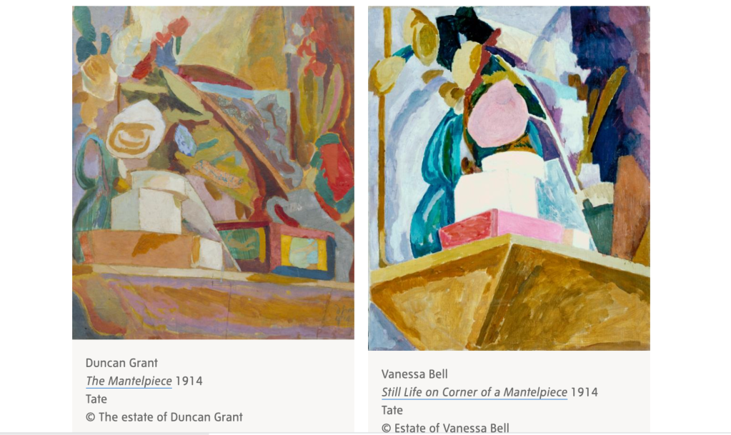
Source: ‘The Art of Bloomsbury’, ‘ Look Closer series, Tate Gallery, accessed April 2021 https://www.tate.org.uk/art/art-terms/b/bloomsbury/art-bloomsbury.

Both have implemented some level of abstraction and are interesting. Indeed Grant turns out to have had a strong interest in both Matisse and Picasso. But Bell has taken it to really exciting levels for the time of painting, and there is a Matisse-like freshness about this. I realise it doesn’t have a figure in it, so it is not entirely appropriate for this part, but I wanted to store it for future reference in this blog. Later on it seems, she experimented with total abstraction, in ‘Abstract Painting’ (1914) with which she became one of the first British artists to paint in the abstract style.

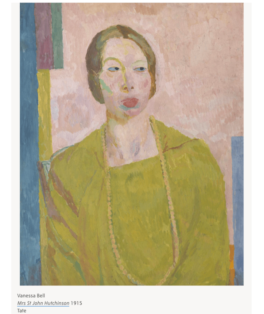
Of more relevance for this ‘Human Form’ part is this image of two of her friends painting, which as the article points out, is a good example of ‘form over content’ ….’the main theory of modernism’. She has painted the people with blank faces, the background with broad swathes of colour – yet at the same time, the shapes of the faces feel right. This is more difficult than it looks, I believe, as when I have tried to leave faces vague (or some element thereof, such as teeth in an open mouth) it has introduced a jarring element. She has it seems the basic form of the face completely right – you can see, for example that the man has a beard and some hair flopping over his forehead – but it does not distract you from the painting.

Another great painting of hers that I liked was this one, a portrait of her husband’s mistress. I love the colours in here, the simple lines and the use of colour and tone to give the merest indication of form and shape – the shadows in the sleeve of the coat for example, or in the hair, and the almost Picasso-eque shape of the right (left hand side of the painting) eyebrow and nose, with the lines on the face picked out in the blocks of colour to the left. The touch of blue at her throat is brilliant.

Later she returned to a more traditional style which is also lovely – her ‘An interior with a table’ of 1921 is almost perfect I think. But with regard to the human form, it is her ability to distill the essence of a human image as in the two paintings above that I really find helpful here.

The other group of painters that I looked at were the contemporaneous (or perhaps a little earlier) Camden Group of painters, about whom the Tate Gallery have carried out fascinating research project (Bonett et al, 2012), which includes a number of excellent essays on specific artists (see Fletcher, 2017 for a review). The group, named after the location where the leading members, Walter Sickert and Spencer Gore, lived and painted, was short lived – starting around 1907 and holding just three exhibitions in 2011 and 2012 and dissolving in 1913 – but during its life time was ‘a determined effort by painters to explore new ways of representing the everyday realities of urban life in Edwardian Britain’ (Bonnet et al, 2012). These artists also were familiar with European artists such as Matisse, but for them the paintings seem to have been more about content than form. They delved into the people, activities and entertainments of urban life, seemingly roaming far further from their socio-economic status than the Bloomsbury group. I love Harold Gilman’s ‘The Eating House’, (1913-4) and Charles Ginner’s Cafe Royal (1911), because you can so much imagine yourself there, especially the former, with the heavily layered embossed paper and paint on the walls – reminiscent of the eel and pie shops in East London that still exist, or perhaps not now but used to when I first lived in London in the 1990s. This was an all male group, rendering their focus on gender and sexuality rather dubious for me, but one of the many brilliant things about the Tate project is that it focuses in also on the excluded female artists painting in the same style.

For the purposes of this exercise – and indeed this whole part – the most interesting paintings are the interiors, including the detailed representation of people, which was a key part of the Camden group’s ouevre.

One of the most famous is this painting Ennui by Walter Sickert, himself the painter of the group to achieve the most fame in his lifetime. It shows a man, in my view with an expression of contentment and relaxation (although this is contested apparently, see Moorby, 2004) with a woman: “The physical proximity of the two figures supposes an intimate connection between them such as marriage, but their complete disassociation and lack of engagement with one another creates an atmosphere of isolation, indifference and loneliness.”

I very much admire this image, although it is not comfortable to look at. It received a lot of attention, perhaps precisely because of the mystery of meaning here, or perhaps because it was very large painting (1524 x 1124) for this particular artist, who previously had always advocated and painted much smaller images, “according to the scale of vision”. To me, it seems like a bored wife driven to distraction by the pontifications of her husband, and I imagine the man droning on, setting the world to rights over his cigar and glass of beer. The picture on the wall suggests the past or possibility of some more exciting existence, but the woman looks way beyond any sexual dreams, in fact she looks in the slough of despond, to be looking at a solid wall for signs of escape.

This is clearly a painting of social realism, which goes beyond an exploration of the individuals or their relationship, but questions of class and socio-economic status. I like the composition, which seems simplified to perfection: as Moorby points out “The furniture completely encircles and encloses the figures, hemming them into their domestic space so that there is a sense of imprisonment and claustrophobia, echoed by the stuffed birds in the glass dome.” Likewise, the colours – a cold mauve, the dirty white, yellow, grungy green, muted brown and so on – reflect the feeling of sadness and dreariness that the painting embodies. The furniture is clearly cheap, shabby and unfashionable. Moorby 2004) describes it as a pictorial illustration of two people facing what Baudelaire describes as ‘tout entière au gouffre de l’Ennui’ (Ennui’s most profound abyss), a life bereft of meaning and hope: “Sickert introduces this psychological state as a symptom of modern urban life prevalent amongst the under-privileged working and lower middle classes”

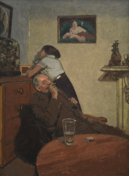
Walter Richard Sickert, Ennui, c1914, Tate N03846.

Finally, this self portrait by Harold Gilman was particularly useful for thinking about my own figure in an interior, indeed it gave me the idea for the pose, although my painting is very different. I love the colours of this – the red curtains, and carpet, the green of the plant in the foreground, and the way that these colours are picked up in the fanciful garden seen through the window. Although it feels like an elaborate painting in some ways, the palette is pretty constrained to the red-green axis (with a a few pale flowers in the garden) and the tones are brilliant – with the contrasting and therefore more distinct flowers in the foreground, and then the rather hazy flowers in the garden, emphasizing distance. The light is so delicately picked out on the man’s left (as you face the painting) side, and his face and the side of his nose.

Harold Gilman, Self-Portrait c.1908–9, Art Gallery of New South Wales. Purchased 1946. Source: Bonnett, 2009

In contrast to the last image by Sickert, this painting seems to me another example of form over content – the aim is to create a beautiful painting, rather than for us to see into the artist’s soul. In its delicacy of tone, and gentle gradations, this painting seems reminiscent of this comment on his slightly earlier works of which Louis Ferguson observed (quoted in Bonnett, 2009)

“very intimate – very smoothly painted – without impasto – without excrescences. Degas, who disliked anything growing out of a canvas – any thrust of pigment into the third dimension – would have passed his hand over the surface with entire satisfaction. The attitudes of the people represented at their domestic avocations were gravely rendered in an illumination both subtle and subdued; the tones harmonized with impeccable taste”

It also – to me at least – in its strong colour and style and a hint of a ‘puntilistic’ style – to show the beginnings of his interest in the post-impressionists, becoming fascinated by Van Gogh in particular, as well as Seurat and Manet. He went even further in this style, with vibrant colours, in Mrs Mounter at the Breakfast Table in 2017 (Tate N05317), a lovely portrait of his housekeeper, a serious elderly working class woman with a headscarf, sitting behind her teapot.

At the same time, however, the man portrayed looks very much as I imagine Gilman for descriptions of him, for example Bonnett (2009), as well as Wyndham Lewis’s (1919) assessment after his death as having “every virtue of middle-class England, and, in fact, [he]was one of the most amusing, genuine, equable, sensitive individuals I have met.”

Perhaps I am retrofitting my view of the image in line with what I have read, but it does seem to me that the painting, even with its emphasis on form, sums up these characteristics – which makes it even better, because as I have been discovering, self-portraits are so hard.

Exercise. Figure in an Interior.

After studying the Bloomsbury and Camden groups a little, I started on my figure in an interior, aiming to go for the same level of simplification and the same sort of palette range as in some of the paintings that I had been looking at, particularly the Gilman self-portrait. I painted on wooden board, with acrylic paint, having primed the board first (with acrylic paint this time, rather than gesso, which I didn’t think had been a success last time.

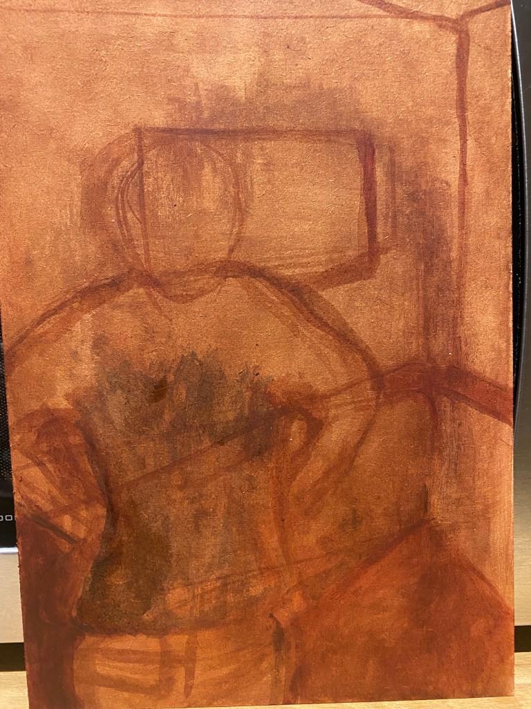
Pedro stood in front of but to the right of a glass door – I wanted the light on one side, as it was in the Gilman self-portrait above, but planned to make it much stronger – a more marked effect, as indeed it is in this room in the afternoon, as the light floods in from the west-facing garden. I also ruthlessly simplified, including only the figure, the corner sofa behind him (a sort of red with a hint of orange) and one picture behind him, a picture of a Spanish bull in a red-orange/terracotta wooden frame, highly appopriate. He was wearing a navy blue aaron sweater (which he nearly always is in the winter), a light blue shirt and faded jeans. I sketched out all these items very roughly in a darker version of the orange background.

I then started to block in the colour. I was quite pleased with the jumper, although here there is still some of the red showing through. The walls are actually a kind of dirty green, but I did them a kind of chalky white which felt more Spanish. The light has come out quite well, but his face is too fat and too yellow, although he is generally tanned.

This is a bit better, I have slimmed down the face and emphasized the light a bit more. I have painted in the cushion on the corner, although I wondered afterwards if this was the right thing to do. The sofa looks a bit mean and thin, and I should have painted it with more depth to the cushions, this would be something to correct if this piece were to be submitted for assignment. The fabric doesn’t look right either – it is actually very soft, but here looks almost like one of those mock suede cloths that can become shiny. The face is still yellow though, and the background to the bull is also too yellow – it is a kind of gold chalk over the black in the actual painting.

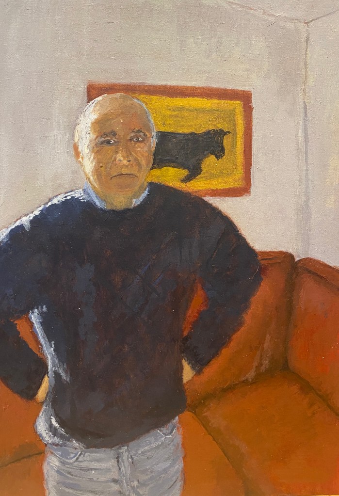
This is the final version. Several of the things that were wrong before are still wrong, particularly the yellow face (which doesn’t look so bad off camera), the size of the cushion and now I have noticed that his eyes are at slightly different levels and different sizes (a common fault of mine, which is very disruptive to an image) and seem to have a black outline. I would like to correct these things. But there are some things I like – the jumper, the jeans, and most importantly the stance and expression of the sitter. He looks serious but not actually sad (although I suppose to a stranger he does look sad, it is just this is his expression in repose – and as the course guidelines discuss, this is often the case for most people) and the slightly puffed up look that some (usually shortish) men get when they fold the arms or put them as in the photograph. I like the angles, and the composition more generally. I have followed the advice in my tutor’s report for the last Part and have ruthlessly simplified, which has worked well. I have thought about the colour scheme of the image and I like the chosen colours with the above caveats.

Exercise. Telling a Story.

For this exercise, I used a photograph, which is of myself aged about three, on a pony in Scotland, and my mother (there is an uncle of mine in the photograph as well). I wanted the story to be the way that we are looking at each other in the photograph, straight into each other’s eyes, My mother is staring at me with a look of fierce love, and for this reason I treasure the photograph because this expression was rarely if ever seen when I was older. The trouble is, the photograph is nearly 60 years old (obviously) and faded, with no light visible (if indeed it was actually captured by the probably inferior camera).

I drew on greyboard again, just focusing on the main characters – my mother, me, and the pony. The drawing of my mother is awful, and I believe I redid it after this, but there is a certain balance of the child and pony, and I like the fact we are just about looking at each other. Needless to say the pony is coming out better than the people, probably because even after all these years of trying to draw people and not having much to do with horses, I seem to know more about how horses look than people, which is rather depressing.

I then started to block in the colour and develop the drawing with paint. Once agin the pony went best, although I thought it would be difficult to paint a more or less a white coat- I used some very pale pink for the slightly albino nose, grey for the nose, nostrils and lips. I tried to vary the colour and tone on the neck and chest to give it some dimensionality.

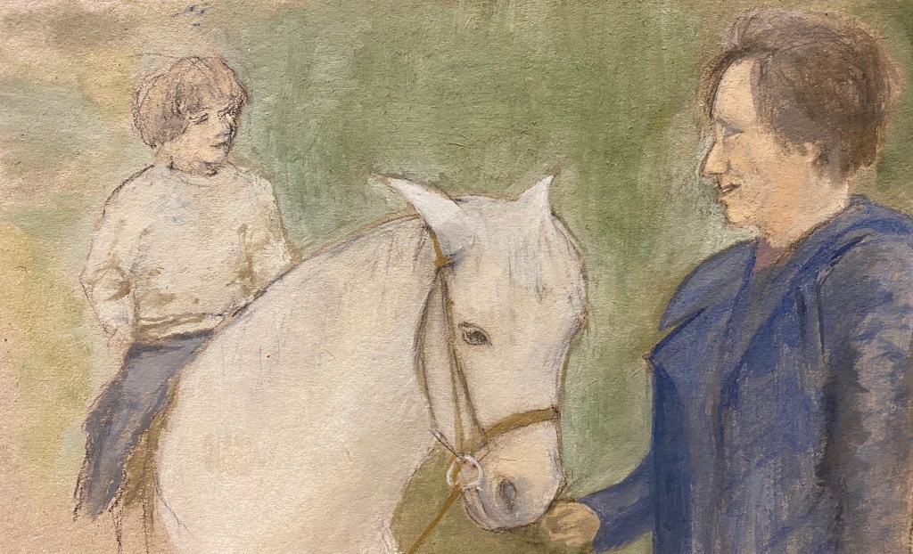
I tried to keep the child more ethereal and vague, and the position of the body of the horse isn’t too bad, but the face is badly drawn too, I realise looking back at it and the hair is terrible. I redid my mother’s face and although it is still not good, I do feel that for her I sort of got something of the look. she is giving to the child.

The final result looks a bit like a (not very good) illustration in a children’s pony book. It was inevitable, perhaps, given my lack of experience of doing this kind of painting (which thinking about I have literally never done before) and the photograph that I used to work from. But I am still pleased that I did it, I learnt a lot and it was interesting trying to represent my mother’s face. Of all the elements,I feel that the simplification was quite successful, again following my tutor’s advice; that the essential elements are there and the extraneous ones have gone.

Exercise. People in Context

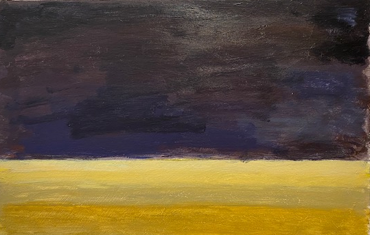
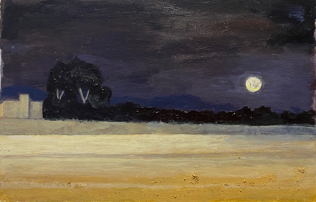
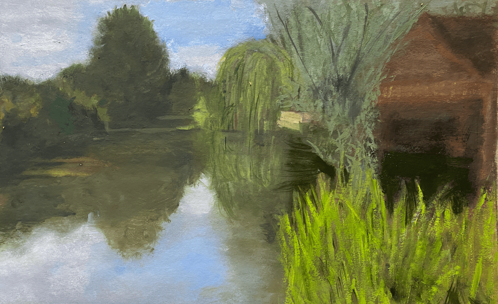
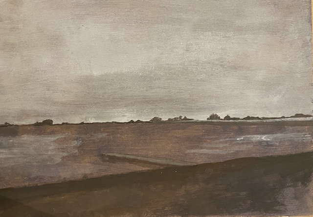
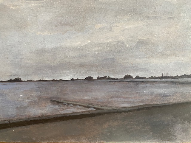
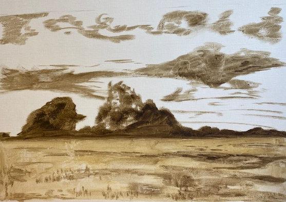
For this exercise, I used a painting by the Belgian painter George Michele (probably) from the 1830s (probably) that the National Gallery was using in a feature ‘painting of the month’, in which visitors to their site were supposed to choose their favourite. I was drawn to this because I have inherited a picture myself that is ‘probably’ by Michel, although no doubt less ‘probably’ than this one (judging by the attitude of the young valuer at Sotheby’s where I took it there to be valued for insurance). They presented the painting very nicely, with an audio of a fierce wind (I cannot find it now but the painting is here https://www.nationalgallery.org.uk/paintings/probably-by-georges-michel-stormy-landscape-with-ruins-on-a-plain) to illustrate how evocative the painting is. I was drawn to the tiny figure of a man, which the discussion of the picture points out creates a real sense of mystery – where could he be going, who is he, why is he alone in such a desolate place in such inclement weather – and thought I would try to replicate this sort of image, although with a more modern figure.

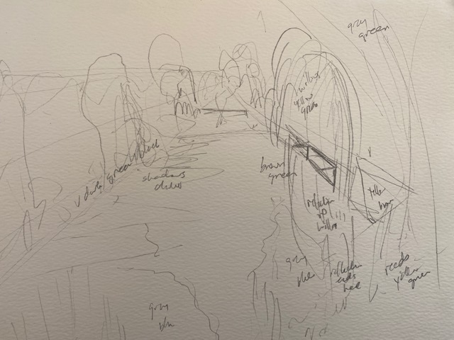
I took a grey board, and used oil paint for this. With some very diluted raw umber, I sketched in the dark places as below.

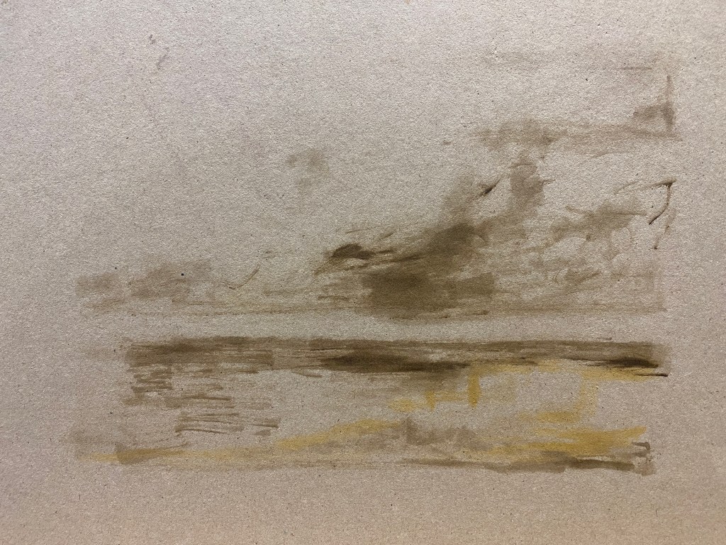
I then built up layers of paint, limiting my palette to black, paynes grey and white for the sky, and a combination of yellow ochre, red sienna, green and raw umber for the land and the ruins, which I kept more vague than in the Michel image. I painted quickly, with broad rough strokes across the board – trying to get the effect of the wind, as the discussion suggested that Michel did. I rather enjoyed a landscape after not doing that for a long while – and I am afraid that I forgot to take photographs.

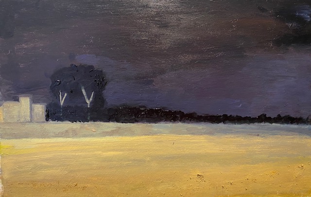
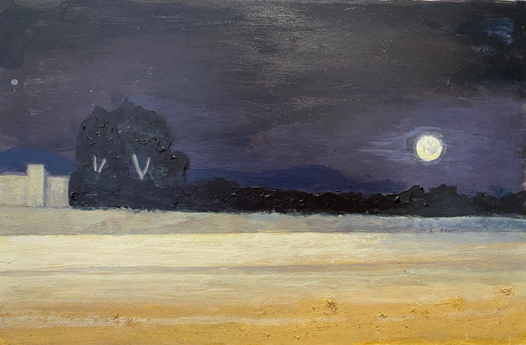
I was quite pleased with my landscape, and then tried to add a figure. I wanted her to be in green, at first with an idea of some kind of common countryside jacket – but then was thinking a parka – a rather urban sort of coat – would be more interesting, yet still blend in with the landscape. So I tried to do that, adding the distinctive fishtail of the parka blown backwards by the wind. However, this has not worked so well – the coat looks a little odd, and I wasn’t able to depict the hood successfully, as I wanted to make it clear it was a woman, by adding longer hair (as someone looked at it and just assumed it was a man). I felt inclined to redo the figure, which is also too large I think. But apart from that I am pleased with the idea and the overall effect. She does blend in to the landscape, while at the same time the viewer would, I hope, ask themselves why she is there.

Response to Tutor’s Report on Part 2.

Overall feedback
You have worked well in your colour experiments and working out the relationships between colour schemes through research. Sometimes your compositions are too complex or busy so you cannot concentrate on the technical aspects of all the areas. Whereas when you have simple set ups or magnify, that is when there is more impact in the work. There is some richness in the
colours you use but this can be improved with more attention to technical skills of
shape, form and tonal qualities.

I appreciate these comments, and the need for simplification is something that I have started to really try hard to do – the Assignment was the most important lesson, particularly when I realised that the quick version that I did afterwards was actually better than the original, in spite of the huge disparity in work that had gone into the two pieces.


Assignment 2 Assessment potential
I understand your aim is to go for the Painting Degree and that you plan to submit your
work for assessment at the end of this course. From the work you have shown in this
assignment, providing you commit yourself to the course, I believe you have the
potential to pass at assessment.

I am pleased to hear this, and wish to continue towards the Painting Degree as it keeps me motivated.


Feedback based on Learning Outcomes
• Explore and employ key processes for drawing and painting.
• Explore a range of media to create visual work.
• Begin to understand how historical and contemporary painters and artistic
movements can and have informed your own practice.
• Reflect on your own learning experience.

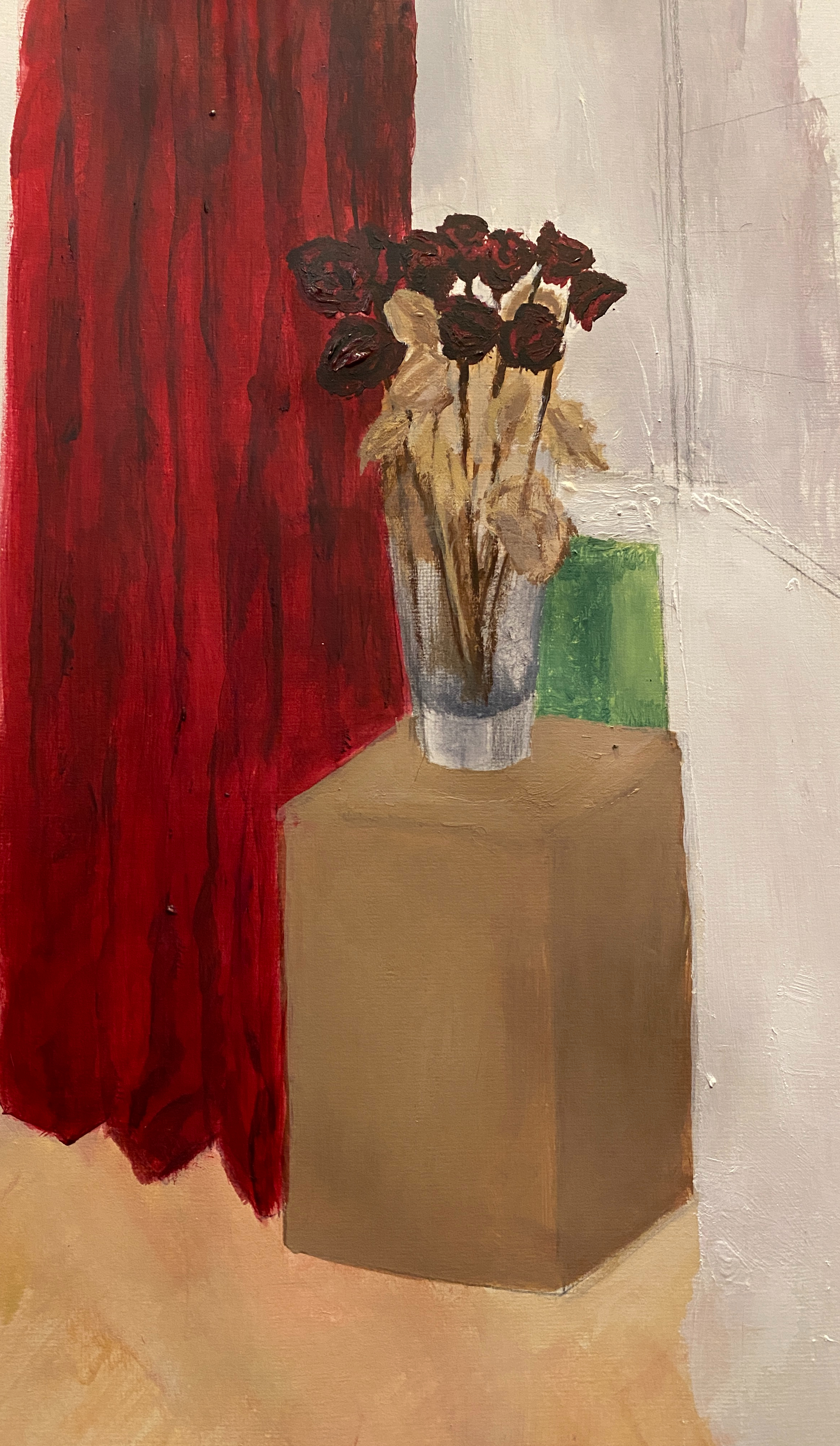
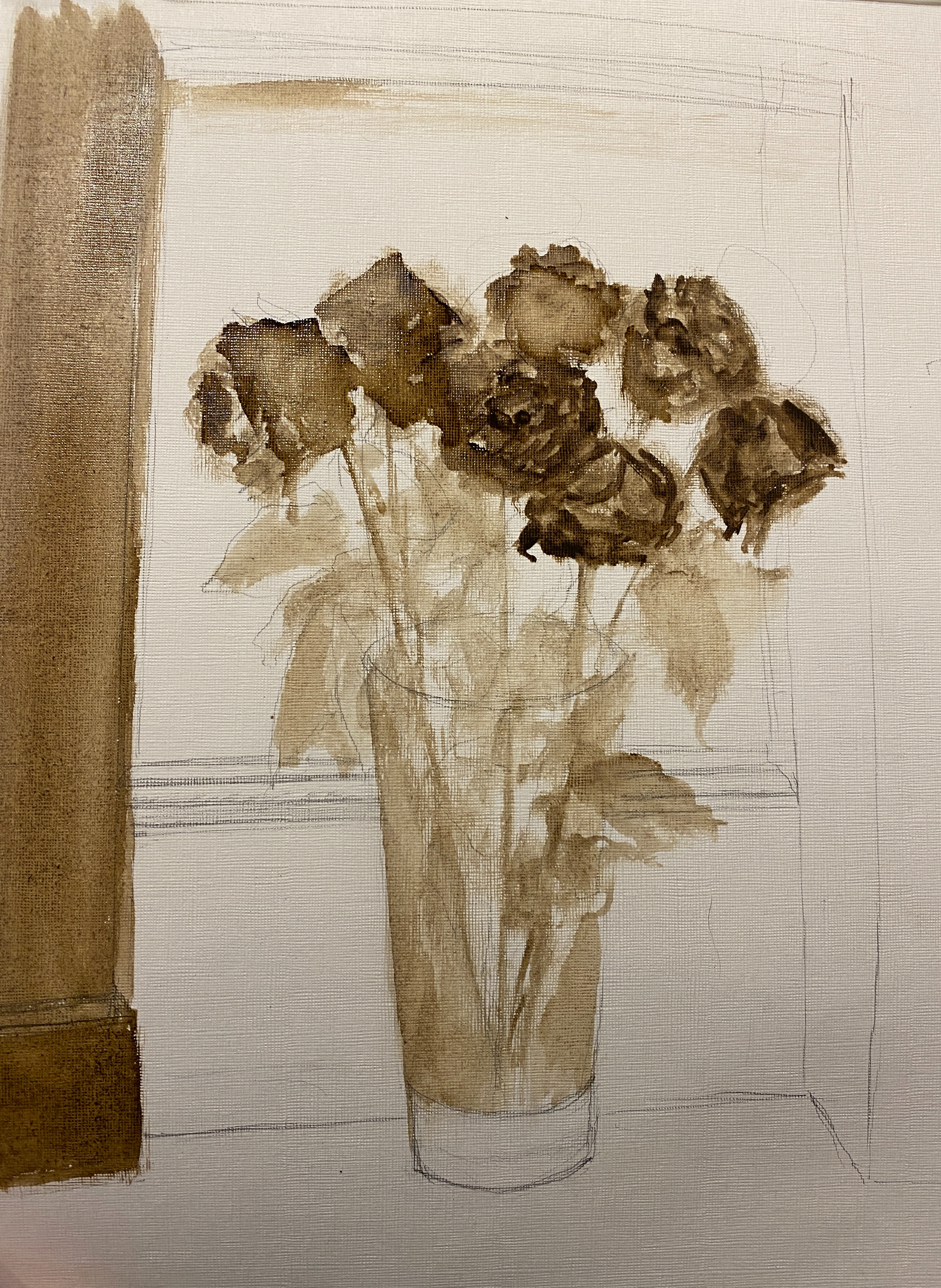
Drawing in paint– you have a real richness with the curtain in the background and the folds are almost looking 3D. You have identified what is not working and I agree. There could be more distinction between the foreground and background to show depth. The actual flowers could have more tonal variations. Also, the plinth could be richer to flow the whole colour palette.

I agree with these comments – all things I have observed. in the course of doing the piece, which I increasingly realised while doing it that it needed to be completely redone.

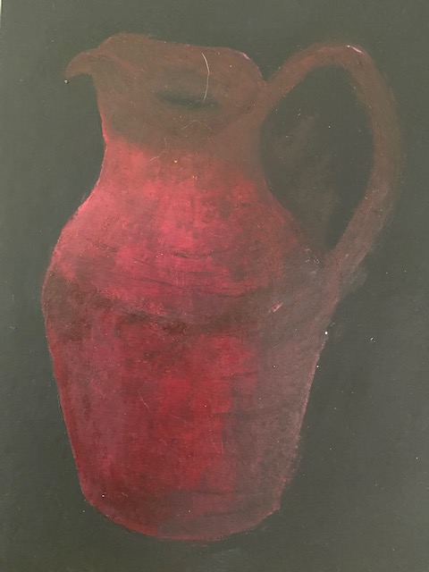
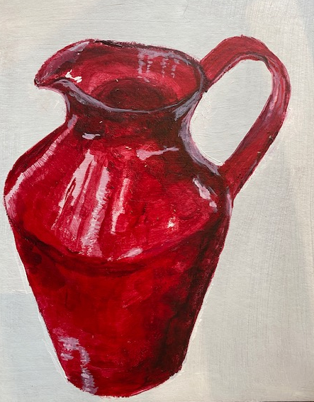
Still-life with flowers- again more tonal variation is needed on the flowers to show the form so have a range of different shades of the same colour. As a composition it’s fine but the background and surface are too different and separate from the rest of the palette. I agree the shadows are not relating to the subject. However, there is some rawness coming through in the application of paint.
Looking back at this piece, I feel that this was indeed the problem – it may have been exacerbated by the fact that flowers are not normally on the floor – in fact, I should have put them on a table or perhaps even where they were in the last painting.

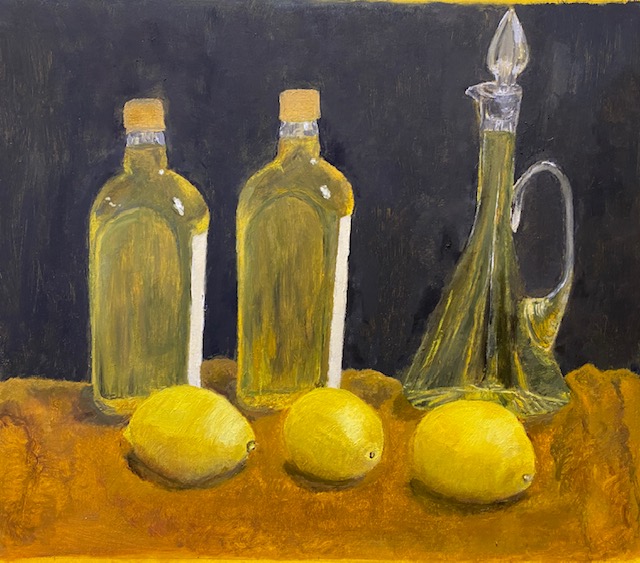
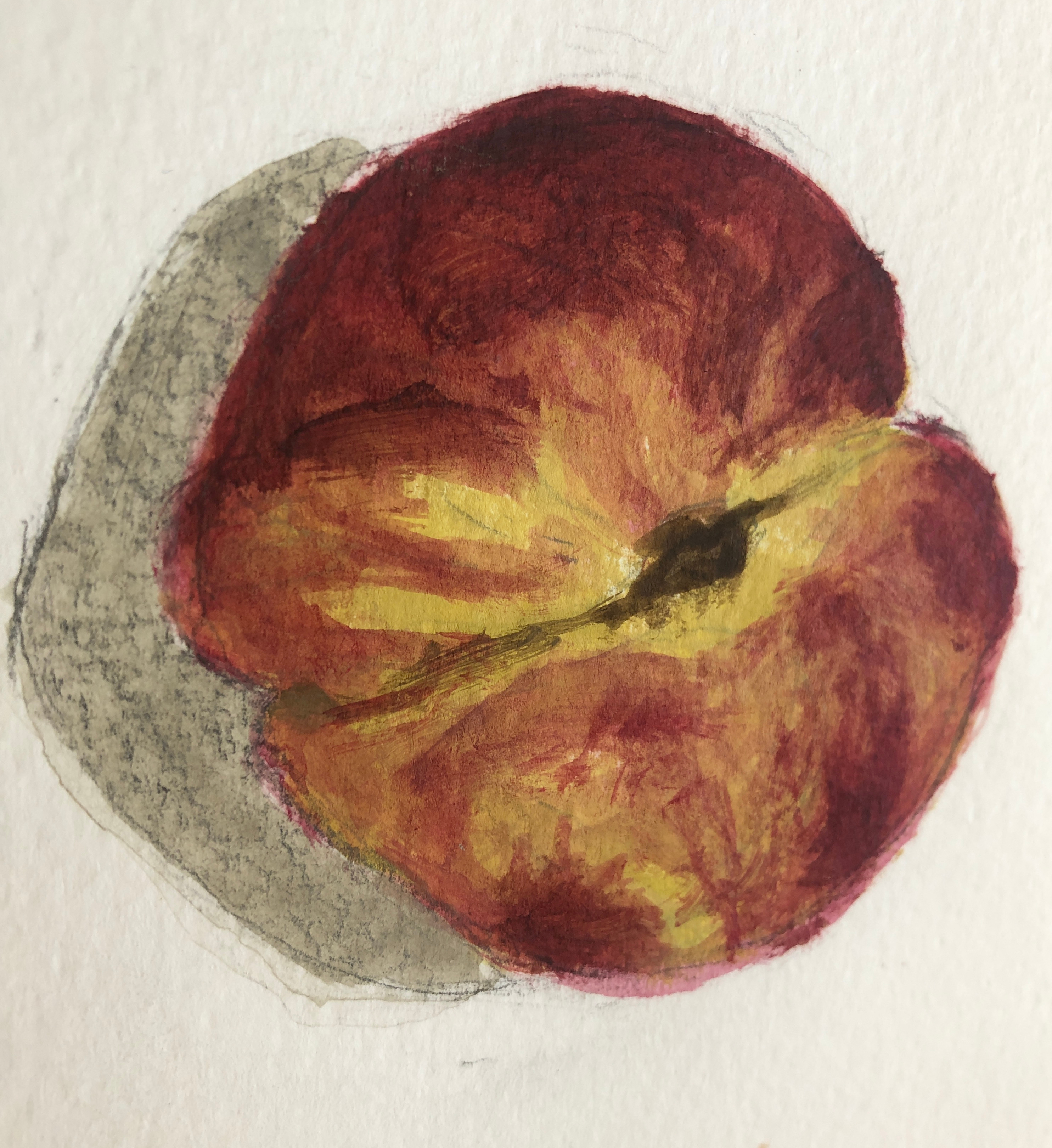
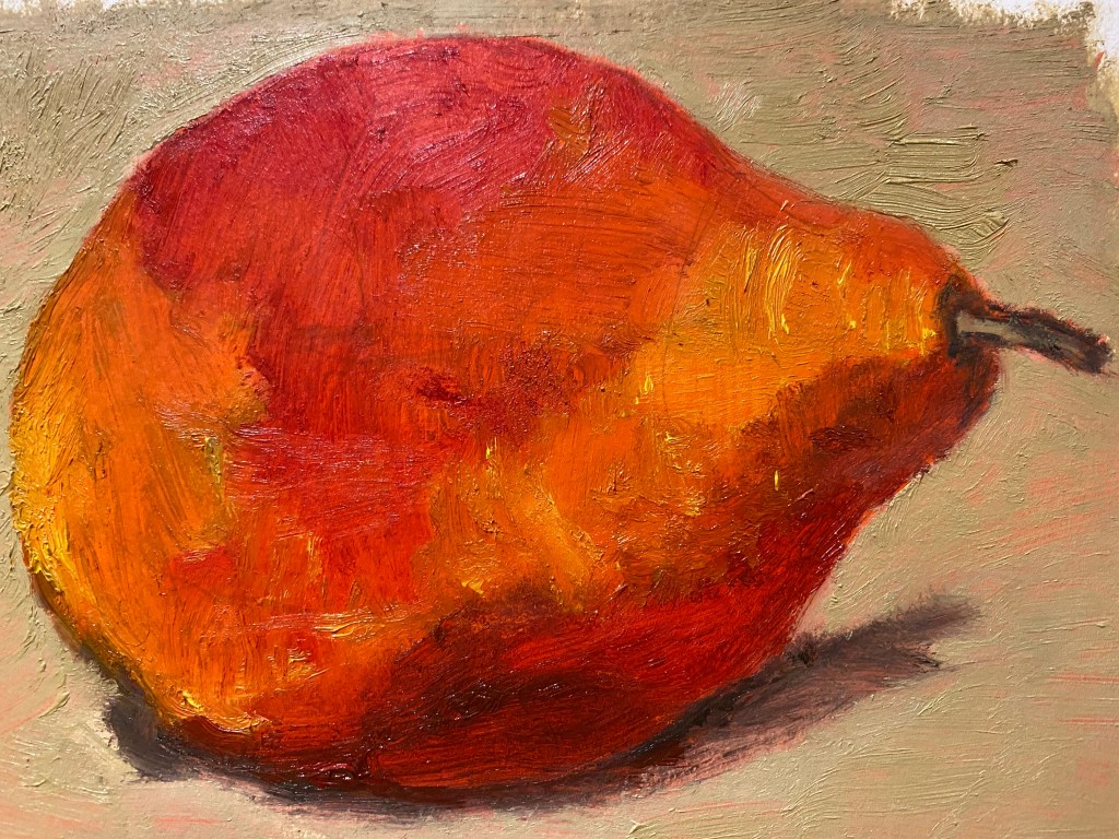
Drawing natural objects- this is a successful piece. The application of paint is raw which means that we can see the reflections and light coming through. It also has good form to show the curvature. The colour is vibrant, and you have observed the tonal ranges well.
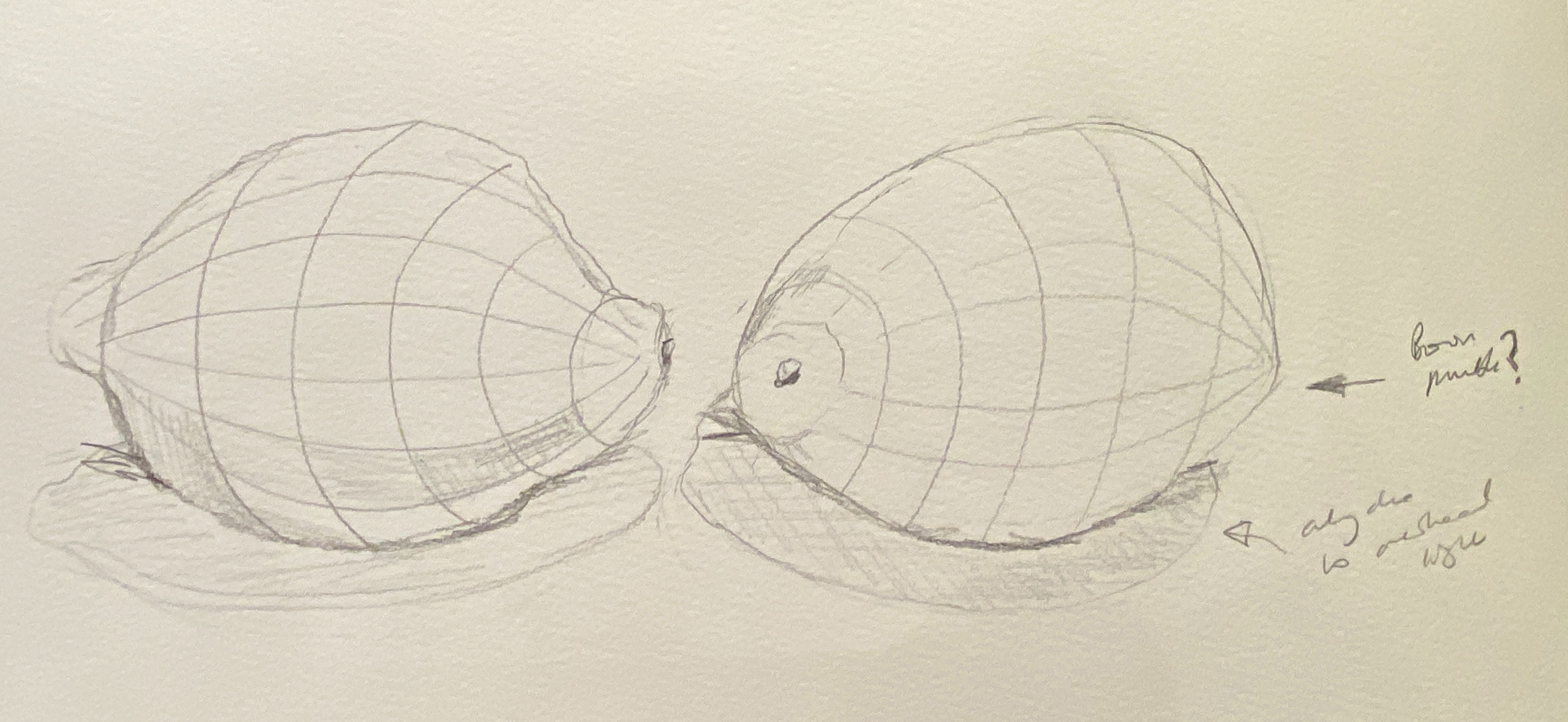
Still-life with natural objects- the final attempt is a vast improvement, and you are seeing the small details which can enhance the work. There is luminosity and light on the lemons now and the shadows are softer. The darker subdued background contrasts well with the brighter vivid subject matter.

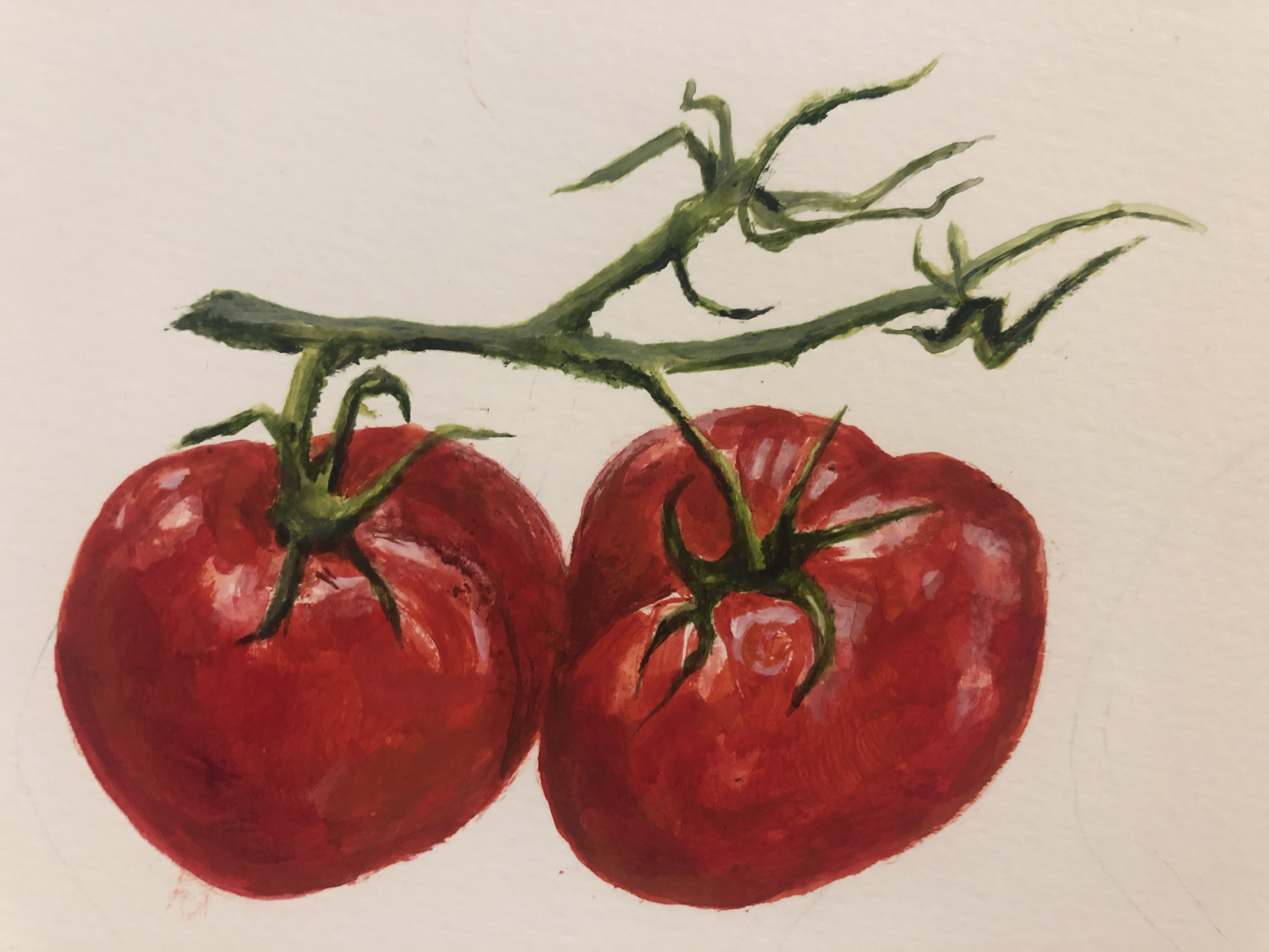
These were my preferred pieces in the whole course so I was glad that the Tutor concurred. I really liked this style of painting, and the technique of Uglow and his followers. The lemons illustrate the payoff from sustained work on one small piece, sticking to the same idea throughout.

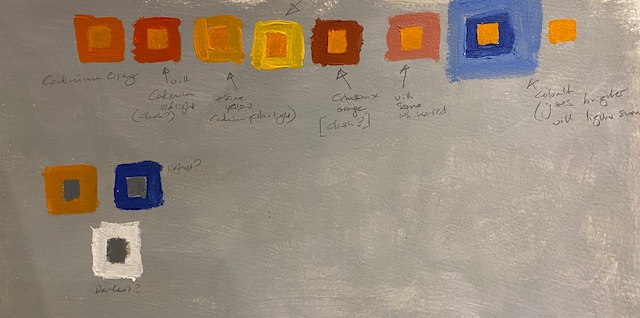
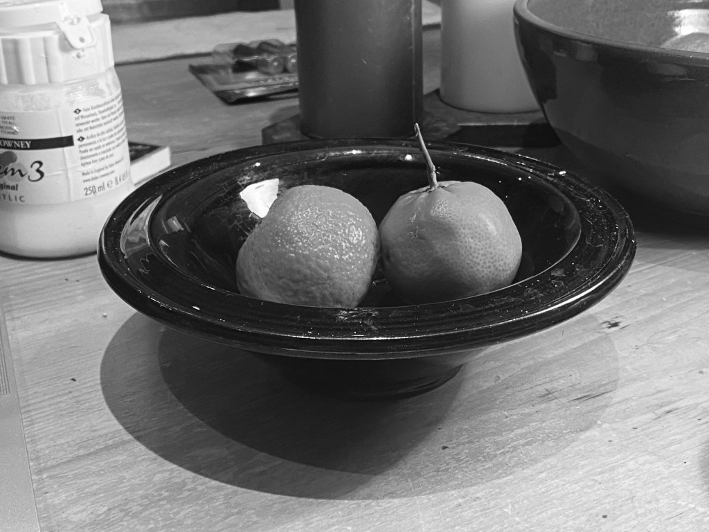
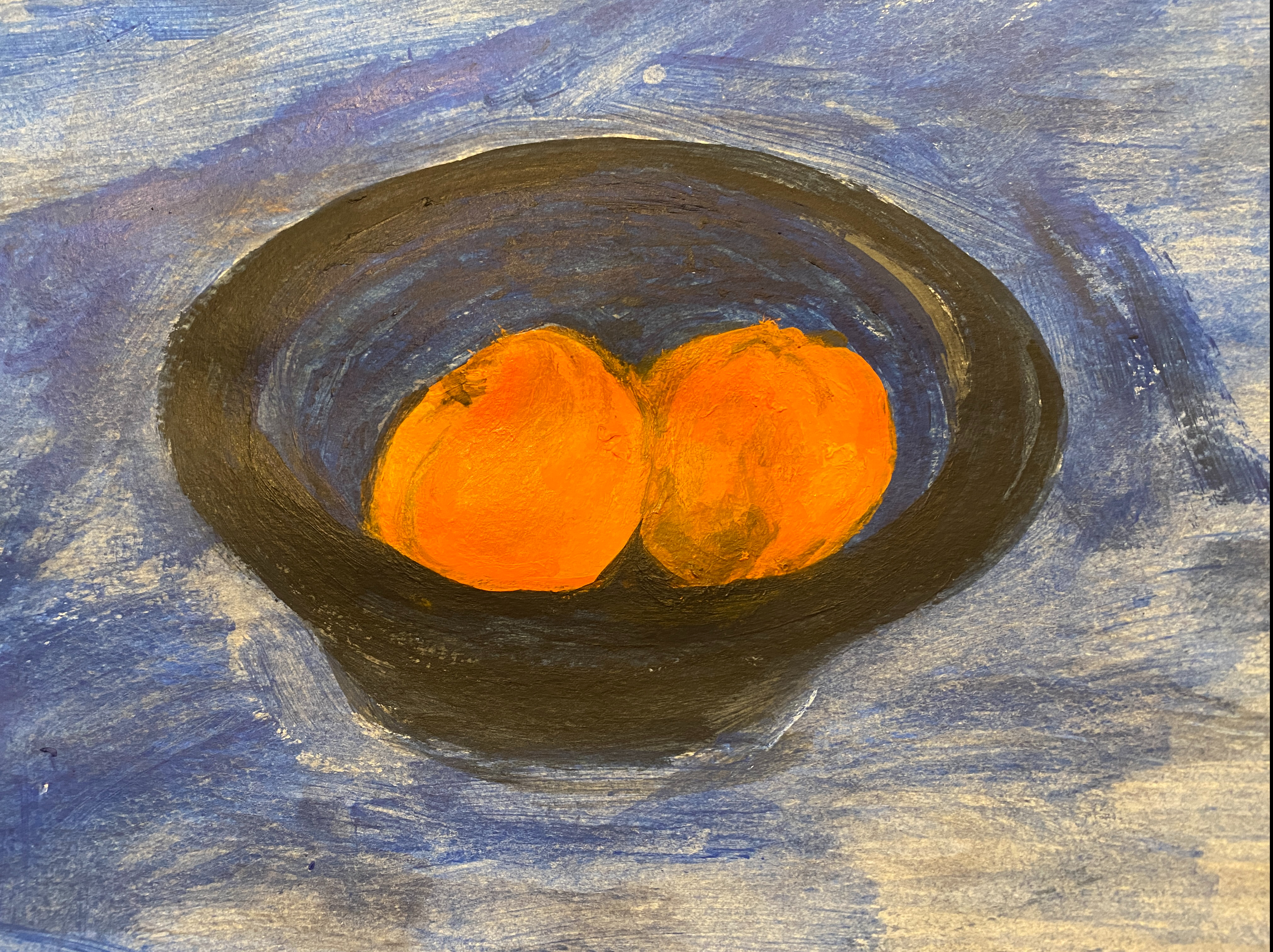
Still-life colour studies– the clementine look a little unbalanced with the shape and form of the bowl and the fruit so work with ellipses more. Also, the main subject matter is very small so magnify them as this is what the focus is. And the shadows are too heavy. However, there is a vibrant mood with the orange and blue so contrasting colours are working.

Yes, I can see looking back that I have a lot to do on shapes that have elipses in, all these bowls have some problem. I practiced this quite a bit during Drawing 1, but I need some more. And this was a lesson – as in the first exercise – to make the thing that you have chosen as the subject to be in the larger thing! Shadows, yes, I was rather excited that the colour was right but it was still too dark.


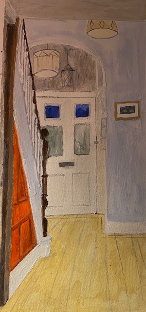
Interiors– it’s good to simplify which you have done with the subdued colours, but you
could even more minimal to evoke mood. So, you can eradicate the lights for example
and leave the viewer looking at an empty space to evoke an emptiness? Concentrate
more on perspective so the geometry is accurate.

These are fair comments. I think I should have redone the drawing here, for the perspective. It is a good point about the emptiness – I think I was at the back of my mind remembering the first time I saw this house in the estate agent’s details, where the hall was beaming with yellowy light (the walls were yellow in those days), with these huge vaulted ceilings. So that empty image would have been a better painting (because I failed to tell the story that was in my mind of such a welcoming place), but a different one.


Assignment– you have made the right choice in working with a dominant colour and this evokes a mood. The composition is quite stifling as it’s very ordered and sometimes, less is more. However, there are some dynamic marks come through and the textural aspects work well. The colours are quite dramatic against the dark background so there is a sense of rawness and vitality with the yellow. You have worked well with the narrative and indicating some sort of story behind the work.
The piece in the addendum is more attractive and appealing because of the composition as it has more narrative. Also, technically there are improvements with light and shape of the subject matter.

Again I agree with all this and am really grateful for the explanation of what went wrong with the main assignment piece – I guess I had worked some of these things (the busyness, too many bottles without thinking why there needed to be so many (ok, our Brexit stockpile, but the viewer is not going to know about that) and so on. But not everything, so this is helpful. I don’t think I will make quite the same mistakes again.


Learning logs/context/sketchbooks/research
You have done vast amounts of research and have your opinions in there. It would be really beneficial to see how other contemporary artists fit in with your theme too. You have understood colour theory and have much analysis and explorations of this in your charts.
You log shows that you are analysing your own work well and identifying areas to improve on. This shows an ability to rectify the technical aspects. It is in-depth and self-reflective.
Sketchbook- it’s fine to work on loose paper because it is still supporting work. I can see you have done many prep pieces and sketches so there is development there.

This was welcome feedback – research is my job, so I should be able to do it, but I struggled at first to apply it to this new field, and it is good if it is getting to the right level for what is required here. I do need to look at more contemporary artists though, this is a good point, I am far too obsessed with artists that I know well. I enjoyed very much the artists I looked at for the studies of the red pear and lemons, none of which I knew about.

Action points and further research

Kathryn Petke- looking at close-ups and magnification
Boo Ritson- for the richness and consistency of paint
Wayne Thiebaud- for working with multiples and subdued colours.
• Simplify some of your compositions by magnifying and honing in so there is
more impact.
• Try and have unity with the colour palette in the work. There is sometimes very
light areas and then very dark areas. Have a happy balance.
• Technical aspects- working with more tonal ranges to show form of the subject.
• A richness and rawness comes through in your painting application so this can
be pushed.

I am grateful for the recommendations of the contemporary artists, as I was for the last part, which I looked at too. I was very struck by BooRitson, with the seemingly almost physical layers of paint, which are illusionary I think – it is probably quite flat – a really clever effect. And also Wayne Theibaud. I don’t think I will ever achieve this kind of pop art style, but it would be a really good idea to try to a still life in this style. It would have been so good if I had tried some multiples before embarking on all those oil bottles. And trying to match these colours would also be a good exercise.

These are very good points. Simplification is the message that has sung out during this part – all the benefits that came from applying it to the red pear and lemons paintings in terms of focusing on one object in one style – and all the problems caused by an overly complicated composition, as in the assignment. I had not thought about the unity with the colour palette – this is again I realise a jarring elements in lots of things I have done in the past and I need to get this balance. It is all about looking at the painting all the time, and calibrating as you go, squinting to see the darkest and lightest areas and so on. The tonal ranges to show form of the subject was crucial for the lemons and I will try to apply this to the more complicated forms of the human body and face in the next Part.
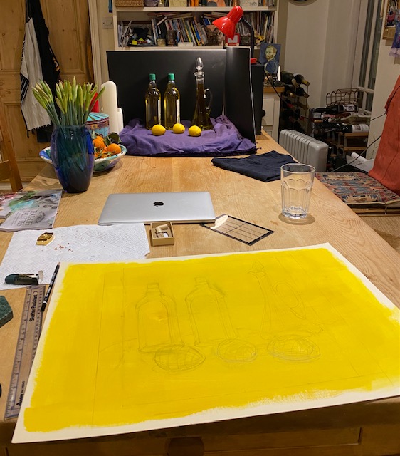
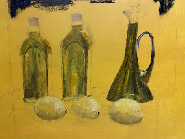
Assignment.

After the debacle of my previous attempts at self-portraits as above, I decided that I was a bit stuck, and booked a lesson with the artist Kieran Stiles, with whom I used to do group life drawing classes and a few extra ones in those halcyon days when one could do such things in his studio at Folly Bridge in Oxford. This class was on Zoom of course, and was just for myself and a friend who also paints, to make it a little cheaper. Having completed two self portraits where the resulting image was extremely flat, before doing the assignment, I wanted to remember how to use tone and light to illustrate shape. I also wanted to have a go at painting images in semi darkness. I have always been fascinated by paintings of the dark – I did the fifth part of Drawing 1 on this topic, and plan to do the same for POP1. Just before the second lock-down I was fortunate enough to see the ‘Young Rembrandt‘ exhibition at the Ashmolean museum (Brown et al, 2019), and the self-portrait used for advertising the exhibition, of a very young Rembrandt was a high spot of this wonderful exhibition. In this image, the figure is almost in darkness with only a cheek, the side of the neck and part of the nose are lit at all, and then only dimly.

This was a very useful class, going through some of the most basic elements of acquiring a three dimensional image. We discussed the expressionistic self-portraits of Freud, and I realised for the first time what made these so distinctive – and so difficult to mimic. To paint like this goes against the edict to paint what you see, because each mini-plain, each brush stroke is exaggerated; Freud doesn’t really look like this – but this is the element of his physique – old, wrinkled – that the artist has chosen to emphasize. The dark parts are painted lighter, the light bits lighter, and so on. I think that before I can hope to learn to paint in this way, I need to learn how to paint things more or less as they are. I have written down they key lessons that I learnt – originally written in my sketch book – to remember them.

  • The tone of the picture must be relative to the concave/convex aspect of form – best observed by looking at some of Rossetti’s huge lips in some of the pre-Raphaelite drawings or paintings.
  • To get the curve of a surface plane of an object, you must blend from light to dark.
  • For older people, the curve will be much tighter, and the blended part between light and dark will be much less. Also for the forehead there will be a much larger area of blend- for the nose much less – the top of an arm versus the wrist is another such contrast.
  • For those parts that are darkest in the image (best observed by squinting at it through half closed eyes) – such as nostrils or under the hairline – one must go dark enough, it is easy to be bit lily -livered bout this.
  • Squint at the picture and look for the darkest parts – and then remember that nothing else is as dark as this. Remember, pencil is restricted – there are only about 5-6 tones, so if you don’t work out with the darkest bits (which you need to (de)saturate, then you don’t have enough leeway.
  • With teeth, understate them – remember there is no light in the mouth in a normal setting, so don’t try to show details, or gaps between them – and err on the side of darkness. This was useful as I have always been very scared of showing teeth.

I knew most of these things at the back of my mind, but it was really good to get the reminder. In the class we tried out the technique on an image from the Rembrandt exhibition discussed above, because I was keen to try something that had a lot of darkness in it, having failed so miserably when I tried this on a self-portrait above. First of all I learnt that you cannot – as I did there – paint a face and then overlay it with paint for the darker bits however diluted (neither can you do this to represent bright light). That is not what Rembrandt did at all. He is painting every part of it, just with very dark colours – indeed he is painting what you see – so if you see very faint lines of the image he is painting that. We focused only on the nose,

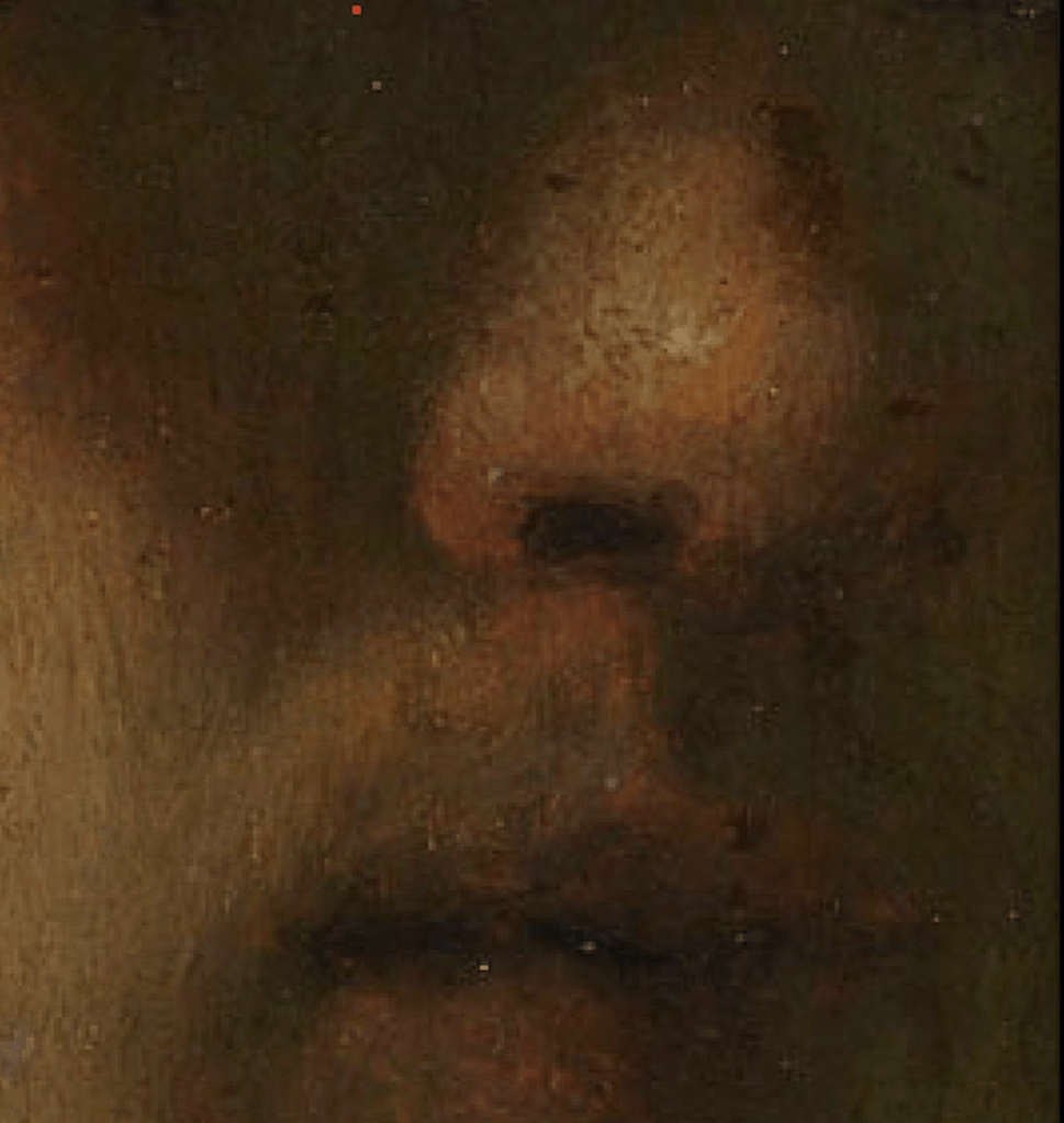
So far I have tried just the nose, and here it is.

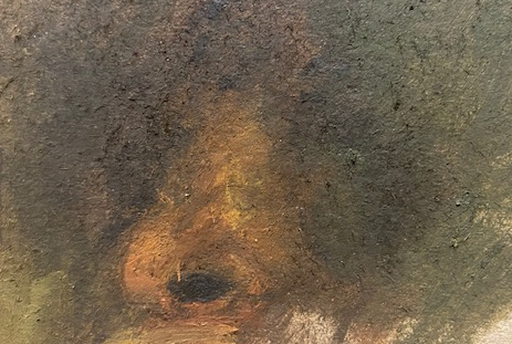
Although this is a tiny fraction of the painting, it took a long time and although I was pleased with the result (in contrast my household were amazed that I should have spent so long with so little to show for it) I have finally started to realise how hard it is to do this. It is in fact a bit like painting in the dark. It was fascinating though, especially when you honed in digitally to other parts of the image – you could see for example that the right eye was not really elaborated at all, because the colours are so dark (a kind of murky green) and Rembrandt was not prepared for digital explorations of the dark corners of his paintings (you have to Zoom in a lot to see this). I learnt a lot from this, and I will try to finish this and experiment some more with this technique in Part 5, when I will be painting to the theme of darkness.

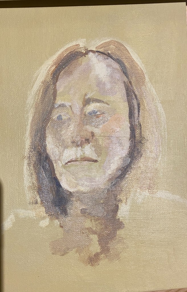
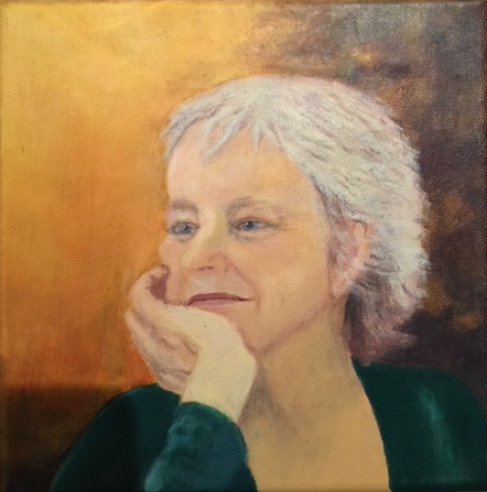
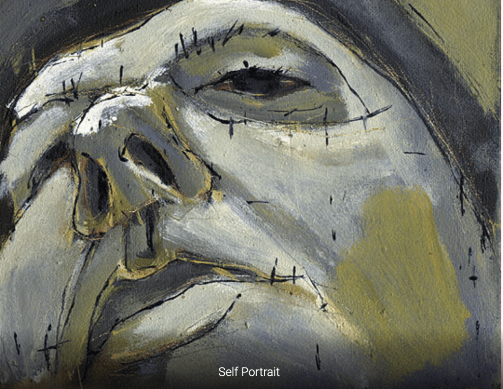
Meanwhile, I needed to proceed with the assignment. Rather than fixing on a dark image for this, I wanted to put into practise what I have learnt about making form with tone, light and colour (also mentioned in my Tutor’s last report). The image I chose for this was one of the poet Sylvia Plath (1932-1963), in a garden of some kind in bright sunlight. I wanted to give myself the best chance of getting some kind of dimensionality through tone, something that was not really easy in most of the subjects I had chosen before, particularly those from old photos such as that the ‘character’ portrait of my friend, or the ‘story’ one of my mother and a younger me. She was clearly an interesting character who I felt it would be interesting to paint and about whom I knew a little. I did not plan to paint the whole image – I don’t like the whole image because she seems to be what I believe is called gurning, towards the camera, but took just a section of the right hand side of the face and hair. I wanted to use what I learnt before (during the last assignment) about focusing on one area in detail.

I first drew the image in pencil and then started to fill in a small portion

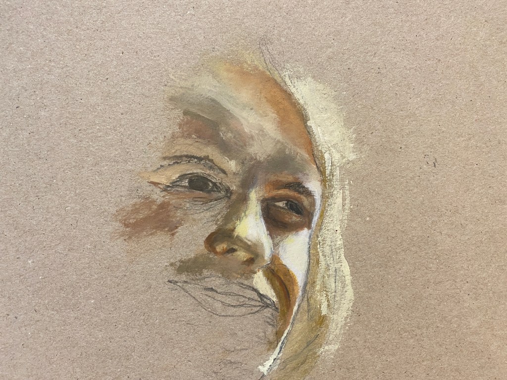
Only the right eye (as you look at the image) is really done here, and indeed I realised once I looked at it that the drawing is wrong – everything needs moving up, the nose is too large, the sunlit patch to the right of the face too long and so on. Also, the left eye is far too low – it needs moving up. For the next attempt I tried to make points on the image – for example the corners of the mouth, the corners of the eyes, the edge of the nose – to try to line them up in my own drawing, to get all the features in tune. And of course I needed to redraw the bottom of the nose anyway, which here is at an angle suggesting that I am looking up it from below.

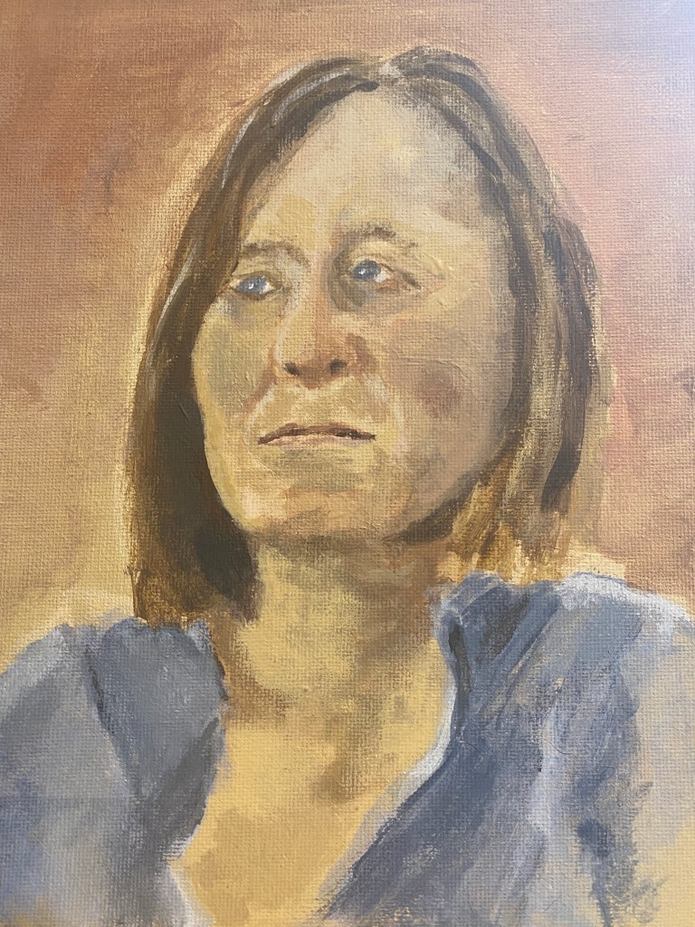
This is the next attempt, where I have tried to correct some of the errors, and redrawn the left eye and the nose, and started to paint in the mouth and extend the face downwards. The bottom of the nose is a bit better, but still wrong and the shape of the face is wrong below the mouth, too straight down and too long.

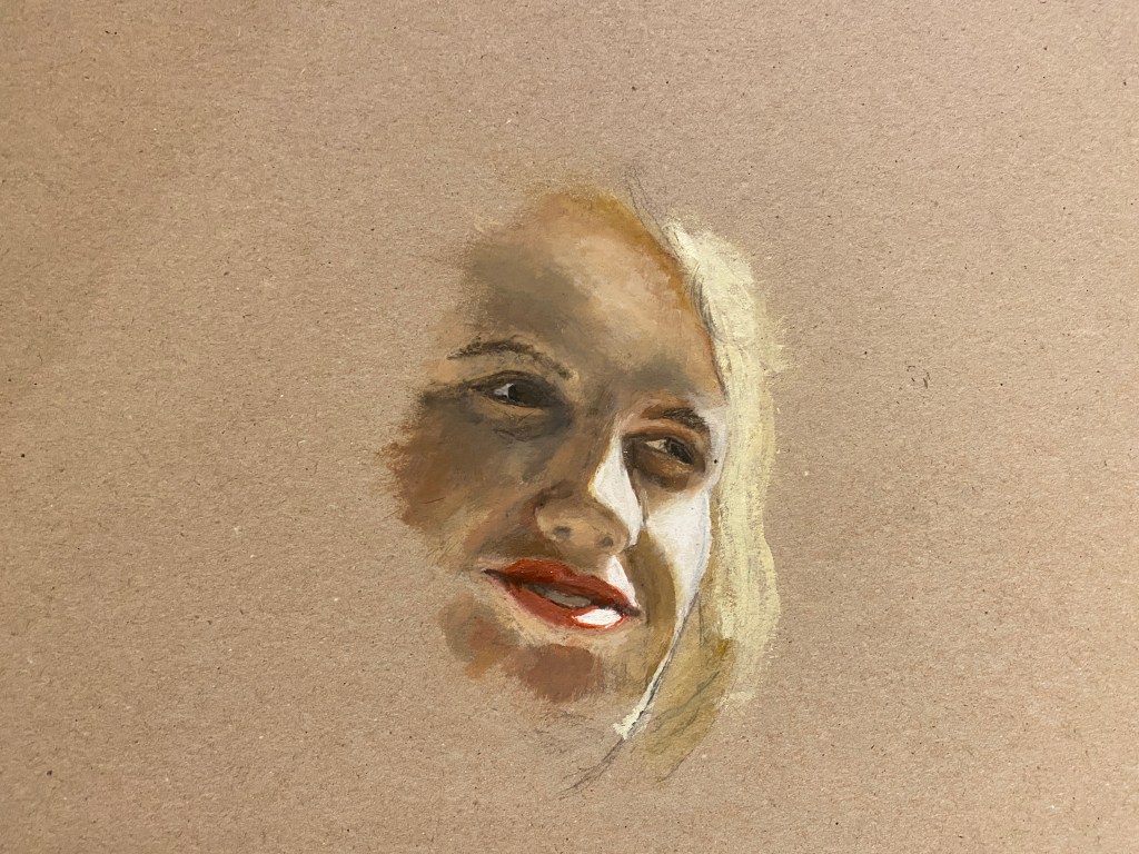
This next attempt above is better, but there are still several things wrong here. The skin colour around the lower part of the portrait, especially around the darker shadowed areas around the mouth is too blueish/purplish, and I wanted some warmer oranges and yellows to pick up the sunlit feeling. The area around the nostrils was still wrong, and I needed to redraw it. Also, there seemed to be some errors with the white area on the nose, particularly at the bottom. The blend of the colours between the lights and darks was still a bit sharp, making her appear older than she can possibly be here.

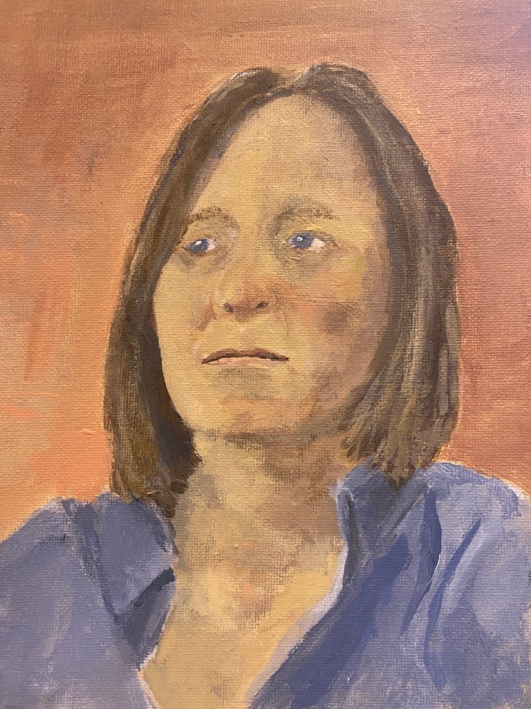
I worked on all these things and filled in the back ground in a murky green (which I believe is what is in the photograph). This is the final result. I note that the more purple and darker colours around the eyes and on the left forehead have come out very dark and purple – it doesn’t look so emphasized off camera but I will try to correct it a bit.

My first impression of this is I cannot believe that it has taken me so long! I have spent so long on every area of the painting, but it is quite small – not even the whole face – and still looks woefully unfinished to me. I am particularly unhappy about the mouth – it makes me think of the portrait that I did above of my friend, where although this is a more sophisticated image, as I described I seem there to have ‘got lucky’ with the mouth, drawing it right straight away. Here the mouth is a little open, which I have never done before, but that is not enough excuse for how it has turned out. It is not right even now, even though I have repainted it several times. But it does seem better than the other portraits that I have done, more three dimensional for sure. I like this style of painting and I want to try some more, and to finally manage an acceptable self-portrait.

For now, I feel like I have learnt a lot doing the assignment, and indeed this whole Part – there is some idea of progression here, with some blips on the way. I like the fact to have chosen such a sunny image of a woman who was so famously and so tragically depressed, made her first documented suicide attempt at a very young age (in 1953, so only 19). The Bell Jar is mandatory reading for psychiatrists apparently, being an almost perfect depiction of the condition. Yet here she looks interested, engaged, highly intelligent as indeed she was (apparently her IQ was high, 160), on the verge of being happy, or at least cheerful – and the sunlight emphasizes that. She also looks a little glamorous, is clearly taking care of her appearance (indeed her lipstick is what is making the mouth so difficult) – again not the stereotypical style for someone who is depressive. One of my aims was to highlight that depression is not part of the personality – at least not for her, but a terrible illness when it is as serious as in her case – someone who is chronically depressed does not necessarily have a depressive character.

References

Baudelaire, Charles. The Flowers of Evil, trans. by James McGowan, Oxford and New York 1993, pp.6–7.

Bonett, Helena. ‘Harold Gilman 1876–1919’, artist biography, October 2009, in Helena Bonett, Ysanne Holt, Jennifer Mundy (eds.), The Camden Town Group in Context, Tate Research Publication, May 2012, https://www.tate.org.uk/art/research-publications/camden-town-group/harold-gilman-r1105360, accessed 13 April 2021.

Bonett, Helena, Holt, Ysanne andMundy, Jennifer. ‘Introducing The Camden Town Group in Context’, May 2012, in Helena Bonett, Ysanne Holt, Jennifer Mundy (eds.), The Camden Town Group in Context, Tate Research Publication, May 2012, https://www.tate.org.uk/art/research-publications/camden-town-group/introducing-the-camden-town-group-in-context-r1106438, accessed 09 April 2021.

Brown, C. Camp, A.V. and Vogelaar, C. (2019) Young Rembrandt. Musuem De Lakenhal. Leiden, 2019); Ashmolean Museum. Oxford, 2020.

Fergusson, Louis. ‘Harold Gilman’, in Wyndham Lewis and Louis F. Fergusson, Harold Gilman: An Appreciation, London 1919, pp.19–20.

Fletcher, Pamela (2017) The Camden Town Group in Context, edited by Helena Bonett, Ysanne Holt, and Jennifer Mundy, The Art Bulletin, 99:2, 198-201, DOI: 10.1080/00043079.2017.1304665

Herbert, Martin, ‘Michael Borremans‘ ArtReview 22nd JUne 2015.

Lewis, Wyndham. ‘Harold Gilman’, in Wyndham Lewis and Louis F. Fergusson, Harold Gilman: An Appreciation, London 1919, pp.12–13.

Moorby, Nicola. ‘Ennui c.1914 by Walter Richard Sickert’, catalogue entry, May 2004, in Helena Bonett, Ysanne Holt, Jennifer Mundy (eds.), The Camden Town Group in Context, Tate Research Publication, May 2012, https://www.tate.org.uk/art/research-publications/camden-town-group/walter-richard-sickert-ennui-r1133434, accessed 17 April 2021.

Sawyer, Drew ‘Haunted: Michael Borremans’ Enigmatic Art’, Document Journal, April 8th 2015

Featured

Assignment Two.

My initial idea for this assignment was to carry on painting lemons, or other fruit, in the same style as the lemons that I had done earlier, perhaps in a bowl. However, it seemed to me that this was a rather easy way to tackle the assignment and I should try something different – that I hadn’t done already – and challenging. Given that it was during the days between Christmas and New Year, 2020, the forthcoming departure of the UK from the EU was very much on my mind, and I started thinking about the stockpile that we had made in anticipation (I have never stockpiled anything before, even during the first lockdown of the coronavirus crisis, as we live very near the shops, but for Brexit, to which I am passionately opposed, it feels somehow legitimate). I started thinking about how precious things like olive oil are going to become, now that it will be more difficult to trade with the countries that produce them. So I decided to try to produce a version of those seventeenth century still lifes, portraying riches from foreign lands – because it seems rather possible that we might once again think about European goods in the same way. I remember as a child that we had just one tiny bottle of olive oil, that was used sparingly and would be replenished whenever my father travelled for work. So now the ten or so bottles of olive oil that we have in our cellar seem very precious to me, and I thought might make a good subject for a still life.

I selected a couple of bottles, the same, and a flagon of oil that I keep standing by the cooker, and stood them in a line. The idea is that even plastic bottles of oil are now very precious – and a flagon on its own would be no good – without the capacity to fill it up, so even the plastic bottles become objects of interest. I wanted some lemons too, that eternal symbol of foreign luxuries from sun-kissed lands, so selected three and arranged them in front. I wanted the dark background of classic still life, so made a kind of box of black card, and laid the oil and lemons on a purple cloth, as I had an idea that would be the right colour to paint them against. I shone a light (balanced on a box) down on the bottles. I should say that I tried many variants of this image and drew all of them, but in the end this seemed the simplest and best.

I took a sheet of A3 card, and painted it yellow (in acryllic), thinking of the way that I had prepared the image of a pear in Part Two, painting card in the colour of the pear and then painting the background (in that case a murky green) around the drawn image. I then started to draw the oil and lemons, shown in situ here.

I then started to build up the image. I mixed the colours for the oil, with yellow ochre, yellow cadmium, sap green, burnt umber, paynes grey, mars black and some naples yellow to lighten. The oil in the flagon (which is actually an old decanter meant for wine) is extra virgin, so is greener than the oil in the bottles which is a mixture of refined and virgin olive oil, so it is more yellow. In Spain, the refined olive oil used to be the smart and precious one – while the extra virgin was the rough unrefined one that anyone with a few olive trees in their campo had easy access to, but of course now we consider the less refined the more valuable.

This is an early version after starting to paint. I actually like this image somehow – the flagon is the right shade of darkness and there is a nice feel of the way it looks as if the base is slumped on the table, which is how it looks in real life. I like the lemons here too, in some ways they look better than the final image, for all I have worked on them so much. the shape of the bottles too is somehow also more right.

Here is the next image. I first started painting the background in Paynes Grey, being scared to go with full on Mars black. But I have never realised before how much blue there is in Paynes Grey, and it created a really jarring note, against the otherwise harmonious yellow, green, gold, image, so I mixed some Mars black with Naples yellow and painted over in the subsequent images.

The painting went through various iterations after this, not necessarily for the better. One huge issue I faced was what colour to paint the background to the lemons and the lower part of the oil bottles. I actually really liked the vivid yellow, it made the whole image sunny and bright and reminiscent of mediterranean feelings, so much part of what we are leaving behind with Brexit. In some ways I wish I had left it this way, but of course it looks unfinished, and at the time I couldn’t think of a way to make it less so. Looking at it now however, I think I could have finished it like this, even if it meant painting over the yellow acryllic with oil paint, it would have looked fine once the yellow border was clipped off, and if I were to do it again, that is what I would do.

However, I didn’t and my first thought was to try a kind of rusty red, the colour of mountains in Murcia where we go every summer. But this looked terrible and I wiped most of it off. Although my initial thought had been purple, which would have been complementary to the yellow – once I had this yellow image in front of me this felt like the wrong colour somehow, it seemed to have nothing of the spirit of the painting as it developed. This is partly because the yellow was all set to disappear, so it would have become a completely different painting.

My next two thoughts were orange – to keep the sunlit feel of the current background – and blue, to represent the European flag (even in my most allegorical moments I considered a pile of stars or at least some stars some where in the painting), But this would have made it more like a cartoon or propaganda or something which was not my aim. So I messed around mixing paint for a while, trying both options on opposite ends of the painting, and ultimately ended up mixing the two to get a kind of broken gold, which is what I ultimately used. It seemed reminiscent of those still life paintings with their rich brocades and tapestries, while also retaining something of the meditarranean flavour.

I did try to replicate the cloth that I was using, using a more purplish shade for the shadows in the cloth. This hasn’t really worked, however, and I think it would take a lot more time to do this – the final result is more abstract than I had originally intended.

Finally, I looked at this image and allowed myself one last chance at improvement. I picked the middle lemon, which is completely wrong – too cuboid, without the foreshortening that is should have because it is half turned towards the viewer. I also think all three lemons lack depth and the shading on the lower half should be darker. Here is the final result; the middle lemon is better, but I can see further weaknesses now – an adjustment of the flagon for example has somehow made it look wrong and that now needs correction. .

So what went right, and what went wrong? I had a lot of ideas about this piece, and I think it was a potentially interesting subject. The dominance of yellow was the right idea, and I like the colour of the lemons and the oil, tinged with gold in the two bottles – emphasising the idea of liquid gold. The top of the bottles are nice and smooth, but the lower parts lack depth and perspective. Looking back on it, the composition to me seems wrong, and I realise that although I spent a lot of time thinking about it, I should have carried on until I found something more imaginative. I think instead of the two rows I should have made some kind of grouping of the bottles, flagon and lemons, and perhaps chosen three different kinds of olive oil and container. Another grouping would have enabled me to create sense of depth for the bottles; here, the three dimensional base is difficult to show as the lemons are in the way. I also regret the card that I used to paint on – which was slippery (even in spite of the undercoat of acrylic) and made it hard to layer the paint without leaving it to dry for a long time, which I did not have the scope to do. The lighting could have been better too – I painted this in my kitchen which is full of light from all sides and the ceiling too – a darker environment with light shining on the bottles and lemons would have made for a more dramatic image. There are some touches of light here which I have endeavoured to portray, but this would be so much more an interesting painting if there were strong shafts of light.

As with some (but not all) of my previous assignments, this image looked better at some of the intermediate stages, and I wish in some ways I had preserved the dominance of yellow – leaving the yellow border against the final image gives some idea of how that might have looked:

However, a more general lesson for me is that if you are not using contrasts of light then you must try to use colour to achieve variation and dramatic effect in a painting, and I will make sure that I remember that in future assignments, having failed to do so in this and the previous one.

A few hours after completing (I thought) this assignment, I realised where I had gone wrong, a realisation that came from re-reading my tutor’s report on Part One. I should have thought more about other artists work when thinking where I was going with this assignment. Of course, I had the cultural reference point of the Dutch still lives, but I made no attempt to replicate the style of these paintings, nor was I even aiming at that – but in fact I had no aim, no ideal in mind at all. I had looked at various more recent paintings in the process of the painting to get ideas for various elements, particularly the background) For technique I drew on what I learnt about Dukes and Uglow in the external class I did and in my painting of lemons and the red pear, and indeed I was initially seeking some of their simplicity of style, although those ideas became dissolved in the final choice of subject, which was a bit more complicated.. What I should have done was look at more recent paintings for ideas for the kind of painting that I was aiming at – a style, a certain mixture of abstract, expressionism or realism, naive style and so on. Indeed, one such target was literally presented to me in the course work – the interior of Van Gogh’s bedroom at the start of the Project Drawing and painting interiors on page 70 of the course notes, with the letter from van Gogh to his brother:

“This time it simply reproduces my bedroom; but colour must be abundant in this part,
its simplification adding a rank of grandee to the style applied to the objects, getting to
suggest a certain rest or dream. Well, I have thought that on watching the composition
we stop thinking and imagining……”

I think this could have been one approach to this painting – one that I should have seen, but got too lost in the composition and my own painting without looking outside (indeed stopping to think or imagine). I could have gone with my original choice of purple (possibly even this lighter lilac) for the bottom half of the background, and done everything with colour – green, yellow, gold and purple, a more limited palette than he has used here – but fitting everything together in a harmonious whole, without trying to faithfully represent what was there. I might have thought about one of the Sunflower paintings – either with a dark background, such as this powerful image below (which indeed even has the lilac base):

File:Six Sunflowers 1888.jpg - Wikimedia Commons

or this one, with my alternative idea of a yellow background for yellow objects:

In the time that I had allowed for the assignment, I do not believe I could have achieved anything like the same density or textural build up with the oil paint, but I do believe that would have benefitted from choosing some kind of target style like this and sticking with it (as I did when painting the lemons, for example, limited aim though it was) rather than changing my mind so many times during the course of the painting.

.I am not sure whether this is a kind of post-hoc rationalisation for a journey not travelled (and therefore not put to the test), originating with dissatisfaction with the painting that I actually produced. So I will submit this assignment now, but if I have time in the coming days I will try to see what this might look like. Meanwhile, I hope that I might have finally learnt the lesson of looking at artists’ work whilst trying to create my own because I don’t believe that I will progress without that.

Addendum

After completing the assignment as above, I could not resist to try out the ideas I mooted in the conclusion. So I took a (much smaller) board and painted it yellow as before. As this was a test, I took just two bottles and a lemon, and built up the painting as before, but much more quickly and this time with the second of the two sunflower images above in mind, in terms of keeping yellow as the dominant colour throughout, with variants in different parts of the painting.

I used the same colours here, although a little less of the very dark green in the oil, as this is less ‘extra virgin’ than the oil in the flagon and there is more light in it. The shadows are too dark here I think (they are a mixture of sienna, paynes grey, naples yellow and a touch of cobalt) and I have lightened them in the image below.

The next phase was tidying up the drawing (the pencil had smudged over the background) and painting the background (the yellow here is the original acryllic background with which I prepared the board). This time the background is a lighter version of the cadmium yellow that I used for the lemon, and the surface on which they are standing is a kind of dirty broken green, a combination of yellow, white, the olive green and a little sienna, in an attempt to replicate the background in the Sunflowers painting.

This is not finished. Indeed I remain even now undecided about the two backgrounds. I wonder about painting the bottom surface a vibrant colour like the orange in the painting by Charlotte Verity that I looked at during Part 2, or lilac as in the Van Gogh painting of his bedroom in the course notes (or indeed in one of the Sunflower paintings). I wonder about painting the background black as it was before, or a rich purple (for the sake of colour complementarity) or midnight blue, as in the earlier Sunflower painting above. However, it feels like a basis for something nice, and expresses what I wanted to convey. There is a (limited, I realise) sense in which it is informed by previous paintings – even the calm stillness and evenness of tone of Morundi as well as the colour combination of the Sunflower paintings, although of course, there has not been time here to do anything like the build up of paint (and indeed, I am not sure that this would be the right thing to do with this painting, bottles of oil are, in contrast to ‘sunflowers, such smooth and non textured objects). By being more simple than the earlier piece, I think the idea of the painting – the value of products of the Mediterranean sun – comes across a bit more. The philosopher Luciano Floridi (a professor of the ethics of information) always says that ethics is like salt – you need some everywhere but you only need a little and it is very cheap. I think there might be an analogous statement about oil and lemons in situ – that they benefit all forms of food, most things taste better for their presence (actually in this case, particularly in Spain, quite a lot is generally used!) – and it is cheap, but not, sadly, in the UK going forward. There is another link between the idea of olive oil and lemons as products of the sun and that of sunflowers here. As an article in Artsy. net put it:

‘The Symbolist poet and critic Gabriel-Albert Aurier wrote of …..the artist’s [Van Gogh] “obsessional passion for the solar disc, which he loves to make shine in the blaze of his skies, and, at the same time, for that other sun, that vegetable star, the magnificent sunflower, which he paints over and over, without wearying, like a monomaniac.” Van Gogh responded that they did indeed represent an idea: “gratitude.”’ (Thackaray, 2019).

Although this painting took only a day, and is far smaller and less detailed than the assignment piece, and there remains indecision about the direction it should take, so is still blessed misleadingly with some of the charm of the journey not travelled, I prefer it to the earlier assignment piece.

Reference

Tess Thackaray, ‘Why Van Gogh Fell in Love with Sunflowers’, Arty, June 20th 2019 https://www.artsy.net/article/artsy-editorial-van-gogh-fell-love-sunflowers.

Featured

Part 1. What paint can do.

Project 1. Basic Paint Exploration

For this part, I used acrylic paint. I have used both acrylic and oil in the past, and prefer the latter, but for the purposes of exercises I did not want to have to wait for things to dry. It was exciting to be using colour again after two years of Drawing 1, when I had hardly painted.

Exercise 1. Getting to know your brushes.

Here I started to get in the mood of paint by painting a small landscape in my sketchbook (Moleskine, A3, painting sketchbook). I used acryllic (it doesn’t seem possible to use oil in the sketchbook, as I would never be able to close it). It was a long time since I had used acryllic paints, and it felt very strange – as if I had forgotten how to paint, and the result is very naive; I have completely forgotten how to do ripples, for example, although I suppose it will come back. I wanted everything to be green – as this is how this part of the river is – but that meant that the sweep of the willow which looked nice when it was first painted disappeared, and the reflections of the trees have lost form – I realised afterwards that obviously this should have been done with a darker wash on a transparent background, rather than vice versa. I used a large flat brush, which was good for the hedge and the reeds (with the edge of the brush). The final result is not good at all, but at I have started to get into the feel of painting again, which I guess was the idea.

IMG_0089

The next thing I painted was one of those doughnut peaches that have started to be available over here (it is a Spanish variety, called chato). The shape isn’t quite right – I need to remember how do make things more 3 dimensional (this is too large at the top right), and my shadows are somehow always wrong, I just don’t seem to get that right. But I was pleased to have immediately mixed the right colours, from my fairly limited selection of acryllic paints. I chose cadnium yellow light, crimson (which I mixed with raw umber for the darker parts) and yellow ochre. I used a dry brush and pressed hard agains the paper for the dryer parts. The edges are a bit fuzzy – partly because of the paper but mainly because I am using a large brush, I need to look out for that.

47C4FBF2-6064-43BE-88AD-B85EB8B4F5E6

53F913E7-0265-4808-B25C-3DED210A7152

After experimenting with various brushes, I painted a banana. This little image had a troubled time because someone ate the two bananas that I was using as a model. I used the same yellow and mixed with raw umber for the darker parts, and the raw umber was with Paynes grey for the ends, and a touch of sap green for the stalks. I remembered how many colours there are in everything, even in these seemingly uniform bananas.

Then I painted two tomatoes, using Perylene Maroon and Caldmium red light, mixing them with my fingers, using mixing white for the reflective parts. I enjoyed using these colours very much and these were fun to do. I was quite pleased with the result; they are not right of course, but there are places where they appear to have the slightly plasticky appearance that some tomatoes have, and I like the crease in the one on the right.

7B280332-17B8-4A9A-88FB-7CF481E596E9

Exercise. Applying paint without brushes.

As instructed, I tried a range of methods to apply paint, blending with the fingers, with a sponge, cloth and ultimate a set square from an old maths set – the result is below. I learnt more from the process than the result, for example that if you blend wiht the figure the colours merge and soften, but is you do it with something hard you can get some really strong tones. – and also do firm lines and even curves (this was by rotating the setsquare). On top left of the page I was just cleaning off the set square with water and then drying on the page, and it looks remarkably like a blood stain. It was fun to do.

I also tried some pastels with water blotted on top. I hate pastels, the colours always seem so blurry and soft and the colours merge so easily. These were a box of Unison pastels rescued from the house of an elderly aunt that I am clearing to sell. So they were dusty and old and the names of the colours couldn’t be read – but then the colours looked just like I always expect pastels to look, similar colours and as if they are viewed through a fog. To be honest, they rather reflected my aunt’s use of colour.

I then did a tomato with the setsquare that I used earlier, to try another technique. I quite like this although it took a long time to get it anywhere near the tomato shape and the shading seemed impossible. But I quite like the orange and red patches – it gives it a richer, fuller feel than the more accurate ones, and the tomato is indeed the queen of fruit.

Project 2. Transparent and Opaque.

Tonally graded and Overlaying wash

I used acrylic paints for these exercises, and now I come to do the blog I realise that I have used the results of the first exercise for the second exercise (because I overlaid some of the tonal washes with the other colour, and stupidly forgot to take a photograph in between), so I have blended the exercises.

I used two blues – a deep cobalt and a phthalocynine blue, because I didn’t have any ultramarine.  Some of the results are here

03D41A06-3BD6-4E4F-A08D-941298735F9A

These are opaque washes, blended with white paint (it is the mixer white, so should be good for blending) – the first bar is Prussian blue, going to white – and the third and fourth are deep Cobalt, going also to white. These worked reasonably well, although as the exercise instructions note, you must work very quickly with the acrylic or it does dry out.

The second bar along is the blended wash, going from Prussian blue to cobalt. Here I found it really difficult to blend in the middle – I need to try this exercise with oils, but I got some idea of how the process works.

The second page below is with transparent washes, and this time Cobalt blue (the first bar) and Phthalocynin blue (the second). I like the look of these much better, which is strange in a way because the colours are not so deep, and this was especially true when I got to the overlaid colours. Of the four bars at the top of the page, the third and the fourth bars are ‘wet on wet’, and the blending was much easier, although I think because the cobalt blue was a better quality paint, it ‘won out’ over the Phthalocynin, even though the latter was a darker colour.  I like the appearance of the third bar in particular. Even nicer is the ‘wet on dry’ bar underneath, where I really love the merging together of the colours, seems beautiful.

IMG_0245

Overall, although I am quite familiar with blending in the opaque way, the transparent washes technique was new to me and I plan on using it extensively, also for oil, and I have signed up for a class on ‘working from dark to light’ on 31st July with the OCA tutor Kevin Ashcroft, which I detail in the blog post for the Assignment of this part.

Monochrome studies

For this part I took an image that I have focused on all summer, which is some trees in the middle of a field of barley. I walked though this field all through the lock-down period and beyond, so I saw the barley growing everyday and the changing colours and shape of the trees against the barley and the sky. I found it fascinating how very dark the trees looked, and even more so the darker the barley became.

IMG_0246

I did this exercise in acrylic again, although I am yearning for oil and will use that for the assignment. Here I used a light grey wash as instructed and an opaque Prussian blue for the trees. I left some lighter parts (because you can see the sky in some parts of the trees). I quite like the effect here, the problem being in that some areas the blue is lighter, and the fact that I don’t remember why is a clear lesson that I must try to complete the blog or write more in my sketch book at the time. It may have been that I was trying to do as instructed in the exercise and have some lighter areas to represent less dense foliage. Anyway, I don’t like that effect so much – I think it should all be dark and that even darker than this would be better, the kind of purply brown-black that the silhouette of trees sometimes appears as.

The second image had the opaque image as the background, and the Prussian blue wash on top, where I have tried to paint the negative spaces to create the image. This is not very successful at all – I suppose the negative spaces between the trunks gives some idea of what the image is supposed to be, but overall it is not a success. I need to try this exercise again. I think some of the problem comes from having used the wrong image, and possibly also the wrong colours – particularly in the second, the dark blue and the grey are somehow rather sickly together. But actually, looking it now some weeks afterwards, this image is embarassingly bad.

IMG_0247

At the last moment, I decided I had to have another go at this exercise. I took a photograph of some trees on an island in the middle of the Thames from Port Meadow in Oxford, and zoned in on the trunks themselves and the water below. I painted a board with a thick mixture of raw umber, mixer white and Mars black, and then drew the outlines of the trunks with charcoal, ultimately painting the negative spaces with perylene green acryllic paint, having just discovered a tube of it that I had forgotten that I had.

This result was much better, and I really like the technique.IMG_0280

I used the same colour with a slightly lighter wash for the water, and a much lighter wash for some shadows on the trees. I will definitely try this again and other points during the course, and believe that I might attempt again a fallen tree in the style of Redon, that I tried unsuccessfully in Part 1 of Drawing 1. I love this colour of paint, and will try to get it in oil too.

I think I have learnt the difference between the two techniques, and will bear in mind that I have to learn more about both of them in the exercises to come.

Project 4 Working on different coloured grounds.

Here I took my subject as simple jug (which is red). I prepared two backgrounds on canvas board – one white, and one black. I drew the jug a few times in charcoal, for example as below:

IMG_0248

First, I painted the jug on a black background and the result is below, although I find this image quite impossible to photograph – the dark surface reflects the light however you position it with respect to the windows. I tried to use the background as the darker areas. I found this really hard, not helped by the fact that I don’t have a really good drawing for the jug here, and however I adjusted it, it seemed to get worse. I like the kind of dark mystery of it, and that it seems to almost grow out of (or into) the background, and the ‘black hole’ in the centre (although in retrospect, I wonder if that should have a touch of red in it, because perhaps it makes the painting look unfinished). I like the way texture of it looks and the lines that go around the jug to the right, and the pleasing glow to the left where the richness of the colour indicates the only piece of light I really allowed here. It is not in the end successful, but there are some nice elements and  I will definitely do this again, but make sure to pay more attention to the drawing before I start painting, because where you have an opaque smooth background like this, it is more difficult to repair any mistakes.

IMG_0251

Second, I painted the jug on a white background. I used crimson as before (in the tomato sketches), with Paynes grey and some mixer white to adjust the tone. I tried to leave white areas for the reflective part, but after much staring at the image, I decided they were actually mostly a paler red/pink.

IMG_0249

I am quite pleased with this image. The reflections look more or less right to me, and on the right side under the handle, where the reflection is on a darker part of the jug, I am especially pleased because when I looked at the colour in real life and on a photograph, I thought I would never get it right, it felt impossible (this is one of the things I like about this course, that sometimes it seems impossible to do what you are asked, and you usually can get there if you spend enough time and concentrate enough). However, I have had one or two problems with the drawn image (it is better than the previous one, but there is a problem with the handle) and I did not dare do a shadow for fear of ruining it – it can be seen by the previous exercises that I am really bad at shadows, they nearly always come too dark, and I need to learn how to do them properly.

Overall, I have found this exercise useful. I am glad that I used a simple image like this jug, and the stark contrast of backgrounds. I think I have learnt something, and will be able to develop this technique for the future.

Part 5. Personal Project: Darkness

The instructions for this Part ask you to review your progress in the course: “reviewing what you’ve achieved so far and reflecting on which projects you’ve enjoyed most. Which tasks have you found the most challenging? What areas require more practice?”

I started by reviewing my tutor’s report for Part 4, as I have for every report. With this report my tutor’s comments have been very helpful and insightful and also very consistent with earlier parts, with the same points recurring, and this was no exception. So reviewing this Part helped me to think about the course as a whole.

Report on Part 4.

I was very pleased with the overall comment, which was:

This has been one of your more successful subjects. The landscape and outside depictions are working well. There are personal interpretations coming through and this gives some strong narratives to your work. Landscapes more than townscapes show more inventiveness. You are handling paint well through semi-abstraction and the colour schemes gives atmosphere to the landscapes. Technically, you have improved with perspective and depth as well as composition.”

I believe that I have always been more successful with landscapes, particularly of the natural world. In Drawing 1 I focused on townscapes (which lend themselves more to drawing, I think) and feel as if I had some success in developing my understanding of perspective, as evidenced by my tutor’s report on Part Three. In this the painting course, I took the chance to develop my treatment of landscapes which was one of my key objectives of embarking on this degree because I felt that I had a tendency to paint in the same way rather repetitively (sun on the river with stormy skies kind of thing). In this part of the course I have painted many different kinds of landscape in different ways, so I am pleased about that.

For ‘View from a window‘, the tutor commented “the first piece is confusing with the depth because the distance looks like it’s all the same plane. However, with the luminosity of light
it does contain some atmosphere. The second attempt is much better with depth. However, the hedge is quite dominating with the tonal values. Compositionally, the framing works well.

I agreed with these comments; first time with this kind of subject for a while, I had forgotten things I used to know about perspective and the painting is shallow and 2 dimensional, which improved in the second version with some practice. It is also quite right that the hedge is dominating – it does in real life, because it badly needs cutting, and there is lots of new, bright green, growth – but I should have toned this down for the painting, because this was a view from a window not a study of the hedge.

For Hard/ soft landscape, the comment was “I think this piece is finished. It has rawness and
bleakness which gives a convincing atmosphere to the landscape. You have worked well with being semi-abstract and omitting every detail. The colour scheme works well to add to the atmosphere.

I was surprised here, but pleased as this piece (as I noted in the blog) was a response to the recurring comment that I tend to overwork everything, and my better paintings are ones that I do quickly and stop early, an observation that is very much reinforced by this comment. Here I prepared the board with a brownish purple, and very much liked the colour as a kind of summary of the landscape. I drew the basic lines of the reservoir walls and road, blocked them in very roughly and gave the merest hint of the shape of trees on the horizon. It seemed to me that I finished it impossibly early – but now I look at it again, I realise that the tutor is right and this is quite a successful image, however unfinished it seemed to me. Finally, I had managed to simplify the image and lose details, bringing the painting down to the essence of the landscape, I am happy about that, because I feel as if I have been striving to do that all along.


For Linear perspective‘ she observed “very convincing perspective here which draws the viewer into the image. You have been sensitive with your colours and this gives a narrative to the light of day. The buildings have good detail which contrasts well with the more organic application of the trees. A good technical piece.

I was pleased to have these comments, because I struggled with this piece – feeling that I overdid it with so many houses in the terrace, making it look impossible, but perhaps that did contribute to drawing the viewer in.

For Aerial perspective, the observation was “well done for persevering with this piece. The first attempt is clunky, but the final is quite sophisticated. With more highlights of the two trees, the light of day and form comes through. The reflective elements of the water have been rendered well. The depth and perspective are also convincing, and you have worked on this with the correct tonal values.”

I really enjoyed doing this, even though it is a rather gloomy image of a wet, muddy day (one of those almost monochrome days of deepest winter). I thought the final image was quite good and I am pleased that the tutor thought so too.

For Mood/atmospherealthough some exciting marks are coming through, the work has become a little too muddy (3rd piece). The 2nd piece is the most successful with the movements of the sea and the contrasting colours. The 3rd piece, the water becomes too solidified, so the fluidity becomes lost.


For the Menorca piece (something that I did in preparation for the Assignment to test out the use of red/green colour contrast and also to test out doing a painting in thirds), the tutor commented “the contrasting colours work well and there is a sense of harmony with the colours used. This about your format- landscape would show more movement and compositional technique (rather than portrait format) the water has movement. But the mountains, could have more highlights to show the forms and textures.

This comment is absolutely right – strangely I struggled with the mountains and I should have persevered still more to get the highlights. I don’t know why I wanted to do it in landscape – I think it felt better for doing the thirds, or perhaps it was something to do with the slice of the image I wanted to paint. However, I recognise that landscape would have made for a much more sophisticated painting. I am glad that the colours worked, I really like the combination here.

For my attempt at Painting outside the tutor commented “well done for getting out there because it gives a more honest portrayal of what you see. However, although this piece has been painted sensitively, there is no actual focal point so at the moment, it looks like a background. You did mention that there needs to be a focal point- this would give some narrative and composition to the work. There are some diverse marks which are expressive and with this process and some focal point, the piece can work.”

This is absolutely right again, it does indeed look like a background and there is no focal point. It is difficult, because the focal point was intended to be the bend in the river on the horizon, which you can’t really see, but I need to think about how to portray that when I rework the assignment.

For this problematic AssignmentI can see why this piece is unfinished. The last piece in your blog has elements which are not united. For example, the brown building is quite
muddy, the shrubbery in the foreground is a different tonal value to the other tones you have used so it looks superimposed and generally the right hand side contains too many disparate techniques. However, if you divide the painting down the middle the left hand side works very well with the reflections of the water being extremely convincing. It’s a matter of balancing the right hand side with the techniques you have done on the left. Overall, though, you are nearly there, and it could be a harmonious, serene and calming piece of work.

I found this insight amazing. The picture looked so terrible to me, and yet my tutor was right, once you looked just at the left side, it was serene and indeed, convincing. I had got in a terrible mess while painting the details of the other side, and had done everything in a discordant way, forgetting what I had learnt during the course about simplifying and so on. When I arrived home from Spain, from where I sent the assignment, I took a palette with severely limited colours following my plan as detailed in my assignment blog, and with the intention of just overpainting while I decided what to do, painted with the two colours on top of what was there. I mixed only these colours, except where I mixed them with white which I used to entirely replace the blue in the sky and reflected in the water. The result is below, and even though it is not finished with some of the old version, such as the willow tree still there, too bright and still too stark a contrast between the two sides (and I have still to work on the focal point, as pointed out by my tutor with regard to the piece I painted outside, see above), I already like it hugely more than the original Assignment piece. I had been planning to repaint, but when I saw the tutor’s report I preserved the left hand side of the painting and painted on top.

There is much to do here in terms of rectifying the points noted above, and I will endeavour to tackle these with more repainting before I submit for assessment, as this is still not finished. But meanwhile, I have, thanks to my tutor, learnt an important lesson. Always look at what you have done and work out carefully what is wrong before you start again, because it can be that you can rectify the problem, rather than (as I would probably have done here without this advice) started all over and replicated some of the problems of the previous version. I had started to have rethinking the painting as recorded when I submitted the assignment, in terms of making it a study in red and green, for example, but it had never occurred to me that some of the painting was worth saving.

Thinking about the course, Practice of Painting, as a whole

Overall, I feel that the comments on this Part reflect very well the things that I have learnt in this course, although there are other things I should note. They vary as to whether I have managed to overcome or at least ameliorate the problem during the course, or whether I still struggle and must work on in the next part. These are:

Simplification. The need to simplify the image that one is trying to paint, making it achievable and removing all unnecessary details that are not part of what I want to get across in the painting. I feel that I have improved my ability to do this – the painting of Farmoor Reservoir in Part 4, for example, exemplified this, while the final piece for Part 4 exemplified the converse, which is what caused the discordance of the right hand side of the painting.

Referring to artists. To think about the ‘style’ of the painting, with some kind of reference to art history, is also important. I find it hard to do this without becoming too imitative, as when I tried to mimic Emil Nolde or the Michelle painting I used in Part 3. But I think it is something that is improving. It is clear when there is no reference to any kind of previous work, the painting becomes rather lost, or at least if there is such a reference it is a great help (as I found painting fruit and thinking about the style of Euan Uglow and Robert Dukes; painting a red pear, and the lemons, taught me a huge amount).

Brush work. Think about brush work as a way of representing dimensionality, painting in different ways and angles is something I keep forgetting to do, but I realise made a big difference in the class I took on the Scottish colourists, and also the still lives of fruit, thinking about the micro-details of the way that the colour formed and the light fell on to the planes of the fruit and using colour accordingly.

Outlines. Avoid heavy lines around things, particularly people’s faces (a fault I encountered in Part 3 a few times), unless it is a deliberate attempt to paint in a certain style, such as that of Cezanne or indeed the Scottish Colourists.

Writing about art. I believe that I have learnt to write about painting in a more appropriate fashion – something I struggled with in Drawing 1, with the transition from social science (in which I work) to humanities. I was pleased with some of the essays I wrote here, such as the discussions of Still Life in Part 2, and Chiascuro in Part 1, or the Review of the David Hockney exhibition (Part 4).

Avoiding overworking. I have learnt the importance of stopping a painting before it is overworked. However, that doesn’t mean sadly that I don’t continue to do this – as in the Assignments for Part 2, Part 3 and also Part 4. I am trying to stop doing this but it is hard – feeling that I haven’t finished, that I must something complete something that I should abandon (“a work of art is never finished, only abandoned”, an insight I derived from John Banham’s wonderful novel The Sea.

After Part 4, I realise that I also get this feeling when something has gone wrong, as in the Assignment for Part 4 – thinking that I can save it by continuing to paint on – whereas what I should do is look far more carefully at what is wrong with the painting, and paint over where it has gone wrong. Sometimes – but not always – it would be better to start again, as I did in Part 2 where the piece of work I shall submit for assessment is actually a quick painting completed after the over-crowded, over-thought, over-complicated Assignment Piece.

Theories of colours. I feel that I have more sophisticated ideas about colour after this course. I found the series of Exercises on the theory of colour time consuming but worth it, understanding far better why some colour combinations work, some end up as ‘broken’ colours, saturation and desaturation and so on.

Part 5. Personal Development

Project Different ways of applying paint

Throughout these exercises, I geared my efforts towards my ultimate aim of this section, to paint darkness (although there were a few diversions on the way, because the exercises were interesting). This was the plan for my Personal Project for the Assignment, and it made sense to me to use the Exercises as a way of starting to work towards that.

Exercise. Impasto

I was fascinated to read about how other artists have used impasto, because I admit that I have never noticed this at all really while looking at paintings. Indeed, I have been rather adverse to paintings with either layers of paint or objects in the paint, perhaps because it reminded me of the collages one (or one’s child) was forced to do at school, which generally look pretty ugly. Or perhaps it seemed to me that it took away somehow from the purity of oil painting, which seems to me (that is, used to seem to me, my views have changed a lot as I have worked through this course) like the highest form of art. Now I feel more open to the idea.

The painting I focused on was Van Gogh’s Starry Night, reading various sources including this rather helpful blog produced by Old Holland paint. I realise that he has a very specific intention here, which is to highlight the stars and moon – bringing them to the fore of the painting, and perhaps creating highlights and reflections in the three dimensional layers of paint. I read about this – and then tried to replicate the effect, but without copying. So closing the laptop and trying to remember the painting, while also remembered the image in Part Four that I did of the sea, and thinking about how impasto might have helped here):

I am loving the use of impasto here. It is indeed giving the moon type light a three dimensionality which surprised me. And actually it has made the sea excitingly three dimensional also. I like the colours too. I am definitely a convert to impasto.

Exercise Dripping, dribbling and spattering

I read around the topic of Jackson Pollock, using the very useful MOMO reports of his various exhibitions there. I started off with oil, using orange solvent as dilution. I wanted to splatter on colours to make darkness ‘from the bottom up’, with ever thicker layers of paint as follows. I tried a different manner of putting paint on, with the dripping technique suggested. Given that I just don’t have the space in the kitchen where I paint to throw paint around, and it is no longer the weather for working outside, this seemed a viable alternative.

I had started with blue and the grey that seemed to most closely resemble ‘eigenlicht’ (see below) and shortly brought in red, with the aim of bringing creating, over all a kind of purply black darkness.

I probably liked this one the best – the red splodges have a flower like quality and I like the blue behind the darkness (it doesn’t look dark enough, but it did in real life as opposed to the photograph).

This is the final version, and although I still like the blue showing behind the black, I feel I probably went too far; it is beginning to look like black/grey paint. So if I respond to the question in the course notes ‘how do you know when you are finished?’ I would probably say ‘I didn’t, but now I realise that it was half an hour ago (which, incidentally is true of much of my deliberate painting). I do note however, the problems that I have photographing these dark images – the penultimate one here was actually much better in reality, whereas this last one looks better in the photograph than the actual version.

I felt here that I hadn’t really got the paint fluid enough to drip sufficiently, say in the style of One: Number 31, 1950, and decided to try with acrylics. Water is after all cheap and harmless, and acrylic flow improver is also OK, whereas by this point I was practically choking on orange solvent (which is supposed to be benign but isn’t).

I wanted here to get the sense of tangled undergrowth, but to start with a far darker background than Pollock. This is my first attempt. I painted the card a mixture of burnt umber and bone black, and while it was still a little wet, I flicked paint on sap green heavily diluted with the flow improver. This looked rather good when it was wet, but I was rather disappointed when it dried. Also, because I hadn’t had the space to paint with the kind of abandonment that was required, I have actually included it in the exercise below, where we were asked to paint with natural forms. I had tried to direct the painting a little with orange sticks, and the strange thing was that although I had applied the paint randomly, it seemed to come out in some kind of pattern.

Project Adding other materials

Research point 2:

Find out what you can about the Abstract Expressionists and, in particular, the style of
painting called Tachism or ‘Action Painting’. Look at the work of those artists who developed
this style of spontaneous, expressive painting which worked by the artist making large
gestures and exploiting accidental effects. Look at the work and ideas of Hans Hartung,
Franz Kline and Jackson Pollock, amongst others.

This research point was a bit of a shock for me. For me, abstract expressionism was a move away down the modernist line towards the abstract, but still bore some resemblance to the represented object, epitomised by Ivon Hitchen’s later paintings where the blocks of colour wrapped around the dark centre of the mill pond for example, still bear some relation to the environment in which they were painted. For other painters such as Kandinksy, who I believe also fall into this description, there is a kind of progression through their career as an artist, moving from away from the representional but evoking (perhaps just to me) something of of the flavour of the earlier paintings. Although I shy away from the purely abstract part of the term, I am comfortable with the ‘expressionist’ part of the description. I have always seen Howard Hodgkin, one of my favourite painters of all time, as one of the most perfect protagonists of the genre, given his desire to paint feelings and emotions, such as the feeling you have when you look out of the window in the morning. As the critic Andrew Graham-Dixon put it: “Howard Hodgkin paints emotional situations, Cezanne painted apples.”  (Wroe, 2001). His focus on mark making, and the technical process of making seemingly spontaneous brush marks – paintings that could actually have taken years to create – seemed also to me to qualify him for this category.

However, I note the Tate’s description is:

“Abstract expressionism is the term applied to new forms of abstract art developed by American painters such as Jackson Pollock, Mark Rothko and Willem de Kooning in the 1940s and 1950s. It is often characterised by gestural brush-strokes or mark-making, and the impression of spontaneity”

and realise that I may have always slightly mistaken the term, or at least the emphasis on the New York painters of this period in its normal use. For these painters, I like this delineation of the work of Kline and Pollock from others in the genre Hopkins (1979):

“The uptown intellectuals were all more conceptual in approach, more specifically image-makers, while Kline, Pollock and de Kooning were more truly expressionist, creating primarily through gesture. These three painted, one could easily imagine, as if their very lives depended upon it, with no time to revise or ruminate. Spontaneity, velocity and an immediately apprehendable passion saturated their work.”

For this research point I looked at Franz Kline in particular, as I had focused on Jackson Pollock for the exercise on paint splattering above. The painting by Franz Kline in the course notes appealed to me, as it looked a little like a painting of darkness.

Kline (1910-1962) was firmly in the ‘action painter’ genre. Like Kandinsky, he started off with recognisable landscapes and cityscapes, and ‘Hot Jazz’, this lovely bar room picture which is so incredibly full of movement it feels like you can already see the beginnings of ‘action painting’ although this is not technically so.

Franz Kline (1940) ‘Hot Jazz’ Oil on canvas, https://chrysler.emuseum.com/objects/13825/hot-jazz

It seems after this, his pieces became progressively more abstract, with many of his figures based on “locomotives, stark landscapes, and large mechanical shapes of his native, coal-mining community in Pennsylvania”. It seems that “This is sometimes only apparent to viewers because the pieces are named after those places and objects, not because they actually look like the subject” (Christov-Bakargiev, 2004: 57). Later he dropped representation and moved to entirely abstract pieces, with the figures replaced with lines and planes, reminiscent of Cubism. He painted in monochrome, in black and white “to depict negative and positive space” and although he seemed to be turning back to colour in his last years (he died prematurely of heart failure at the age of 51) he was sometimes known as the ‘black and white painter’.

oil on canvas
support: 101 1/2 x 75 inches (257.81 x 190.5 cm); framed: 104 x 78 1/4 inches (264.16 x 198.755 cm)
Collection Albright-Knox Art Gallery, Buffalo, New York
Gift of Seymour H. Knox, Jr., 1959

I quite like this image, but I think that is partly because it is very dark and I am focusing on darkness. I can well see how it might relate to his youth in Pennsylvania, and be a distant memory of locomotives or mines or some mechanical object of industrialization. It is a huge painting, so I can see I would be even more likely to think that if I saw it in real life. But I am not sure that I would make these conclusions if I had not read anything about it. I think I would look at it and feel perhaps fear, and dread – these are the emotions that it invokes. A massive black hole, the brutal solidity of steel, the desperate dirtiness of coal – these are the kind of things that I think of when I look at it, knowing a little more of the context. It is not a comfortable feeling.

I am beginning to realise that my view of painters like Kline – and Pollock and the abstract expressionists that are most famous as such – is more subjective and more brutal than for other works of art. When it comes to representational painting – even genres which I positively do not like, such as the pre-Raphaelites – I can admire the skill of the portrayal – a Rossetti mouth, for example. For more abstract work, such as the impressionists or Seurat I can admire the capturing of the moment, the originality (for its time) and the flooding of light and colour, even if I personally do not like it (I very much dislike puntillism and Seurat, for example – but I can see it is a fascinating and informed technique). But with abstract expressionism – I love Hodgkin so it seems to me great, and for Kline, I find it very hard to judge. There is nothing here that I really like, although I can see the huge black and white paintings would be very impressive in real life and in their temporal and spatial (American) context.

However, what would have happened if he had lived longer? I do very much like this much later painting (indeed one year before his early death) because the translucent yet darkened blue is very much what I would love to achieve myself. Indeed, in the NYT review of a 1986 retrospective of his work observes:

“The show ends with the 1961 ”Scudera,” perhaps the last work Kline completed, in which a great blue wind is threatening to cave in a black square. When Kline died he had clearly just begun. “

Scudera Franz Kline 1961; United States  : Action pain
Private Collection 199.3 x 282 cm

Similarly, as Hopkins (1979) put it in his review of an exhibition of Kline’s colour paintins in the Phillips Collection in DC:

“This is a magical painting, an ascension which one can easily imagine inside the dome of a Borromini church. At the very end of his life the color and everything else came together for what may be his greatest painting, a work that one can describe, even in these positivist, hardheaded times, as spiritual. “

It is difficult. I do know that I am very influenced by colour, which changes my reaction to works of art. .A long time ago I asked a friend of mine, a talented artist but at that time making his living from framing, to frame a huge art poster that I had bought, for the arthouse film Querelle, by Fassbinder, with two huge, graphic male faces kissing, red tongues to the fore (at the time and still, quite a shocking image), on a vivid blue background. I asked him if he liked it and he – clearly hating it but wishing to be tactful – said ‘Blue is always nice’. Here I feel as if my instinctive reaction to the colour may be informing my response to this particular painting. Kline rarely painted in colour until the end of his life, although he did squeezed everything possible out of black and white alone as the New York Times (1986) observed:

“Kline seems to have wanted black and white to be everything – earth, air, fire, water. At times he seems to have tried almost to will black and white into color: The 1958-60 ”Cupola” superimposes numerous layers of black and white in a furious effort to open them up and explore the possibilities of gray.”

Overall, I remain uncertain about abstract expressionism, although I love the Scudera image above. I note from the Tate notes for Hans Hartung: “Hartung developed a vigorously gestural and linear style in the early 1930s. Believing that painting should record and evoke his immediate inner experiences, tensions and energies, he rejected observation and memory as possible starting points and relied instead on spontaneous feeling and direct physical action.” (Tate notes). To me, memories and emotion are tied up with visual images, landscapes, objects, scenes and most of all colours. It is hard to be really drawn to the black and white images of Kline, outside of their temporal or geographical context.

Exercise Mixing materials into paint

For this Exercise I wanted to experiment with sand, because I quite often want to paint sand – so this seemed like a useful – if obvious – way to do it. It turned out that sand is quite a difficult thing to get hold of in the middle of a city, although I kept my eye out carefully on walks and so on. Eventually however I managed to procure three varieties of sand – some ‘scatter sand’ from an art shop; some builders’ find sand from a sack in someone’s garden – and some much coarser sand that a friend provided, which to be honest looked more like small stones, and I couldn’t see having any place in a painting.

In this sketch for one of my paintings of darkness below, I tried the art shop sand, but it seemed to have no effect at all. I think when it says scatter sand, this must be for sprinkling on top of wet paint – and I don’t like that effect. This is the builders’ sand below – and here I do quite like the result; it looks kind of three dimensional, without looking so obviously like sand:

I like the effect here (in close up), and will add sand to my arsenal of materials. I can see that on a bigger painting the coarser sand could be an option, but it would have looked out of place here on A4 paper.

Project Towards abstraction

I feel as if all through this painting course, and particularly the last landscape section, I have been moving towards abstraction. I welcomed the idea of going a bit further down that line. It seems as if for subjective views of painting, that everyone finds their own place in the modernist line between classic representation (although that in itself would be a controversial label) and the all white painting. My place on the line is rather nearer the abstract than I have achieved in general hitherto on this course.

Exercise Abstraction from study of natural forms

For the natural forms, I took one of my dripping paintings from the Exercise above and used a stick to encourage the paint to go in certain directions. The strange thing here is that I had done this painting (sap) green on dark brown, with the idea that I would come up with a good way to paint a dark abstract hedge or clump of trees. What I found interesting was that it came out far less abstract than I had envisaged. Whether this was just luck, or my inner self resisting unconsciously the shift to abstraction, or some natural formation of paint particles I don’t know, but this is the result:

Although this was a disappointment for the actual exercise I was doing at the time (due perhaps to my difficulty in getting enough liquidity into the paint), I do like it as a use of natural forms. Here it is at a later stage, when it was dryer and with less light coming into the camera (I am realising as above that taking photographs of representations of darkness is almost as difficult as taking photographs in the dark, as below), which I like even more:

Assignment Five: Darkness

I decided some time ago to focus on painting Darkness for Part Five of the course. I have been fascinated by the idea of representing darkness for many years now, and also tackled this theme in this same Part of Drawing 1. There I wrote an extensive discussion of the topic, focusing on work by Hopper, Schilliaert, Sterne, Doig, Munsch and a couple of St Ives artists (such as Le Grice), all of whom’s treatment of darkness I love. I experimented with some of these treatments myself, but always working with drawing media (soluble graphite, pen and ink, pencil and so on) and almost exclusively working with monochrome tones, as you might expect for a drawing course, rather than colour. However, I noted there that some of these artists have explored colour, in very different ways, when tackling Darkness.

In this Part of this painting course, I want to take a different approach, tackling directly the question of the colour of darkness. I also want to follow the theme and instructions for this part of the course by becoming more abstract than previous work I have done.

Variations on darkness

There are so many different kinds of darkness. Aside from that ‘black on black’ kind of darkness in the countryside when you first leave the light of indoors into some unlit environment, and gradually start to discern shapes of things, there are all the other times that you see darkness primarily as a contrast with something else; the darkness between rocks in a pile near the coast for example, as here, in a photograph I took in Whitby in Yorkshire:

In this very simple painting of the rocks – using graphite solution of black, grey and white, so no colour – you can see that the darkness, when it is nothingness, purely the absence of something, then it is relatively easy to portray the effect:

A similar darkness occurs at the base of a hedge against the river, and sometimes in the gaps between trees in a forest, as portrayed so brilliantly in Redon’s ‘Two Trees’.

There is the darkness when you come into the house from a sunlit garden, and your eyes take a little time to adjust so that you are blinded by the light; the darkness when you shut your eyes or draw the curtains and turn off the lights; the darkness behind wardrobes or under furniture. There is the blackness of a deep pool or river.

It is perhaps the darkness that comes when you shut your eyes but not too tightly that you get the most exciting variations. I find this especially when at the dentist, when you are given those dark glasses to wear and lightly close your eyes underneath them. If there is a source of light, you see different colours – only, in my experience, a couple at once, but they can be very marked and beautiful. It may be because I last went to the dentist after painting all weekend, and I was thinking about colour anyway, but it seemed to me that I saw really interesting veiled colours and shapes.

There are also huge variations in the way that darkness is portrayed by artists. There is the misty mysterious darkness of Schilliaert; the rich, embossed, swirling blue darkness of Van Gogh’s Starry Night; the dim, blue-purple darkness of Munsch’s painting of the same name; the solid black of Doig (with strange green shapes just discernible when you look closer); or the thick almost glossy black of La Grice. There is the almost luminescent blue darkness (well I think it is darkness, who in his painting Scudera achieves the kind of veiled luminous blue that you sometimes see when lightly closing your eyes, see above) of Franz Kline (1961, referenced in the course notes), and the warm brown darkness of Hedda Sterne in her painting of ‘Moonlight’ in New York.

What is the colour of darkness?

If you search online for ‘what is the colour of darkness, you arrive at Eigenlicht (Dutch and German for ‘intrinsic light’ , “the uniform dark gray background that many people report seeing in the absence of light” Common scientific terms for the phenomenon include “visual noise” or “background adaptation”. (Hansen and Fulton, 2000).

Certainly as pointed out above, this concept cannot encompass the huge variations of colour in the work of artists that have treated the subject.

I experimented a little below. What I found most interesting was that the grey oil paint that I had (shown at the top in the middle) was, indeed, more convincing than the black (bottom right quadrant in the shading at the top left), and much more convincing than the green or brown tinged splodges on the left of the card. The ideas about impasto (explored above) gave me other thoughts, over on the bottom right here although not dark enough, but suggesting the start of some interesting possibilities.

Capturing Darkness.

One of the tantalising things about representing darkness is the extreme difficulty and perhaps the impossibility of photographing darkness. In the past, with previous phones, the camera has never been good enough to capture more than the darkest of images, as with the photograph of the dark beach I drew in Drawing One:

And if not completely dark then extremely grainy, as in this second image:

On the one hand this is exciting, because you are painting something which you do not have the capacity to represent with a photograph – sometimes the images you can take on just the camera of your phone are so good and so striking (especially of sunrises, for example) that it is hard to see what a painting can add. I feel the same about those images taken by satellite or in space of the moon, earth or solar system. What can I add to this beauty? But here with the unrepresented darkness, there is plenty of scope for interpretation and imagination.

However, last time I bought a telephone I went for the 11 pro plus or whatever it is called precisely because of its sophisticated claims of being able to take pictures in the dark. And indeed it can – for example, look at the contrast between the rocks in the photograph from Whitby above. But the problem at night, when there is any source of light at all (even or perhaps especially the moon) is that often it takes such a good photograph, you no longer can tell that it is at night. Take this image of the moon at night in the countryside in Murcia, taken in the summer of 2021:

It is lovely, and it was lovely to look at the time, but the two images were quite different. There is far more light in the photograph (even after I have edited it to make it darker, as I have here) than there was in reality, while at the same time the moon was visible with incredible detail in real life, you felt as if you could see the craters (an illusion?) but in the photograph, it looks blurred and rather like a streetlight.

Likewise take this image of an autumn evening after dinner, taken of the River Cherwell outside the Cherwell Boathouse restaurant, with the punts lined up for the night. It was lovely then and lovely in this image – but again, it did not look this way in real life – far, far darker.

So it seems that the darkness remains illusive, which emboldens me still further to try to paint it. I want to try to capture the lovely purple light and the clarity of the image of the moon of the first image, and the orange glow and rich blue of the second image, without turning away so sharply from the reality of darkness as my camera has done.

The Colour in the Darkness

To develop a series of paintings on this topic, I decided to approach it through the lens of complementary colours. As the image of the almost perfect darkness of the hole between rocks in Whitby, darkness presents in a monochrome way – as contrast to something else, most usually light of some kind, or the effect that light creates when reacting with an object. But generally scenes of darkness are distilled to a few colours, as many of the parts of the scene – say, green grass for example, cannot be seen. Indeed this is generally the role of darkness, to simplify objects to silhouettes, for example, or the landscape to mere hints of mountains on the horizon. I have not really thought about this before, but it seems that darkness simplifies colours too, perhaps always resulting in some kind of monochrome effect (monochrome in the sense of opposite colours, rather than black and white). The images that I most wanted to try to portray all seemed to fall within this theme; the purple and yellow of the moon in Murcia; the blue and orange/brown of the boats on the river Cherwell, and this image of the sunrise taken by the river on a morning walk:

As noted above, pictures of sunrise like this are often so attractive it is hard to think of how to improve upon them in a painting, but here I want to go much more abstract, and follow some of the techniques of abstract impressionism discussed in the Exercise above.

Purple and yellow

I started with this scene and sketched out the horizon, simplifying the details (although they are quite simple already) to the stark looking building on the left (it is actually the side of a perfectly normal family house in the campo, but in the dark it has acquired a sense of mystery), the trees and hedge with the wall in front, the mountains (a different shade of purple behind) the purple sky and the sand to the foreground. As noted above, I mixed sand with the paint to get the textural appearance in the foreground, which I like. Unfortunately, I forgot to take photographs (I found myself completely engrossed in the painting), but here is the the first one that I have:

Overall, I was pleased with this image. I was annoyed with myself for painting it in portrait, as the image lends itself to landscape orientation, and this is not the first time that I have done this. When I started it was just a sketch, but it became quite developed later on. I like the inky black of the trees and the grey of the building, but the other colours are a jarring note – a little sickly, I think. The colour of the sand is wrong – it needs desaturating (mixing it with a little purple perhaps) and the lighter parts too light. I think the purple is wrong. I mixed phtalo blue (red shade) because I found to my surprise that I only had cobalt blue in good quality acryllic, which was running out, so I was trying to spare it) with crimson – and there is definitely too much red in here, introducing the sickly note. It looks better in the real thing than in the photograph, but even so, I believe it is too light. The texture on the wall against the house (I am not sure if it is wall, or a kind of ‘steppe’ in the soil, a quite common way of delineating fields in this part of the world) seems wrong too, and perhaps I might use some of that coarser sand for this. The final thing that is wrong is the moon. I have followed the photograph, where the moon appears as a kind of diffused light, but in reality the moon was hyper-clear, as a perfectly round disk, a yellow light and some crater like appearances. I wanted to replicate this, perhaps following the technique of Hedda Sterne, another painter with some abstract expressionist heritage, although also surrealism, whose life spanned a remarkable 1910-2011. She was Romanian, although she moved to New York in the early 1940s and like the painters discussed above, is associated with the city.

Before I redid the painting therefore, I looked at some of Sterne’s paintings. I avoided her surrealist work, although some of it is lovely, and focused on those that the colours and effects that I wanted. The most obvious one is this one, called Moonlight, painted a few years after her arrival in New York as a refugee in 1941:

Hedda Sterne, Moonlight, 1946, Oil on canvas, 36 in. x 24 in, retrieved from https://heddasternefoundation.org/artwork-year

This is somehow for me a warm painting, while the effect I want to achieve is colder – at least for the sky of mine. But when I looked at her sky, I realised that it was a cold grey, and the moon itself has some of that cool pink, so it is what I want – it is the surroundings that are warmer, with that rich orange and ‘brownstone’ (that identify the painting straightaway as New York, in my view), and that is in part why the contrast works so well. To me it is completely beautiful. I love the barely discernible windows (or are they?) and doorways (but are they?), and the effect of the moon is lovely – just what is needed, the effect that seems to be what one sees in the moon, but is so impossible to capture in a photograph.

Looking at her other paintings, I realised that some – while less on-topic, had the colours that I wanted. These were from her landscape period in the 1960s, in contrast to her architectural city scapes, or the organic lines and wandering landscapes of the 1990s (which are also lovely, but I was trying not to turn this into a research point).

Hedda Sterne, Vertical Horizontal #1, 1963, Oil on canvas, 96 in. x 70 in, retrieved from https://heddasternefoundation.org/artwork-year
Hedda Sterne, Horizon VI, 1963, Oil on canvas, 85 x 50 in. (215.9 x 127 cm)

I painted a large MDF white, with two coats and let it try. I painted the sand in lines to start with, going from darker and warmer to lighter and colder to try to introduce some arial perspective. For the sky, I was very careful not to introduce any red, indeed the only red I used was Sienna Red, but rather made the darkest parts of the sky a mixture of cobalt blue and burnt umber, a combination I have used many times to get my favourite shade of purple. For the very darkest parts I used Paynes grey to replace some of the blue – this colour always surprises me with how much blue it contains. At this point, and after drying overnight (these boards seem to take a long time to dry) the painting looked like this:

This looked wrong to me – the yellow (raw sienna at the base was too yellow, the top bands (lemon and naples yellow) also, and you can’t see the lines between the bands at the top so it looks like three equidistant divisions rather than getting thinner as intended.

However, I decided to leave it until I had decided what to do, and proceeded as follows. Here I have painted in the house to the left and had the kind of hedge, and rough wall extend into the distance although it seems to fall off the edge of the painting so that doesn’t look right. I have merged and shifted the yellow bands, and added some sand to the paint, and it looks a bit better but still not right. I used perylene green for the trees and the hedge, although it is so dark you can hardly tell – I like that, because it is how it is in the dark, you know things are green but you cannot see the green.

Next I painted in the mountains that you can just see in the photo, behind the trees/hedge and building, using a bluer purple. I actually really like this effect, although you can only just see it. Then I painted the moon, using a small coin to make the disc shape. I wanted to try something Hedda Stern like, but after trying (and failing) to photograph the moon left over from the night before in the early morning, I realised the extent to which it seems to have a lemon yellow in it, as well as a yellow closer to raw sienna.

So I tried to introduce a little of that colour here, against the titanium that I had used before. I realise the moon is big, but I decided not to worry about that – the moon that night was worthy of attention, it attracted attention and dominated the landscape, so although it is non realistic here – it is somehow more realistic than what I am able to capture in a photograph. It has, in Platonic terms, the form of the moon that I saw.

I also looked at some more Sterne paintings, particularly the one ‘Horizon’ shown above, and decided that whatever the photograph told me, these were the colours that would improve the integrity of the painting with regard to the sand in the lower part.

So here is the final result. I am much happier with this. I still wonder about the Sienna sand at the base – and whether I should paint it over or even dispense with it altogether. I had tried to paint the image roughly in thirds, with the sand forming around one third, but I am not sure this has added much to the painting. It is a difficult decision, so I have left it for now to see what is my tutor’s view. I have, however corrected a couple of mistakes in the last version below.

Murcian Moon, acryllic on A3 board.

I feel that I have captured something of the darkness here, in terms of the colours, the perfection of the moon, the brooding haze (more usually associated with daytime) of the mountains and the monochromicity of trees. As I am beginning to realise generally happens when you try to paint a dark image, the darkness has distilled the colours to the bare essentials. In day time, there would have been so many more colours to be seen. Have I captured anything of the place? I like the simplicity of this image, and the stark elements – the emptiness of the sand, the brutal concrete of the building and the wall, the emptiness of the sky and the landscape in general. In this part of inland rural Spain, you are never far from the harshness of of the land and the ruthless living it yields.

Blue and orange

Next to the river scene and here I used oil on A3 grey card.I looked at a couple of Doig paintings before I started. One, the most obvious, is of course the White Canoe series which I have stared at many times before. The other was a less frequently seen painting, an early painting of Doig’s, the Milky Way that I noticed on my book case, depicted on a birthday card that a friend had sent, which seemed particularly relevant to my needs:

Peter Doig, ‘Milky Way’, 1989-90. © Peter Doig. All Rights Reserved, DACS (2015), Retrived from https://www.nationalgalleries.org/art-and-artists/features/peter-doigs-milky-way

These are also trees on the river, although in this case,  “The tree line in Milky Way is a mixture of what I could see from my working space in my parent’s barn and other sketches I made of Northern-looking pines and dying trees. The idea was the trees were illuminated by city light or artificial light from afar.” (Peter Doig in Amar, 2013). My trees are also illuminated, by light behind me, although evidently very different sort of trees. What I didn’t realise from looking at the card, that I saw in the actual image, is that he has a tiny figure of a girl in a canoe. I am not trying to copy here however, just taking inspiration, and I have my own boats.

I painted the background blue black, and after much thought placed the horizon/river bank more or less two-thirds up the painting. I started to paint the trees and hedge at the top (simplifying along the lines of Doig’s image).

I carried on by trying to get the lovely reflections that there are in the actual photograph. I became fascinated by the tree trunks and branches, they are beautiful, almost like the skeletons of the image, and I wanted to capture them. I rejected the idea of the punts in the foreground – I am not keen on punting and wanted more of a generic boat, a boat which you might take on a journey rather than the pleasure-seeking punt, with more of a Doig’s ‘White canoe’ feel about it. The boat in this first photograph is too large, and the diagonal quayside is spoiling the symmetry of the painting, introducing a jarring element. (also jarring in this photograph is that the horizon is not straight, but in the actual painting I hope and trust that it is. I have mixed the blue with the brown (raw umber) in some parts to generate a purplish blue black effect. I have used Old Holland Indian Yellow / Orange lake extra, which is a gorgeous colour but is – in spite of what it looks like and how the tube is painted – is rather more yellow colour once you start mixing. I quite like the mustardy feel of the painting but it is not quite the orange/blue theme I had intended.

I decided to remove the quay, and that I wanted more than one boat to continue the slightly ‘procession’ feel of the trees, which I believe has come here from looking at the Doig painting. Painting over the quayside gave a brownish tinge to the water, making it look translucent in this part of the painting which I like – the feeling that you get when a river or stream is shallow over stones – although I don’t believe that is the case on this part of the river. I started to put in the two boats: as you can see, the left one has worked reasonably well, but the left hand side has to go. Here I have painted a light line to indicate the horizon as Doig did in the painting above, but I decided that this is not right for my darkness and have painted most of it over.

Here is the next version. I have put some more blue (this is ultramarine, mixed with grey and black). I have repainted the offensive boat, having them both more or less the same direction (which they would naturally do as they floated) and tied to a buoy or something under the water. I like the roughness of the two boats, but it doesn’t seem right to have such approximate images in the foreground. I decided that I had to tidy them up, and I also wanted to give them some kind of reflection. I took photographs of rowing boats on the canal on one of the dog walks, in order to fasten on some kind of generic image of a simple rowing boat, and worked on the boats as below.

I tried to maximise the orange in the boats, and also the white which picks up on the skeletal tree trunks. I quite liked the feel of translucent water under the boats, but I felt that they should have reflections, so I added these as below.

I quite like this final image. I think there are some mistakes – the painter of the left boat is a little thick, the reflections of the trees are by no means accurate. But I do very much like the colours – which is what drew me to this photograph in the first place – while retaining more of the darkness, I think than the photograph has done.

Red and Green

For this painting, my third set of colours, I decided to move further towards the abstract expressionism route. I wanted to get some of the feeling of Scudera, Kline’s lovely blue painting. I wanted to turn to my third image of darkness, the fiery red autumn sunrise that I saw behind the trees on the river a couple of weeks ago, into something more abstract than I have done hitherto. For this reason I took the photograph shown above, rather than the (even) more dramatic images to be seen that day, such as this:

I could not see easily how this could be abstracted, whereas I had more ideas about the image I chose – I felt that this one would look like a forest fire. Indeed it looks so much like fire that when I tweeted the image I had some concern that some of my friends in the West Coast of the US might be offended, so traumatic were the fires last year.

I started off by painting a small canvas bright cadmium red light, as below. Then using Perylene green (I started with Paynes Grey, until I realised it was adding a blue note that I absolutely didn’t want, so just used it for a bit of desaturation), I painted a line across the centre and diagonal lines coming out from the centre, making sure to reflect them in the middle line. The middle line I developed with multiple layers of Perylene green paint, so that it became textured, as a kind of hedge across the middle.

I stupidly forgot to take photographs, for which I can only apologise – I suppose at least it shows that I was painting quickly and with absorption, as abstract impressionists should. I poured the paint rather than painting, mixed with flow improver, and kind of massaged it into shape with the brush. Once the dark lines and shapes in the centre had dried (which took quite a long time), I dripped sap green as I had done before the Exercise above, and started to manipulate the paint with an orange stick, again as I had in the Exercise, hoping to create something of the ‘natural form’ effect as I had before. I did this all over the painting, leaving slashes of colour in the middle. The first effect seemed too red, so I spread some of the darker green – heavily diluted, this time with water to fade the colour – with a fan brush over the edges of the painting.

I worked on this for a while. The final work is below, although once again it is proving really difficult to take a photograph without some reflection of light, so the actual image is darker than this. However, I do like the purplish colour of the top left corner, which does seem as it is in the photograph.

Overall, I do quite like this. When I finished I immediately started painting over another board to start again, because I felt as if I hadn’t really achieved what I had intended. This has nothing of the mystical elegance and simplicity of Scudera. But when the paint had dried I started to like it a little more. It does have some feeling of mystery and somehow for me it has something of the feeling of that dark morning, suddenly (it seemed) illuminated by fire. People’s reactions to it were good, even when they had not seen the original photograph. I do wonder if it is fine art, rather than a painting? I do sometimes think this when looking at abstract expressionism (I remember going to an exhibition of Patrick Heron, and finding that rather than cards, mugs were the way this work looked best). However, the whole exercise was a thought provoking process, and I am sure that I will continue to have ideas for my (as yet) blank red board. Although, on reflection, I believe that the most exciting thing to do, if I had time and sufficient supplies of Golden Acrylic paint, would be to paint the same image on a huge board. This might enable some really interesting colour and textural variations at the margins and in the greenery, and would be (I think) an exciting painting to have on the wall.

Conclusion

Overall, I have enjoyed this project and feel excited by some elements of what I have done. I have achieved a little of what I wanted to achieve and feel that in these last three paintings, I have taken (progressively) some more steps towards abstraction, one of the things I wanted to achieve. I am a little nearer to knowing what is the colour of darkness, in that it is partly about finding the colours that you want to find – but also partly about the way that the darkness sharpens some colours while muting others. In my travels across the wheel of colour, I believe I have revealed some of the infinite possibilities of finding some kind of beauty in darkness, Ultimately, I could probably have achieved such variation by pursuing Kline’s path, by squeezing every last possibility out of black and white and all their combinations. I have to admit, that I would, ultimately, have achieved more perfection. If you look at the picture of rocks in Whitby with which I started this project, you are seeing perhaps – in nothingness – the most perfect dark, perhaps true Eigentlich. But darkness is more than just absence of everything. It seems that it distills the visual world, simplifying objects, people, landscapes – and colour. I am pleased to have explored a little of this darkened, yet colourful world.

References

Amar, Adeline (2013) ‘Peter Doig’s Milky Way’, National Galleries of Scotland (following Doig’s 2013 exhibition there ‘No Foreign Lands’, 3rd August to 3rd November). Retrieved 22nd October, https://www.nationalgalleries.org/art-and-artists/features/peter-doigs-milky-way.

Christov-Bakargiev, Carolyn (2004). Franz Kline, 1910-1962. Italy: Skira Editore. p. 57. ISBN 8876241418.

Hopkins, B. (1979) ‘Franz Kline’s Colour Abstractions: Remembering and Looking Afresh’, Art Forum, Vol 17 No. 10.

New York Times (1986) ‘Art View: Franz Kline – A Legacy in Black and White’,  Jan. 19, 1986, Section 2, Page 29 of the National edition. Retrieved 15th October 2021 https://www.nytimes.com/1986/01/19/arts/art-view-franz-kline-a-legacy-in-black-and-white.html

Wroe, N. (2001) ‘The Colour of Emotion’, the Guardian, 24th March, 2001.

Assignment 4. Looking Out (Landscape).

I had many ideas about this assignment, but the ultimate decision was to paint the river that I visit every day and painted for the ‘Painting Outside’ exercise. I wanted to try to something in the style of Ivon Hitchens, as explored in the coursework for Part 4, or at least approaching that style.

Before starting this assignment, I did a painting class on ‘The Scottish Colourists’. These classes have helped in the past when I was feeling a bit stuck, and for this exercise I felt like I needed some new thinking about colour. The course was online, run through the Ashmolean Museum, but led the with the same artist (Kieran Styles) that I have done classes with before. It looked at the work of this group of Scottish painters who went to Paris in the 1880s and were inspired by the French impressionists and their revolutionary ideas – magenta shadows and so on. They were excited by the idea of freedom of exact representation and the restrictive formality of the austere Scottish academy at the time, a time which fortuitously coincided with the greater available of reasonably priced colours. The main ones were; Samuel John Peploe; JD Ferguson; Leslie Hunter; Frances Campbell. They returned from Paris with the enthusiasm to reinvent painting of the Scottish countryside in this way.. Peploe in particular was influenced by Cezanne, and his elegant use of lines around planes or shapes in his paintings. They were known with their use of complementary colours, especially blue/purple with orange/yellow – buzzing interaction of colour.

It is Peploe’s image of rocks, sea, hills and sky from which we worked. We started by painting a grey board with acryllic (just to dry quicker) – a kind of purple, Phtalo blue mixed with magenta or crimson. We followed the folowing principles:

(1) Violets and magentas for the shadow

(2) Blocking colours in the foreground with multi-directional brushwork (mkes it more three dimensionl)

(3)Blue lines, linear mark mking

(4) Observing that every area of colours has several colours within it, at least 8 in the rocks in the foreground (less in the background, as per aerial perspective.

(5) Put complementary colours together

I can see there are things wrong here:

  • I should have tried harder to get smaller brush marks in the foreground, to create a granular effect on the rocks, as there is (by accident) on the unfinished sandy area (purple, because this was the background colour).
  • I don’t have enough variation in my linear brush marks around areas of the painting – should be bolder and thicker at the foreground, thinner at the back, this would give more dimensionality, perhaps.
  • I need less hard lines around the colour, some mismatch of lines and colour patches, as Cezanne does in many images..

I loved the underpainting here – the purple and I wanted to use it for the river scene. I had the idea that a rich red / brown could provide the same effect as the lovely purple in the Scottish paintings, this time using the ubiquitous green in the river scene as the complementary colour. I had tried this in a minor way in the ‘thirds’ painting of Menorcan cliffs and sea in the relevant exercise, with a sienna undercoat (the colour of the red mountain)) and I wondered if it could work here, as it had there.

A faint covering of Raw Sienna is showing, with the vague impression of sand.

I took plenty of photographs of the river at different times of day, and looked at previous photographs where the boat house is showing (in winter, that is) to understand a little of how it fits into the landscape. I painted a small board with a dark brown/red undercoat and tried a sketch first, as follows.

Like nothing else in the world, this should show me the importance of stopping for a moment, of looking, of seeing what is there and building on that rather than one pre-conceived ideas – because I like this image better than almost all of them to come. Even the perspective looks better than later versions, which were carefully measured.

Here is the image with a little more working. I quite like the way the boathouse turned out, and the darkness of the hedges and shadows on the left. But the willow tree at the back is all wrong – too big, given the distance away.

Next I started on the Assignment. I took a larger board and painted it the same dark red/brown colour. I used a photograph which I took with a ‘panoramic’ setting, the idea being to get the ‘wraparound’ effect you have as you look down the river with the banks almost enclosing you. This time I measured out a ‘golden rectangle’ and drew the correct lines for the golden ratio within, so that I had the key lines for the painting, including the upper line for the horizon. This I planned to be high up in this way with the idea that the sky would be seen mainly in the reflection. , rather than ‘wasting’ a lot of the painting on a rather boring sky (I do find some blue, cloudless skies boring in some strange way, or at least sickly with so much green. I spent quite a lot of my early years wondering what everything would look like if the sky were pink, which is strange because I knew nothing about the colour wheel or complementary colours in those days).

This is the first version of the sketch, although it isn’t a very good photograph (there is a shadow to the left). I tried to get the darkness of the left bank and the different blocks of different shades/tones of green – including the mysterious green triangle in the bend of the river that you can only just see in the distance, the willows next to that and their reflection, then nearer the grey green tree (I think also a willow but not a weeping one) and the dark boathouse more to the foreground. There is one place where a little landing stage shows at the end of a lawn, and I tried to show that but it is too bright here. The sky is a provisional blue, although I still wondered what colour it should be to get the feeling of the place. I quite like the colours on the water here.

In this next version I have been working quite a long time and I am afraid I forgot to take photogrpaphs – perhaps because I had started to see how badly it was going. I have painted in the boathouse, and started to paint the water plants (which may or may not be marsh lillies, but I never saw them with flowers. For them I used a bright green, made by adding cadmium yellow, in a nod towards aerial perspective (although this is spoilt I think by the brightish green I have used at the back. I have worked on the reflection to the left and it is not too bad, but it lacks spirit. The colour of the sky is rather sickly and improbable.

Finally here is the ultimate version, where I have tried to add some detail, and correct mistakes I had perceived in the perspective and so on. Underneath the boathouse is darker, and I have added some definition to the grey green plant in the middle area. I have struggled some more with the reflection of the willows, although not with a very satisfactory result.

I was reviewing this piece and writing the blog while visiting family in Spain. It was a relief to be unable to continue messing around with the painting without tangible results – this made me work out what went wrong and to think about what I would do differently, to get the kind of painting I imagined here. But it was frustrating not being able to start again for two weeks. So I have used the time to plan out a new painting as follow:

  • Emphasizing the wrap around feeling of being almost in the river – the Ivon Hitchens effect.
  • Using the red green colour tones, throughout including a slightly pink sky and avoiding blue.
  • Using dark lines to indicate some areas – the lines of the river bank perhaps (from thicker to thinner), the boat house and perhaps some of the different kinds of plant on the bank.
  • Using a more expressionist style, in general.
  • Emphasizing the different areas of the sections of the painting, with different colours, as with the Scottish colourists.
  • Using some white or very light areas to indicate more reflections – for some reason the reflections have not worked in this painting, and I am not quite sure why – they have in the past, including on the drawing of the same scene that I did for the third assignment in Drawing 1.

Part 4. Looking Out.

I like landscapes as a genre. I grew up in the middle of nowhere, and there wasn’t much else to do apart from appreciate it.

Exercise. A Review.

I saved this exercise until there was hope of going to a gallery exhibition again, and for this I found myself lucky – given that everything is booked up even for members – because I managed to get tickets for the David Hockney exhibition at the Royal Academy on 2nd June, which at the time was completely sold out. My ‘review’ is as follows:

In this exhibition, David Hockney has captured Spring in Normandy on his iPad and presented it to his audience on a platter piled high that is both delicate and luxurious, as if it ran from the finest crab to the most meaty lobster. I was captivated from the first moment, when you walk into the exhibition and are presented with two animated images on opposite screens, one of a blossoming cherry tree (starting from its winter nudity) and the other of a garden in driving rain, and everyone is asking ‘how does he do that?’.

In the galleries there are walls banked with paintings, a cornucopia of greens of course, but also pinks, purples, yellows, vibrant chocolatey brown and blue. They are numbered in date order, but they are not always presented chronologically. Some walls look at first like a haphazard collection of series paintings, but this is a different idea of series from that of Monet, for example, who also painted in Normandy. Hockney wants you to walk through it like a narrative, like the Bayeux tapestry which is nearby to where he is staying, and influenced his thinking about these paintings. For this reason perhaps these large canvases are very close; indeed in the forthcoming Normandy exhibition the paintings will be joined to each other to mimic the tapestry more closely. It starts with the end of the winter, some hoary nights with bare trees, and finishes at the very beginning of July with purple nights where you can feel the bulked up heat. Each painting seems to emphasise one element or moment; the blue haze over the hills perhaps, the darkness between two bushes, the green lichen on a tree, the clouds looking almost more three dimensional than the hills, as is sometimes the case. Every object or plant feels so familiar, even when painted in an almost naive way – the radically simplified garden chairs in front of a house, or scribbled shadows on a lawn, a tribute to dappled things and perhaps a quick homage to those famous LA pools. There are many jokes ; a still life of cherry blossoms and cherries, the first ‘r’ in cherry replaced with an ‘e’ and my favourite of all, a pond with a leitmotif of rain that you can almost hear. A whole palette of greens predominate, but there are other colours, luxuriant images of darkening or dark skies, the rich yet fresh brown of newly planted earth. The whole effect is almost a Platonic form of nature, yet produced by this most artificial of methods. These must have been printed form the iPad, but they look like paint.

How does he do that? There are some clues in the gallery notes and the exhibition catalogue (in the shape and size of an iPad) which you will not mean to buy but you will if you can possibly afford it. He has a special application custom built for him, for example, that allows him to use different types of brushes. He says that he ‘thinks like a painter on the iPad now’ (Hockney, 2020), whereas his earlier forays into the medium (he started using the iPad in 2010) he called drawings. There is a rather defensive quote from him at the beginning about how you must be able to draw or paint before you could do this. I never had any doubt that this was the case, but it is still a mystery how they can look quite so much like paint from a brush. Still versions of the animated images at the beginning remain a particular puzzle; are they just that, still versions of the animated scenes, or are those animations of the drawing behind the still studies, every brush stroke for example?

I don’t really care how he did it. There are weaknesses in this exhibition no doubt; people who saw his ‘A Bigger Picture’ in 2012 might see too much of the same here, while people who did not like his early work might see too narrow a track from those stylised pools, bright colours and off-beat dimensionality. In his 83rd year, he has delivered to the world this visual feast that would be a joy in any year. But for many including myself, experiencing this as the first exhibition after over a year of lock-down, and remembering that glorious 2020 Spring on which we focused like no other in the eerily quiet and empty days of lockdown, it is epiphanal. He always meant to be in Normandy at this time to paint this Spring, so the coincidence with the pandemic is serendipitous. Everything else about this exhibition reflects intention and planning; the February start, the long, long hours at a tiny table outside, the early starts, the late nights, the clear homage to other artists, the dedication to learning and developing his new tools. Artistic genius is always some combination of dedication and innovation; this triumph confirms Hockney as the master of both.

Project. From Inside Looking Out

Exercise. View from a Doorway.

I painted for this exercise from the doorway of my house, which was actually really interesting as I realised I had hardly ever explicitly looked out of my door, other than to see something that was happening or to look for someone coming. I live on a main road, so it is a strange view. I have really good friends who live just over the road, but when the road is very busy, that feels quite a long way away. Indeed, it could be that you have to walk up to the lights to cross the road, if it is very busy. On Sundays, or during lock down, the road is quite empty and the other side feels nearer.

I did a couple of sketches to start, from front and back doors, but the back garden didn’t really sing to me – more interesting in winter perhaps, or even in full summer but at this particular time it just looked like a messy back garden.

So I took the image from the front. This meant that it had to include a little bit of my car which sits on the small front patio. I am afraid I forgot to take photos, so the result is here.

When I first did this it seemed as if I had captured something of the bright windy day of Spring, with clouds flying and flashes of light (that is supposed to be light on the pavement opposite). Looking back at it, it is not looking so much like that. I think I have the distances wrong, it looks so near whereas the road is wide, but when I look at the photograph, it is technically right. I had simplified the image quite a bit, and I wonder if I did so too much. I have left out the neighbour’s car (thereby moving the house a bit nearer to the road), and perhaps I should have left it in, with this idea of each house having an exit vehicle immediately by the door. I should have got more of the light in, on the hedge, the near side of the road. The only things I like are that the light is there on the right wall of the opposite house, the sky is that mixture of blue and grey that you get sometimes in ‘Spring, and strangely, the car looks alright. But overall it is rather a dull image.

I did have another quick go at this image, as below. This time I included a bit of the porch from further back, so that you get the rather interesting shape of the Victorian doorway. I focused on a different house, to the right of the one in the earlier image. This is nothing, the proportions are all wrong, but I quite like the bright colours, particularly the hedge which , at this time of year, looks quite unnaturally green in places where the new growth comes and the doorstep outside, glistening in the rain. To me it has the fresh feel of summer rain in the porch, but I think that it is just I am so familiar with what it feels like, not because the image portrays that.

Exercise. Hard or soft landscape.

For this exercise, I took a view that I am very familiar with – the reservoir used for sailing at Farmoor in Oxfordshire, where I have spent many hours waiting for my son or watching him sail. It is in a beautiful “soft” place, nestled in the rolling hills, and are full of all kinds of water birds – yet I see this as a “hard” landscape, given the brutal concrete banks all the way around, and the stark, long walk ways across the middle, dividing the larger lake (which is huge, it takes about 45 minutes all the way around and the smaller one. You become very conscious of this hardness when you launch a dinghy; the crunching sound of your hull on the concrete, the fear of being blown back against the bank and so on. I find the whole place a fascinating mixture of ugliness and beauty – the sun setting over the lake from the club house window is phenomenal, and I have tried to paint it at various times.

This time I was motivated to try to do something reminiscent of Paul Nash, a painter I love. This sometimes bleak landscape with its brutal walls seemed to suit his ‘cool and orderly English way’ , his and his (self-described in the 1920s) feeling of being “A war artist without a war” (Neve, 2020: 18). Indeed, some menacing lumps in the water (they are actually nesting places for the birds) reminded me very much of sailing (in a much bigger boat) past the huge bulk of rusty watchtowers left over from the war in the Solent. After the war he painted ‘how concrete ramps and army-grey shingle sloped into the grey sea towards France’, which Neve describes graphically as ‘ a landscape that replaced the urgency of suffering with the vacant afternoon of no feeling at all’ (Neve, 2020: 18). It is of constant interest to me that this lake of both utility (it provides perhaps the very water that I drink in Oxford) and pleasure (with a hugely active sailing lake where many children have learnt to sail) should somehow also satisfy this description. Of all his paintings that I have seen, however, it is perhaps his 1923 image ‘The Shore’ (Oil on canvas62.2x94cm, Leeds Art Gallery) that I was thinking of when I did this painting.

I first prepared a wooden board with a kind of thin muddy brown watered down, as below, with a pale chalky grey white for the sky:

I put on some layers of paint, which you seem to need quite a lot of with these MDF boards – I like the final result on these, but they seem to get very wet and yet need several coats.

This is the next version. I have drawn in some lines and got the broad blocks of colour: the sky, the water and the dark grey of the walkway, which is also a road along which fishers or birdwatchers occasionally drive, so quite wide.

I then painted in some forms – the wall at the side of the walkway, the (floating) mooring planks jutting out into the lake in the foreground and background, and the trees on the horizon. These were also quite geometrical shapes, and Nash himself was fascinated by clumps of trees, at first those in his father’s garden, in Buckinghamshire, and also in the distance over the hills from his uncle’s house in Oxfordshire – Wittenham Clumps, which he painted from a distance (Neve, 2020: 17). These are nothing like the ones in his airy painting of the same name (1913), but the shapes of trees and hedges from a distance is always very evocative of the English countryside, I think. I wondered if I had done these too small, but I wanted to convey the size of the lake, which really is very large.

The horizon is uneven here which spoils the image, so I straightened it up and redid the trees on the horizon. This is the next version:

Anyone who saw this told me to leave it as it was. It is not finished, I realise that. the colours are too similar, the geometrical shapes are not brave enough to mimic Nash. The horizon needs to be a little lighter, the wall at the front should be a bit darker. I may try to do that at later point, but there is something nice here, and given my terrible propensity to ruin things by overworking them, I have left it for now.

Exercise. Linear perspective

When I did this exercise in Drawing One in 2019, I was living in Capitol Hill in Washington DC, and spent a lot of time learning how to draw perspective, something I found difficult to grasp. I love the architecture around there, the coloured houses which have a Georgian feel although of course they are much later. I tried looking out old photographs of the area and trying to paint them, but it just didn’t seem to work – the scenes have faded from my memory and I can’t recapture the feeling. So on a work trip to London I took some photographs of Georgian streets, including one of Tavistock Square where I used to work, so had many opportunities to stare at in the past.

This was a very obvious image to choose, you could say easy, but there was quite a bit of simplification to be be done, as some of the houses were quite different. I pained in watercolour on top of a pencil drawing. I am afraid that I didn’t take any photographs of the midway stages, but it is fairly obvious what I have done. Some inaccuracies in the lines of perspective have crept in when I put on the paint, and this creates a jarring note to the foreground of the picture. I feel like something has gone wrong with the tree at the corner of the square in the foreground, and I realise that there is too much separation of the two ‘sides’ of the painting, and I should paint the tree over more of the foregound, as it is in the photograph. The road goes on for too long somehow, obviously this is not a really long crescent, you can see quite a lot of houses but nowhere near this many! I should have made clearer the different buildings on the horizon line – the continuation of the road behind, and the red modern building in front, I think. It is some of the things I like about Georgian squares; the chocolate brown of the houses, the chalky white (I used gouache) of the painted parts, and the dark glass in the foreground, as well as the glossy Downing St style front door that stands out. The colours are not too bad overall. But it is a very flawed painting, and reminded me that I need a lot more practice – drawing is one thing, but when you add paint things can go wrong on top of drawing errors.

Exercise. Aerial perspective.

For this exercise I chose a photograph I took in the floods of February; it is the smaller of the two meadows where I walk, framed by the trees in front of it and more of less flooded with muddy water, with a few islands of green. I took the photograph not because of the floods (which had lasted many weeks already) but because there was a heron in the middle, and it made for a lovely photograph, the majestic bird magnified as far as my phone would allow.

I thought this was a good photograph for this exercise, in order to use the three elements of aerial perspective listed in the course notes:

• Controlled loss of focus (in terms of sharp delineation between different tonal areas)
and fading outlines are rendered through progressive loss of contrast into the distance.
• A loss of colour saturation, i.e. a fading out of bright, saturated colours going into the
distance towards more muted, faded shades.
• Distance can also be achieved by colour temperature. Warm colours painted in the
foreground will automatically achieve a sense of closeness against colder colours in the
distance.

I planned to do the first of these through painting the trees and the muddy banks sharply, while the middle space had less definition, and the undergrowth at the back was fuzzy and undefined. The second I planned to achieve with sharper, brighter colours at the front, and more of a diluted wash at the back. The third, I thought it might be possible to make the trees and earth more of a warm brown, while the undergrowth at the back was a cooler purplish or cold pink colour.

I painted this on an MDF board, and this is the first sketch. The background is roughly sketched in, with the broad shape of the green parts and the brown water, with the trees painted in over the top, with some light on the water near the front, which seemed like a good way of satisfying criteria (2) above. While I was reasonably happy with this start (particularly actually the light wash at the back, which I lost later on), I could see that the muddy bank at the front was a problem, because I wanted to define it well, but in real life it is quite messy and ill-defined.

In the next attempt, I straightened off the horizon and defined the trees at the back a little. I tried to get the reflections in the water and to define the bank a bit more, while making the trees sharper. I quite like the way that the water is looking, but the front trees are still a little fuzzy – while perhaps to the back of the water is now a little too defined, although the back hedge is beginning to have the purple haze that I wanted.

I added some definition at the front, painting green lichen on the green, defining the bank and the water at the front including a reflection of the left hand trunk, and some kind of sense of the pitted mud, although I think there is a problem with the colour here, it has gone a bit cold for this image. I added some green at the front among the mud as it seems to be in the photograph, but I feel unsure whether green is a cold or warm colour – I thought kind of midway, which is why it was good to have in the middle ground.

Finally, I tried to correct some of these problems, as below. I increased the purplish blush at the back, tried to put some more definition in the foreground, added some more shifting colour and tonality to the water and made the foremost water brighter. It doesn’t entirely resolved any of the problems, and may have introduced some new ones, but I think this is the best I can do for now. Overall I can’t decide about this image – at moments I do like it. It has something of the oh so familiar meadows where I walk every day, and are often flooded. I quite like the tree trunk on the right and some parts of the water, and the slightly startling green in the middle, which I have decided is a cold rather than warm colour (I have made it more yellowy to the foreground, which is kind of warmer). Ultimately, this was probably not the best image to choose, good photograph as it is. The colours at the front are naturally desaturated, and it is hard to make them bright – it is a muddy, gloomy picture really, with some of the hopelessness of early February. Everything is rather the same colour and tone, so I have had to use my imagination and maybe haven’t been brave enough with that. I haven’t added the heron, because this is an exercise about something else and I wasn’t sure that I would be able to do it convincingly at this distance – perhaps I will do so later, but I thought I would see what my tutor thought first.

Project Expressive landscape

Research Point.

I spent quite some time looking at Paul Nash for the ‘hard landscape’ above, so for this exercise I chose alternative expressionist painters; first, Emil Nolde, as suggested and second, Ivon Hitchens, a painter I have always loved and know rather little about. I had an idea that his endless paintings of river scenes would suit well the landcape around here.

Emil Nolde  (7 August 1867 – 13 April 1956)  is a wonderful painter. I saw an exhibition of his at the Whitechapel art gallery many years ago, but of course have no photographs from that. He was one of the first German expressionists, and apparently one of the first painters to really explore colour. I associate him with images of the sea, but it seems he was fascinated with flowers, after Van Gogh and quite a bit of religious painting, expressing his anti-semitic views. He was an enthusiastic supporter of Hitler, and joined the Nazi party. His painting was always controversial, both artistically and politically. I steered away from these and concentrated on the landscapes, incredible bursts of colour that take your breath away. However, even here his work, along with the other modernists, was controversial and termed ‘degenerate art’; he was officially condemned by Hitler, despite being an esteemed artist in Germany and a supporter of the Nazis. In 1937, 1,052 of Nolde’s works were confiscated, more than any other artist, and he was the most prominently represented artist at the ‘Degenerate Art’ exhibition despite his protests. By 1941, despite his continuing support of the Nazis, he was banned from painting even in private, and it was not until after 1945, when he was perhaps strangely exonerated from his Nazi sympathies, that he painted freely again. Even in the 2020s though, he became a victim of what some commenators call ‘cancel culture’ when the Angela Merkel took down his paintings from the Chancellory, when his Nazi past was revealed (Colbert, 2020).

I wasn’t sure if this new knowledge of Nolde’s past should revise my view of him or not. I think it did make me more questioning of the emotions embodied in these rich colours and swirling seas – more angry, more disturbed than I had thought before. Many of them are angry though; as artsmia put it : “For Emil Nolde the sea was a primal force—beautiful, awe-inspiring, bountiful, frightening, unpredictable, untamable”. As the title illustrates, even this seemingly calm image is in fact a heavy sea”

Heavy Seas at Sunset
Dated c. 1930 – 1935
Source: https://collections.artsmia.org/art/1315/heavy-seas-at-sunset-emil-nolde

https://collections.artsmia.org/art/1315/heavy-seas-at-sunset-emil-nolde

Some of the more typical pieces really go to town on this, as in this more typically angry sea:

Exhibted at Emil Nolde: Colour is Life at the Scottish National Gallery of Modern Art: Emil Nolde (1867-1956), Light Breaking Through (Durchbrechendes Licht), 1950. Oil on canvas 68.5 x 88.5 cm © Nolde Stiftung Seebüll
Source: https://www.christies.com/features/Emil-Nolde-Colour-is-Life-9322-1.aspx

The sea is menacing – as is the sky – and the two are merging into each other as they do when you are in a small boat on a high sea. The fire in the sky seemed to be at first to suggest danger – coming darkness perhaps – but looking at the title more likely the hope of the sunrise? I love this painting, which seems to sum up Nolde’s view of the sea quoted above. At the same time, it is a joyous revelling in colour, you can’t help feeling that the artist took pleasure in this fierce beauty as well. As Hartley (2020) (co-curator of the exhibition ‘Colour is Life’ at the Scottish National Gallery) put it when asked if colour was Nolde’s real strength:

“I think so. He had a passion and a truly brilliant talent for it, which he never lost. This is why we called the exhibition Emil Nolde: Colour is Life. To stand in front of a Nolde painting is to experience what amounts almost to an electrical current, so strong are his colours…….I should add, though, that he wasn’t a calculating painter, with a regulated way of working. He painted viscerally; choice of colour seems to have come to him by feeling.”

Another amazing thing about this painting, as Hartley also points out, is that he is painting here in 1950 as strongly and vividly as he was before the war, and seemed to retain this intensity right until the end.

I had also not realised that so many of Nolde’s works were watercolours, painted in secret during those prohibited years of the war, like this beautiful image of Lake Lucerne, which does not have a single line in it, and seems to embody the tranquil peace and cold beauty of the lake, in contrast to those angry seas. Again though, it is a painting where the colours seem to have come to the artist ‘by feeling’.

In many ways this painting seems to demonstrate some of the rules of aerial perspective proposed above (warm colours to the fore, cold behind, for example) – and at the same time smash them to pieces. As the work’s notes at the Sammlung Staedelmuseum put it in the accompanying notes:

‘This composition lives from the charged relationship between the nuances of two colours and the forms which grow out of them, join together and move apart: advancing blue and withdrawing yellow, transparent and dense, dark and light, cold and warm, a correspondence between above and below, between left and right, between far and near. The polarities, or “duality” as Nolde called it, have given way to harmony.’

Lake Lucerne, 1931 – 1934, 340 x 470 mm, Watercolour on Japanese wove paper, https://sammlung.staedelmuseum.de/en/work/lake-lucerne

Ivon Hitchens

The next painter I looked at was Ivon Hitchens  (1893 – 1979), more of an abstact expressionist but also someone who seemed very much to paint by feeling. I was interested in his river scenes. My favourite uncle had a print of one of these over his fireplace (well, imitation fireplace, like the print which now that I have it in my own house, is a faded reproduction of the 1960s). I always liked it, and believed naively as a child that it was an original. There are a couple of huge and wonderful original paintings at Nuffield College in Oxford, where I go for meetings with the Principal (who has a particularly fine one in his office) or workshops sometimes, and I am always mesmerized by them.

The prints that provoked this interest is this lithograph, the Boat on the Pond:

and this darker painting of the Boat House, of which my uncle had an even worse reproduction – the painting looks so gorgeous in the comparative sense, and in the real sense with that wonderful contrasts of green/red brown; purple and mustardy yellow – and yet the harmonies of the blues and purples, the yellows and the greens. It is lovely..

The Boat House
Ivon Hitchens (1893–1979)
The Fitzwilliam Museum
Source artnet.org https://artuk.org/discover/artworks/the-boat-house-4488

Hitchens started out as a member of the London group, that I discussed in relation to the human form in Part Three. He painted with Gore, for example and later with Ben and Winnifred Nicholson. However, the landscapes for which he is famous came only in his 40s after he was bombed out of his London studio in 1937. he bought a patch of rough ground in Sussex and moved there with his wife and baby son. What he painted there was mostly very near to his own ground; he made a small pond to catch reflections (and later more), gradually built a low house where he added room by room, and saw almost nobody, developing a ‘philosophical nature which found its outlet only in the refined simplicity of the paintings’ (Neve, 2020: 179). Knowing this, I always warmed to him because of my own habit to walk to the same small meadow every morning, take endless photographs of the same view, from the end of the small meadow, always finding new beauty and interest there(I drew it as the Assignment 3 (Expanse) of Drawing One.

I guess this is the most typical kind of image – usually a pond or other water (he left his habitat only in search of other water), with the other elements of the landscape (such as the house, shown in shades of purple and grey) and the sky reduced to long cylindrical blocks of colour. This painting shows his propensity to leave white spaces on the canvas ” as though to let in brightnesss and air and to emphasize the spontaneity of his fresh marks on it.’ (Neve, 2020): 177).

Artist:
Ivon Hitchens
 (British, 1893–1979)
Title: Dark pond
, 1960–1960
Medium: Oil on Canvas
Size: 41.3 x 78.7 cm. (16.3 x 31 in)
Source: artnet.com http://www.artnet.com/artists/ivon-hitchens/dark-pond-U7XMaRahckh0nCihMCrr7w2)

Hitchens always, when it was in the least bit fine enough, took his equipment out into the undergrowth in a wheel barrow and stayed there all day with sandwiches and chocolate (Neve, 2020: 180), focusing only on things at close range. His aim was to create tunnels for our fields of vision, like the overlapping discs produced by looking through binoculars, hence the elongated shape of so many of his pictures. Each painting illustrates distinctive palettes; this one seems like sedge green/cerulean and blue/black/purple.

Was Hitchens an expressionist? I wondered at first if he fell into the category discussed in the course notes, but reading this passage by Neve (2020) I was in no doubt:

“Stand in front of a painting by Ivon Hitchens. It is wide and fresh. You scan it from side to side as you would look from side to side at the view itself. Your must let its sentiment wash over you: its colour and spaces, its broad gestures which the eye follows as though the pigment is being brushed on as you watch. It is clear that this is a kind of writing, but there is no need (yet) to read it or to make out exactly what it means. Instead you feel its resonance and breathe its air. It seems to shift in front of you as light shifts on water, or leaves turn over in the wind. It has the first requirement of a work of art: it is alive.”

I believe then that he is described as “abstract expressionist”: as Neve again put it: “If you are alert to this, it stirs in you sudden recollections, not exactly of how things look but of how it feels to see them.” That doesn’t automatically mean that it is expressionist, I suppose – which is perhaps rather more about the artists’ own feeling? But to me it feels the same, he has somehow revealed the pure form of the things he paints, uncovering the feelings that all of us – including him, including the viewer – are evoked by the landscape. He feels something about it which resonates with what I feel. It seems to me that he buried himself in this obscure location to both attain safety and security amidst the terror of war, but also to really enjoy the atmosphere and feeling of the place through his continual exploration of colour and shape. Usefully, Neve (2020: 182-3) describes how Hitchens painted outside really carefully, and it is my plan to try to mimic this a little when I undertake the Exercise on painting outside.

Exercise. Creating Mood and Atmosphere.

For this painting, I took an old oil painting that I did ages ago, perhaps even before the course started. This is Minorca, the Bay of Fornells, where I have been several times with my son to sail (there is a sailing school there). It is a huge, huge bay and the most lovely place to sail a dinghy – reasonably safe – but huge enough to feel very free.

This painting is from a photograph taken in Fornells itself, near the entrance to the open sea. I painted it after we came home from the first time we went there. When I did this painting I was rather proud of it. I felt like the sea was the right colour, that I had the lighter more translucent sea in the foreground. I thought the rocks were quite realistic, particularly where the grey turns to brown next to the sea (this is a different kind of rock, fused together after some kind of volcanic interaction, I suppose. You can see the bulk of the other coast, which looks appropriately hazy and so on.

However, now I look at it afresh it seems rather dead, without spirit. It has something of this beautiful place, and as a memory of that it has served admirably. But it is the opposite of expressionistic – it has a blank expression, if you like.

I thought about what this painting would be like with expression. It seemed to me there would be two options. One would be to emphasize the blue sea (and make the sky bluer, with the red of the earth in the foreground and white dinghies and other boats everwhere – give the sense, which there is some times of some kind of huge playground, a kind of aquatic Central Park where everyone is doing something different, but all with some kind of craft.

Alternatively, I thought how to make this into an angry Nolde-ian scene. Every year, provided the weather is fine enough, the more advanced sailors sail out to sea, beyond the horizon point here. Waves are not very easy to contend with in a laser dinghy, especially someone of my sailing abilities, so it has to be quite calm for us to go. But I started to think what it looked like in the winter when the wind and waves were wild, and how frightening it would be. Suddenly the entrance to the bay would seem narrow, with dangers lurking either side, whether you were coming in or indeed going out. The sea would feel completely in charge, all encompassing, which is how Nolde seems to have felt about it. This is summed up by Vergo and Lunn (1996: 132) in the exhibition catalogue for a show of his work in Whitechapel art gallery, which I saw. They claim that what preoccupied Nolde was the task of representing the ‘awsome power of the sea as an elemental force, often shown juxtaposed with scudding storm clouds’..As his first biographer put it:

“Nolde understands the sea like no other painter before him. He sees it not from the beach or from a boat but as it exists in itself, devoid of any reference to the man, eternally in motion, ever changing, living out its life in and for itself, a divine self-consuming, primal force that in its untrammelled freedom has existed unchanged since the very first day of creation. He has painted the sea in all its permutations, but above all in sotrym agitation, its heavy swell transformed into white breakers as it retreats upon itself, beneath heavy threatening clouds, behind which the the autumnal evening sky bleeds in tones of red and deepest orange.” (Sauerlandt, 1921: 49-50).

I had lots of ideas about this painting – too many, in fact. Some of them were about having rocks all around, making the bay into a kind of rocky trap. There didn’t seem to be enough space to express that though, in this small painting, as well as getting the size and movement of the sea, at least not in an expressive way. So I went for the Nolde effect, and started to paint a rapidly moving sea, moving the brush really quickly and having it reach in all directions. I used blue and orange – equally, I think it could be red and green, or purple sea and yellow sky. In the end I wasn’t very happy with the image, as it seemed rather imitative of Nolde’s wonderful painting above (I should at least have used different colours), but I did enjoy doing it – and it taught me a couple of things about painting the sea. Most of all, the investigation of expressionism showed me what was wrong with my earlier painting, and made me think about how to paint images like this in the future.

‘This first image was too ‘nice’, too gentle – the sea not wild enough.

The next image is a bit better – the sea is wilder, the sky more menacing. The rocks are two soft somehow they need harder edges.

The next image is better – the sea kind of more rolling, more of a swell and the idea of danger. I quite like the orange sky – again, attractive but dangerous. I need some orange on the water, I think, I painted it on a couple of times and removed it but it needs to be there to draw the two halves of the painting together.

Research Point 2. The Golden Mean

This was a useful research point – I knew vaguely about the principle, partly from A level mathematics, but have never reviewed it carefully in relation to art. There is a very nice simple explanation at the ‘Draw Paint Academy here, which I found told me most of what I wanted to know, with some examples of paintings that embody the rule.

The golden ratio is the ratio of approximately 1 to 1.618, and it is believed that a rectangle of these proportions (as follows) will be more aesthetically pleasing than any other rectangle – there is a formula for this, but the author of the web site cited above provides a very useful diagram:

From: https://drawpaintacademy.com/golden-ratio-in-art/

This ratio is at the heart of various mathematical phenomena, such as the Fibonacci sequence; because if you spiral a line through the golden rectangle (which breaks down each sub rectangle into smaller and smaller rectangles with the same proportions), you get a spiral of proportions that appears often in nature, from planets to snail’s shells.

In art, the golden ratio has often been used to guide the placing of objects or the horizon in paintings, using something like the diagram below, from the same source.

Source: https://drawpaintacademy.com/golden-ratio-in-art/

This is illustrated very well by the following painting by Seurat, where there is a figure in several of the ‘cells’, and the uppermost line appears to have guided the horizon.

The most obvious example of the golden mean comes from Mondrian, who literally painted golden rectangles, as in this iconic image.

Composition with Large Red Plane, Yellow, Black, Gray, and Blue, 1921 https://www.theartstory.org/artist/mondrian-piet/artworks/

I do admit that I am not entirely convinced by the Golden Mean. With the obvious exception of Mondrian, most of the examples given are a little ambiguous. In the Seurat painting above, for example, it is not really clear (to me) that the golden mean is defining the picture. Some of the people are in the cells, but parts of them are outside and I do wonder if you could almost always argue that parts of the picture are arranged in this way. I can see that sometimes there are some clear uses of it, as in the horizon in some of the paintings illustrated in various discussions of the principle,

In contrast, I do think that the simpler ‘rule of thirds’ might be of more practical use. After all, the golden ratio is not so very far away from this. . Here the picture is divided into 9 equal parts and the consequent cells used to structure the composition. This seems to me a plausible guide. I started to think that the Seurat picture above might also work with this principle – the figures do not absolutely sit in the sub-divisions of the Golden Rectangle, although the horizon is spot on, I do see.

In preparation for the forthcoming assignment (this was the last exercise I did) and also to do the exercise on “painting from a photograph” with measurements, I took a detail from a photograph of the sea in Menorca from where I had just returned, below.

I cheated here really. I wanted to divide the image into thirds, at least along one dimension, and to catch the contrast between the red cliff, the green – and then the blue green sea. I took the red cliff and made the other parts (the sky and the sea) more or less equal. The result is below:

I quite like this. I have simplified radically, but I like the effect – the red against green, the chaotic nature of the foam on the sea, the bare board coming through and seeming like the sandy floor of the water, and the contrast between the darker water of the deeper sea and the lighter green of the shallows. I struggled a bit with the rock face on the cliff, but it isn’t terrible. As usual when something works out, this really didn’t take very long, three hours at the most I think. I painted very quickly, which is why the sea part has worked.

Project. Painting Outside.

I tend to resist painting outside – it aways seems unbelievably difficult to get all your materials ready on the kitchen table, never mind in a field or up a hill. However this part of the course clearly calls for that so I resolved to do it. I thought about it during the week – and chose my spot in the meadow where I walk the dog, taking a few photographs and so on. It was worth spending this time because this may be the landscape that I do for the Assignment. The place is on a little prometary poking out into the river Cherwell, looking downstream. It is kind of a hidden place, although dog walkers generally come here on their way around the meadow, because the view is lovely. You are surrounded by undergrowth, so it has something of Ivon Hitchens preferred painting location about it. In the summer especially, you feel immersed in green, of the river, the reeds, the hedges, the willow, the other threes and the undergrowth.

Exercise. Painting a landscape outside.

On Sunday, I set off reasonably early (well, for a Sunday – 8am) with watercolours, water, watercolour paper in a knapsack. I also took a towel and wore a bathing suit, because I planned to swim afterwards, immersion in the view in every sense! It was a very hot day, the hottest of the year to date and I knew that there would be people looking for a good place to sit. I walked with the dog so that she wouldn’t be too much of a pest, and settled down. There was a brief phase of disruption when someone appeared on a paddleboard from his sidestream (which has gardens going down to it) and jumped off, proceeding to swim laps up and down, not part of my ambience at all. So I did not start very peacefully, although he did leave eventually.

The first thing to say is that it was really interesting – but really hard. The light and shadows were what I usually see – this is the time I come during the week, usually even earlier – but different from the timing of photographs I have painted this view from in the past, so the reflections and shadows were on a different side of the river, obviously. I chose the view as the one in which I felt most enclosed, and drew a quick sketch

Here are the paints on the bench, next to me (taken from above)

I painted quickly, mixing colours rapidly – too rapidly, I think. The problem was that it quickly became really hot, and the angle of the sun offered my bench no shade at all. I regretted not bringing a hat – as suggested in the course notes – I am unused to it being this hot, of course, but I now get the point that it affects the light too.

The greens were easiest – my watercolour set helpfully has four. What I found really hard was the colour of the sky’s reflection on the water. I spent a long time trying to decide what colour it was – a kind of blue grey, I think, but why? The sky was bright blue, the river brown green, I don’t understand why the combination should come up like that, but anyway everything looked wrong wrong and of course ultimately I had to settle for what is here, because with watercolour there is not much going back, only darker, and this is already too dark.

I soon realised my drawing wasn’t good enough, the river banks slope too slowly and the bend of the river on the horizon too large. That made the banks on the right (where there a are a couple of wooden parts for tying up boats) very difficult to get right and they aren’t. On the left, the hedges nearest to me are obviously much taller. I have tried to correct these issue in the next version”

And to correct a few more mistakes here

This is really not a good painting – unusually, it looks a bit better in real life than it does here – watercolour on watercolour paper does not photograph well, I believe, because it becomes kind of transparent, and the water is actually a much darker green brown. But still. I feel like that I have learnt quite a lot, and had lots of ideas about how I might paint this particular landscape in a different , more abstract way, potentially for the assignment. There is nothing more I can do to this – it is how it is – but the process made me think of where I should have left part of the canvas blank (on the river), where I should have blocked it in with colour before I started with the reeds and so on (at the front) – and where I should have emphasized some mad made feature – like the wooden banks – before I started. I will try to do the blue grey lights on the river before I start another version – if I want to use some kind of Hitchens style then the colours will be vital. Finally, I drew a sketch again, just to remind me of what colours should go where, in case that I do not paint from here when it comes to the main canvas.

Review of Report for Part Three.

I was very pleased with the ‘overall feedback’, especially the points about being
“bold in your application of paint with rawness and vibrancy.” and the comments on the colour schemes being “experimental”. With regard to the comment ” try not to overdo the work becomes it becomes too muddy.” I couldn’t agree more, this is a persistent theme, as is the point about angles being “distorted”. I was happy to hear that “there is an individuality
coming through, especially with character and personality in your works,” because sometimes I worry that I am merely imitative.

With regard to the comments on individual pieces, I was glad to see that (in general, there are exceptions) my tutor favoured the same pieces as I. I agree very much that in P1 the paint was too heavy handed, while the female figure lying down had worked well. I can see now looking back that I need to get “darker tones to show more emphasis on the muscles.” I was amazed to hear that the self-portrait wasn’t too bad and note the positive points re colours and contours which I had failed to notice., and indeed the patches of tones and the emergence of character and personality which I certainly hadn’t seen.


For the piece on creating mood/ atmosphere, I was grateful to my tutor for taking it seriously, and actually pointing out some ways it might work, for example with the removal of sharp outlines. I was grateful for the comments on personality and agree with the point on harmonious colours in my portrait of Joni – the yellow version is the best.


For the figure in an interior- I can see that she is right in saying that “the face is a little too disjointed in technique compared to the clothing”, it also looks yellow to me and the eyes look almost as if they are made up – this is spoiling the painting. What I didn’t understand, however, was the comment on “the foreshortening is there when it should not be.” because I was quite proud of the foreshortening (Pedro has rather a big stomach, emphasized by the large jersey, and very small neat legs, which I thought I had portrayed alright) so I will ask my tutor about this. Re the ‘telling a story’ piece, I think it is right that the use of media suited the piece, but agree very much that I should have avoided the heavy outlines on the face and the solidity in shapes and forms – this is what is wrong with this image.

I agree that the ‘People in context’ piece is the most successful, and serene. This may owe more to Michele than me, but I think it did work well and led to an evocative piece of work which as always with my better pieces, I did quickly.

Re the Assignment- I can see that I have committed my usual error of overworking it – it was better at earlier stages, when it was more unfinished, and I have introduced too many colours, I think and as my tutor points out, done too much blending (this is another tendency of mine and leads to muddy colours, as she pointed out at the start of the report, as well as losing “the fluidity and movement” of brush marks). I would like to know how to rectify this, but I suppose it may be impossible at this stage. I was pleased she observed the ‘good lighting’ (the photograph had great lighting, which was why I chose it) and the depth, but agree that the colour scheme “is a little too exaggerated”.

I liked this comment: “You have done many attempts of the subject and have shown an ambition into a complex subject. You have clearly worked hard to identify mistakes and have corrected them along the way. . ………You have been self-reflective to the point where you are improving your skills each time.” I think I am improving, but sometimes progress seems slow to the point of stasis.

I appreciate the comments on my “Learning logs/context/sketchbooks/research”, especially that my “visual language has improved.” I realise that I really need to look at more contemporary artists, I have the same tendency when reading, so must make an effort to look at new things.

With respect to “action points and further research” my tutor recommended the following painters.

Egon Schiele- showing rawness and honesty in the human figure.

I looked at a whole range of images painted by this fascinating painter (who, like Nolde received from Hitler the ‘degenerate art’ label, although here it is far easier to understand why. I see the rawness, the patches of colour, the angular limbs and find it inspiring.


Yan Pei Ming- for colour schemes and honing into the face. I loved his portraits, especially the reworked Mona Lisa and the 2020 self portrait ‘La Lasssitude‘ . You can see the features almost carved out of the paint. Most seemed to be monochromatic and that is the way I think I am going to go with portraits; I particularly like the red/white portrait of the pope.

Glenn Brown- showing distorted faces and a narrative. I acan see he is a great painter – but I find all the cultural references and disorted images a little hard to fathom. It is very far from the kind of painting I want to do, but I can see that he is a brilliantly talented artist.


Dion Archibald- showing movement and fluidity in figures. I loved the weird distorted angles and honesty of this painter. I liked his ‘learn the rules before you break them’ (that is what I am trying to do on this course). I particularly liked the three dimensionality of this self portrait

Biography.

Colbert, Jorg (2020) “What Emil Nolde’s Past Can Tell Us about How to Deal with Photography”, CPhMag.com.

Hartley, Keith (2020) “Emil Nolde — Colour is Life”, 31st March, https://www.christies.com/features/Emil-Nolde-Colour-is-Life-9322-1.aspx

Landau Fine Art (2021), Emil Nolde, Biography https://www.landaufineart.ca/nolde

Neve C (1990) Unquiet Landscape: places and ideas in twentieth-century English painting.
London: Faber and Faber Limited. Revsied 2nd Edition 2020.

Sauerlandt, M. (1921) Emil Nolde, Munich: Kurt Wolff: p49-50.

Vergo, P. and Lunn, F. (1996) Emil Nolde, Exhibition Catalogue, Whitechapel Art Gallery.

Part 2. Close to Home.

Project 1. Understanding Colour.

I spend quite a lot of my time thinking about colour – of things that I see in everyday life, of paintings, in nature, people’s clothes, the walls and other parts of my house and, in these strange days of 2020, of other people’s houses on whatever digital platform we are meeting on. I have been enchanted with the colour wheel ever since I encountered it back in the 1990s, and usually have one in my bag. I am always happy to see complementary colours that do not share a pigment – indeed, at work I have even redesigned the web sites of two departments as head (to be dark purple and yellowy cream; and dark blue and orange). I am aware of the difficulties of getting the right shade and tone for true complementarity; a rich yellow and pale purple for example, might well not be pleasing to the eye. The important thing is, as I understand it, that they must not share a pigment – and some yellows would have a touch of orange. But I look forward very much to gaining more knowledge of this fascinating topic.

Research Point 1.

Find out more about the colour theories of Chevreul and make notes on how particular artists have used Chevreul’s theories to expand the possibilities of painting.

I was not aware – or perhaps, had forgotten, that the wheel of colour originated from Isaac Newton, observing the way that light bent when passing through a prism, although the acronym ROY G BIV stirred a vague memory from school days. His findings allowed him to systematise colour diagrams – these were not new, they had been known since the 15th century, but he arranged them in a circle which placed complementary colours opposite to each other (Bomford and Roy, 2009). This work led directly to a number of scientific (or quasi-scientific) theories of colour.

One of these is Goethe’s Theory of Colours (1810). This treatise provoked great controversy at the time owing to its opposition to Newton’s theory, without any real theoretical justification in the scientific sense. But it did offer a full exploration of how we experience colour, and as such has been far more influential on artistic practice. So although it seems that some or even much of this painstaking work later turned out to be wrong, or at least not scientifically verified, there is a lot of interesting material in his book, and some really insightful observations. For example, that the shifting colours of shadows, a physiological reaction to dazzling yellow-orange sunlight: ‘During the day, owing to the yellowish hue of the snow, shadows tending to violet had been observable; these might now be pronounced decidedly blue as the illumined parts exhibited a yellow deepening to orange. But as the sun at last was about to set and its rays, greatly mitigated by the thicker vapours, began to diffuse a most beautiful red colour over the whole scene around me, the shadow colour turned to a green, in lightness to be compared to sea-green, in beauty the green of an emerald’ Goethe, 1810: 19-20, Bomford and Roy, 2009: 15). I cannot say that I have ever seen anything like these glories myself, but perhaps I have not been looking in the right places – I will do so from now on. However, facing a locked down winter in crisis-hit Britain of 2020, I doubt that I will see much sun so I will need to look for paintings that use these kind of colour effects.

It seems that it is Michel Eugène Chevreul (31 August 1786 – 9 April 1889) who is responsible for the early version of the ‘colour wheel’ that is most used today, shown below, which so neatly illustrates not only the spectrum of colours, but the way that they relate to each other.,

Presentation of a way to define and name the colous, Chevreul, 1861

Chevreul was a chemist, who during his long life (to 102, an impressive tally for the time) achieved an extraordinary amount, in terms of advancing in science across several fields, including the way that soap is created and the identification of key characteristics of diabetes. Like Goethe, his work on the ‘theory of colour’ and in particular the importance of complementary colour was also extremely influential in the work of Delacroix, and later in impressionism and neo-impressionism, from Seurat to Van Gogh to Delauney, and in particular prominence in this image of a ‘The Skiff’ by Renoir (1875):

Pierre-Auguste Renoir | The Skiff (La Yole) | NG6478 | National Gallery,  London
Pierrre-Auguste Renoir (1875) The Skiff (La Yole) National Gallery London

These painters used (or as their critics perceived, over-used) the tinting of shadows with the complementary of the adjacent highlight, mimicking the physiological behaviour of the human eye when exposed to bright colour, meaning they were usually blue-violet in contrast to orange-yellow sunlight. This ‘violettamania’ sometimes caused problems for them – as Chevreul pointed out, the mixing of complementary colours was liable to lead to grey, something that is evident in some of Seurat’s paintings and others who tried the technique of ‘Pointillism’ where dots of colour were used with the idea that they would reform into brilliant colours in the eye (Bomford and Roy: 65).

Exercise: Mixing greys – anachromatic scale

I enjoyed this exercise, although in the first attempt the dark tones were too close together. In the second attempt, on the right, I thought that it came out quite well, although I fear you cannot see this from the photograph, and the darker shades still look too close. What does come out clearly, however, is the different contrasts with the mid-grey tone at either end of the spectrum, which are almost more marked in the photograph then in real life. Although I had originally intended to use acryllic paints, I found that these dried too quickly so I used oil.

Exercise. Primary and secondary colour mixing

Again I used oil for this exercise, mainly for the drying problem, but also as I have a better range of paints.

This was more difficult, and as you can see I kept running out of space. Here there just seemed to be a much greater range of possibilities, although I can see that for the yellow to blue spectrum I have several the same colour in the yellowy green range, and could have lost a couple. It was nice doing it however, and gave a sense of possibility given the huge scope of colours from just these basic elements.

The primary colours that I started with are shown at the top – at least these were the choices that I had. I chose, for the exercise the Schvenginen deep red and lemon yellow (both Old Holland paints), and the cobalt blue (Georgia). The ultramarine on the right (Michael Harding) is a lovely colour, but has more red in it. I noted that it was possible I was getting some disparities from the differential colours of the paint – the red and yellow were of the highest quality, while the cobalt blue was more standard and probably a less pure pigment.

Exercise Primary and secondary colour mixing

Here I mixed the primary colour scales, using some white to keep the tones constant. it was interesting to note that in the mid red-blue spectrum there was a kind of brown for the darker spectrum, and a grey-brown, not quite grey, for the lighter spectrum, although there is still a touch of violet in it.

Exercise Broken or tertiary colours

For this exercise, I used a different red – cadmium red light, because the exercise asked for something with more orange in it – to go to Prussian blue, using some white to try to keep the tones consistent. Here there is a marked broken colour effect – when I first did it, before it dried it seemed brown – as marked in the photograph – but now that I look at it again, I wondered if it is more the adjacent colour which is more grey, and seems an almost perfect ‘non-colour’. I found fascinating the statement in the Excercise that these colours make up most of our world – and now I have done this exercise I am seeing them everywhere.

For the next one, going from cadmium yellow orange to sap green lake, the mid point still seems green, but again, now that it has dried I wonder if it is more to the left, a kind of mustardy brown.

Finally, going from red/orange to green, it seemed as if the mid-point was again a really ‘true’ non-colour (if that is not a contradiction in terms).

Exercise. Complementary colours

This was a lovely thing to do. I used the same colours as I had used in the other exercises, and measured the angles to ensure they were equidistant. I made a mistake in the first version, where I had too many yellow strips, but it turned out it only required making things darker, so it was possible to rectify. However, it showed me that this wasn’t as easy as it looked and I am still not sure that I have quite the right colours lined up. The blue is definitely against orance, but I wondered if it would be even better with the slightly redder orange to the right – likewise thee yellow and the violet, but then I think it is just that I very much prefer orange to yellow. The treen and red (the cadmium red light) seem just right – make the heart sing – so I think it is relatively ok.

This exercise required the mixing of complementary colours. This was interesting – particularly seeing all the broken colours come out, all looking the same. there seemed to be big variation in the contrasts – the lemon yellow and purple (also the violet underneath, where I added some white to adjust the tone) was particularly startling through its brilliance, but I am wondering if this was because of the better quality paint. Either way, this was a very interesting exercise.

Project Still Life.

Research Point 2. Dutch still life and flower paintings.

In Drawing 1, I approached this topic with trepidation, as I have never liked still life painting, subconsciously relegating it to the bottom of the pile of  art that I wanted to see or think about, and skipping over such works when visiting an exhibition. So it was interesting to read that still life, the representation of ‘anything that does not move or is dead‘ is ranked as the fourth or fifth genre, after history painting, portraiture, genre (scenes of everyday life) and landscape in the hierarchy of genres established by the French Academy of Art, which seems to have been used as a benchmark ever since.

I also learnt what a long and distinguished history the genre has, from the depiction of objects and animals on Egyptian tombs and Greek vases through religious symbolism within other works in the Middle Ages and Renaissance, and its place as a key element as a subject in its own right of 16th century painting onwards, through to modernism. The Wikipedia entry on Still Life, although I assume deprecated as a source for research points, is actually an excellent essay on the topic (as Wikipedia can be but often is not, as with my own academic subject of political science).

This Exercise asks you to start with Dutch still life painting, while In Drawing 1, I focused on still life painting over the centuries from a Spanish perspective, given that I was in Madrid at the time and visiting the wonderful art galleries there.

Still life paintings proliferated in the Dutch ‘golden age’ of the 17th century, fuelled by wealth from overseas trading and colonial takeover, continual flows of exotic goods into the Netherlands. Fiore (2018) points out that there are two traditional perspectives on these paintings. First, through a Christian lens they are viewed as symbols of death and a reminder of the precarity of life, with their ripe or rotting fruit, flowers or hourglasses (memento mori). Second, they are demonstration of an artists’s skill, in terms of detailed representation of complex images or visual effects. In both these perspectives they are somewhat devoid of more nuanced narrative, but Fiore suggests that behind these scenes there are deeper meanings. The prosperity of the time meant that people turned to the amusements of everyday life, particularly material goods, and they wanted to see these represented in paintings, in celebration of their newfound wealth.

The picture below epitomises Fiore’s point, showing as it does objects such as a lemon and olives which came from the Mediterranean and would never grow in the Netherlands, and a mince pie – ‘Seasoned with expensive imported currants and spices from India and the Near East, mince pie was a delicacy served only on festive occasions’.

Willem Claesz Heda Banquet Piece with Mince Pie, 1635, National Gallery of Art, Washington D.C.Permanent collection

Other commentaries, however, point to other aspects of the painting – the fact that there is disarray, with goblets on their side, a half peeled lemon, the empty oyster shells and uneaten bread has been suggested as some to mean that the diners have taken the pleasures of the flesh, and ‘ignored their salvation, signified by the bread of life’, causing the National Gallery of Art to put it in the ‘omens of death’ category noted above. Other critics labelled this type of painting as ‘still life of disorder’ representing the ‘ongoing battle between vice and pleasure, virtue and abstention’ (Bryson, 2013). However, there yet another interpretation – to me highly plausible – which is that only the wealthy could afford to waste things in this way – particularly the half peeled imported lemon – suggesting that the painting was intended to represent the wealth and status of the patron.

This desire to portray wealth, riches and the fruits of colonialism seems to have become more and more marked throughout the 17th century, with ever more luxurious and valuable objects on display; Ming porcelains, Persian carpets, lobsters and so on, as in this later painting by a different artist, William Kalf. The paintings are different in composition, background, and the richness of the objects portrayed – another level of luxury in this later painting. I find it fascinating however that the image of the lemon could be so similar, suggesting that one of the symbolic interpretations above must have been right. Indeed, lemons have been calculated to appear in over half of Dutch paintings 1500-1650 (Pieper, 2018). The subject has not received very much scholarly attention, but in a Masters thesis dedicated to the topic, Pieper (2018) argues that ‘the meanings of lemons in Dutch paintings were multivalent’, including the symbolism of wealth, unease with this wealth, and the celebration of Dutch victory over Spain in 1609 to obtain access to the Meditaranean and trade in this fruit, as well as the more conventional purposes, such as this dark image by William Kalf.

Willem Kalf Still Life with a Chinese bowl, a Nautilus Cup and Fruit, 1662, “Asia > Amsterdam” at Rijksmuseum, Amsterdam. Source: https://upload.wikimedia.org/wikipedia/commons/c/ce/Still_Life_with_Chinese_Bowl_and_Nautilus_1662_Willem_Kalf.jpg

Some of these paintings even include the ultimate luxury – human slaves, which (horrifyingly) did not it seems, at the time, violate the conditions to be categorised ‘still life’.

While I admire the huge skill in many of these paintings, and in many cases find it hard to understand how such exactitude may be achieved, I do not actually enjoy looking at them very much. They do not seem aimed at beauty – rather an exposition of skill and expertise, and it is hard to know if this was what their purchasers or patrons were looking for by commissioning these paintings for their homes. It does indeed seem that they were rather looking for some demonstration of their wealth or nobility, either through the richness and luxury of the items portrayed, or through the superior (and therefore more expensive, presumably) skills of the painter that they had employed.

To think about later examples of still life, I took the advantage of a rare (in lockdown) visit to London to visit the National Gallery and picked out examples of this genre on my dash through the empty galleries. First, I wanted to see the originals of paintings in the Dutch tradition that I have discussed above, to see if I was more drawn to them in ‘real life’, but this is not the case, although I was even more amazed by the extraordinary skill exhibited.

Second, I wanted to see some later paintings of ‘still life’. The first painting is by Courbert (1871-2) of some fruit, Apparently this is part of a serios of simple still lives with apples that Courbet painted when incarcerated in Sainte-Pelagie prison in Paris for his involvement in the Paris Commune of 1871, where his sister often brought him fruit. Presumably, his choice of subjects was limited – but he certainly made the most of this one. The rich colours and the light on the fruit, particularly the apples are really gorgeous. The limited palette of both complementary reds and greens, combined with colours quite close on the spectrum makes the fruit bowl both comforting and deeply appealing. The rather mottled nature of the fruit suggests that it was possibly not the best fruit in the world, but pomegranates often are somewhat battered in appearance, and presumably he would have had to keep the fruit for some time. The simple dark background and the dull tankard set it off perfectly, while the elaborate baroque frame adds a note of incongruity. Given its simplicity and the context, it is about as far from the elaborate Dutch paintings above as it can be within the same broad genre. I suppose there is some vague connection, in the painter is appreciating something valuable and difficult to obtain, in the circumstances, but here – rather than revelling in the luxury of it all, seems to suggest a hunger for beauty, as well as for the subject of the painting that is a far cry from the gratuitous waste and unnecessary luxury of the Dutch still lives.

Gusav Courbet (1819-1877) Still Life with Apples and Pomegranate, 1871-2

The second painting is by Gauguin (in around 1890) apparently painted in homage to Cezanne of a painting from 10 years earlier, and seeming also to send at least a nod to the Courbet painting above, at last in the colour combination, although this is more complex. I love this painting, with the vivid, rich colours of the Mediterranean, and the multiple examples of complementary colours – the green and red of the fruit, the orange against the blue bowl and blue tankard. I note how these vivid colours contrast with the faded, less vivid colours of the paintings (presumably of the region) shown in the background, to make the eye focus on the darker, brighter fruit and the foreground, while together they form an attractive whole. It has various symbols to locate it in time and place and context (indeed, Gauguin was a prominent figure in the symbolist movement), but most of all it is a deeply pleasing image, and to me contrasts strongly with the Dutch paintings above. The main reason is that it feels as if it has been painted because the artist wished to create something of beauty, to play with colours and to pick up an artistic line (in the homage to Cezanne), rather than to make money or to demonstrate skill. But it may be that I am romanticising Gauguin’s motives, just because I like the painting, in a way that I would not for the (many) paintings of his that I do not like, and for which the motivations – or at least the story behind them and what thesymbolize, is deeply suspect.

Another painting I saw was by an associate of Gauguin’s – Van Gogh, of two crabs.

Vincent van Gogh (1853-1890) Two Crabs, 1889, National Gallery, lent from a private collection

This painting was apparently painted after van Gogh’s release from hospital in Arles in January 1889, a series of ‘crab studies’. Again, I find this a beautiful painting. The crabs (apparently the same crab on its front and on its back) may lack the intense accuracy of detail of the Dutch painting above, but the perfection of the colours and certain parts – such as the claws and the top of the shell make it like a Platonic ‘perfect form’ of a crab. It is (to me) a perfectly melded combination of realism and impressionism). They sit on (rather than in) a bed of green ‘sea’, which seems to me symbolic rather than realistic, and sets them off perfectly – the colour is (again to me, I know it is not perfectly complementary) a perfect contrast – and the green of the sea is picked up in the ghostly green of some parts of the shell. Likewise, the parallel strokes on the crab’s underbelly and over some parts of the shell mirror the (broader) strokes of the what the gallery’s description describes as an ‘exuberant sea like surface’.

I like all three of these more modern paintings than the older still lifes either from the Netherlands, or those that I wrote about in the earlier blog on Spanish still life. In their simplicity and rich use of colour, they seem a more honest artistic endeavour, a search for beauty that has to some extent in each in its own way, achieved some sort of perfection.

Exercise. Drawing in paint.

My house is rather cluttered, so the instruction to just pick some objects that happened to be there was hard to achieve. I located a corner of the sitting room where I could put a vase of dead roses (something I used as a model with some success in the first part of the course) against a red silk curtain and green wall. I liked the combination of colours and the contrast of the vibrant red with the dull black red of the dead roses, and the red-green complementary colours.

I drew first of all with a pencil, and then used acrylic paints to avoid the drying problem.

I was keen to get painting, and this is a very loose drawing – the trouble is that I forgot to take photographs of the different stages, including the point where I started drawing with paint – in pale brown, which was the whole purpose of the exercise. So here is the final drawing, or at least the stage at which stopped as it felt counterproductive to go further:

There are so many things wrong here that I hardly know where to start. I seemed to have a lot of trouble depicting the curtains, which seem stiffer and less flowing (or at least billowing) than they actually are – although they do have a certain stiffness. I got lost in the detail of the wooden detail on the wall, and the paint became hopelessly solid. The image is really too small for a still life, with too much of the other bits of the picture in relation to the flowers, particularly the old speaker on which they are sitting, which is not exactly an attractive object (I have given up a bit in trying to paint it, as you can see). I realised soon that I had chosen a very complicated bit of the wall (this is a Victorian house and has odd nooks and crannies in the walls, and this was a three surfaced corner. The only bits that I liked were the slightly violet white walls, which I had simplified drastically compared with what is there – this is an alcove with a white cupboard below and a crowded book case above – and the vase where I felt the smokey grey of the glass came out passably well. However, it taught me a few things:

  • composition matters a lot in still life – there is a need to simplify the background and ruthlessly select the objects and target the light (in this image, the light is just coming from above and doing little for the image)
  • you need to emphasise the subject of the still life and not draw attention away with distracting elements – here, I have chosen a green for the wall which is a very bright, distinctive colour – it draws attention away from both the curtains and the flowers, which is not in general what a wall should do. I had liked the colour – which is more vibrant even that what is actually on the wall – but this small patch of intense colour is not right – the background should set off the image, not be the story themselves.
  • if it is a still life, there needs to be most of the objects being painted and less of any extraneous objects, which should be simplified out of the centre of the frame
  • there are ways of playing with white, so that it isn’t just white (which it never is anyway, in real life)
  • it is possible to use a combination of shaded graphite and paint to portray glass

Still Life with Flowers

I went straight onto this one, because I felt that I hadn’t finished with the dead roses – I wanted to get a better image of them. I like the deep, dull, dark red and black of the buds, and the fragile crispy pale brown leaves, and the smokey interior of the vase, and I liked the idea of portraying them against a green wall (and I really like the green walls of my sitting room, obviously, as I chose them). This time I used an easel and I sat on the floor, where I placed the flowers next to the fireplace, which is a dull metallic black, with a slightly protruding alcove cupboard on the right. This time I worked in oils.

I drew first in pencil and then in diluted raw umber, as above. I quite like this image. The diluted paint is actually good for the leaves, and I went quite dark for the darkest bits of the roses, with the aim of layering up as illustrated in the OCA organised session with Keith Ashcroft that I attended in Part 1.

If I had the time again I would have stopped there and really thought about the next stages, as this was probably the high point of the painting, rough and unfinished as it is.

I then started to fill in some of the colour – the green of the wall, and the dark, dark red of the roses. This image shows that it has become rather crooked, and the edge of the cupboard is too large compared with the angle at which was looking at it. The photograph itself is rather crooked, so it looks worse than it is, but even so I realised a ruler was needed. I quite like the way the flowers have developed, but the darkness means it is difficult to see any layering that is in fact there.

The next version is more finished, and I have corrected some of the errors above. I have straightened it up and narrowed the side of the cupboard, and given a bit more substance and volume to the pillar at the side of the fireplace, although it was tricky because I was viewing it almost head on, with just a hint of the side showing, The leaves are now really problematic, and I am wishing that I had left them as they were at the beginning, with just a hint of detail- they are now rapidly becoming overworked, without gaining anything in the process. I quite the like some parts of the inside of the vase, where the dead leaves have sort of coagulated, but it looks very two-dimensional and I am not sure what to do about that. Finally, the shadows on the skirting board are dreadful – and I am thinking I really need a whole course on shadows. They seem too dark; looking at them in real life they did seem dark, but sometimes you need more than a mere reproduction of what you see to get an idea of it.

Exercise. Drawing Natural Objects

This exercise I did as a combination of an exercise, and the last part of the research point on the genre of still life (see above), because I attended an online workshop run by a local artist Kieran Stiles on the paintings of Robert Dukes, and how to paint in this style.

Dukes is a contemporary painter who paints dramatic, highly coloured images of fruit, among other things. He was apparently inspired by the still life paintings of Euan Uglow, who also uses dramatic use of colour and form to create extremely appealing images of fruit, as below. You can just about see in these apples how he picks out the planes of the surface of the fruit to make a three dimensional object, and in some of them this kind of ‘sculpting’ by delineating lots of tiny planes is even more apparent or emphasized. The shadows are dark and create atmosphere, in spite of being only hinted at, and the colour is used carefully to pick out the fruit – the top right of this is dark red and speaks to the red patches on the apples, while the wall is a lighter version of the shadow, or at least this is how it seems to me.

Euan Uglow (1932-2000) Two Apples, art.uk

Dukes takes this a stage further with his even more dramatic use of colour. There is a lovely recent exhibition here at Browse and Darby. You can see from these images that Dukes seems to take Uglow’s technique to another stage of abstraction, where the surfaces of the fruit are depicted with colour and light, the colours are even more dramatic and the images are simplified, yet with subtle blocks of colour emphasizig the planes of the surface of the fruit.

One of the important things that I learnt in this workshop was the perspective lines of fruit, not something that I had really thought about before. That is, we should think of each piece of fruit as a globe and draw the two sets of perspective lines, as follows.

The next key point was that the blocks of colours should follow – rather than crossing randomly – these lines, so that each block should be, to some extent, inside these lines.

I was pleased with this image, and the artist taking the workshop said that it was ‘flawless’ which obviously pleased me hugely. But in the end, although I had used an actual red pear as well as the images by Dukes to create this image, it didn’t feel like a purely observational piece, but more a (reasonably good) mimicking of this artist.. But it did break me out of a logjam that I was in, where I didn’t seem able to move forward with the course, so I was happy for that, and approached the next exercise with enthusiasm.

Exercise. Still Life with Natural Objects

After this I moved on to purely observational painting of two lemons, as below (only they moved during the course of the painting). Lemons seem such a classical element in the still life paintings that I have looked at and researched, and are symbolic for all kinds of reasons, especially in Spain where they also assume such importance in cooking and eating (they even squeeze lemon juice on crisps).

I started by deciding the colours as above. I painted the board that I was using (this is A4) yellow, with the aim of using the same technique that I had learnt in the workshop, but choosing instead complementary colours of yellow and purple. I drew roughly in pencil the 3-dimensional planes of the lemons, and I fear you can still see my pencil lines even in the finished product.

After the drawing, I started painting, using the reverse side of a piece of board that I had used for a previous exercise long ago.

These were clearly not right, on any level, but I had got to the point where I felt as if I were moving paint around everytime I touched them, and not very productively, so I left them for a week, with the idea of returning to focus on the shadow, to move it further up (having studied the real life lemons in details, and adjusting the colours for both lit and shadowy part of the lemon, which is notoriously difficult to get right, apparently..

This was the final result:

I am quite pleased with this. Clearly there is much that could be done – the line of the shadow should be smoother, there is more I could do with the darker part of the lemons, particularly the left hand side one, where I wonder if it should be higher. There is some lack of definition on the top of the left lemon (which was my favourite, but now I prefer the one on the right), which I could alter but find that I quite like (Dukes, it seems, sometimes leaves spots of the colour of the fruit on the background). But overall, I am pleased, I have made progress and I don’t want to jeopardise that by looking for improvement in something that I do, at last, actually feel pleased about, for the first time in this part of the course.

Project. Colour Relationsips.

Exercise. Exploring Contrasts.

Here I followed the exercise, and felt that I achieved the desired results, first of all with colour contrasts on a grey background, as follows:

I used cadmium orange, cadmium red light and cadmium yellow, moving on to Crimson with orange and finally cobalt blue. I noted the changing contrasts in my sketch book – the close colours did seem to have the effect of cancelling each other out. One other observation was that both the red and crimson made the orange seem brighter – not because they are complementary, but possibly because they clash unpleasantly. The cobalt blue was not the perfect complement for the orange (I think the orange should have had more red) but it still made it brighter. For the grey, the contrast was greatest with the white surround, as would be expected. The most interesting contrast for me was that putting the lighter blue surround on the cobalt blue surround to the orange made it notably brighter. I am not completely sure why this is – but I will remember for future exercises.

Exercise: Successive contrast

I started off on this exercise cynically, thinking that it could not possibly work, but I found it fascinating – looking first at the red circle below and then at a blank sheet of paper (I did need the pencil mark on the white sheet of paper, though), and seeing the light green (with a touch of blue but not enough to be turquoise) translucent penumbra of light. I understand the theory, I think – but I am a little unclear as to how you could use it in a painting. I am wondering if some paintings that I have looked at it in the past have used this effect, and I haven’t noticed as I did not know to look for it.

Exercise: Still Life Colour Studies

Still Life with colour accuracy – and complementary colours.

After a few false starts in the selection of objects, I chose a blue bowl with two clementines in. The description of the exercise mentioned that you might select some interesting or exciting colour combination, and I have always been drawn to blue and orange. I wanted to practice painting fruit in a bowl too, as my lemons and pear had been rather free standing. Also it was something that could easily be reinstated after a meal and so on, as I was using the kitchen table.

I started by taking a black and white photograph to get the tones, as below. The bowl is a kind of blue black with a black rim, but the photograph shows how very deark is the blue, as you hardly notice the difference in tone between the colours, while the orange of the clementines is about half way between those colours, and the almost white of the reflection.

I did this in acrylic because I wanted to move a bit more quickly, after spending a couple of weeks on the lemons.

This was the first attempt. I thought to use a lighter blue wash to heighten the contrast between the fruit and the bowl, as in the exercise on contrasting colours. Here however I have gone too dark, and the contrast is having the opposite effect. The instructions for the exercise say comfortingly not to worry too much about line, as it is an exercise in colour, but I think here I have gone a little far in that direction (some preliminary drawings were much better) so I have corrected the image in the final version.

Two Apples

Here is the result. As with the lemons I found the colours on the clementines really hard to achieve, and I am still not convinced that the darker shadowy bits are right. However, I am quite pleased by the basic colour of the fruit which seems right, at least as so far as things can when you move from oil (as with the pear and lemons ) to acryllic, where the colours never seem as good, somehow, or at least as deep and glowing. I was amazed by how much red (I used cadmium red light) the clementines seemed to need, making me wonder how orange these fruit actually are, I have lightened the background to strive for the effect of the previous exercise, and I think it has worked, to some extent – the contrast is strong. I think the bowl is the right colour as well, with the tones reasonably representative and the reflection seems almost right.

I experimented with the shadow, with which I have had such problems in the past. I used a combination of Prussian blue, orange and red – aiming to get the broken colour that comes from mixing complementary colours. I am actually really pleased with this – I know it is not right, it is too dark, but I love this colour (half brown, half grey) for shadows, and I will carry on working on this technique until I get it right.

Still life with colour used to evoke mood

Next I took the other option available, which was to evoke mood. The problem here was that the image I had chosen was not very conducive to mood. That is, to capture the complementary colours was to capture a lively cheerful image, it seemed to me – and with the same objects – this was difficult to get any other kind of mood (unless I have misunderstood the instructions, which to be honest were not terribly clear). So here, after reading the instructions for this sub-exercise, I decided to go for a muted image of the original. I think I have seen some still lives like this, with very muted, even faded colours. I never quite see the point of them, but anyway, here is the attempt:

I think I have ruined this though by doing the reflection on the bowl and the fruit, so it doesn’t look so muted after all. I like the shadow though – the same technique as before only lighter. You notice it far less – and I do think it is right for a shadow. I am pleased with that if nothing else. I do wonder though if I have understood the exercise right – and if really you were able to go off and choose wholly other colours, in which case I might have used red and purple, or some depressing mixture of colour to depict a very different mood.

Project. Drawing and Painting Interiors

I identify very strongly with the leading sentence of this project; “A major challenge in painting or drawing an interior is simplifying or finding focus in the complexity of the subject.” My house is very cluttered, for no very good reason other than that I have accumulated a lot of things over time – from my late parents (I was an only child) and various relatives, as well as my own life and that of my partner and son (although to be fair, they are less responsible than I). I intend at some point to go right the way and apply ruthlessly the William Morris test (have nothing in your home that you do not know to be useful or believe to be beautiful), but there always seems to be something more important to do. Also, I can’t help noticing that the homes of William Morris enthusiasts tend to be rather cluttered too. Whatever the reason, therefore, my house in no way resembles the modernist oasis to which I often aspire, and simplification of any possible image of the interior for painting is a major task.

Research Point 4. Dutch genre painters.

I am familiar with Vermeer (1632-75), but not Samuel van Hoogstraten (1627-1678) or Jan Steen (1626-79), so I looked at these first. However, Steen’s paintings seem all full of people, which seemed to me outside the spirit of the exercise, and I found them unappealing in any case – crowded, sometimes salacious and bawdy, yet stylised, and of a time to which I do not feel drawn. I can see that he is an excellent representation of the genre, but the only parts that I liked were the glimpses into other rooms, little vignettes of a servant preparing food in the kitchen and so on. I think we are all drawn towards such images, which is why it is difficult not to peer in through windows of houses going past in the street, especially in winter when they are brightly lit.

Samuel Hoogstraten I found far more pleasing, with clean, yet richly coloured images of interiors, with few if any people in them. He was famous for his three dimensional ‘peepshows’, images of interiors in wooden boxes which are very attractive, and even his paintings have a somewhat three dimensional feel. I particularly liked this oil painting of a detail of an interior. It has an air of mystery – the viewer it seems is already in a room, that you see barely a glimpse of – just the richly tiled floor- and then another door, with a key in the lock and a corridor, going from one unknown room to another, seeing just a table, a chair a candle and a picture. There is a sense of depth from the perspective on the tiles – yet it feel very near and and intimate. A bright light flooding in, presumably from a window on the right, enhances the sense of mystery and attraction of the image, making the yellow tablecloth and chair glow, especially against the dark shadows and floor.

View of a Corridor, circa 1670, oil painting, 103cm x 70 cm, Louvre Museum.

It seems that this wasn’t the only time that he used this subject, as the following painting has the same title:

View of a Corridor, Dyrham Park, 1662, 260 cm x 140 cm, https://commons.wikimedia.org/wiki/File:View_of_a_Corridor_1662_Samuel_van_Hoogstraten.jpg.

This larger, grander and more complex image is also attractive – with the sense of travelling through the rooms, grounded by the broom, the foot of the stairs and particularly the dog in the foreground. There is the same sense of mystery, this time provided by the couple talking in the next room (the man’s face reflected in the mirror) and the little details of a piece of furniture in each room, all giving the sense of distance and brought together by the rich red and brown furnishings. The same trick is carried out with the floor tiles in terms of emphasizing the perspective with careful spacing and diminishing size of the tiles, and their continuation, in different colours, through to the last room. It is a very attractive image, particularly I think because of the careful choice (and limited range) of similar, rich, warm, colours. The more you look at it the more you notice – the map on the wall, for example, and the bird cage high up in the ceiling. The interior is evidently of a grander dwelling than the earlier image. However, I think I still prefer the first one above, for its simpler, starker focus on the corridor itself. Somehow I find myself more interested in the residents of this interior, for all there are fewer signs of their occupation. It is a far less complex image, but seems to pack in an equal amount of mystery, intrigue and sense of what is beyond.

Finally, Vermeer is different again, with his incredibly rich depictions of both people and interiors against dark backgrounds, and rich fabrics painted in incredible detail. I particuarly noticed this image of a woman playing the virginal, with a man standing beside her.

undefined

Johannes Vermeer – Lady at the Virginal with a Gentleman, ‘The Music Lesson’, 1662-5, oil painting, 74 cm x 75 cm. 

This is a gorgeous painting. For the phenomenal colours alone, particularly the floor, the carpet and the skirt of the lady, I would want to gaze at it. The painting of the design of the tapestry cloth is both seemingly faithful to the original yet, potentially even richer and more beautiful. Both this cloth and that of the woman’s skirt is almost luminous in the richness of the colour. Everything is picked up at some point in the images – for example, the details of the windows seem to be replicated, far tinier and more delicate, in the virginal – the perfect white of the jug on the table in the frills on the man’s shirt and so on. You are drawn into the depth of the room by the diminishing size of the tiles, and the slope of the beams on the roof. In the mirror, it seems as if the woman’s eyes are slanted over towards the man, which makes the viewer wonder if this is more emotionally charged than a mere music lesson. The light on the nearest part of the window frame is really lovely. Although I realise that the human drama is intended as an important part – even the subject – of this painting, I find it self sufficient without that – I found myself drawn more to the absence of the humans in the first painting above than I do to this couple – whose significance to me comes from the complementary richness and detail of their clothes, and their place in their painting as a whole. However, I am well aware that Vermeer painting some incredible portraits, where the humans were clearly centre stage, such as The Girl with the Pearl Earring, in spite of the beautiful clothing and ornaments which, as in this case, sometimes made their way into the title of the image (and indeed, the subject of the book of the same name by Tracy Chevalier).

Exercise. Simple perspective in interior studies

I moved straight to this exercise, as the previous research point I have done before, in Part 3 of Drawing 1. In March 2019 I spent three weeks alone in Washington DC, focusing on this topic and trying very hard to learn perspective by drawing the streets and around Capitol Hill. I chose the hall in my house, because you can see it from the kitchen and there are lots of interesting angles – and, most importantly, less clutter than the rest of the house (although I still had to remove 10 coats from the bannister and my art portfolios from the corridor.

Here is the first attempt. I chose a vanishing point above the letter box in the front door and worked to that, although of course the stairs coming down introduce another plane which does not conform to a vanishing point. It seemed to go alright, but when I looked at the finished image, I realised that the stairs were going all the way to the front door, which was clearly not right.

The next attempt didn’t look so right, although this time the stairs did not stop in an impossible place. I forgot to take a photograph at the right moment, but it is shown here with the painting started.

I carried on painting, depicting the colours more or less accurately, but I left the floor, with the Victorian tiles, and showed it as vertical lines and the colour of wood. The image struck me as, well, boring, which seemed strange as I always think of the entrance to this big Victoria house as being quite appealing. But thinking about it, I realised that of course that what people notice when they come in is the tiles – which aren’t in the picture.

I didn’t feel that this image was worth investing the time of trying to paint the tiles, a daunting task because it is a very complex pattern. But in the end I thought – well, how would you portray them? So I made an attempt to simplify and paint the pattern as follows.

I think the colours are reasonably accurate here, and there is the feeling of the floor about them, without having tried in this small an image to replicate the entire complexity of the pattern. But I think if you wanted to really depict the pattern, you would need first to understand it fully – and the best way to do this would be a frottage of a couple of entire tiles. If I had not been so late for my assignment, I would have done this – it would have been quite a relaxing process I think, a bit like doing a jigsaw puzzle.

With respect to the depiction of the interior, however, I am not sure that this would have been time well spent. The best thing to do would probably have been diagonal tiles, as in the interior of Hoogstraten above, perhaps in mustard and terracotta with a touch of blue or white in the corners, which would have given the same impression – and sense of perspective – without trying to capture the pattern.

References

Bomfrod and Roy () ‘Colour’

Bryson, N. (2013). Looking at the overlooked: Four essays on still life painting. Reaktion Books.

Chevreul, Michel Eugène (1839). De la loi du contraste simultané des couleurs et de l’assortiment des objets colorés. – translated into English by Charles Martel as The principles of harmony and contrast of colours (1854)

Chevreul, Michel Eugène (1855). The Principles of Harmony and Contrast of Colours, and Their Applications to the Arts (2 ed.). London: Longman, Brown, Green, and Longmans. Michel Eugène Chevreul. (English translation)

Fiore, J. (2018) ‘In Dutch Still Lifes, Dark Secrets Hide behind Exotic DelicaciesArtsy, 4th September. https://www.artsy.net/article/artsy-editorial-dutch-lifes-dark-secrets-hide-exotic-delicacies

von Goethe, J. W. (1810) Zur Farbendlehre, JG Cottaschen Buchhandlung, Tubingen (first published in English, 1840, Theory of Colours, translated by Charles Eastlake).

Piepmeier, M. (2018) The Appeal of Lemons: Appearance and Meaning in Mid-Seventeenth Century Dutch Paintings, MA thesis submitted to University of North Carolina at Chapel Hill, Department of Art (Art History) in the College of Arts and Sciences.

Response to Tutor’s Report on Part 1.

My tutors report was extremely useful, and I respond to the comments below.

Overall Comments: You have worked and adhered to the projects in a productive way. You are understanding the technical aspects of colour
and tone. Where your work is exciting is when you work with abstraction (initial
landscape daring and the magnified monochrome piece.) Other times, you are a little
timid so the work lacks a sense of dynamism. However, for the first submission you
have been open minded. Take more risks with your subjects and the application of
paint.


Assignment 1 Assessment potential
“You may want to get credit for your hard work and achievements with the OCA by
formally submitting your work for assessment at the end of the module. More and
more people are taking the idea of lifelong learning seriously by submitting their work
for assessment but it is entirely up to you. We are just as keen to support you
whether you study for pleasure or to gain qualifications. Please consider whether you
want to put your work forward for assessment and let me know your decision when
you submit Assignment 2. I can then give you feedback on how well your work meets
the assessment requirements.

Response: I do wish my work to be put forward for assessment, as I did in Part 1. It is not that I am in need of a degree, but I know now from experience that this is the best way that I can keep motivated and keep painting, so I value greatly the opportunity to work towards the end result of a degree qualification.


Feedback on assignment

Demonstration of technical and Visual Skills, Quality of Outcome, Demonstration of
Creativity

“You have started to work loosely immediately in ‘getting to know your brushes’- well
done as this shows an ambition straight away. The initial landscape is fluid and
expressive. You then work more technically with the tomatoes so there is good
observation happening. Layering up tones and textures gives convincing form to the
subject. You have been open minded.”

Response: I was very pleased with these comments, although I really need to take heed of the comment that the ‘trying out the brushes’ piece – where I hadn’t thought about it and was not really trying to achieve a realistic image – was far more expressive and one of the more successful paintings. My tutor on Drawing 1 said the same thing quite often, and it is evidently right.

Monochrome– the first piece is detailed and the use of colour is strong and bold. This
gives a great impact to the trees. I agree the second piece is too much of a wash
and has not worked. The third attempt has more of an abstracted response and the
magnification is engaging. As you say, an enticing hue and tone.”

Response: I agree very much with this, and looking at it, I am sorry that I even submitted the bad second image. For the final image, although I think it has worked much better and I still love that green – the trees themselves are flat and I could have done a lot more here to work them into rounded trunks. This is something I will work on in Part 5, where I am planning to focus on darkness between things – holes, gaps and so on.

Different coloured backgrounds– the piece on the dark background is a little too flat
so we do not see the details and form coming through. However, the white
background is much more successful as it is luminous. The reflections and highlights
have come through so we see the shape and the surface texture of the jug. Just a
little more concentration on balance and symmetry is needed.”

Response: these comments are spot on. Yes, balance and symmetry is a persistent challenge for me and I need to pay more attention throughout the course.

Assignment– technically you have worked well with light to dark transformations. You
have focused on harmonious colours to make for a calm scene and some
atmosphere. There are subtle textures which gives some essence of the clouds and
the fields. However, as you mention is it an engaging image? There is depth in the
scene and perspective but with more enticement of perhaps the colours, it would
appeal more.’

Response: I agree with these comments too. Technically it is better than many things that I have done – but it is too timid and dull – too safe also, there is nothing really difficult here, given the lack of precision needed to represent either hedges or clouds. I think also, I took the instructions for the assignment too seriously – that it must be strictly representative – and could rather have played with colours and light contrasts. And the choice of the landscape was something that appealed to me – I love fields and days like this – but I should have thought more about how it might be perceived by the viewer. The appeal of a view like this is actually quite a delicate thing, and that therefore oil paint was not the right medium – this should have been a watercolour, or at least I should have used very diluted paint. My desire to try out the techniques I learnt from the Ashcroft session should have been satisfied on a different image.

Sketchbooks: Demonstration of technical and Visual Skills, Demonstration of Creativity
I can’t see many example of the sketchbook. It would be good to see this next time.
Use it as a space to play, make mistakes and see what paint can do. Do quick
drawings of anything that inspires you, which you might take forward into further
projects. Use it to play with different painting media and discover things you have
never thought of doing. Don’t be worried about refinement and any ‘final’ work in
there.
This is the link about keeping sketchbooks:
https://www.oca-student.com/study-guides/keeping-sketchbooks

Response: It is true that I don’t really use the sketchbook enough in this way – in part because most of the sketches I did here were on loose bits of paper and so on. I will try to use the sketchbook more next time, although I have to say that the demands of the learning log often outweigh that of the sketch book – because it seems a poor use of time to write everything down twice. I tend to draw when I am at my desk working and so on, or on paper or card when I am painting, and should try harder to move these loose drawings to the sketch book.

Research:
Context, reflective thinking, critical thinking, analysis

Your research on artists is in-depth. You have not only analysed them but dug in
deep to find meanings and contexts. You have the ability to research well. It would
be useful to build up your contextual understanding by independently looking at other
artist that relate to your work. This way you can see how to push what you have; a
mixture of historical and contemporary artists. Also, when annotating, discuss how
they link in with your work so the theory and practice is entwined.

Response: This point about looking at other artists in relation to my own work is also something that my previous tutor commented upon, and I thought I had begun to do, but seemingly not. I must try harder to do this – I guess that there is a certain reluctance to compare myself with any proper artists, but I think that at last, belatedly as can be seen from the end of Assignment 2 – I have begun to see how crucially important this point is to my future work.

Learning Logs or Blogs/Critical essays
Context, reflective thinking, critical thinking, analysis
Your log is detailed of your progress and you addressed your progress well. You are
being objective and reflective with your work and identifying where work has need for
improvement as well as the successes.
Suggested reading/viewing
Context
• Georgio Morandi- using limited plates and giving a narrative to everyday
objects.
• Charlotte Verity- sensitive and expressive use of media in her tree drawings
• Gerhart Richter- Atlas series- using scrapping and building up textures
• Peter Doig- atmosphere and narrative in the work.

Response:
With the suggested artists to look at, I am very familiar with Peter Doig and wrote a research point on his work in preparation for Assignment 5 of Drawing 1, and made some tentative allusions to his work (actually, looking back on it, too tentative) in Assignment 3 of that course. But for a painting (as opposed to drawing) course, there may be more scope to do this, and I will certainly think of it for subsequent assignments.

Charlotte Verity I was not familiar with, and I loved the delicate images with fantastic colours, particularly the pale blues and this great and surprising orange in an otherwise delicate image, which I would have done well to remember for the Assignment 2:

Charlotte Verity | Colchester Art Society

It seems to go against all that you might learn for designing a picture – with such a bold colour that you would think would outshine the delicacy fo the flowers or the pale blue – but somehow it complements them (as you would expect from the colour wheel but not with such difference in shade and tone).

Gerard Richter I am familiar with, but only I now realise a few elements of his long, varied and incredible career, where there are so many different phases. I was very attracted to his Colour Chart series, and the way that he wrote about photography and its relationship with painting. I had not seen his Atlas series, which was really interesting to read about. I wondered how he would have approached this in the digital age – like many people with a smart phone I have literally thousands of photographs on my phone and since starting this art course, take more and more – a cloud, a hedge, the light on the river and so on. I wonder what it would be like to try to organise them, but I have thought about it and maybe this could be a project for one of the courses to come. I noticed in the Keith Ashcroft session that I attended that he collected old photographs and uses them as subjects, and this is something I have also been thinking about. I have just cleared out the house of an elderly uncle and aunt of mine, finding many many old photographs. Many of them – holiday snaps from the 1970s taken with apalling cameras and by my uncle, a terrible photographer – I threw away. But some of the older photographs might form interesting subjects for Part 3 of the course. Given that we seem set to be locked down for the whole of January and February, there certainly will not be many human subjects around to draw from.

Morundi is another painter that I don’t know much about, and I can see the attraction of his calm, sombre still lifes. They are not the kind of paintings that I would have been drawn to in the past, given my antipathy to the still life genre and my thirst for colour and light, but I look at them with new eyes after starting this course, and can see how brilliant – and difficult to replicate – they are.


“Please inform me of how you would like your feedback for the next assignment. Written or
video/audio”

Response: I am really relaxed about this – and am happy to go with whatever my tutor prefers.

Strengths, Areas for development: Your work shows technical ability through detail and application of paint. When you work with abstraction and magnification, this gives the work more engagement so it goes beyond the obvious. Working with highlights, reflections
and textural application gives your work form and an engagement. Feel free to go beyond the exercises and do more work. You have made a good start so you can push yourself. Your research and analysis is indepth. Try and be more daring with your subjects and take risks. This will allow you to be more inventive. Well done, I look forward to your next assignment”

Response: This is all very good advice, which I will try to follow.

Assignment 1.

Before I started the assignment, I attended a two hour course on 31st July taught by Keith Ashcroft for OCA, called ‘Working from Dark to Light‘. It seemed almost made for this assignment, and it was very good. So I tried to put into practice this experience, as well as the various exercises in the rest of Part 1.

In the workshop, Keith worked from an old photograph (in fact, from a 1970s slide) of some children swimming in a pool which seemed that it was on a ship (in fact one of the participants confirmed this, as he had worked in the navy). The image can be seen in this padlet below:

Made with Padlet

The way Keith worked was to mix the paint 50/50 with the solvent (studio safe orange solvent), starting with just raw umber to indicate the darkest parts of the painting – in his case the steps of the pool for example. To do this, he used a black and white version of the slide, to indicate the darkest and lightest areas, a technique that I think I would have benefitted from when painting the jug in the last exercise in the coursework. He then layered up with similar mixtures of the colours – so quite a transparent wash, but layer upon layer. There were useful tips about the colours and paints, and the paper that he used as well, although I found myself unable to find the Seawhites paper treated for oil painting, which sounded really good.

I decided to use this technique to do the assignment, but for this, as suggested in the course notes I chose a landscape. This was a photograph of a barley field, hedges and trees, although not the same one that I had used in the coursework (in fact, I roamed far and wide with the dog to try to locate the site, but in vain). Here the tree was part of the hedge on one side of the field.

I edited the image as in black and white to indicate the darker areas, as above. On a treated A3 ‘canvas’ surface paper for oil painting (although not the Seawhites version that Keith Ashcroft had recommended, which I can’t seem to buy online), I used a 50:50 Michael Harding raw umber paint: solvent to block in the darker areas – the trees/hedge, the blue sky in the left top corner, and the darkest clouds, as follows:

I then started to add the paint. I discovered at this point that I had a strictly limited palette, as some of my paints had dried out for lack of use, or at least I could not remove the caps, which comes to the same thing as far as using them. The colours I did have were ultramarine, mars black, titanium while, raw umber, burnt umber, naples yellow and a small amount of chrome yellow. I could open the phthalo green, but not the much more useful sap green.

I started to layer up with fairly thin, transparent paint as Keith Ashcroft had done, layering up particularly with the hedge and the clouds, where I used a grey mixed with the black and white and just a hint of the raw umber. I tried to capture the shadows of the darker clouds on the barley. For the sky, I could really have done with some cerulean blue for the lower bits of the sky visible through the clouds – in this image, there was a distinction between the almost cobalt at the top and pale cerulean nearer the horizon which is an odd note in some landscapes, but not as marked as it can be (see below).

Sky in Port Meadow, Oxford, 30th August 2020

This was the earlier stage of the painting:

I decided there was too much brown in the cloud, that the painting strokes were too horizontal, and there should be far more rounded marks for the fluffy parts of the clouds. The marks I had started to make for the barley were not working, so it required more paint layers and more filling in of the base – where the paint should be darker. The sky needed to be bluer, with proper clarity and generally the image needed lightening, particularly the sky, with more attempt to get the shape of the clouds. I made some attempt to mix a light cerulean colour for the lower parts of the sky.

Here is the final image. It is not that I believe it is finished, it is just that I don’t believe I can carry on without making it worse, indeed I fear that I might already have done so by overworking the cloud. I know from experience that clouds should be painted quickly, with light strokes and I was worried that I had got a bit lost in the details. Interestingly and annoyingly, because the converse is normally the case, it looks better off camera than it looks in this image.

Overall, what works well here and what doesn’t? I am pleased that I had tried the technique that I learnt in the exercises and in the short course; that is, the tonal washes and layering of semi-transparent paint. I will aim to develop this further during the course. I think the painting looks like what it is supposed to represent, as instructed (my natural inclination with skies is to go more abstract), and although my attempts to paint a cornfield ultimately failed, it is reasonably apparent what it is supposed to be, and I like the shadows from the clouds. Overall, the painting has a lightness about it of a summer’s day with a breeze and some coolness, which I like, especially in the lower part of the sky. There are parts of the hedge and the trees which look like that kind of messy foliage from a distance, with some layers and depth, although not enough, and they make a stark contrast against the sky and the corn, which is how they do in real life.

What doesn’t work? Well, it is not a particularly exciting image, and I am not sure why I chose it – it is not the sort of thing I normally choose. I think I had a vague idea that with the dark hedges and the shadows on the barley I could get some kind of chiaroscuro effect, but really that could not be so here – this is just a difference in tone and colour between different elements of the landscape, and I am not sure that I could make the shadows for this particular image dramatic (as, say, Georgio Chirico or even Paul Nash might do) without disobeying the instruction to be representative? I think the clouds are heavy and overworked – and I could have done more with the layering of the hedge, and I could have spent more time learning how to paint corn, and also to pay more attention to the hedge side in the middle of the painting, where there was some corn growing against the hedge. Most importantly, it would have been good to choose an image with more perspective and dark and light areas, so that I could indeed have achieved some kind of chiaroscuro effect.

Overall however, I enjoyed the exercise – planning the painting, picking out the dark areas, mixing the colours, and applying the techniques to the painting, and I believe what I have learnt will be useful throughout the course to come.

Chiaroscuro

Chiaroscuro (or claroscuro in Spanish) is ‘the dramatic contrast of dark and light in an image’ (White, 2011: 33). It is not therefore restricted to static images, and indeed the first time I felt like I really understood what it meant was watching the Godfather. For painting, that means a piece that involves strong contrasts between light and dark, such that the work itself depends upon such contrasts – as in the depictions of light which contrasts with dark objects or areas of  darkness, or the use of light and dark tones to indicate three dimensionality. Two artists famous for this technique are Caravaggio and Rembrandt, and I will focus on these two.

Caravaggio

Caravaggio (1571-1610) is a painter who has always been fascinating to me since someone gave me a book of prints in my extreme youth. His reputation for laviciousness and debauchery make one think more of darkness or at least rich colours of wine and song, so I was interested in the idea that he is know for chiaroscuro too. But of course, when you look at his paintings with this in mind, it is very clear that his dramatic lighting is distinctive, and are a key reason why many of his paintings are edgy and sinister; it is not just the dissolute expression of the figures. This is another discovery I have made on this course, which forces you to look at well known images afresh. Even in this image ‘Boy bitten by a Lizard’, it is the contrast of the darkness of the rest of the image with the clarity of the skin on his shoulder, or the whiteness of the folds in the cloth or the rose in his hair that make the image so dark:

I have never seen an exhibition of Caravaggio’s paintings, but in 2018 I was fortunate enough to be at an event in Rome, and a friendly bishop who was at the same meeting as I and knew of my interest in art rushed me through the crowded streets in the break to see three Caravaggio paintings in a nearby church, the Church of San Luigi dei Francesi.  Caravaggio moved to Rome from Milan in 1592, and over 14 years from that time, established his reputation with several commissioned paintings, which were made to be on public view for church-goers of the 17th century. I was seeing this painting therefore, I have realised two years later, in its ‘natural setting’.  It wasn’t quite ‘the minimal natural light from the church windows and doorways …… supplemented by the flickering light of oil lamps and candle flame.’ as Jones (2020) observed of Caravaggio’s day, but it was very dark indeed, and the powerful mystery of the paintings was clear. The dramatic effect of chiaroscuro is thus heightened, with only the light areas of the painting visible.

The first painting seemed a strange image to have in a church, because it looks like a group of card-players or drinkers (and indeed, he seems to have built on his previous painting the Cardsharps), although there are no cards nor drink on the table.  Matthew was a tax collector, and I assume this is supposed to be the tax collector’s office; you can see the money, which one of the protagonists is disconsolately counting.  Jesus is over on the right, calling him to follow as an apostle.

The Calling of Saint Mathew, 1600 by Caravaggio

The Calling of Saint Matthew 1599-1600. Oil on canvas, Contarelli Chapel, Church of San Luigi dei Francesi, Rome.

Jesus is pointing at Matthew, as are the others in this side of the painting, while Matthew is pointing at himself, in a ‘What, me?’ kind of way – they form a circle of animated light in the darkness. The light shines on the faces (particularly Matthew’s), the hands and the legs, at least in so far as they form part of the circule of light. The lines of the hands and the legs make the picture dynamic, but as Moir (1989: 72) put it: ‘The light has been no less carefully manipulated: the visible widow covered with oilskin, very likely to provide diffused light in the painter’s studio; the upper light, to illuminate Saint Matthew’s face and the seated group; and the light behind Christ and Saint Peter, introduced only with them. It may be that this third source of light is intended as miraculous.’ Whether or not it is so, clearly the light would not be cast in this way in a natural setting; Christ and Saint Peter are not in the shafts of light from the window.

The neighbouring painting in the Church is another fine example of chiaroscuro. 

Image for post

The Inspiration of Saint Matthew (1602) by Caravaggio. Oil on canvas. Contarelli Chapel, Church of San Luigi dei Francesi, Rome. Source Wikimedia Commons

In this lovely painting, the angel is giving Saint Matthew inspiration. But in spite of the theme and the church setting, it is a very tangible image – St Matthew looks real, his troubled expression provokes the viewer to consider his state of mind, the warmth of the orange cloth glows out of the gloom, and even the angel is beautifully plausible, floating in the swirl of white cloth, which is curved around a pillar. The look between them is intimate. Again, it feels like a strange image to have in a church.

Clearly Caravaggio is a master of chiaroscuro; indeed he exaggerated the style so much that he is sometimes credited with the label tenebrismo (from Italian tenebroso – ‘dark, gloomy, mysterious’) – the even more dramatic contrasting of light and dark, where the darkness is the dominant feature of the painting, that became popular in Spain in the 17th century – although in fact this style is evident in earlier artists, including Tintoretto but particularly El Greco (although his paintings are dramatic for reasons other than the dark/light contrast). But it is in Spain that the movement was particularly evident, particularly in the work of José de Ribera (1591-1652). One example of this style is this painting of the Martydom of St Andrew, where the only light in the painting is on the faces or hands of the protagonists, or the body of St Andrew – with one patch of blue sky, somewhat incongruous given the rest of the image, but heightening the sense of drama.

Martydom of St Andrew, 1628, Oil on canvas, Height: 2,090 mm (82.28 in); Width: 1,830 mm (72.04 in), Museum of Fine Arts, Budapest.

Rembrandt

One of the other paintings always mentioned as a leader in chiaroscuro, but from a more subtle and nuanced perspective than Caravaggio was Rembrandt (1606-1669), with less drama – for Rembrandt, chiaroscuro is less the dominant theme of the painting. These paintings come from an exhibition at the Ashmolean Museum in Oxford, which was extended to allow that so many of us were enclosed in our houses in the spring and summer of 2020; I saw it in August. The exhibition covered the early work of Rembrandt, particularly the self portraits, and many of these do exhibit the style of chiaroscuro, although it seemed to me that for Rembrandt, it was more of a tool for achieving his desired effect, whereas for Caravaggio it drove the image to a higher degree  – he wants the viewer to focus on the contrast.  I came to the conclusion that there were two key ways in which Rembrandt used the effect, and for each of these there are really classic examples of chiaroscuro.

One way was in the portraits, to emphasise the volume and three dimensionality of the face. The most dramatic of these, and indeed the most classically chiaroscuro of these was this self portrait from 1629, indeed it was chosen and for the cover of the catalogue (Brown et al, 2019), although I did not actually see this one: it was only in the Leiden version of the exhibition, and a slightly less dramatic image was used as the signature image of the Ashmolean exhibition (Self-portrait, 1629, Bayerische Staatesgemaldesammlungen, shown in Camp et al: 92).

Self-portrait with dishevelled hair, c1628 – c1629, Oil on panel, 22.6cmx18.7cm, Rijksmuseum, Amsterdam.

Here with the left side of the face in darkness and the right cheek and neck the only source of light – the eye has no choice but to see the image as three dimensional. Many of these portraits used this technique, although less pronounced and less dramatic, even the tiny etchings, which were very beautiful. As well as the three dimensionality, it gives the face an aura of mystery, which although not quite drama, is in some sense theatrical.

The other use of chiaroscuro that was when he portrayed darkness itself.  For example, in this painting of the holy family escaping into Egypt, here he is actually portraying the contrast of light and dark (please excuse the blue light in the image, this is my camera) with the shadow and a source of light over to the left of the painting, creating an intimate tableau amidst the darkness. As the programme notes observe, it is unconventional for Rembrandt to convey them as peasants like this. Apparently the Christ Child’s identity is revealed by the glow of the light, although not in a marked way – the man’s legs are glowing more, as this source of light would suggest.

IMG_0180

The Flight into Egypt, 1627, oil on panel, Musee des Beaux-ARts, Tours. Young Rembrandt Exhibition, Cat 26.

Also an image of actual darkness and looking beyond the exhibition, in the catalogue, there is shown this lovely image of an old man asleep by the fire (Camp et al, 2019: 211, plate 93):

Rembrandt, Old Man Asleep by the Fire, 1629, Oil on panel, 51.9 cm x 40.8 cm, Galleria Sabauda, Turin. 

Again here, we might assume that it might be in fact dark apart from the light of the fire, but it is exaggerated again by the profound darkness of his clothing and the glowing of his face, which is out of proportion to the light that the fire would cast. I would love to see this painting in real life – while the image here (taken from the official site of the gallery) is lovely, I found the image in the catalogue even more beautiful and dramatic, being almost totally black aside from the man’s form (the fire is not shown), and it would be good to see if this is an artefact of the photography or how the image actually appears. The image here is lovely too of course, with such subtle gradations of darkness in the clothes, the walls and the wooden floor, but a far cry from the drama of the Caravaggio paintings above.


Finally, I will put in a word for a painting in the exhibition which is now deemed not to be by Rembrandt himself, although it was thought so for many years. I loved this image; the programme notes observe that the ‘evocative depiction of light’ closely resemble paintings by the Young Rembrandt, but it was later identified as false, and the painting attributed to an ‘unknown contemporary familiar with the artist’s work’, not even one of his students or followers.

IMG_0196

Follower of Rembrandt van Rijn, A Man Seated Reading at a Table in a Lofty Room, c 128-20, Oil on panel The National Gallery. Cat 74, the Young Rembrandt Exhibtion.

This painting follows the dramatic style of chiaroscuro but is also, as with the two Rembrandt paintings above, a depiction of actual light and darkness. It seems very modern (although it is not) and made me think of the many more modern painters who have used this style, for example Arkhip Kiudzhi on whom I wrote a blog post for OCA Drawing 1, shown here. He uses colours in his dramatic depiction of light, which in turn made me think back to El Greco and how he depicted the effect, and also forward to many other artists. These ruminations will have to wait for a future post; I am sure the topic will reoccur during this course, given the importance of chiaroscuro in the history of painting.


References

Brown, C. Van Camp, Vogelaar (2019) Young Rembrandt, Exhibition Catalogue, Leiden: Museum de Lakenhal and Oxford: Ashmolean Museum (2020).

Jones, C. (2020) ‘Caravaggio’s Art In the Churches of Rome’,  23rd April, https://medium.com/thinksheet/caravaggios-art-in-the-churches-of-rome-464d3951575b

Moir, A. (1989) Caravaggio. London: Thames and Hudson.

White, K. (2011) 101 Things to Learn in Art School. Boston: MIT Press.