I like landscapes as a genre. I grew up in the middle of nowhere, and there wasn’t much else to do apart from appreciate it.
Exercise. A Review.
I saved this exercise until there was hope of going to a gallery exhibition again, and for this I found myself lucky – given that everything is booked up even for members – because I managed to get tickets for the David Hockney exhibition at the Royal Academy on 2nd June, which at the time was completely sold out. My ‘review’ is as follows:
In this exhibition, David Hockney has captured Spring in Normandy on his iPad and presented it to his audience on a platter piled high that is both delicate and luxurious, as if it ran from the finest crab to the most meaty lobster. I was captivated from the first moment, when you walk into the exhibition and are presented with two animated images on opposite screens, one of a blossoming cherry tree (starting from its winter nudity) and the other of a garden in driving rain, and everyone is asking ‘how does he do that?’.
In the galleries there are walls banked with paintings, a cornucopia of greens of course, but also pinks, purples, yellows, vibrant chocolatey brown and blue. They are numbered in date order, but they are not always presented chronologically. Some walls look at first like a haphazard collection of series paintings, but this is a different idea of series from that of Monet, for example, who also painted in Normandy. Hockney wants you to walk through it like a narrative, like the Bayeux tapestry which is nearby to where he is staying, and influenced his thinking about these paintings. For this reason perhaps these large canvases are very close; indeed in the forthcoming Normandy exhibition the paintings will be joined to each other to mimic the tapestry more closely. It starts with the end of the winter, some hoary nights with bare trees, and finishes at the very beginning of July with purple nights where you can feel the bulked up heat. Each painting seems to emphasise one element or moment; the blue haze over the hills perhaps, the darkness between two bushes, the green lichen on a tree, the clouds looking almost more three dimensional than the hills, as is sometimes the case. Every object or plant feels so familiar, even when painted in an almost naive way – the radically simplified garden chairs in front of a house, or scribbled shadows on a lawn, a tribute to dappled things and perhaps a quick homage to those famous LA pools. There are many jokes ; a still life of cherry blossoms and cherries, the first ‘r’ in cherry replaced with an ‘e’ and my favourite of all, a pond with a leitmotif of rain that you can almost hear. A whole palette of greens predominate, but there are other colours, luxuriant images of darkening or dark skies, the rich yet fresh brown of newly planted earth. The whole effect is almost a Platonic form of nature, yet produced by this most artificial of methods. These must have been printed form the iPad, but they look like paint.
How does he do that? There are some clues in the gallery notes and the exhibition catalogue (in the shape and size of an iPad) which you will not mean to buy but you will if you can possibly afford it. He has a special application custom built for him, for example, that allows him to use different types of brushes. He says that he ‘thinks like a painter on the iPad now’ (Hockney, 2020), whereas his earlier forays into the medium (he started using the iPad in 2010) he called drawings. There is a rather defensive quote from him at the beginning about how you must be able to draw or paint before you could do this. I never had any doubt that this was the case, but it is still a mystery how they can look quite so much like paint from a brush. Still versions of the animated images at the beginning remain a particular puzzle; are they just that, still versions of the animated scenes, or are those animations of the drawing behind the still studies, every brush stroke for example?
I don’t really care how he did it. There are weaknesses in this exhibition no doubt; people who saw his ‘A Bigger Picture’ in 2012 might see too much of the same here, while people who did not like his early work might see too narrow a track from those stylised pools, bright colours and off-beat dimensionality. In his 83rd year, he has delivered to the world this visual feast that would be a joy in any year. But for many including myself, experiencing this as the first exhibition after over a year of lock-down, and remembering that glorious 2020 Spring on which we focused like no other in the eerily quiet and empty days of lockdown, it is epiphanal. He always meant to be in Normandy at this time to paint this Spring, so the coincidence with the pandemic is serendipitous. Everything else about this exhibition reflects intention and planning; the February start, the long, long hours at a tiny table outside, the early starts, the late nights, the clear homage to other artists, the dedication to learning and developing his new tools. Artistic genius is always some combination of dedication and innovation; this triumph confirms Hockney as the master of both.
Project. From Inside Looking Out
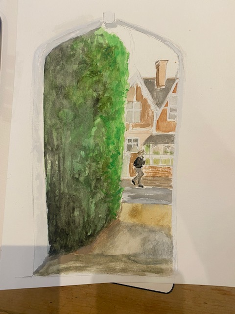
Exercise. View from a Doorway.
I painted for this exercise from the doorway of my house, which was actually really interesting as I realised I had hardly ever explicitly looked out of my door, other than to see something that was happening or to look for someone coming. I live on a main road, so it is a strange view. I have really good friends who live just over the road, but when the road is very busy, that feels quite a long way away. Indeed, it could be that you have to walk up to the lights to cross the road, if it is very busy. On Sundays, or during lock down, the road is quite empty and the other side feels nearer.
I did a couple of sketches to start, from front and back doors, but the back garden didn’t really sing to me – more interesting in winter perhaps, or even in full summer but at this particular time it just looked like a messy back garden.

So I took the image from the front. This meant that it had to include a little bit of my car which sits on the small front patio. I am afraid I forgot to take photos, so the result is here.

When I first did this it seemed as if I had captured something of the bright windy day of Spring, with clouds flying and flashes of light (that is supposed to be light on the pavement opposite). Looking back at it, it is not looking so much like that. I think I have the distances wrong, it looks so near whereas the road is wide, but when I look at the photograph, it is technically right. I had simplified the image quite a bit, and I wonder if I did so too much. I have left out the neighbour’s car (thereby moving the house a bit nearer to the road), and perhaps I should have left it in, with this idea of each house having an exit vehicle immediately by the door. I should have got more of the light in, on the hedge, the near side of the road. The only things I like are that the light is there on the right wall of the opposite house, the sky is that mixture of blue and grey that you get sometimes in ‘Spring, and strangely, the car looks alright. But overall it is rather a dull image.
I did have another quick go at this image, as below. This time I included a bit of the porch from further back, so that you get the rather interesting shape of the Victorian doorway. I focused on a different house, to the right of the one in the earlier image. This is nothing, the proportions are all wrong, but I quite like the bright colours, particularly the hedge which , at this time of year, looks quite unnaturally green in places where the new growth comes and the doorstep outside, glistening in the rain. To me it has the fresh feel of summer rain in the porch, but I think that it is just I am so familiar with what it feels like, not because the image portrays that.
Exercise. Hard or soft landscape.
For this exercise, I took a view that I am very familiar with – the reservoir used for sailing at Farmoor in Oxfordshire, where I have spent many hours waiting for my son or watching him sail. It is in a beautiful “soft” place, nestled in the rolling hills, and are full of all kinds of water birds – yet I see this as a “hard” landscape, given the brutal concrete banks all the way around, and the stark, long walk ways across the middle, dividing the larger lake (which is huge, it takes about 45 minutes all the way around and the smaller one. You become very conscious of this hardness when you launch a dinghy; the crunching sound of your hull on the concrete, the fear of being blown back against the bank and so on. I find the whole place a fascinating mixture of ugliness and beauty – the sun setting over the lake from the club house window is phenomenal, and I have tried to paint it at various times.
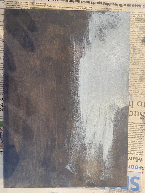
This time I was motivated to try to do something reminiscent of Paul Nash, a painter I love. This sometimes bleak landscape with its brutal walls seemed to suit his ‘cool and orderly English way’ , his and his (self-described in the 1920s) feeling of being “A war artist without a war” (Neve, 2020: 18). Indeed, some menacing lumps in the water (they are actually nesting places for the birds) reminded me very much of sailing (in a much bigger boat) past the huge bulk of rusty watchtowers left over from the war in the Solent. After the war he painted ‘how concrete ramps and army-grey shingle sloped into the grey sea towards France’, which Neve describes graphically as ‘ a landscape that replaced the urgency of suffering with the vacant afternoon of no feeling at all’ (Neve, 2020: 18). It is of constant interest to me that this lake of both utility (it provides perhaps the very water that I drink in Oxford) and pleasure (with a hugely active sailing lake where many children have learnt to sail) should somehow also satisfy this description. Of all his paintings that I have seen, however, it is perhaps his 1923 image ‘The Shore’ (Oil on canvas62.2x94cm, Leeds Art Gallery) that I was thinking of when I did this painting.
I first prepared a wooden board with a kind of thin muddy brown watered down, as below, with a pale chalky grey white for the sky:
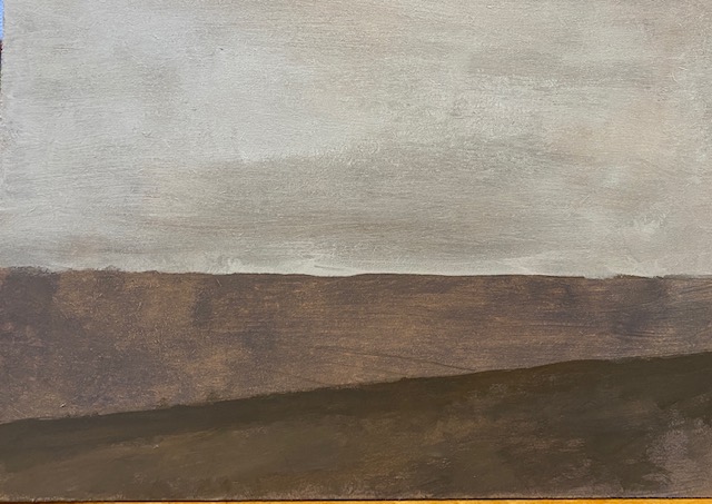
I put on some layers of paint, which you seem to need quite a lot of with these MDF boards – I like the final result on these, but they seem to get very wet and yet need several coats.
This is the next version. I have drawn in some lines and got the broad blocks of colour: the sky, the water and the dark grey of the walkway, which is also a road along which fishers or birdwatchers occasionally drive, so quite wide.
I then painted in some forms – the wall at the side of the walkway, the (floating) mooring planks jutting out into the lake in the foreground and background, and the trees on the horizon. These were also quite geometrical shapes, and Nash himself was fascinated by clumps of trees, at first those in his father’s garden, in Buckinghamshire, and also in the distance over the hills from his uncle’s house in Oxfordshire – Wittenham Clumps, which he painted from a distance (Neve, 2020: 17). These are nothing like the ones in his airy painting of the same name (1913), but the shapes of trees and hedges from a distance is always very evocative of the English countryside, I think. I wondered if I had done these too small, but I wanted to convey the size of the lake, which really is very large.
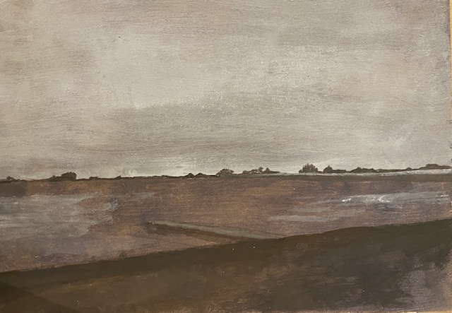
The horizon is uneven here which spoils the image, so I straightened it up and redid the trees on the horizon. This is the next version:
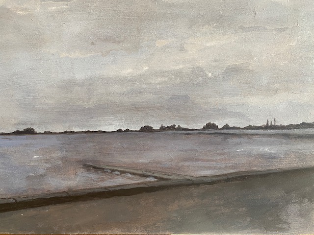
Anyone who saw this told me to leave it as it was. It is not finished, I realise that. the colours are too similar, the geometrical shapes are not brave enough to mimic Nash. The horizon needs to be a little lighter, the wall at the front should be a bit darker. I may try to do that at later point, but there is something nice here, and given my terrible propensity to ruin things by overworking them, I have left it for now.
Exercise. Linear perspective
When I did this exercise in Drawing One in 2019, I was living in Capitol Hill in Washington DC, and spent a lot of time learning how to draw perspective, something I found difficult to grasp. I love the architecture around there, the coloured houses which have a Georgian feel although of course they are much later. I tried looking out old photographs of the area and trying to paint them, but it just didn’t seem to work – the scenes have faded from my memory and I can’t recapture the feeling. So on a work trip to London I took some photographs of Georgian streets, including one of Tavistock Square where I used to work, so had many opportunities to stare at in the past.
This was a very obvious image to choose, you could say easy, but there was quite a bit of simplification to be be done, as some of the houses were quite different. I pained in watercolour on top of a pencil drawing. I am afraid that I didn’t take any photographs of the midway stages, but it is fairly obvious what I have done. Some inaccuracies in the lines of perspective have crept in when I put on the paint, and this creates a jarring note to the foreground of the picture. I feel like something has gone wrong with the tree at the corner of the square in the foreground, and I realise that there is too much separation of the two ‘sides’ of the painting, and I should paint the tree over more of the foregound, as it is in the photograph. The road goes on for too long somehow, obviously this is not a really long crescent, you can see quite a lot of houses but nowhere near this many! I should have made clearer the different buildings on the horizon line – the continuation of the road behind, and the red modern building in front, I think. It is some of the things I like about Georgian squares; the chocolate brown of the houses, the chalky white (I used gouache) of the painted parts, and the dark glass in the foreground, as well as the glossy Downing St style front door that stands out. The colours are not too bad overall. But it is a very flawed painting, and reminded me that I need a lot more practice – drawing is one thing, but when you add paint things can go wrong on top of drawing errors.

Exercise. Aerial perspective.
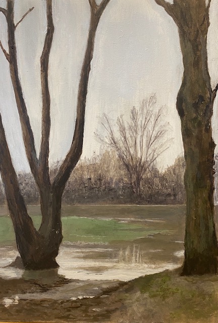
For this exercise I chose a photograph I took in the floods of February; it is the smaller of the two meadows where I walk, framed by the trees in front of it and more of less flooded with muddy water, with a few islands of green. I took the photograph not because of the floods (which had lasted many weeks already) but because there was a heron in the middle, and it made for a lovely photograph, the majestic bird magnified as far as my phone would allow.
I thought this was a good photograph for this exercise, in order to use the three elements of aerial perspective listed in the course notes:
• Controlled loss of focus (in terms of sharp delineation between different tonal areas)
and fading outlines are rendered through progressive loss of contrast into the distance.
• A loss of colour saturation, i.e. a fading out of bright, saturated colours going into the
distance towards more muted, faded shades.
• Distance can also be achieved by colour temperature. Warm colours painted in the
foreground will automatically achieve a sense of closeness against colder colours in the
distance.
I planned to do the first of these through painting the trees and the muddy banks sharply, while the middle space had less definition, and the undergrowth at the back was fuzzy and undefined. The second I planned to achieve with sharper, brighter colours at the front, and more of a diluted wash at the back. The third, I thought it might be possible to make the trees and earth more of a warm brown, while the undergrowth at the back was a cooler purplish or cold pink colour.
I painted this on an MDF board, and this is the first sketch. The background is roughly sketched in, with the broad shape of the green parts and the brown water, with the trees painted in over the top, with some light on the water near the front, which seemed like a good way of satisfying criteria (2) above. While I was reasonably happy with this start (particularly actually the light wash at the back, which I lost later on), I could see that the muddy bank at the front was a problem, because I wanted to define it well, but in real life it is quite messy and ill-defined.

In the next attempt, I straightened off the horizon and defined the trees at the back a little. I tried to get the reflections in the water and to define the bank a bit more, while making the trees sharper. I quite like the way that the water is looking, but the front trees are still a little fuzzy – while perhaps to the back of the water is now a little too defined, although the back hedge is beginning to have the purple haze that I wanted.
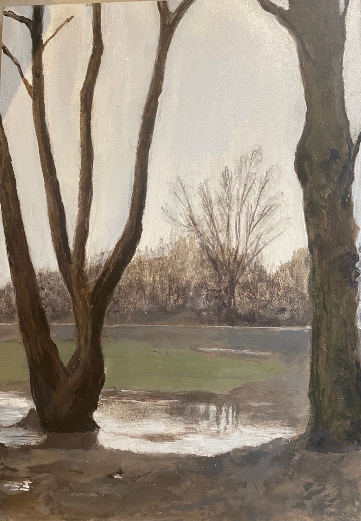
I added some definition at the front, painting green lichen on the green, defining the bank and the water at the front including a reflection of the left hand trunk, and some kind of sense of the pitted mud, although I think there is a problem with the colour here, it has gone a bit cold for this image. I added some green at the front among the mud as it seems to be in the photograph, but I feel unsure whether green is a cold or warm colour – I thought kind of midway, which is why it was good to have in the middle ground.

Finally, I tried to correct some of these problems, as below. I increased the purplish blush at the back, tried to put some more definition in the foreground, added some more shifting colour and tonality to the water and made the foremost water brighter. It doesn’t entirely resolved any of the problems, and may have introduced some new ones, but I think this is the best I can do for now. Overall I can’t decide about this image – at moments I do like it. It has something of the oh so familiar meadows where I walk every day, and are often flooded. I quite like the tree trunk on the right and some parts of the water, and the slightly startling green in the middle, which I have decided is a cold rather than warm colour (I have made it more yellowy to the foreground, which is kind of warmer). Ultimately, this was probably not the best image to choose, good photograph as it is. The colours at the front are naturally desaturated, and it is hard to make them bright – it is a muddy, gloomy picture really, with some of the hopelessness of early February. Everything is rather the same colour and tone, so I have had to use my imagination and maybe haven’t been brave enough with that. I haven’t added the heron, because this is an exercise about something else and I wasn’t sure that I would be able to do it convincingly at this distance – perhaps I will do so later, but I thought I would see what my tutor thought first.
Project Expressive landscape
Research Point.
I spent quite some time looking at Paul Nash for the ‘hard landscape’ above, so for this exercise I chose alternative expressionist painters; first, Emil Nolde, as suggested and second, Ivon Hitchens, a painter I have always loved and know rather little about. I had an idea that his endless paintings of river scenes would suit well the landcape around here.
Emil Nolde (7 August 1867 – 13 April 1956) is a wonderful painter. I saw an exhibition of his at the Whitechapel art gallery many years ago, but of course have no photographs from that. He was one of the first German expressionists, and apparently one of the first painters to really explore colour. I associate him with images of the sea, but it seems he was fascinated with flowers, after Van Gogh and quite a bit of religious painting, expressing his anti-semitic views. He was an enthusiastic supporter of Hitler, and joined the Nazi party. His painting was always controversial, both artistically and politically. I steered away from these and concentrated on the landscapes, incredible bursts of colour that take your breath away. However, even here his work, along with the other modernists, was controversial and termed ‘degenerate art’; he was officially condemned by Hitler, despite being an esteemed artist in Germany and a supporter of the Nazis. In 1937, 1,052 of Nolde’s works were confiscated, more than any other artist, and he was the most prominently represented artist at the ‘Degenerate Art’ exhibition despite his protests. By 1941, despite his continuing support of the Nazis, he was banned from painting even in private, and it was not until after 1945, when he was perhaps strangely exonerated from his Nazi sympathies, that he painted freely again. Even in the 2020s though, he became a victim of what some commenators call ‘cancel culture’ when the Angela Merkel took down his paintings from the Chancellory, when his Nazi past was revealed (Colbert, 2020).
I wasn’t sure if this new knowledge of Nolde’s past should revise my view of him or not. I think it did make me more questioning of the emotions embodied in these rich colours and swirling seas – more angry, more disturbed than I had thought before. Many of them are angry though; as artsmia put it : “For Emil Nolde the sea was a primal force—beautiful, awe-inspiring, bountiful, frightening, unpredictable, untamable”. As the title illustrates, even this seemingly calm image is in fact a heavy sea”

Dated c. 1930 – 1935
Source: https://collections.artsmia.org/art/1315/heavy-seas-at-sunset-emil-nolde
https://collections.artsmia.org/art/1315/heavy-seas-at-sunset-emil-nolde
Some of the more typical pieces really go to town on this, as in this more typically angry sea:

Source: https://www.christies.com/features/Emil-Nolde-Colour-is-Life-9322-1.aspx
The sea is menacing – as is the sky – and the two are merging into each other as they do when you are in a small boat on a high sea. The fire in the sky seemed to be at first to suggest danger – coming darkness perhaps – but looking at the title more likely the hope of the sunrise? I love this painting, which seems to sum up Nolde’s view of the sea quoted above. At the same time, it is a joyous revelling in colour, you can’t help feeling that the artist took pleasure in this fierce beauty as well. As Hartley (2020) (co-curator of the exhibition ‘Colour is Life’ at the Scottish National Gallery) put it when asked if colour was Nolde’s real strength:
“I think so. He had a passion and a truly brilliant talent for it, which he never lost. This is why we called the exhibition Emil Nolde: Colour is Life. To stand in front of a Nolde painting is to experience what amounts almost to an electrical current, so strong are his colours…….I should add, though, that he wasn’t a calculating painter, with a regulated way of working. He painted viscerally; choice of colour seems to have come to him by feeling.”
Another amazing thing about this painting, as Hartley also points out, is that he is painting here in 1950 as strongly and vividly as he was before the war, and seemed to retain this intensity right until the end.
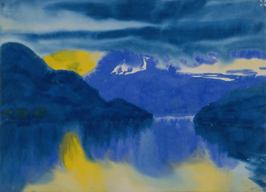
I had also not realised that so many of Nolde’s works were watercolours, painted in secret during those prohibited years of the war, like this beautiful image of Lake Lucerne, which does not have a single line in it, and seems to embody the tranquil peace and cold beauty of the lake, in contrast to those angry seas. Again though, it is a painting where the colours seem to have come to the artist ‘by feeling’.
In many ways this painting seems to demonstrate some of the rules of aerial perspective proposed above (warm colours to the fore, cold behind, for example) – and at the same time smash them to pieces. As the work’s notes at the Sammlung Staedelmuseum put it in the accompanying notes:
‘This composition lives from the charged relationship between the nuances of two colours and the forms which grow out of them, join together and move apart: advancing blue and withdrawing yellow, transparent and dense, dark and light, cold and warm, a correspondence between above and below, between left and right, between far and near. The polarities, or “duality” as Nolde called it, have given way to harmony.’
Ivon Hitchens
The next painter I looked at was Ivon Hitchens (1893 – 1979), more of an abstact expressionist but also someone who seemed very much to paint by feeling. I was interested in his river scenes. My favourite uncle had a print of one of these over his fireplace (well, imitation fireplace, like the print which now that I have it in my own house, is a faded reproduction of the 1960s). I always liked it, and believed naively as a child that it was an original. There are a couple of huge and wonderful original paintings at Nuffield College in Oxford, where I go for meetings with the Principal (who has a particularly fine one in his office) or workshops sometimes, and I am always mesmerized by them.
The prints that provoked this interest is this lithograph, the Boat on the Pond:

and this darker painting of the Boat House, of which my uncle had an even worse reproduction – the painting looks so gorgeous in the comparative sense, and in the real sense with that wonderful contrasts of green/red brown; purple and mustardy yellow – and yet the harmonies of the blues and purples, the yellows and the greens. It is lovely..
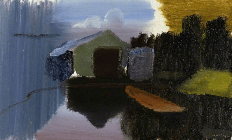
Ivon Hitchens (1893–1979)
The Fitzwilliam Museum
Source artnet.org https://artuk.org/discover/artworks/the-boat-house-4488
Hitchens started out as a member of the London group, that I discussed in relation to the human form in Part Three. He painted with Gore, for example and later with Ben and Winnifred Nicholson. However, the landscapes for which he is famous came only in his 40s after he was bombed out of his London studio in 1937. he bought a patch of rough ground in Sussex and moved there with his wife and baby son. What he painted there was mostly very near to his own ground; he made a small pond to catch reflections (and later more), gradually built a low house where he added room by room, and saw almost nobody, developing a ‘philosophical nature which found its outlet only in the refined simplicity of the paintings’ (Neve, 2020: 179). Knowing this, I always warmed to him because of my own habit to walk to the same small meadow every morning, take endless photographs of the same view, from the end of the small meadow, always finding new beauty and interest there(I drew it as the Assignment 3 (Expanse) of Drawing One.
I guess this is the most typical kind of image – usually a pond or other water (he left his habitat only in search of other water), with the other elements of the landscape (such as the house, shown in shades of purple and grey) and the sky reduced to long cylindrical blocks of colour. This painting shows his propensity to leave white spaces on the canvas ” as though to let in brightnesss and air and to emphasize the spontaneity of his fresh marks on it.’ (Neve, 2020): 177).
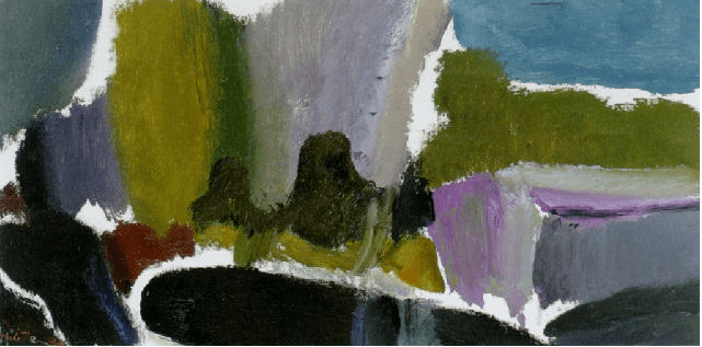
Ivon Hitchens
(British, 1893–1979)
Title: Dark pond
, 1960–1960
Medium: Oil on Canvas
Size: 41.3 x 78.7 cm. (16.3 x 31 in)
Source: artnet.com http://www.artnet.com/artists/ivon-hitchens/dark-pond-U7XMaRahckh0nCihMCrr7w2)
Hitchens always, when it was in the least bit fine enough, took his equipment out into the undergrowth in a wheel barrow and stayed there all day with sandwiches and chocolate (Neve, 2020: 180), focusing only on things at close range. His aim was to create tunnels for our fields of vision, like the overlapping discs produced by looking through binoculars, hence the elongated shape of so many of his pictures. Each painting illustrates distinctive palettes; this one seems like sedge green/cerulean and blue/black/purple.
Was Hitchens an expressionist? I wondered at first if he fell into the category discussed in the course notes, but reading this passage by Neve (2020) I was in no doubt:
“Stand in front of a painting by Ivon Hitchens. It is wide and fresh. You scan it from side to side as you would look from side to side at the view itself. Your must let its sentiment wash over you: its colour and spaces, its broad gestures which the eye follows as though the pigment is being brushed on as you watch. It is clear that this is a kind of writing, but there is no need (yet) to read it or to make out exactly what it means. Instead you feel its resonance and breathe its air. It seems to shift in front of you as light shifts on water, or leaves turn over in the wind. It has the first requirement of a work of art: it is alive.”
I believe then that he is described as “abstract expressionist”: as Neve again put it: “If you are alert to this, it stirs in you sudden recollections, not exactly of how things look but of how it feels to see them.” That doesn’t automatically mean that it is expressionist, I suppose – which is perhaps rather more about the artists’ own feeling? But to me it feels the same, he has somehow revealed the pure form of the things he paints, uncovering the feelings that all of us – including him, including the viewer – are evoked by the landscape. He feels something about it which resonates with what I feel. It seems to me that he buried himself in this obscure location to both attain safety and security amidst the terror of war, but also to really enjoy the atmosphere and feeling of the place through his continual exploration of colour and shape. Usefully, Neve (2020: 182-3) describes how Hitchens painted outside really carefully, and it is my plan to try to mimic this a little when I undertake the Exercise on painting outside.
Exercise. Creating Mood and Atmosphere.
For this painting, I took an old oil painting that I did ages ago, perhaps even before the course started. This is Minorca, the Bay of Fornells, where I have been several times with my son to sail (there is a sailing school there). It is a huge, huge bay and the most lovely place to sail a dinghy – reasonably safe – but huge enough to feel very free.
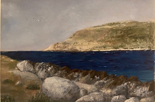
This painting is from a photograph taken in Fornells itself, near the entrance to the open sea. I painted it after we came home from the first time we went there. When I did this painting I was rather proud of it. I felt like the sea was the right colour, that I had the lighter more translucent sea in the foreground. I thought the rocks were quite realistic, particularly where the grey turns to brown next to the sea (this is a different kind of rock, fused together after some kind of volcanic interaction, I suppose. You can see the bulk of the other coast, which looks appropriately hazy and so on.
However, now I look at it afresh it seems rather dead, without spirit. It has something of this beautiful place, and as a memory of that it has served admirably. But it is the opposite of expressionistic – it has a blank expression, if you like.
I thought about what this painting would be like with expression. It seemed to me there would be two options. One would be to emphasize the blue sea (and make the sky bluer, with the red of the earth in the foreground and white dinghies and other boats everwhere – give the sense, which there is some times of some kind of huge playground, a kind of aquatic Central Park where everyone is doing something different, but all with some kind of craft.
Alternatively, I thought how to make this into an angry Nolde-ian scene. Every year, provided the weather is fine enough, the more advanced sailors sail out to sea, beyond the horizon point here. Waves are not very easy to contend with in a laser dinghy, especially someone of my sailing abilities, so it has to be quite calm for us to go. But I started to think what it looked like in the winter when the wind and waves were wild, and how frightening it would be. Suddenly the entrance to the bay would seem narrow, with dangers lurking either side, whether you were coming in or indeed going out. The sea would feel completely in charge, all encompassing, which is how Nolde seems to have felt about it. This is summed up by Vergo and Lunn (1996: 132) in the exhibition catalogue for a show of his work in Whitechapel art gallery, which I saw. They claim that what preoccupied Nolde was the task of representing the ‘awsome power of the sea as an elemental force, often shown juxtaposed with scudding storm clouds’..As his first biographer put it:
“Nolde understands the sea like no other painter before him. He sees it not from the beach or from a boat but as it exists in itself, devoid of any reference to the man, eternally in motion, ever changing, living out its life in and for itself, a divine self-consuming, primal force that in its untrammelled freedom has existed unchanged since the very first day of creation. He has painted the sea in all its permutations, but above all in sotrym agitation, its heavy swell transformed into white breakers as it retreats upon itself, beneath heavy threatening clouds, behind which the the autumnal evening sky bleeds in tones of red and deepest orange.” (Sauerlandt, 1921: 49-50).
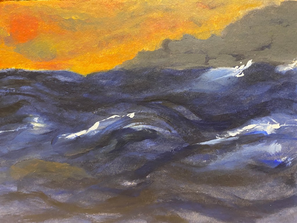
I had lots of ideas about this painting – too many, in fact. Some of them were about having rocks all around, making the bay into a kind of rocky trap. There didn’t seem to be enough space to express that though, in this small painting, as well as getting the size and movement of the sea, at least not in an expressive way. So I went for the Nolde effect, and started to paint a rapidly moving sea, moving the brush really quickly and having it reach in all directions. I used blue and orange – equally, I think it could be red and green, or purple sea and yellow sky. In the end I wasn’t very happy with the image, as it seemed rather imitative of Nolde’s wonderful painting above (I should at least have used different colours), but I did enjoy doing it – and it taught me a couple of things about painting the sea. Most of all, the investigation of expressionism showed me what was wrong with my earlier painting, and made me think about how to paint images like this in the future.
‘This first image was too ‘nice’, too gentle – the sea not wild enough.

The next image is a bit better – the sea is wilder, the sky more menacing. The rocks are two soft somehow they need harder edges.

The next image is better – the sea kind of more rolling, more of a swell and the idea of danger. I quite like the orange sky – again, attractive but dangerous. I need some orange on the water, I think, I painted it on a couple of times and removed it but it needs to be there to draw the two halves of the painting together.
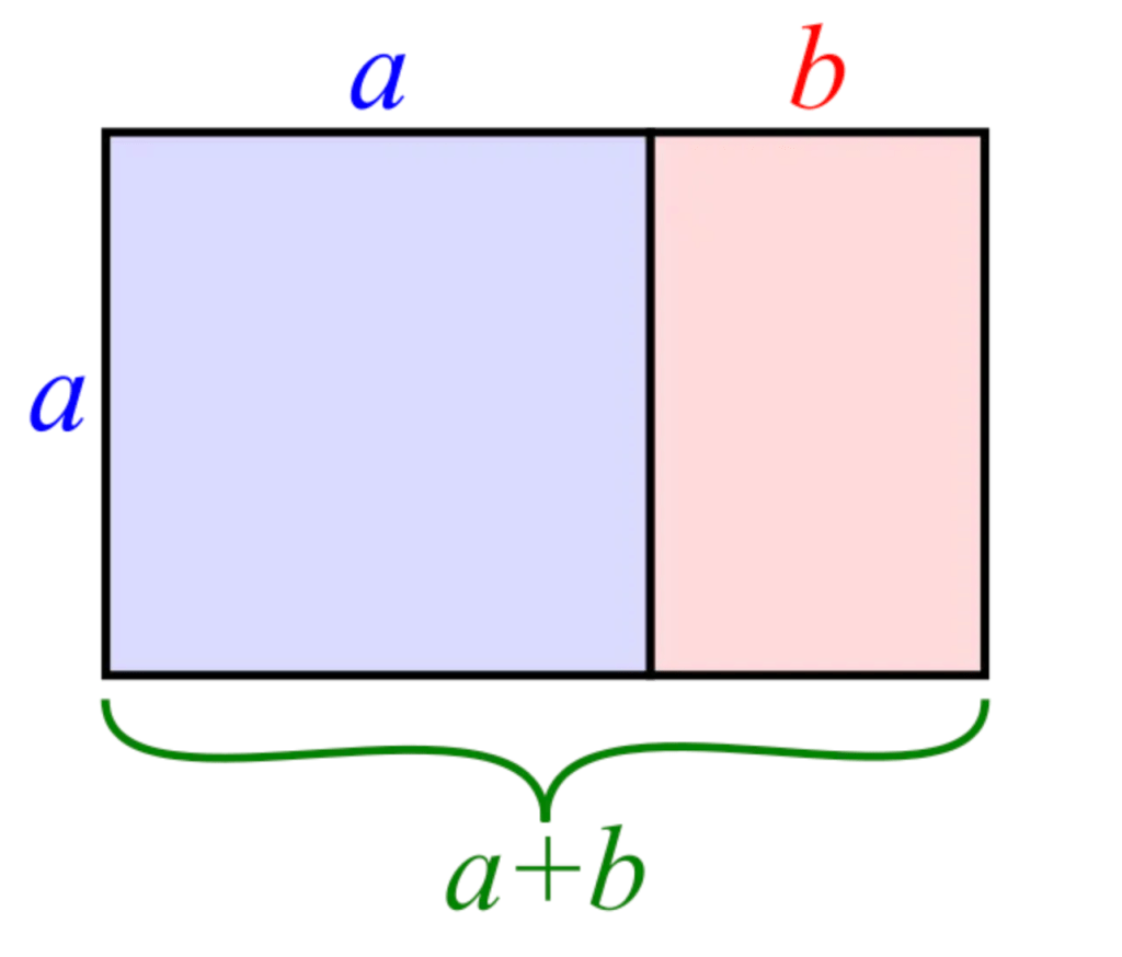
Research Point 2. The Golden Mean
This was a useful research point – I knew vaguely about the principle, partly from A level mathematics, but have never reviewed it carefully in relation to art. There is a very nice simple explanation at the ‘Draw Paint Academy here, which I found told me most of what I wanted to know, with some examples of paintings that embody the rule.
The golden ratio is the ratio of approximately 1 to 1.618, and it is believed that a rectangle of these proportions (as follows) will be more aesthetically pleasing than any other rectangle – there is a formula for this, but the author of the web site cited above provides a very useful diagram:
This ratio is at the heart of various mathematical phenomena, such as the Fibonacci sequence; because if you spiral a line through the golden rectangle (which breaks down each sub rectangle into smaller and smaller rectangles with the same proportions), you get a spiral of proportions that appears often in nature, from planets to snail’s shells.
In art, the golden ratio has often been used to guide the placing of objects or the horizon in paintings, using something like the diagram below, from the same source.

This is illustrated very well by the following painting by Seurat, where there is a figure in several of the ‘cells’, and the uppermost line appears to have guided the horizon.

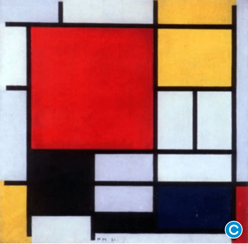
The most obvious example of the golden mean comes from Mondrian, who literally painted golden rectangles, as in this iconic image.
I do admit that I am not entirely convinced by the Golden Mean. With the obvious exception of Mondrian, most of the examples given are a little ambiguous. In the Seurat painting above, for example, it is not really clear (to me) that the golden mean is defining the picture. Some of the people are in the cells, but parts of them are outside and I do wonder if you could almost always argue that parts of the picture are arranged in this way. I can see that sometimes there are some clear uses of it, as in the horizon in some of the paintings illustrated in various discussions of the principle,
In contrast, I do think that the simpler ‘rule of thirds’ might be of more practical use. After all, the golden ratio is not so very far away from this. . Here the picture is divided into 9 equal parts and the consequent cells used to structure the composition. This seems to me a plausible guide. I started to think that the Seurat picture above might also work with this principle – the figures do not absolutely sit in the sub-divisions of the Golden Rectangle, although the horizon is spot on, I do see.
In preparation for the forthcoming assignment (this was the last exercise I did) and also to do the exercise on “painting from a photograph” with measurements, I took a detail from a photograph of the sea in Menorca from where I had just returned, below.

I cheated here really. I wanted to divide the image into thirds, at least along one dimension, and to catch the contrast between the red cliff, the green – and then the blue green sea. I took the red cliff and made the other parts (the sky and the sea) more or less equal. The result is below:

I quite like this. I have simplified radically, but I like the effect – the red against green, the chaotic nature of the foam on the sea, the bare board coming through and seeming like the sandy floor of the water, and the contrast between the darker water of the deeper sea and the lighter green of the shallows. I struggled a bit with the rock face on the cliff, but it isn’t terrible. As usual when something works out, this really didn’t take very long, three hours at the most I think. I painted very quickly, which is why the sea part has worked.
Project. Painting Outside.
I tend to resist painting outside – it aways seems unbelievably difficult to get all your materials ready on the kitchen table, never mind in a field or up a hill. However this part of the course clearly calls for that so I resolved to do it. I thought about it during the week – and chose my spot in the meadow where I walk the dog, taking a few photographs and so on. It was worth spending this time because this may be the landscape that I do for the Assignment. The place is on a little prometary poking out into the river Cherwell, looking downstream. It is kind of a hidden place, although dog walkers generally come here on their way around the meadow, because the view is lovely. You are surrounded by undergrowth, so it has something of Ivon Hitchens preferred painting location about it. In the summer especially, you feel immersed in green, of the river, the reeds, the hedges, the willow, the other threes and the undergrowth.
Exercise. Painting a landscape outside.
On Sunday, I set off reasonably early (well, for a Sunday – 8am) with watercolours, water, watercolour paper in a knapsack. I also took a towel and wore a bathing suit, because I planned to swim afterwards, immersion in the view in every sense! It was a very hot day, the hottest of the year to date and I knew that there would be people looking for a good place to sit. I walked with the dog so that she wouldn’t be too much of a pest, and settled down. There was a brief phase of disruption when someone appeared on a paddleboard from his sidestream (which has gardens going down to it) and jumped off, proceeding to swim laps up and down, not part of my ambience at all. So I did not start very peacefully, although he did leave eventually.
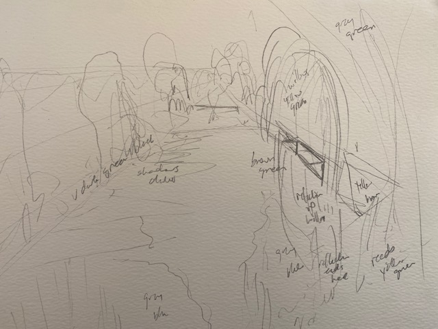
The first thing to say is that it was really interesting – but really hard. The light and shadows were what I usually see – this is the time I come during the week, usually even earlier – but different from the timing of photographs I have painted this view from in the past, so the reflections and shadows were on a different side of the river, obviously. I chose the view as the one in which I felt most enclosed, and drew a quick sketch

Here are the paints on the bench, next to me (taken from above)

I painted quickly, mixing colours rapidly – too rapidly, I think. The problem was that it quickly became really hot, and the angle of the sun offered my bench no shade at all. I regretted not bringing a hat – as suggested in the course notes – I am unused to it being this hot, of course, but I now get the point that it affects the light too.
The greens were easiest – my watercolour set helpfully has four. What I found really hard was the colour of the sky’s reflection on the water. I spent a long time trying to decide what colour it was – a kind of blue grey, I think, but why? The sky was bright blue, the river brown green, I don’t understand why the combination should come up like that, but anyway everything looked wrong wrong and of course ultimately I had to settle for what is here, because with watercolour there is not much going back, only darker, and this is already too dark.

I soon realised my drawing wasn’t good enough, the river banks slope too slowly and the bend of the river on the horizon too large. That made the banks on the right (where there a are a couple of wooden parts for tying up boats) very difficult to get right and they aren’t. On the left, the hedges nearest to me are obviously much taller. I have tried to correct these issue in the next version”

And to correct a few more mistakes here
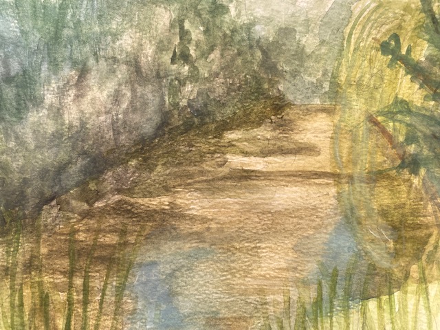
This is really not a good painting – unusually, it looks a bit better in real life than it does here – watercolour on watercolour paper does not photograph well, I believe, because it becomes kind of transparent, and the water is actually a much darker green brown. But still. I feel like that I have learnt quite a lot, and had lots of ideas about how I might paint this particular landscape in a different , more abstract way, potentially for the assignment. There is nothing more I can do to this – it is how it is – but the process made me think of where I should have left part of the canvas blank (on the river), where I should have blocked it in with colour before I started with the reeds and so on (at the front) – and where I should have emphasized some mad made feature – like the wooden banks – before I started. I will try to do the blue grey lights on the river before I start another version – if I want to use some kind of Hitchens style then the colours will be vital. Finally, I drew a sketch again, just to remind me of what colours should go where, in case that I do not paint from here when it comes to the main canvas.
Review of Report for Part Three.
I was very pleased with the ‘overall feedback’, especially the points about being
“bold in your application of paint with rawness and vibrancy.” and the comments on the colour schemes being “experimental”. With regard to the comment ” try not to overdo the work becomes it becomes too muddy.” I couldn’t agree more, this is a persistent theme, as is the point about angles being “distorted”. I was happy to hear that “there is an individuality
coming through, especially with character and personality in your works,” because sometimes I worry that I am merely imitative.
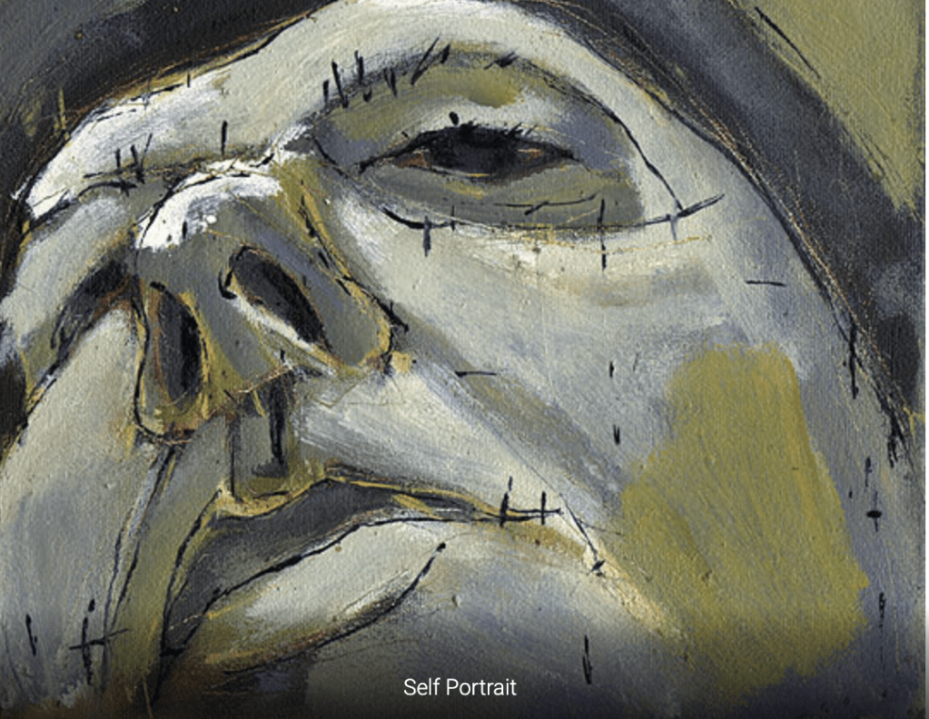
With regard to the comments on individual pieces, I was glad to see that (in general, there are exceptions) my tutor favoured the same pieces as I. I agree very much that in P1 the paint was too heavy handed, while the female figure lying down had worked well. I can see now looking back that I need to get “darker tones to show more emphasis on the muscles.” I was amazed to hear that the self-portrait wasn’t too bad and note the positive points re colours and contours which I had failed to notice., and indeed the patches of tones and the emergence of character and personality which I certainly hadn’t seen.
For the piece on creating mood/ atmosphere, I was grateful to my tutor for taking it seriously, and actually pointing out some ways it might work, for example with the removal of sharp outlines. I was grateful for the comments on personality and agree with the point on harmonious colours in my portrait of Joni – the yellow version is the best.
For the figure in an interior- I can see that she is right in saying that “the face is a little too disjointed in technique compared to the clothing”, it also looks yellow to me and the eyes look almost as if they are made up – this is spoiling the painting. What I didn’t understand, however, was the comment on “the foreshortening is there when it should not be.” because I was quite proud of the foreshortening (Pedro has rather a big stomach, emphasized by the large jersey, and very small neat legs, which I thought I had portrayed alright) so I will ask my tutor about this. Re the ‘telling a story’ piece, I think it is right that the use of media suited the piece, but agree very much that I should have avoided the heavy outlines on the face and the solidity in shapes and forms – this is what is wrong with this image.
I agree that the ‘People in context’ piece is the most successful, and serene. This may owe more to Michele than me, but I think it did work well and led to an evocative piece of work which as always with my better pieces, I did quickly.
Re the Assignment- I can see that I have committed my usual error of overworking it – it was better at earlier stages, when it was more unfinished, and I have introduced too many colours, I think and as my tutor points out, done too much blending (this is another tendency of mine and leads to muddy colours, as she pointed out at the start of the report, as well as losing “the fluidity and movement” of brush marks). I would like to know how to rectify this, but I suppose it may be impossible at this stage. I was pleased she observed the ‘good lighting’ (the photograph had great lighting, which was why I chose it) and the depth, but agree that the colour scheme “is a little too exaggerated”.
I liked this comment: “You have done many attempts of the subject and have shown an ambition into a complex subject. You have clearly worked hard to identify mistakes and have corrected them along the way. . ………You have been self-reflective to the point where you are improving your skills each time.” I think I am improving, but sometimes progress seems slow to the point of stasis.
I appreciate the comments on my “Learning logs/context/sketchbooks/research”, especially that my “visual language has improved.” I realise that I really need to look at more contemporary artists, I have the same tendency when reading, so must make an effort to look at new things.
With respect to “action points and further research” my tutor recommended the following painters.
Egon Schiele- showing rawness and honesty in the human figure.
I looked at a whole range of images painted by this fascinating painter (who, like Nolde received from Hitler the ‘degenerate art’ label, although here it is far easier to understand why. I see the rawness, the patches of colour, the angular limbs and find it inspiring.
Yan Pei Ming- for colour schemes and honing into the face. I loved his portraits, especially the reworked Mona Lisa and the 2020 self portrait ‘La Lasssitude‘ . You can see the features almost carved out of the paint. Most seemed to be monochromatic and that is the way I think I am going to go with portraits; I particularly like the red/white portrait of the pope.
Glenn Brown- showing distorted faces and a narrative. I acan see he is a great painter – but I find all the cultural references and disorted images a little hard to fathom. It is very far from the kind of painting I want to do, but I can see that he is a brilliantly talented artist.
Dion Archibald- showing movement and fluidity in figures. I loved the weird distorted angles and honesty of this painter. I liked his ‘learn the rules before you break them’ (that is what I am trying to do on this course). I particularly liked the three dimensionality of this self portrait
Biography.
Colbert, Jorg (2020) “What Emil Nolde’s Past Can Tell Us about How to Deal with Photography”, CPhMag.com.
Hartley, Keith (2020) “Emil Nolde — Colour is Life”, 31st March, https://www.christies.com/features/Emil-Nolde-Colour-is-Life-9322-1.aspx
Landau Fine Art (2021), Emil Nolde, Biography https://www.landaufineart.ca/nolde
Neve C (1990) Unquiet Landscape: places and ideas in twentieth-century English painting.
London: Faber and Faber Limited. Revsied 2nd Edition 2020.
Sauerlandt, M. (1921) Emil Nolde, Munich: Kurt Wolff: p49-50.
Vergo, P. and Lunn, F. (1996) Emil Nolde, Exhibition Catalogue, Whitechapel Art Gallery.
