Project 1. Understanding Colour.
I spend quite a lot of my time thinking about colour – of things that I see in everyday life, of paintings, in nature, people’s clothes, the walls and other parts of my house and, in these strange days of 2020, of other people’s houses on whatever digital platform we are meeting on. I have been enchanted with the colour wheel ever since I encountered it back in the 1990s, and usually have one in my bag. I am always happy to see complementary colours that do not share a pigment – indeed, at work I have even redesigned the web sites of two departments as head (to be dark purple and yellowy cream; and dark blue and orange). I am aware of the difficulties of getting the right shade and tone for true complementarity; a rich yellow and pale purple for example, might well not be pleasing to the eye. The important thing is, as I understand it, that they must not share a pigment – and some yellows would have a touch of orange. But I look forward very much to gaining more knowledge of this fascinating topic.
Research Point 1.
Find out more about the colour theories of Chevreul and make notes on how particular artists have used Chevreul’s theories to expand the possibilities of painting.
I was not aware – or perhaps, had forgotten, that the wheel of colour originated from Isaac Newton, observing the way that light bent when passing through a prism, although the acronym ROY G BIV stirred a vague memory from school days. His findings allowed him to systematise colour diagrams – these were not new, they had been known since the 15th century, but he arranged them in a circle which placed complementary colours opposite to each other (Bomford and Roy, 2009). This work led directly to a number of scientific (or quasi-scientific) theories of colour.
One of these is Goethe’s Theory of Colours (1810). This treatise provoked great controversy at the time owing to its opposition to Newton’s theory, without any real theoretical justification in the scientific sense. But it did offer a full exploration of how we experience colour, and as such has been far more influential on artistic practice. So although it seems that some or even much of this painstaking work later turned out to be wrong, or at least not scientifically verified, there is a lot of interesting material in his book, and some really insightful observations. For example, that the shifting colours of shadows, a physiological reaction to dazzling yellow-orange sunlight: ‘During the day, owing to the yellowish hue of the snow, shadows tending to violet had been observable; these might now be pronounced decidedly blue as the illumined parts exhibited a yellow deepening to orange. But as the sun at last was about to set and its rays, greatly mitigated by the thicker vapours, began to diffuse a most beautiful red colour over the whole scene around me, the shadow colour turned to a green, in lightness to be compared to sea-green, in beauty the green of an emerald’ Goethe, 1810: 19-20, Bomford and Roy, 2009: 15). I cannot say that I have ever seen anything like these glories myself, but perhaps I have not been looking in the right places – I will do so from now on. However, facing a locked down winter in crisis-hit Britain of 2020, I doubt that I will see much sun so I will need to look for paintings that use these kind of colour effects.
It seems that it is Michel Eugène Chevreul (31 August 1786 – 9 April 1889) who is responsible for the early version of the ‘colour wheel’ that is most used today, shown below, which so neatly illustrates not only the spectrum of colours, but the way that they relate to each other.,

Presentation of a way to define and name the colous, Chevreul, 1861
Chevreul was a chemist, who during his long life (to 102, an impressive tally for the time) achieved an extraordinary amount, in terms of advancing in science across several fields, including the way that soap is created and the identification of key characteristics of diabetes. Like Goethe, his work on the ‘theory of colour’ and in particular the importance of complementary colour was also extremely influential in the work of Delacroix, and later in impressionism and neo-impressionism, from Seurat to Van Gogh to Delauney, and in particular prominence in this image of a ‘The Skiff’ by Renoir (1875):
These painters used (or as their critics perceived, over-used) the tinting of shadows with the complementary of the adjacent highlight, mimicking the physiological behaviour of the human eye when exposed to bright colour, meaning they were usually blue-violet in contrast to orange-yellow sunlight. This ‘violettamania’ sometimes caused problems for them – as Chevreul pointed out, the mixing of complementary colours was liable to lead to grey, something that is evident in some of Seurat’s paintings and others who tried the technique of ‘Pointillism’ where dots of colour were used with the idea that they would reform into brilliant colours in the eye (Bomford and Roy: 65).
Exercise: Mixing greys – anachromatic scale
I enjoyed this exercise, although in the first attempt the dark tones were too close together. In the second attempt, on the right, I thought that it came out quite well, although I fear you cannot see this from the photograph, and the darker shades still look too close. What does come out clearly, however, is the different contrasts with the mid-grey tone at either end of the spectrum, which are almost more marked in the photograph then in real life. Although I had originally intended to use acryllic paints, I found that these dried too quickly so I used oil.

Exercise. Primary and secondary colour mixing
Again I used oil for this exercise, mainly for the drying problem, but also as I have a better range of paints.

This was more difficult, and as you can see I kept running out of space. Here there just seemed to be a much greater range of possibilities, although I can see that for the yellow to blue spectrum I have several the same colour in the yellowy green range, and could have lost a couple. It was nice doing it however, and gave a sense of possibility given the huge scope of colours from just these basic elements.
The primary colours that I started with are shown at the top – at least these were the choices that I had. I chose, for the exercise the Schvenginen deep red and lemon yellow (both Old Holland paints), and the cobalt blue (Georgia). The ultramarine on the right (Michael Harding) is a lovely colour, but has more red in it. I noted that it was possible I was getting some disparities from the differential colours of the paint – the red and yellow were of the highest quality, while the cobalt blue was more standard and probably a less pure pigment.
Exercise Primary and secondary colour mixing
Here I mixed the primary colour scales, using some white to keep the tones constant. it was interesting to note that in the mid red-blue spectrum there was a kind of brown for the darker spectrum, and a grey-brown, not quite grey, for the lighter spectrum, although there is still a touch of violet in it.
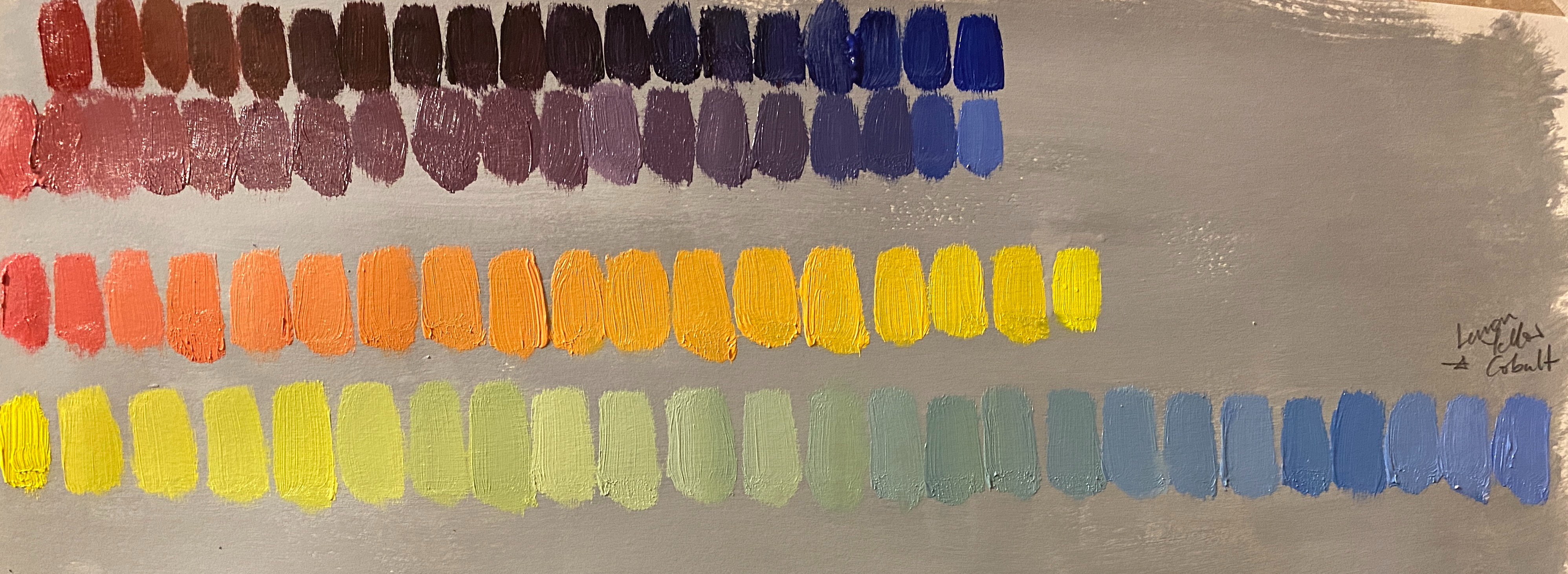
Exercise Broken or tertiary colours
For this exercise, I used a different red – cadmium red light, because the exercise asked for something with more orange in it – to go to Prussian blue, using some white to try to keep the tones consistent. Here there is a marked broken colour effect – when I first did it, before it dried it seemed brown – as marked in the photograph – but now that I look at it again, I wondered if it is more the adjacent colour which is more grey, and seems an almost perfect ‘non-colour’. I found fascinating the statement in the Excercise that these colours make up most of our world – and now I have done this exercise I am seeing them everywhere.
For the next one, going from cadmium yellow orange to sap green lake, the mid point still seems green, but again, now that it has dried I wonder if it is more to the left, a kind of mustardy brown.
Finally, going from red/orange to green, it seemed as if the mid-point was again a really ‘true’ non-colour (if that is not a contradiction in terms).
Exercise. Complementary colours
This was a lovely thing to do. I used the same colours as I had used in the other exercises, and measured the angles to ensure they were equidistant. I made a mistake in the first version, where I had too many yellow strips, but it turned out it only required making things darker, so it was possible to rectify. However, it showed me that this wasn’t as easy as it looked and I am still not sure that I have quite the right colours lined up. The blue is definitely against orance, but I wondered if it would be even better with the slightly redder orange to the right – likewise thee yellow and the violet, but then I think it is just that I very much prefer orange to yellow. The treen and red (the cadmium red light) seem just right – make the heart sing – so I think it is relatively ok.

This exercise required the mixing of complementary colours. This was interesting – particularly seeing all the broken colours come out, all looking the same. there seemed to be big variation in the contrasts – the lemon yellow and purple (also the violet underneath, where I added some white to adjust the tone) was particularly startling through its brilliance, but I am wondering if this was because of the better quality paint. Either way, this was a very interesting exercise.

Project Still Life.
Research Point 2. Dutch still life and flower paintings.
In Drawing 1, I approached this topic with trepidation, as I have never liked still life painting, subconsciously relegating it to the bottom of the pile of art that I wanted to see or think about, and skipping over such works when visiting an exhibition. So it was interesting to read that still life, the representation of ‘anything that does not move or is dead‘ is ranked as the fourth or fifth genre, after history painting, portraiture, genre (scenes of everyday life) and landscape in the hierarchy of genres established by the French Academy of Art, which seems to have been used as a benchmark ever since.
I also learnt what a long and distinguished history the genre has, from the depiction of objects and animals on Egyptian tombs and Greek vases through religious symbolism within other works in the Middle Ages and Renaissance, and its place as a key element as a subject in its own right of 16th century painting onwards, through to modernism. The Wikipedia entry on Still Life, although I assume deprecated as a source for research points, is actually an excellent essay on the topic (as Wikipedia can be but often is not, as with my own academic subject of political science).
This Exercise asks you to start with Dutch still life painting, while In Drawing 1, I focused on still life painting over the centuries from a Spanish perspective, given that I was in Madrid at the time and visiting the wonderful art galleries there.
Still life paintings proliferated in the Dutch ‘golden age’ of the 17th century, fuelled by wealth from overseas trading and colonial takeover, continual flows of exotic goods into the Netherlands. Fiore (2018) points out that there are two traditional perspectives on these paintings. First, through a Christian lens they are viewed as symbols of death and a reminder of the precarity of life, with their ripe or rotting fruit, flowers or hourglasses (memento mori). Second, they are demonstration of an artists’s skill, in terms of detailed representation of complex images or visual effects. In both these perspectives they are somewhat devoid of more nuanced narrative, but Fiore suggests that behind these scenes there are deeper meanings. The prosperity of the time meant that people turned to the amusements of everyday life, particularly material goods, and they wanted to see these represented in paintings, in celebration of their newfound wealth.
The picture below epitomises Fiore’s point, showing as it does objects such as a lemon and olives which came from the Mediterranean and would never grow in the Netherlands, and a mince pie – ‘Seasoned with expensive imported currants and spices from India and the Near East, mince pie was a delicacy served only on festive occasions’.
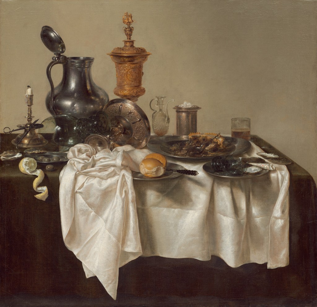
Willem Claesz Heda Banquet Piece with Mince Pie, 1635, National Gallery of Art, Washington D.C.Permanent collection
Other commentaries, however, point to other aspects of the painting – the fact that there is disarray, with goblets on their side, a half peeled lemon, the empty oyster shells and uneaten bread has been suggested as some to mean that the diners have taken the pleasures of the flesh, and ‘ignored their salvation, signified by the bread of life’, causing the National Gallery of Art to put it in the ‘omens of death’ category noted above. Other critics labelled this type of painting as ‘still life of disorder’ representing the ‘ongoing battle between vice and pleasure, virtue and abstention’ (Bryson, 2013). However, there yet another interpretation – to me highly plausible – which is that only the wealthy could afford to waste things in this way – particularly the half peeled imported lemon – suggesting that the painting was intended to represent the wealth and status of the patron.
This desire to portray wealth, riches and the fruits of colonialism seems to have become more and more marked throughout the 17th century, with ever more luxurious and valuable objects on display; Ming porcelains, Persian carpets, lobsters and so on, as in this later painting by a different artist, William Kalf. The paintings are different in composition, background, and the richness of the objects portrayed – another level of luxury in this later painting. I find it fascinating however that the image of the lemon could be so similar, suggesting that one of the symbolic interpretations above must have been right. Indeed, lemons have been calculated to appear in over half of Dutch paintings 1500-1650 (Pieper, 2018). The subject has not received very much scholarly attention, but in a Masters thesis dedicated to the topic, Pieper (2018) argues that ‘the meanings of lemons in Dutch paintings were multivalent’, including the symbolism of wealth, unease with this wealth, and the celebration of Dutch victory over Spain in 1609 to obtain access to the Meditaranean and trade in this fruit, as well as the more conventional purposes, such as this dark image by William Kalf.

Willem Kalf Still Life with a Chinese bowl, a Nautilus Cup and Fruit, 1662, “Asia > Amsterdam” at Rijksmuseum, Amsterdam. Source: https://upload.wikimedia.org/wikipedia/commons/c/ce/Still_Life_with_Chinese_Bowl_and_Nautilus_1662_Willem_Kalf.jpg
Some of these paintings even include the ultimate luxury – human slaves, which (horrifyingly) did not it seems, at the time, violate the conditions to be categorised ‘still life’.
While I admire the huge skill in many of these paintings, and in many cases find it hard to understand how such exactitude may be achieved, I do not actually enjoy looking at them very much. They do not seem aimed at beauty – rather an exposition of skill and expertise, and it is hard to know if this was what their purchasers or patrons were looking for by commissioning these paintings for their homes. It does indeed seem that they were rather looking for some demonstration of their wealth or nobility, either through the richness and luxury of the items portrayed, or through the superior (and therefore more expensive, presumably) skills of the painter that they had employed.
To think about later examples of still life, I took the advantage of a rare (in lockdown) visit to London to visit the National Gallery and picked out examples of this genre on my dash through the empty galleries. First, I wanted to see the originals of paintings in the Dutch tradition that I have discussed above, to see if I was more drawn to them in ‘real life’, but this is not the case, although I was even more amazed by the extraordinary skill exhibited.
Second, I wanted to see some later paintings of ‘still life’. The first painting is by Courbert (1871-2) of some fruit, Apparently this is part of a serios of simple still lives with apples that Courbet painted when incarcerated in Sainte-Pelagie prison in Paris for his involvement in the Paris Commune of 1871, where his sister often brought him fruit. Presumably, his choice of subjects was limited – but he certainly made the most of this one. The rich colours and the light on the fruit, particularly the apples are really gorgeous. The limited palette of both complementary reds and greens, combined with colours quite close on the spectrum makes the fruit bowl both comforting and deeply appealing. The rather mottled nature of the fruit suggests that it was possibly not the best fruit in the world, but pomegranates often are somewhat battered in appearance, and presumably he would have had to keep the fruit for some time. The simple dark background and the dull tankard set it off perfectly, while the elaborate baroque frame adds a note of incongruity. Given its simplicity and the context, it is about as far from the elaborate Dutch paintings above as it can be within the same broad genre. I suppose there is some vague connection, in the painter is appreciating something valuable and difficult to obtain, in the circumstances, but here – rather than revelling in the luxury of it all, seems to suggest a hunger for beauty, as well as for the subject of the painting that is a far cry from the gratuitous waste and unnecessary luxury of the Dutch still lives.

Gusav Courbet (1819-1877) Still Life with Apples and Pomegranate, 1871-2
The second painting is by Gauguin (in around 1890) apparently painted in homage to Cezanne of a painting from 10 years earlier, and seeming also to send at least a nod to the Courbet painting above, at last in the colour combination, although this is more complex. I love this painting, with the vivid, rich colours of the Mediterranean, and the multiple examples of complementary colours – the green and red of the fruit, the orange against the blue bowl and blue tankard. I note how these vivid colours contrast with the faded, less vivid colours of the paintings (presumably of the region) shown in the background, to make the eye focus on the darker, brighter fruit and the foreground, while together they form an attractive whole. It has various symbols to locate it in time and place and context (indeed, Gauguin was a prominent figure in the symbolist movement), but most of all it is a deeply pleasing image, and to me contrasts strongly with the Dutch paintings above. The main reason is that it feels as if it has been painted because the artist wished to create something of beauty, to play with colours and to pick up an artistic line (in the homage to Cezanne), rather than to make money or to demonstrate skill. But it may be that I am romanticising Gauguin’s motives, just because I like the painting, in a way that I would not for the (many) paintings of his that I do not like, and for which the motivations – or at least the story behind them and what thesymbolize, is deeply suspect.
Another painting I saw was by an associate of Gauguin’s – Van Gogh, of two crabs.
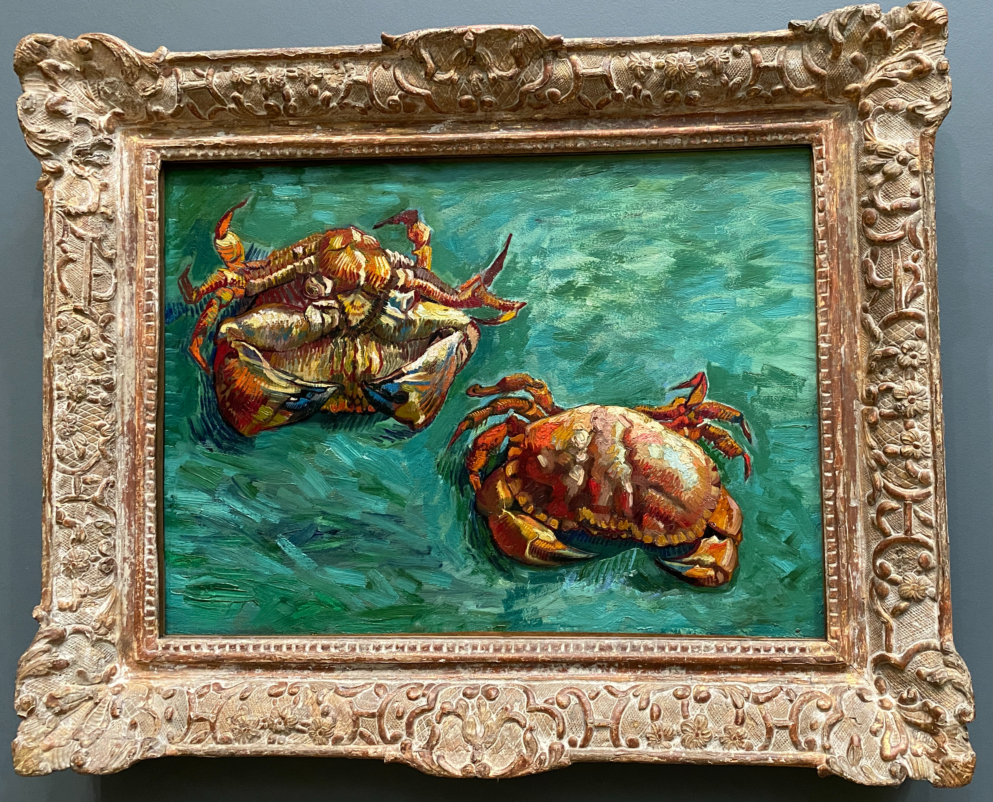
Vincent van Gogh (1853-1890) Two Crabs, 1889, National Gallery, lent from a private collection
This painting was apparently painted after van Gogh’s release from hospital in Arles in January 1889, a series of ‘crab studies’. Again, I find this a beautiful painting. The crabs (apparently the same crab on its front and on its back) may lack the intense accuracy of detail of the Dutch painting above, but the perfection of the colours and certain parts – such as the claws and the top of the shell make it like a Platonic ‘perfect form’ of a crab. It is (to me) a perfectly melded combination of realism and impressionism). They sit on (rather than in) a bed of green ‘sea’, which seems to me symbolic rather than realistic, and sets them off perfectly – the colour is (again to me, I know it is not perfectly complementary) a perfect contrast – and the green of the sea is picked up in the ghostly green of some parts of the shell. Likewise, the parallel strokes on the crab’s underbelly and over some parts of the shell mirror the (broader) strokes of the what the gallery’s description describes as an ‘exuberant sea like surface’.
I like all three of these more modern paintings than the older still lifes either from the Netherlands, or those that I wrote about in the earlier blog on Spanish still life. In their simplicity and rich use of colour, they seem a more honest artistic endeavour, a search for beauty that has to some extent in each in its own way, achieved some sort of perfection.
Exercise. Drawing in paint.
My house is rather cluttered, so the instruction to just pick some objects that happened to be there was hard to achieve. I located a corner of the sitting room where I could put a vase of dead roses (something I used as a model with some success in the first part of the course) against a red silk curtain and green wall. I liked the combination of colours and the contrast of the vibrant red with the dull black red of the dead roses, and the red-green complementary colours.
I drew first of all with a pencil, and then used acrylic paints to avoid the drying problem.

I was keen to get painting, and this is a very loose drawing – the trouble is that I forgot to take photographs of the different stages, including the point where I started drawing with paint – in pale brown, which was the whole purpose of the exercise. So here is the final drawing, or at least the stage at which stopped as it felt counterproductive to go further:
There are so many things wrong here that I hardly know where to start. I seemed to have a lot of trouble depicting the curtains, which seem stiffer and less flowing (or at least billowing) than they actually are – although they do have a certain stiffness. I got lost in the detail of the wooden detail on the wall, and the paint became hopelessly solid. The image is really too small for a still life, with too much of the other bits of the picture in relation to the flowers, particularly the old speaker on which they are sitting, which is not exactly an attractive object (I have given up a bit in trying to paint it, as you can see). I realised soon that I had chosen a very complicated bit of the wall (this is a Victorian house and has odd nooks and crannies in the walls, and this was a three surfaced corner. The only bits that I liked were the slightly violet white walls, which I had simplified drastically compared with what is there – this is an alcove with a white cupboard below and a crowded book case above – and the vase where I felt the smokey grey of the glass came out passably well. However, it taught me a few things:
- composition matters a lot in still life – there is a need to simplify the background and ruthlessly select the objects and target the light (in this image, the light is just coming from above and doing little for the image)
- you need to emphasise the subject of the still life and not draw attention away with distracting elements – here, I have chosen a green for the wall which is a very bright, distinctive colour – it draws attention away from both the curtains and the flowers, which is not in general what a wall should do. I had liked the colour – which is more vibrant even that what is actually on the wall – but this small patch of intense colour is not right – the background should set off the image, not be the story themselves.
- if it is a still life, there needs to be most of the objects being painted and less of any extraneous objects, which should be simplified out of the centre of the frame
- there are ways of playing with white, so that it isn’t just white (which it never is anyway, in real life)
- it is possible to use a combination of shaded graphite and paint to portray glass
Still Life with Flowers
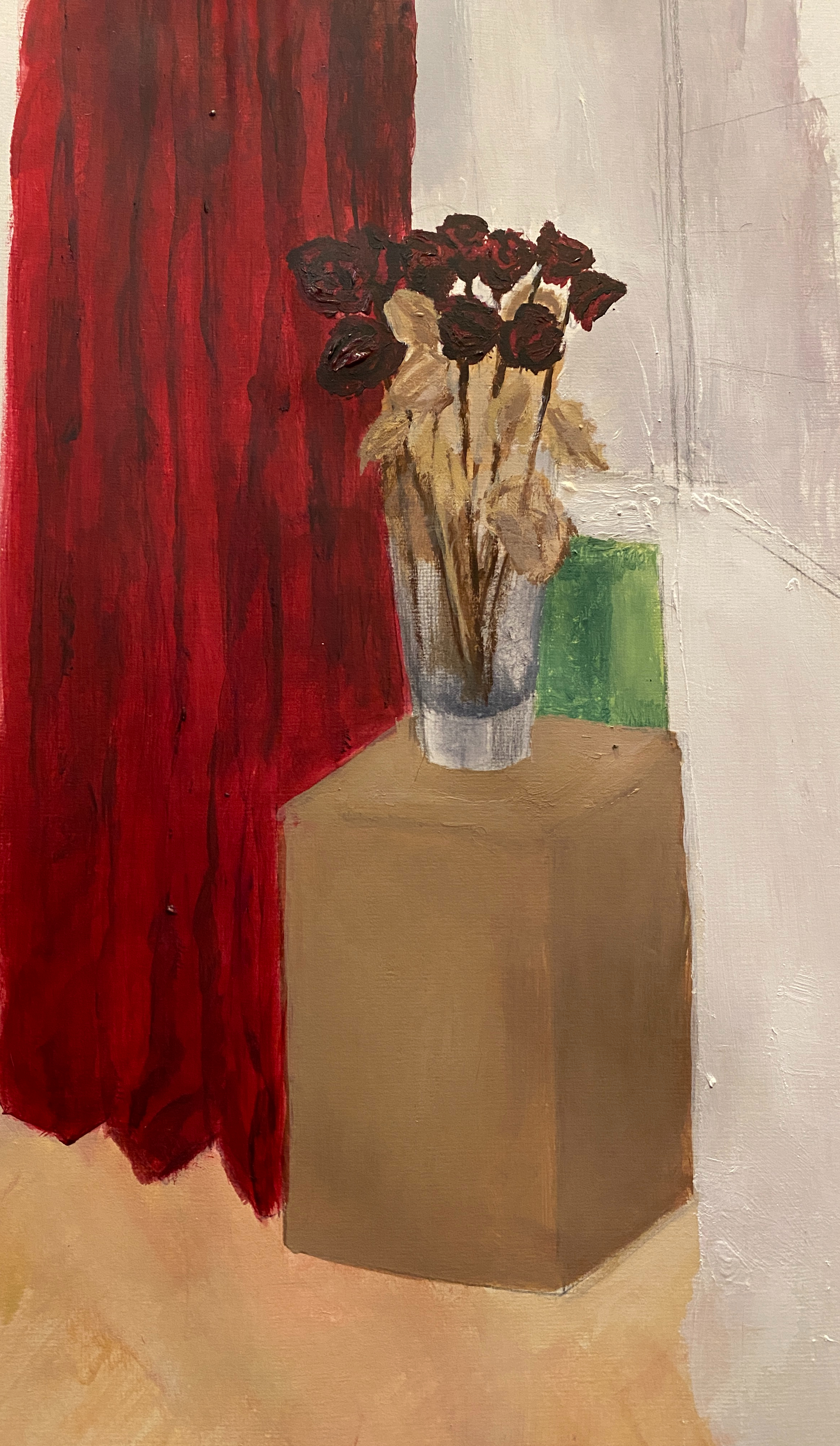
I went straight onto this one, because I felt that I hadn’t finished with the dead roses – I wanted to get a better image of them. I like the deep, dull, dark red and black of the buds, and the fragile crispy pale brown leaves, and the smokey interior of the vase, and I liked the idea of portraying them against a green wall (and I really like the green walls of my sitting room, obviously, as I chose them). This time I used an easel and I sat on the floor, where I placed the flowers next to the fireplace, which is a dull metallic black, with a slightly protruding alcove cupboard on the right. This time I worked in oils.
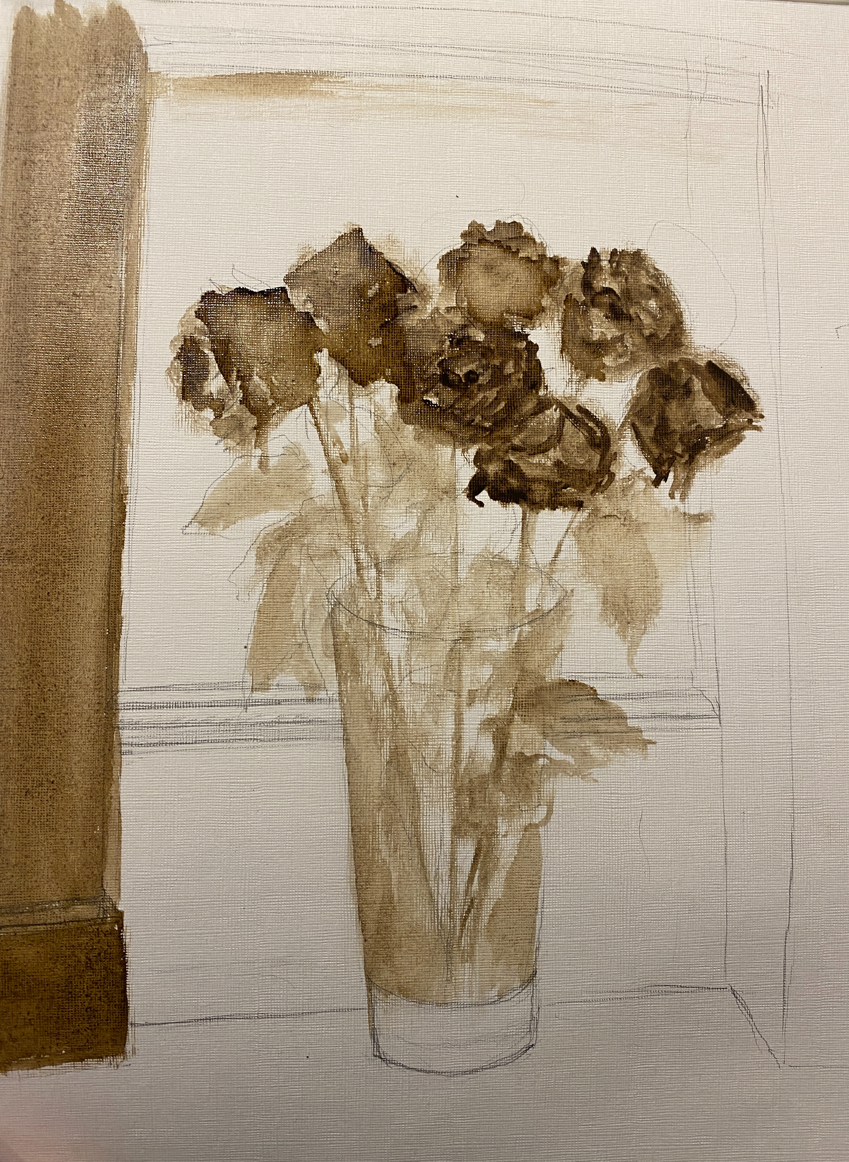
I drew first in pencil and then in diluted raw umber, as above. I quite like this image. The diluted paint is actually good for the leaves, and I went quite dark for the darkest bits of the roses, with the aim of layering up as illustrated in the OCA organised session with Keith Ashcroft that I attended in Part 1.
If I had the time again I would have stopped there and really thought about the next stages, as this was probably the high point of the painting, rough and unfinished as it is.
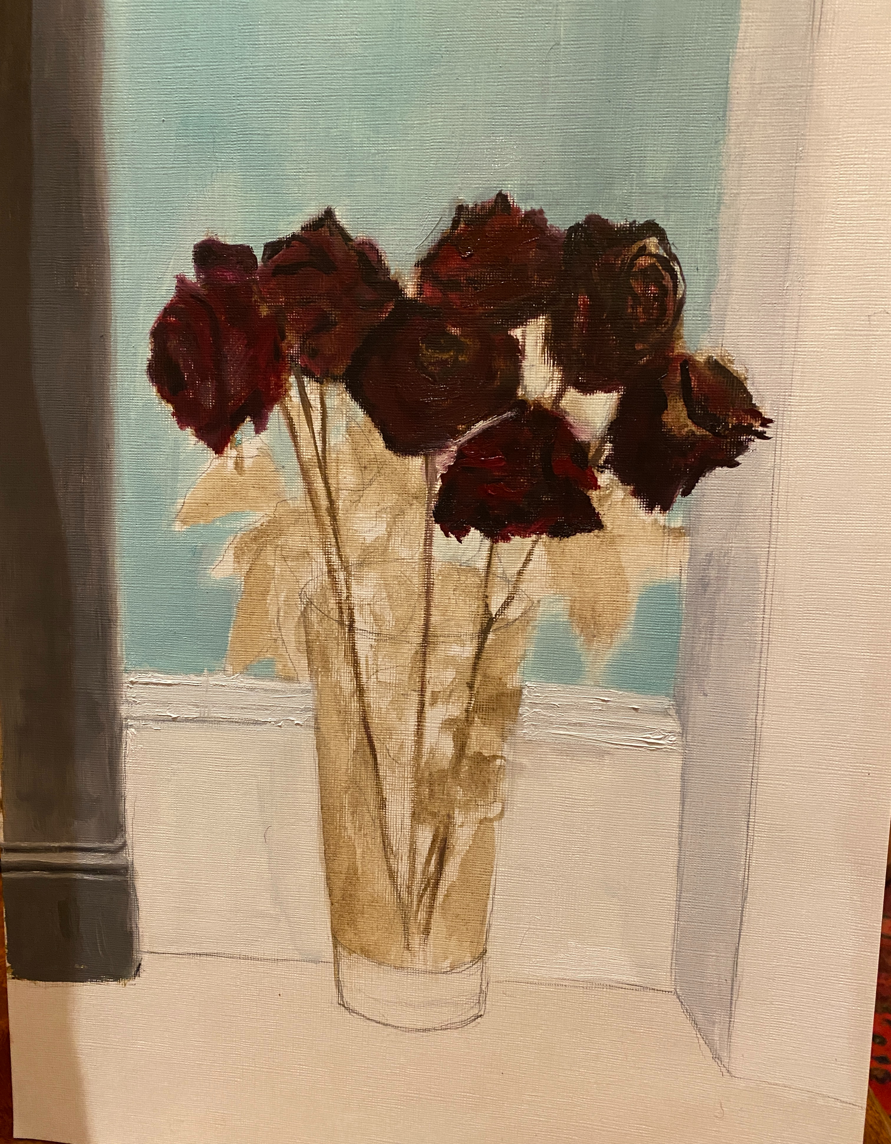
I then started to fill in some of the colour – the green of the wall, and the dark, dark red of the roses. This image shows that it has become rather crooked, and the edge of the cupboard is too large compared with the angle at which was looking at it. The photograph itself is rather crooked, so it looks worse than it is, but even so I realised a ruler was needed. I quite like the way the flowers have developed, but the darkness means it is difficult to see any layering that is in fact there.
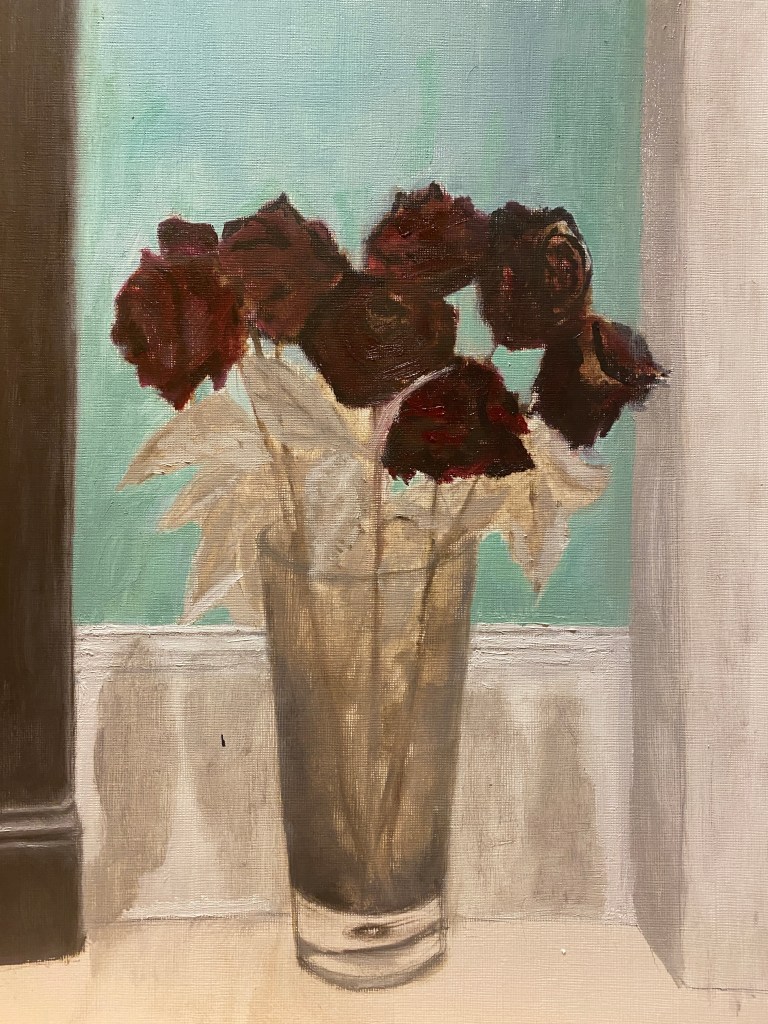
The next version is more finished, and I have corrected some of the errors above. I have straightened it up and narrowed the side of the cupboard, and given a bit more substance and volume to the pillar at the side of the fireplace, although it was tricky because I was viewing it almost head on, with just a hint of the side showing, The leaves are now really problematic, and I am wishing that I had left them as they were at the beginning, with just a hint of detail- they are now rapidly becoming overworked, without gaining anything in the process. I quite the like some parts of the inside of the vase, where the dead leaves have sort of coagulated, but it looks very two-dimensional and I am not sure what to do about that. Finally, the shadows on the skirting board are dreadful – and I am thinking I really need a whole course on shadows. They seem too dark; looking at them in real life they did seem dark, but sometimes you need more than a mere reproduction of what you see to get an idea of it.
Exercise. Drawing Natural Objects
This exercise I did as a combination of an exercise, and the last part of the research point on the genre of still life (see above), because I attended an online workshop run by a local artist Kieran Stiles on the paintings of Robert Dukes, and how to paint in this style.
Dukes is a contemporary painter who paints dramatic, highly coloured images of fruit, among other things. He was apparently inspired by the still life paintings of Euan Uglow, who also uses dramatic use of colour and form to create extremely appealing images of fruit, as below. You can just about see in these apples how he picks out the planes of the surface of the fruit to make a three dimensional object, and in some of them this kind of ‘sculpting’ by delineating lots of tiny planes is even more apparent or emphasized. The shadows are dark and create atmosphere, in spite of being only hinted at, and the colour is used carefully to pick out the fruit – the top right of this is dark red and speaks to the red patches on the apples, while the wall is a lighter version of the shadow, or at least this is how it seems to me.
Euan Uglow (1932-2000) Two Apples, art.uk
Dukes takes this a stage further with his even more dramatic use of colour. There is a lovely recent exhibition here at Browse and Darby. You can see from these images that Dukes seems to take Uglow’s technique to another stage of abstraction, where the surfaces of the fruit are depicted with colour and light, the colours are even more dramatic and the images are simplified, yet with subtle blocks of colour emphasizig the planes of the surface of the fruit.
One of the important things that I learnt in this workshop was the perspective lines of fruit, not something that I had really thought about before. That is, we should think of each piece of fruit as a globe and draw the two sets of perspective lines, as follows.
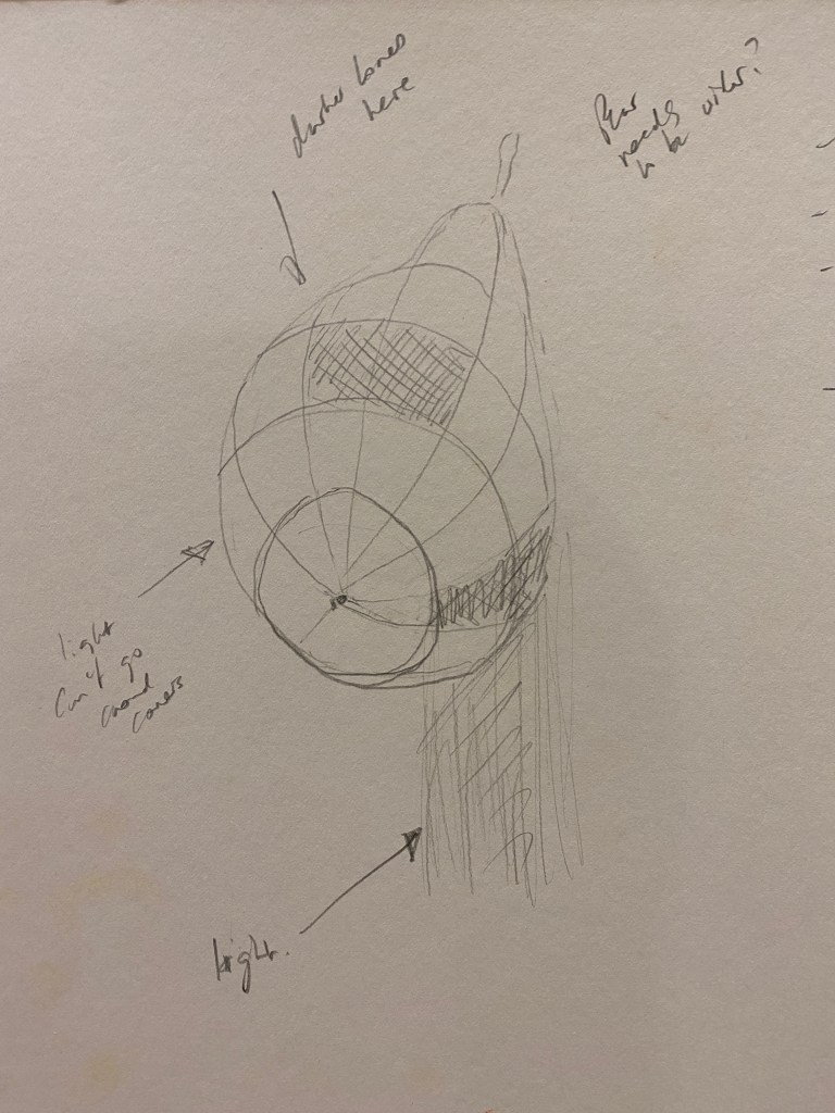
The next key point was that the blocks of colours should follow – rather than crossing randomly – these lines, so that each block should be, to some extent, inside these lines.
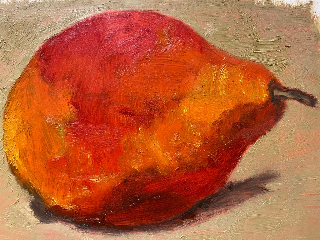
I was pleased with this image, and the artist taking the workshop said that it was ‘flawless’ which obviously pleased me hugely. But in the end, although I had used an actual red pear as well as the images by Dukes to create this image, it didn’t feel like a purely observational piece, but more a (reasonably good) mimicking of this artist.. But it did break me out of a logjam that I was in, where I didn’t seem able to move forward with the course, so I was happy for that, and approached the next exercise with enthusiasm.
Exercise. Still Life with Natural Objects
After this I moved on to purely observational painting of two lemons, as below (only they moved during the course of the painting). Lemons seem such a classical element in the still life paintings that I have looked at and researched, and are symbolic for all kinds of reasons, especially in Spain where they also assume such importance in cooking and eating (they even squeeze lemon juice on crisps).
I started by deciding the colours as above. I painted the board that I was using (this is A4) yellow, with the aim of using the same technique that I had learnt in the workshop, but choosing instead complementary colours of yellow and purple. I drew roughly in pencil the 3-dimensional planes of the lemons, and I fear you can still see my pencil lines even in the finished product.
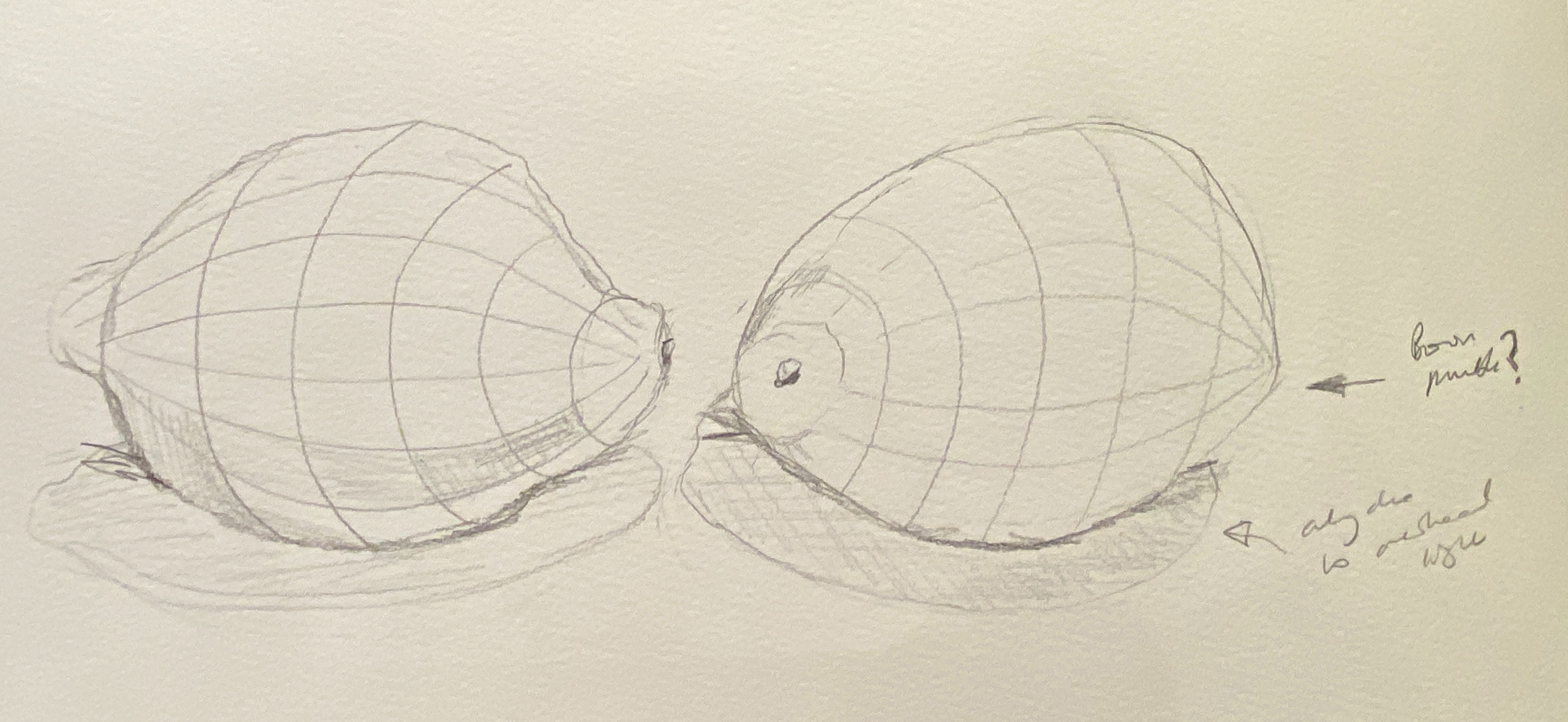

After the drawing, I started painting, using the reverse side of a piece of board that I had used for a previous exercise long ago.

These were clearly not right, on any level, but I had got to the point where I felt as if I were moving paint around everytime I touched them, and not very productively, so I left them for a week, with the idea of returning to focus on the shadow, to move it further up (having studied the real life lemons in details, and adjusting the colours for both lit and shadowy part of the lemon, which is notoriously difficult to get right, apparently..
This was the final result:

I am quite pleased with this. Clearly there is much that could be done – the line of the shadow should be smoother, there is more I could do with the darker part of the lemons, particularly the left hand side one, where I wonder if it should be higher. There is some lack of definition on the top of the left lemon (which was my favourite, but now I prefer the one on the right), which I could alter but find that I quite like (Dukes, it seems, sometimes leaves spots of the colour of the fruit on the background). But overall, I am pleased, I have made progress and I don’t want to jeopardise that by looking for improvement in something that I do, at last, actually feel pleased about, for the first time in this part of the course.
Project. Colour Relationsips.
Exercise. Exploring Contrasts.
Here I followed the exercise, and felt that I achieved the desired results, first of all with colour contrasts on a grey background, as follows:
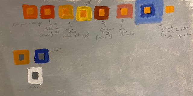
I used cadmium orange, cadmium red light and cadmium yellow, moving on to Crimson with orange and finally cobalt blue. I noted the changing contrasts in my sketch book – the close colours did seem to have the effect of cancelling each other out. One other observation was that both the red and crimson made the orange seem brighter – not because they are complementary, but possibly because they clash unpleasantly. The cobalt blue was not the perfect complement for the orange (I think the orange should have had more red) but it still made it brighter. For the grey, the contrast was greatest with the white surround, as would be expected. The most interesting contrast for me was that putting the lighter blue surround on the cobalt blue surround to the orange made it notably brighter. I am not completely sure why this is – but I will remember for future exercises.
Exercise: Successive contrast
I started off on this exercise cynically, thinking that it could not possibly work, but I found it fascinating – looking first at the red circle below and then at a blank sheet of paper (I did need the pencil mark on the white sheet of paper, though), and seeing the light green (with a touch of blue but not enough to be turquoise) translucent penumbra of light. I understand the theory, I think – but I am a little unclear as to how you could use it in a painting. I am wondering if some paintings that I have looked at it in the past have used this effect, and I haven’t noticed as I did not know to look for it.
Exercise: Still Life Colour Studies
Still Life with colour accuracy – and complementary colours.
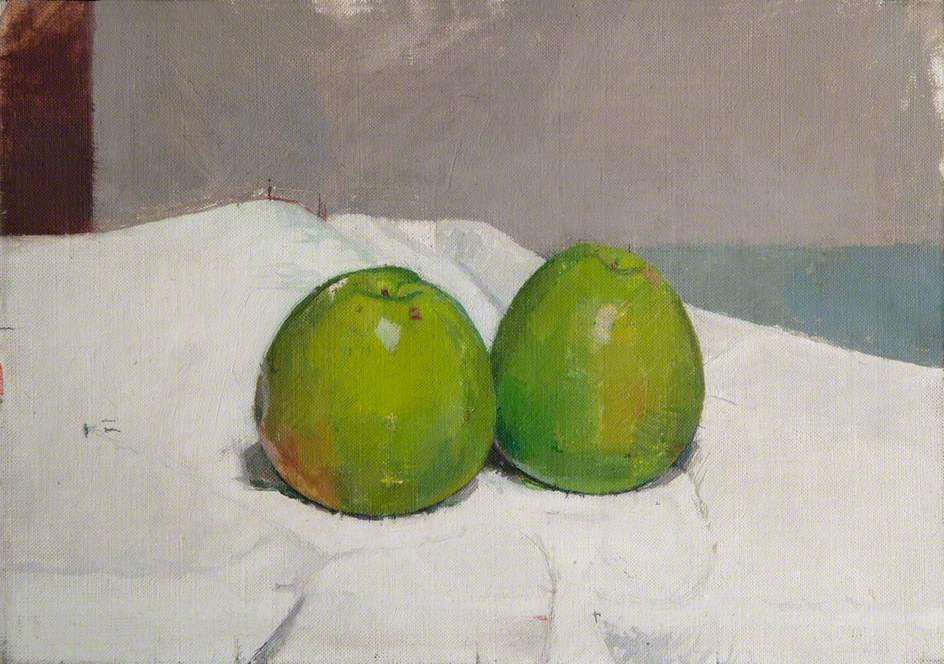
After a few false starts in the selection of objects, I chose a blue bowl with two clementines in. The description of the exercise mentioned that you might select some interesting or exciting colour combination, and I have always been drawn to blue and orange. I wanted to practice painting fruit in a bowl too, as my lemons and pear had been rather free standing. Also it was something that could easily be reinstated after a meal and so on, as I was using the kitchen table.
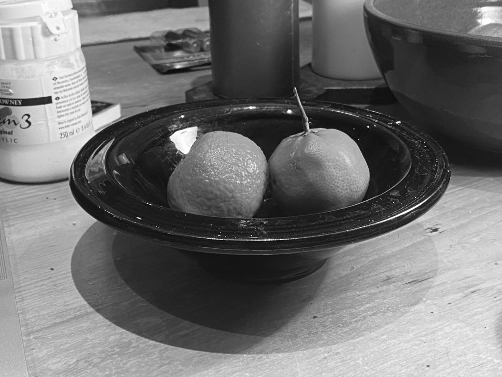
I started by taking a black and white photograph to get the tones, as below. The bowl is a kind of blue black with a black rim, but the photograph shows how very deark is the blue, as you hardly notice the difference in tone between the colours, while the orange of the clementines is about half way between those colours, and the almost white of the reflection.
I did this in acrylic because I wanted to move a bit more quickly, after spending a couple of weeks on the lemons.
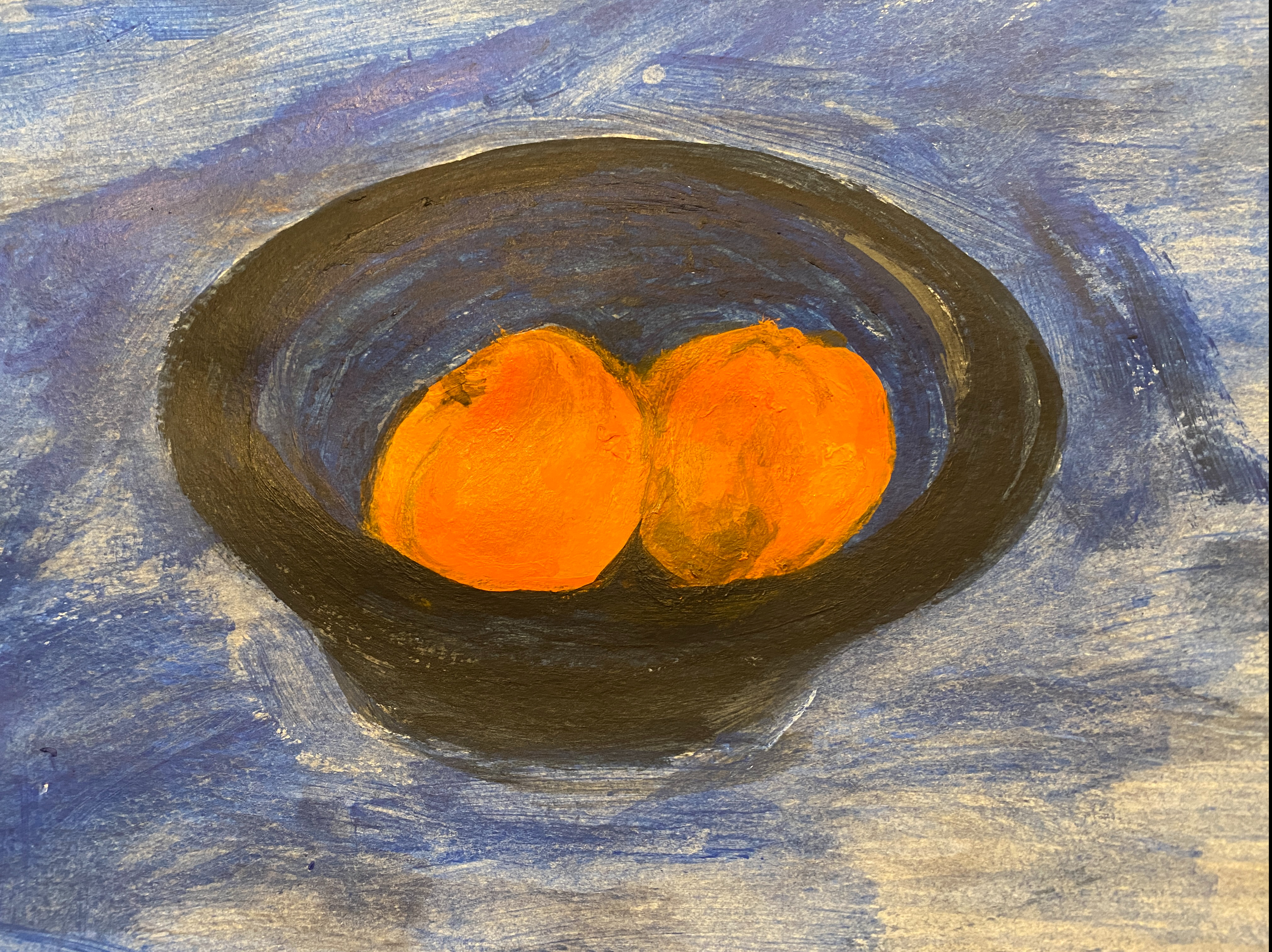
This was the first attempt. I thought to use a lighter blue wash to heighten the contrast between the fruit and the bowl, as in the exercise on contrasting colours. Here however I have gone too dark, and the contrast is having the opposite effect. The instructions for the exercise say comfortingly not to worry too much about line, as it is an exercise in colour, but I think here I have gone a little far in that direction (some preliminary drawings were much better) so I have corrected the image in the final version.
Here is the result. As with the lemons I found the colours on the clementines really hard to achieve, and I am still not convinced that the darker shadowy bits are right. However, I am quite pleased by the basic colour of the fruit which seems right, at least as so far as things can when you move from oil (as with the pear and lemons ) to acryllic, where the colours never seem as good, somehow, or at least as deep and glowing. I was amazed by how much red (I used cadmium red light) the clementines seemed to need, making me wonder how orange these fruit actually are, I have lightened the background to strive for the effect of the previous exercise, and I think it has worked, to some extent – the contrast is strong. I think the bowl is the right colour as well, with the tones reasonably representative and the reflection seems almost right.
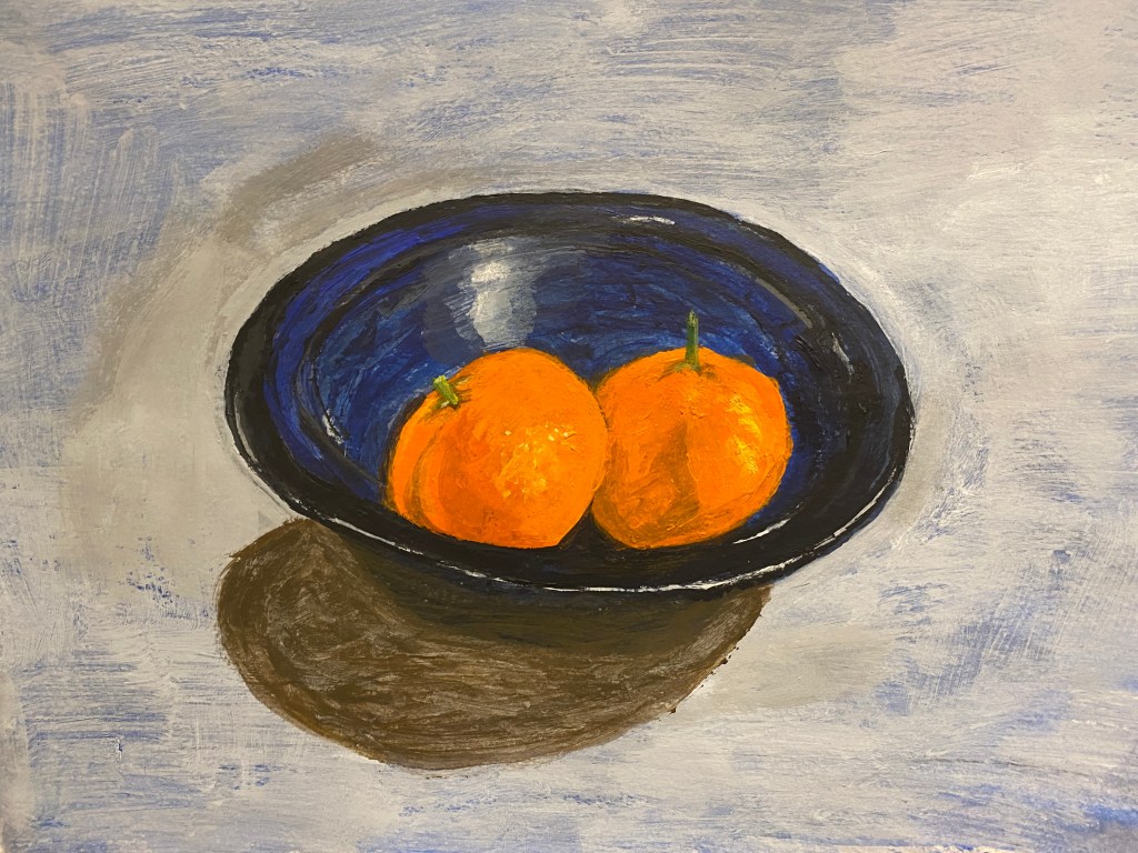
I experimented with the shadow, with which I have had such problems in the past. I used a combination of Prussian blue, orange and red – aiming to get the broken colour that comes from mixing complementary colours. I am actually really pleased with this – I know it is not right, it is too dark, but I love this colour (half brown, half grey) for shadows, and I will carry on working on this technique until I get it right.
Still life with colour used to evoke mood
Next I took the other option available, which was to evoke mood. The problem here was that the image I had chosen was not very conducive to mood. That is, to capture the complementary colours was to capture a lively cheerful image, it seemed to me – and with the same objects – this was difficult to get any other kind of mood (unless I have misunderstood the instructions, which to be honest were not terribly clear). So here, after reading the instructions for this sub-exercise, I decided to go for a muted image of the original. I think I have seen some still lives like this, with very muted, even faded colours. I never quite see the point of them, but anyway, here is the attempt:

I think I have ruined this though by doing the reflection on the bowl and the fruit, so it doesn’t look so muted after all. I like the shadow though – the same technique as before only lighter. You notice it far less – and I do think it is right for a shadow. I am pleased with that if nothing else. I do wonder though if I have understood the exercise right – and if really you were able to go off and choose wholly other colours, in which case I might have used red and purple, or some depressing mixture of colour to depict a very different mood.
Project. Drawing and Painting Interiors
I identify very strongly with the leading sentence of this project; “A major challenge in painting or drawing an interior is simplifying or finding focus in the complexity of the subject.” My house is very cluttered, for no very good reason other than that I have accumulated a lot of things over time – from my late parents (I was an only child) and various relatives, as well as my own life and that of my partner and son (although to be fair, they are less responsible than I). I intend at some point to go right the way and apply ruthlessly the William Morris test (have nothing in your home that you do not know to be useful or believe to be beautiful), but there always seems to be something more important to do. Also, I can’t help noticing that the homes of William Morris enthusiasts tend to be rather cluttered too. Whatever the reason, therefore, my house in no way resembles the modernist oasis to which I often aspire, and simplification of any possible image of the interior for painting is a major task.
Research Point 4. Dutch genre painters.
I am familiar with Vermeer (1632-75), but not Samuel van Hoogstraten (1627-1678) or Jan Steen (1626-79), so I looked at these first. However, Steen’s paintings seem all full of people, which seemed to me outside the spirit of the exercise, and I found them unappealing in any case – crowded, sometimes salacious and bawdy, yet stylised, and of a time to which I do not feel drawn. I can see that he is an excellent representation of the genre, but the only parts that I liked were the glimpses into other rooms, little vignettes of a servant preparing food in the kitchen and so on. I think we are all drawn towards such images, which is why it is difficult not to peer in through windows of houses going past in the street, especially in winter when they are brightly lit.
Samuel Hoogstraten I found far more pleasing, with clean, yet richly coloured images of interiors, with few if any people in them. He was famous for his three dimensional ‘peepshows’, images of interiors in wooden boxes which are very attractive, and even his paintings have a somewhat three dimensional feel. I particularly liked this oil painting of a detail of an interior. It has an air of mystery – the viewer it seems is already in a room, that you see barely a glimpse of – just the richly tiled floor- and then another door, with a key in the lock and a corridor, going from one unknown room to another, seeing just a table, a chair a candle and a picture. There is a sense of depth from the perspective on the tiles – yet it feel very near and and intimate. A bright light flooding in, presumably from a window on the right, enhances the sense of mystery and attraction of the image, making the yellow tablecloth and chair glow, especially against the dark shadows and floor.

View of a Corridor, circa 1670, oil painting, 103cm x 70 cm, Louvre Museum.
It seems that this wasn’t the only time that he used this subject, as the following painting has the same title:

View of a Corridor, Dyrham Park, 1662, 260 cm x 140 cm, https://commons.wikimedia.org/wiki/File:View_of_a_Corridor_1662_Samuel_van_Hoogstraten.jpg.
This larger, grander and more complex image is also attractive – with the sense of travelling through the rooms, grounded by the broom, the foot of the stairs and particularly the dog in the foreground. There is the same sense of mystery, this time provided by the couple talking in the next room (the man’s face reflected in the mirror) and the little details of a piece of furniture in each room, all giving the sense of distance and brought together by the rich red and brown furnishings. The same trick is carried out with the floor tiles in terms of emphasizing the perspective with careful spacing and diminishing size of the tiles, and their continuation, in different colours, through to the last room. It is a very attractive image, particularly I think because of the careful choice (and limited range) of similar, rich, warm, colours. The more you look at it the more you notice – the map on the wall, for example, and the bird cage high up in the ceiling. The interior is evidently of a grander dwelling than the earlier image. However, I think I still prefer the first one above, for its simpler, starker focus on the corridor itself. Somehow I find myself more interested in the residents of this interior, for all there are fewer signs of their occupation. It is a far less complex image, but seems to pack in an equal amount of mystery, intrigue and sense of what is beyond.
Finally, Vermeer is different again, with his incredibly rich depictions of both people and interiors against dark backgrounds, and rich fabrics painted in incredible detail. I particuarly noticed this image of a woman playing the virginal, with a man standing beside her.

Johannes Vermeer – Lady at the Virginal with a Gentleman, ‘The Music Lesson’, 1662-5, oil painting, 74 cm x 75 cm.
This is a gorgeous painting. For the phenomenal colours alone, particularly the floor, the carpet and the skirt of the lady, I would want to gaze at it. The painting of the design of the tapestry cloth is both seemingly faithful to the original yet, potentially even richer and more beautiful. Both this cloth and that of the woman’s skirt is almost luminous in the richness of the colour. Everything is picked up at some point in the images – for example, the details of the windows seem to be replicated, far tinier and more delicate, in the virginal – the perfect white of the jug on the table in the frills on the man’s shirt and so on. You are drawn into the depth of the room by the diminishing size of the tiles, and the slope of the beams on the roof. In the mirror, it seems as if the woman’s eyes are slanted over towards the man, which makes the viewer wonder if this is more emotionally charged than a mere music lesson. The light on the nearest part of the window frame is really lovely. Although I realise that the human drama is intended as an important part – even the subject – of this painting, I find it self sufficient without that – I found myself drawn more to the absence of the humans in the first painting above than I do to this couple – whose significance to me comes from the complementary richness and detail of their clothes, and their place in their painting as a whole. However, I am well aware that Vermeer painting some incredible portraits, where the humans were clearly centre stage, such as The Girl with the Pearl Earring, in spite of the beautiful clothing and ornaments which, as in this case, sometimes made their way into the title of the image (and indeed, the subject of the book of the same name by Tracy Chevalier).
Exercise. Simple perspective in interior studies
I moved straight to this exercise, as the previous research point I have done before, in Part 3 of Drawing 1. In March 2019 I spent three weeks alone in Washington DC, focusing on this topic and trying very hard to learn perspective by drawing the streets and around Capitol Hill. I chose the hall in my house, because you can see it from the kitchen and there are lots of interesting angles – and, most importantly, less clutter than the rest of the house (although I still had to remove 10 coats from the bannister and my art portfolios from the corridor.
Here is the first attempt. I chose a vanishing point above the letter box in the front door and worked to that, although of course the stairs coming down introduce another plane which does not conform to a vanishing point. It seemed to go alright, but when I looked at the finished image, I realised that the stairs were going all the way to the front door, which was clearly not right.

The next attempt didn’t look so right, although this time the stairs did not stop in an impossible place. I forgot to take a photograph at the right moment, but it is shown here with the painting started.
I carried on painting, depicting the colours more or less accurately, but I left the floor, with the Victorian tiles, and showed it as vertical lines and the colour of wood. The image struck me as, well, boring, which seemed strange as I always think of the entrance to this big Victoria house as being quite appealing. But thinking about it, I realised that of course that what people notice when they come in is the tiles – which aren’t in the picture.
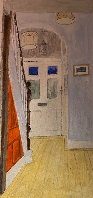
I didn’t feel that this image was worth investing the time of trying to paint the tiles, a daunting task because it is a very complex pattern. But in the end I thought – well, how would you portray them? So I made an attempt to simplify and paint the pattern as follows.
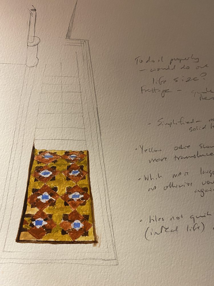
I think the colours are reasonably accurate here, and there is the feeling of the floor about them, without having tried in this small an image to replicate the entire complexity of the pattern. But I think if you wanted to really depict the pattern, you would need first to understand it fully – and the best way to do this would be a frottage of a couple of entire tiles. If I had not been so late for my assignment, I would have done this – it would have been quite a relaxing process I think, a bit like doing a jigsaw puzzle.
With respect to the depiction of the interior, however, I am not sure that this would have been time well spent. The best thing to do would probably have been diagonal tiles, as in the interior of Hoogstraten above, perhaps in mustard and terracotta with a touch of blue or white in the corners, which would have given the same impression – and sense of perspective – without trying to capture the pattern.
References
Bomfrod and Roy () ‘Colour’
Bryson, N. (2013). Looking at the overlooked: Four essays on still life painting. Reaktion Books.
Chevreul, Michel Eugène (1839). De la loi du contraste simultané des couleurs et de l’assortiment des objets colorés. – translated into English by Charles Martel as The principles of harmony and contrast of colours (1854)
Chevreul, Michel Eugène (1855). The Principles of Harmony and Contrast of Colours, and Their Applications to the Arts (2 ed.). London: Longman, Brown, Green, and Longmans. Michel Eugène Chevreul.
(English translation)
Fiore, J. (2018) ‘In Dutch Still Lifes, Dark Secrets Hide behind Exotic Delicacies‘ Artsy, 4th September. https://www.artsy.net/article/artsy-editorial-dutch-lifes-dark-secrets-hide-exotic-delicacies
von Goethe, J. W. (1810) Zur Farbendlehre, JG Cottaschen Buchhandlung, Tubingen (first published in English, 1840, Theory of Colours, translated by Charles Eastlake).
Piepmeier, M. (2018) The Appeal of Lemons: Appearance and Meaning in Mid-Seventeenth Century Dutch Paintings, MA thesis submitted to University of North Carolina at Chapel Hill, Department of Art (Art History) in the College of Arts and Sciences.
Response to Tutor’s Report on Part 1.
My tutors report was extremely useful, and I respond to the comments below.
Overall Comments: You have worked and adhered to the projects in a productive way. You are understanding the technical aspects of colour
and tone. Where your work is exciting is when you work with abstraction (initial
landscape daring and the magnified monochrome piece.) Other times, you are a little
timid so the work lacks a sense of dynamism. However, for the first submission you
have been open minded. Take more risks with your subjects and the application of
paint.
Assignment 1 Assessment potential
“You may want to get credit for your hard work and achievements with the OCA by
formally submitting your work for assessment at the end of the module. More and
more people are taking the idea of lifelong learning seriously by submitting their work
for assessment but it is entirely up to you. We are just as keen to support you
whether you study for pleasure or to gain qualifications. Please consider whether you
want to put your work forward for assessment and let me know your decision when
you submit Assignment 2. I can then give you feedback on how well your work meets
the assessment requirements.“
Response: I do wish my work to be put forward for assessment, as I did in Part 1. It is not that I am in need of a degree, but I know now from experience that this is the best way that I can keep motivated and keep painting, so I value greatly the opportunity to work towards the end result of a degree qualification.
Feedback on assignment
Demonstration of technical and Visual Skills, Quality of Outcome, Demonstration of
Creativity
“You have started to work loosely immediately in ‘getting to know your brushes’- well
done as this shows an ambition straight away. The initial landscape is fluid and
expressive. You then work more technically with the tomatoes so there is good
observation happening. Layering up tones and textures gives convincing form to the
subject. You have been open minded.”
Response: I was very pleased with these comments, although I really need to take heed of the comment that the ‘trying out the brushes’ piece – where I hadn’t thought about it and was not really trying to achieve a realistic image – was far more expressive and one of the more successful paintings. My tutor on Drawing 1 said the same thing quite often, and it is evidently right.
“Monochrome– the first piece is detailed and the use of colour is strong and bold. This
gives a great impact to the trees. I agree the second piece is too much of a wash
and has not worked. The third attempt has more of an abstracted response and the
magnification is engaging. As you say, an enticing hue and tone.”
Response: I agree very much with this, and looking at it, I am sorry that I even submitted the bad second image. For the final image, although I think it has worked much better and I still love that green – the trees themselves are flat and I could have done a lot more here to work them into rounded trunks. This is something I will work on in Part 5, where I am planning to focus on darkness between things – holes, gaps and so on.
“Different coloured backgrounds– the piece on the dark background is a little too flat
so we do not see the details and form coming through. However, the white
background is much more successful as it is luminous. The reflections and highlights
have come through so we see the shape and the surface texture of the jug. Just a
little more concentration on balance and symmetry is needed.”
Response: these comments are spot on. Yes, balance and symmetry is a persistent challenge for me and I need to pay more attention throughout the course.
“Assignment– technically you have worked well with light to dark transformations. You
have focused on harmonious colours to make for a calm scene and some
atmosphere. There are subtle textures which gives some essence of the clouds and
the fields. However, as you mention is it an engaging image? There is depth in the
scene and perspective but with more enticement of perhaps the colours, it would
appeal more.’
Response: I agree with these comments too. Technically it is better than many things that I have done – but it is too timid and dull – too safe also, there is nothing really difficult here, given the lack of precision needed to represent either hedges or clouds. I think also, I took the instructions for the assignment too seriously – that it must be strictly representative – and could rather have played with colours and light contrasts. And the choice of the landscape was something that appealed to me – I love fields and days like this – but I should have thought more about how it might be perceived by the viewer. The appeal of a view like this is actually quite a delicate thing, and that therefore oil paint was not the right medium – this should have been a watercolour, or at least I should have used very diluted paint. My desire to try out the techniques I learnt from the Ashcroft session should have been satisfied on a different image.
Sketchbooks: Demonstration of technical and Visual Skills, Demonstration of Creativity
I can’t see many example of the sketchbook. It would be good to see this next time.
Use it as a space to play, make mistakes and see what paint can do. Do quick
drawings of anything that inspires you, which you might take forward into further
projects. Use it to play with different painting media and discover things you have
never thought of doing. Don’t be worried about refinement and any ‘final’ work in
there.
This is the link about keeping sketchbooks:
https://www.oca-student.com/study-guides/keeping-sketchbooks
Response: It is true that I don’t really use the sketchbook enough in this way – in part because most of the sketches I did here were on loose bits of paper and so on. I will try to use the sketchbook more next time, although I have to say that the demands of the learning log often outweigh that of the sketch book – because it seems a poor use of time to write everything down twice. I tend to draw when I am at my desk working and so on, or on paper or card when I am painting, and should try harder to move these loose drawings to the sketch book.
“Research:
Context, reflective thinking, critical thinking, analysis
Your research on artists is in-depth. You have not only analysed them but dug in
deep to find meanings and contexts. You have the ability to research well. It would
be useful to build up your contextual understanding by independently looking at other
artist that relate to your work. This way you can see how to push what you have; a
mixture of historical and contemporary artists. Also, when annotating, discuss how
they link in with your work so the theory and practice is entwined.
Response: This point about looking at other artists in relation to my own work is also something that my previous tutor commented upon, and I thought I had begun to do, but seemingly not. I must try harder to do this – I guess that there is a certain reluctance to compare myself with any proper artists, but I think that at last, belatedly as can be seen from the end of Assignment 2 – I have begun to see how crucially important this point is to my future work.
“Learning Logs or Blogs/Critical essays
Context, reflective thinking, critical thinking, analysis
Your log is detailed of your progress and you addressed your progress well. You are
being objective and reflective with your work and identifying where work has need for
improvement as well as the successes.
Suggested reading/viewing
Context
• Georgio Morandi- using limited plates and giving a narrative to everyday
objects.
• Charlotte Verity- sensitive and expressive use of media in her tree drawings
• Gerhart Richter- Atlas series- using scrapping and building up textures
• Peter Doig- atmosphere and narrative in the work.
Response:
With the suggested artists to look at, I am very familiar with Peter Doig and wrote a research point on his work in preparation for Assignment 5 of Drawing 1, and made some tentative allusions to his work (actually, looking back on it, too tentative) in Assignment 3 of that course. But for a painting (as opposed to drawing) course, there may be more scope to do this, and I will certainly think of it for subsequent assignments.
Charlotte Verity I was not familiar with, and I loved the delicate images with fantastic colours, particularly the pale blues and this great and surprising orange in an otherwise delicate image, which I would have done well to remember for the Assignment 2:
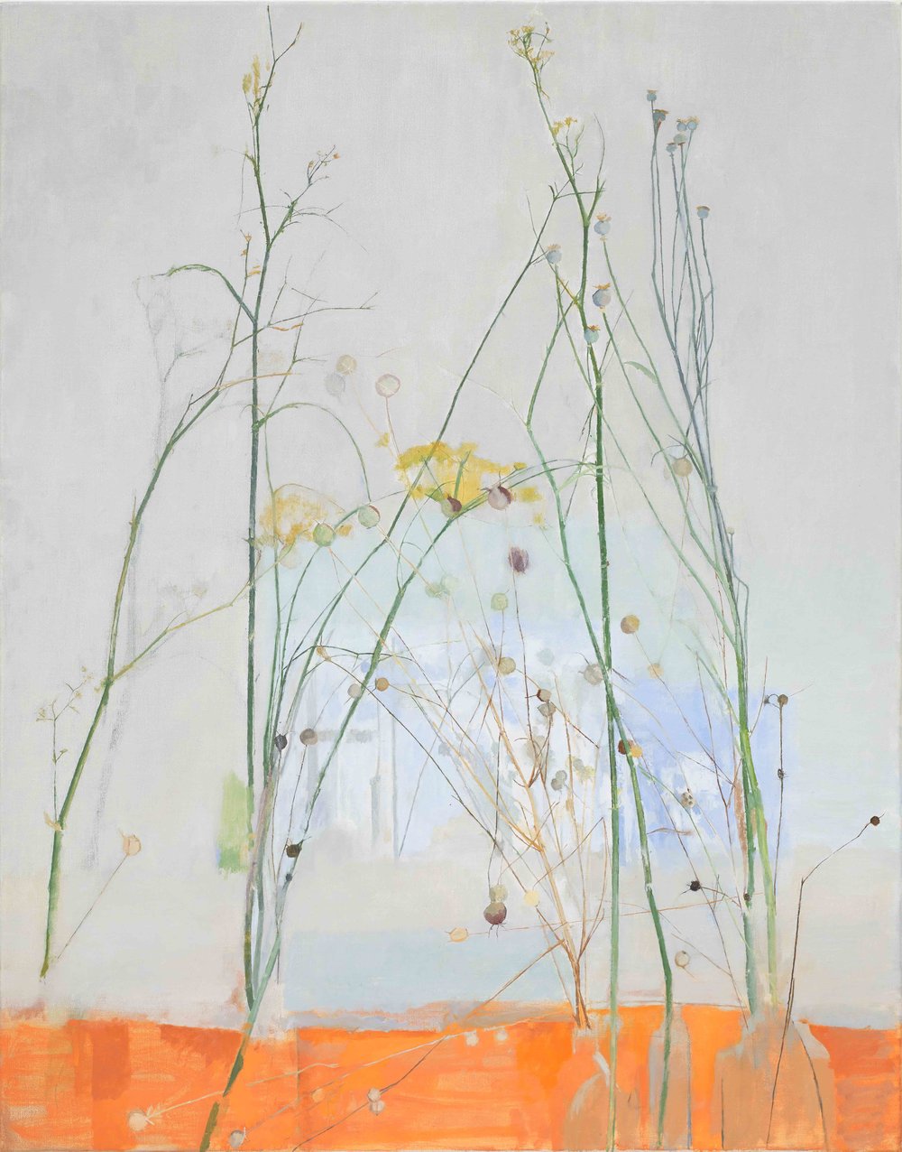
It seems to go against all that you might learn for designing a picture – with such a bold colour that you would think would outshine the delicacy fo the flowers or the pale blue – but somehow it complements them (as you would expect from the colour wheel but not with such difference in shade and tone).
Gerard Richter I am familiar with, but only I now realise a few elements of his long, varied and incredible career, where there are so many different phases. I was very attracted to his Colour Chart series, and the way that he wrote about photography and its relationship with painting. I had not seen his Atlas series, which was really interesting to read about. I wondered how he would have approached this in the digital age – like many people with a smart phone I have literally thousands of photographs on my phone and since starting this art course, take more and more – a cloud, a hedge, the light on the river and so on. I wonder what it would be like to try to organise them, but I have thought about it and maybe this could be a project for one of the courses to come. I noticed in the Keith Ashcroft session that I attended that he collected old photographs and uses them as subjects, and this is something I have also been thinking about. I have just cleared out the house of an elderly uncle and aunt of mine, finding many many old photographs. Many of them – holiday snaps from the 1970s taken with apalling cameras and by my uncle, a terrible photographer – I threw away. But some of the older photographs might form interesting subjects for Part 3 of the course. Given that we seem set to be locked down for the whole of January and February, there certainly will not be many human subjects around to draw from.
Morundi is another painter that I don’t know much about, and I can see the attraction of his calm, sombre still lifes. They are not the kind of paintings that I would have been drawn to in the past, given my antipathy to the still life genre and my thirst for colour and light, but I look at them with new eyes after starting this course, and can see how brilliant – and difficult to replicate – they are.
“Please inform me of how you would like your feedback for the next assignment. Written or
video/audio”
Response: I am really relaxed about this – and am happy to go with whatever my tutor prefers.
“Strengths, Areas for development: Your work shows technical ability through detail and application of paint. When you work with abstraction and magnification, this gives the work more engagement so it goes beyond the obvious. Working with highlights, reflections
and textural application gives your work form and an engagement. Feel free to go beyond the exercises and do more work. You have made a good start so you can push yourself. Your research and analysis is indepth. Try and be more daring with your subjects and take risks. This will allow you to be more inventive. Well done, I look forward to your next assignment”
Response: This is all very good advice, which I will try to follow.
