Chiaroscuro (or claroscuro in Spanish) is ‘the dramatic contrast of dark and light in an image’ (White, 2011: 33). It is not therefore restricted to static images, and indeed the first time I felt like I really understood what it meant was watching the Godfather. For painting, that means a piece that involves strong contrasts between light and dark, such that the work itself depends upon such contrasts – as in the depictions of light which contrasts with dark objects or areas of darkness, or the use of light and dark tones to indicate three dimensionality. Two artists famous for this technique are Caravaggio and Rembrandt, and I will focus on these two.
Caravaggio
Caravaggio (1571-1610) is a painter who has always been fascinating to me since someone gave me a book of prints in my extreme youth. His reputation for laviciousness and debauchery make one think more of darkness or at least rich colours of wine and song, so I was interested in the idea that he is know for chiaroscuro too. But of course, when you look at his paintings with this in mind, it is very clear that his dramatic lighting is distinctive, and are a key reason why many of his paintings are edgy and sinister; it is not just the dissolute expression of the figures. This is another discovery I have made on this course, which forces you to look at well known images afresh. Even in this image ‘Boy bitten by a Lizard’, it is the contrast of the darkness of the rest of the image with the clarity of the skin on his shoulder, or the whiteness of the folds in the cloth or the rose in his hair that make the image so dark:

I have never seen an exhibition of Caravaggio’s paintings, but in 2018 I was fortunate enough to be at an event in Rome, and a friendly bishop who was at the same meeting as I and knew of my interest in art rushed me through the crowded streets in the break to see three Caravaggio paintings in a nearby church, the Church of San Luigi dei Francesi. Caravaggio moved to Rome from Milan in 1592, and over 14 years from that time, established his reputation with several commissioned paintings, which were made to be on public view for church-goers of the 17th century. I was seeing this painting therefore, I have realised two years later, in its ‘natural setting’. It wasn’t quite ‘the minimal natural light from the church windows and doorways …… supplemented by the flickering light of oil lamps and candle flame.’ as Jones (2020) observed of Caravaggio’s day, but it was very dark indeed, and the powerful mystery of the paintings was clear. The dramatic effect of chiaroscuro is thus heightened, with only the light areas of the painting visible.
The first painting seemed a strange image to have in a church, because it looks like a group of card-players or drinkers (and indeed, he seems to have built on his previous painting the Cardsharps), although there are no cards nor drink on the table. Matthew was a tax collector, and I assume this is supposed to be the tax collector’s office; you can see the money, which one of the protagonists is disconsolately counting. Jesus is over on the right, calling him to follow as an apostle.

The Calling of Saint Matthew 1599-1600. Oil on canvas, Contarelli Chapel, Church of San Luigi dei Francesi, Rome.
Jesus is pointing at Matthew, as are the others in this side of the painting, while Matthew is pointing at himself, in a ‘What, me?’ kind of way – they form a circle of animated light in the darkness. The light shines on the faces (particularly Matthew’s), the hands and the legs, at least in so far as they form part of the circule of light. The lines of the hands and the legs make the picture dynamic, but as Moir (1989: 72) put it: ‘The light has been no less carefully manipulated: the visible widow covered with oilskin, very likely to provide diffused light in the painter’s studio; the upper light, to illuminate Saint Matthew’s face and the seated group; and the light behind Christ and Saint Peter, introduced only with them. It may be that this third source of light is intended as miraculous.’ Whether or not it is so, clearly the light would not be cast in this way in a natural setting; Christ and Saint Peter are not in the shafts of light from the window.
The neighbouring painting in the Church is another fine example of chiaroscuro.

The Inspiration of Saint Matthew (1602) by Caravaggio. Oil on canvas. Contarelli Chapel, Church of San Luigi dei Francesi, Rome. Source Wikimedia Commons
In this lovely painting, the angel is giving Saint Matthew inspiration. But in spite of the theme and the church setting, it is a very tangible image – St Matthew looks real, his troubled expression provokes the viewer to consider his state of mind, the warmth of the orange cloth glows out of the gloom, and even the angel is beautifully plausible, floating in the swirl of white cloth, which is curved around a pillar. The look between them is intimate. Again, it feels like a strange image to have in a church.
Clearly Caravaggio is a master of chiaroscuro; indeed he exaggerated the style so much that he is sometimes credited with the label tenebrismo (from Italian tenebroso – ‘dark, gloomy, mysterious’) – the even more dramatic contrasting of light and dark, where the darkness is the dominant feature of the painting, that became popular in Spain in the 17th century – although in fact this style is evident in earlier artists, including Tintoretto but particularly El Greco (although his paintings are dramatic for reasons other than the dark/light contrast). But it is in Spain that the movement was particularly evident, particularly in the work of José de Ribera (1591-1652). One example of this style is this painting of the Martydom of St Andrew, where the only light in the painting is on the faces or hands of the protagonists, or the body of St Andrew – with one patch of blue sky, somewhat incongruous given the rest of the image, but heightening the sense of drama.

Martydom of St Andrew, 1628, Oil on canvas, Height: 2,090 mm (82.28 in); Width: 1,830 mm (72.04 in), Museum of Fine Arts, Budapest.
Rembrandt
One of the other paintings always mentioned as a leader in chiaroscuro, but from a more subtle and nuanced perspective than Caravaggio was Rembrandt (1606-1669), with less drama – for Rembrandt, chiaroscuro is less the dominant theme of the painting. These paintings come from an exhibition at the Ashmolean Museum in Oxford, which was extended to allow that so many of us were enclosed in our houses in the spring and summer of 2020; I saw it in August. The exhibition covered the early work of Rembrandt, particularly the self portraits, and many of these do exhibit the style of chiaroscuro, although it seemed to me that for Rembrandt, it was more of a tool for achieving his desired effect, whereas for Caravaggio it drove the image to a higher degree – he wants the viewer to focus on the contrast. I came to the conclusion that there were two key ways in which Rembrandt used the effect, and for each of these there are really classic examples of chiaroscuro.
One way was in the portraits, to emphasise the volume and three dimensionality of the face. The most dramatic of these, and indeed the most classically chiaroscuro of these was this self portrait from 1629, indeed it was chosen and for the cover of the catalogue (Brown et al, 2019), although I did not actually see this one: it was only in the Leiden version of the exhibition, and a slightly less dramatic image was used as the signature image of the Ashmolean exhibition (Self-portrait, 1629, Bayerische Staatesgemaldesammlungen, shown in Camp et al: 92).

Self-portrait with dishevelled hair, c1628 – c1629, Oil on panel, 22.6cmx18.7cm, Rijksmuseum, Amsterdam.
Here with the left side of the face in darkness and the right cheek and neck the only source of light – the eye has no choice but to see the image as three dimensional. Many of these portraits used this technique, although less pronounced and less dramatic, even the tiny etchings, which were very beautiful. As well as the three dimensionality, it gives the face an aura of mystery, which although not quite drama, is in some sense theatrical.
The other use of chiaroscuro that was when he portrayed darkness itself. For example, in this painting of the holy family escaping into Egypt, here he is actually portraying the contrast of light and dark (please excuse the blue light in the image, this is my camera) with the shadow and a source of light over to the left of the painting, creating an intimate tableau amidst the darkness. As the programme notes observe, it is unconventional for Rembrandt to convey them as peasants like this. Apparently the Christ Child’s identity is revealed by the glow of the light, although not in a marked way – the man’s legs are glowing more, as this source of light would suggest.
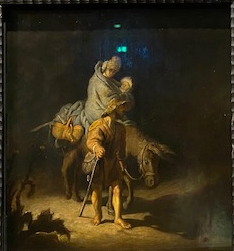
The Flight into Egypt, 1627, oil on panel, Musee des Beaux-ARts, Tours. Young Rembrandt Exhibition, Cat 26.
Also an image of actual darkness and looking beyond the exhibition, in the catalogue, there is shown this lovely image of an old man asleep by the fire (Camp et al, 2019: 211, plate 93):
Rembrandt, Old Man Asleep by the Fire, 1629, Oil on panel, 51.9 cm x 40.8 cm, Galleria Sabauda, Turin. 
Again here, we might assume that it might be in fact dark apart from the light of the fire, but it is exaggerated again by the profound darkness of his clothing and the glowing of his face, which is out of proportion to the light that the fire would cast. I would love to see this painting in real life – while the image here (taken from the official site of the gallery) is lovely, I found the image in the catalogue even more beautiful and dramatic, being almost totally black aside from the man’s form (the fire is not shown), and it would be good to see if this is an artefact of the photography or how the image actually appears. The image here is lovely too of course, with such subtle gradations of darkness in the clothes, the walls and the wooden floor, but a far cry from the drama of the Caravaggio paintings above.
Finally, I will put in a word for a painting in the exhibition which is now deemed not to be by Rembrandt himself, although it was thought so for many years. I loved this image; the programme notes observe that the ‘evocative depiction of light’ closely resemble paintings by the Young Rembrandt, but it was later identified as false, and the painting attributed to an ‘unknown contemporary familiar with the artist’s work’, not even one of his students or followers.

Follower of Rembrandt van Rijn, A Man Seated Reading at a Table in a Lofty Room, c 128-20, Oil on panel The National Gallery. Cat 74, the Young Rembrandt Exhibtion.
This painting follows the dramatic style of chiaroscuro but is also, as with the two Rembrandt paintings above, a depiction of actual light and darkness. It seems very modern (although it is not) and made me think of the many more modern painters who have used this style, for example Arkhip Kiudzhi on whom I wrote a blog post for OCA Drawing 1, shown here. He uses colours in his dramatic depiction of light, which in turn made me think back to El Greco and how he depicted the effect, and also forward to many other artists. These ruminations will have to wait for a future post; I am sure the topic will reoccur during this course, given the importance of chiaroscuro in the history of painting.
References
Brown, C. Van Camp, Vogelaar (2019) Young Rembrandt, Exhibition Catalogue, Leiden: Museum de Lakenhal and Oxford: Ashmolean Museum (2020).
Jones, C. (2020) ‘Caravaggio’s Art In the Churches of Rome’, 23rd April, https://medium.com/thinksheet/caravaggios-art-in-the-churches-of-rome-464d3951575b
Moir, A. (1989) Caravaggio. London: Thames and Hudson.
White, K. (2011) 101 Things to Learn in Art School. Boston: MIT Press.
