I had many ideas about this assignment, but the ultimate decision was to paint the river that I visit every day and painted for the ‘Painting Outside’ exercise. I wanted to try to something in the style of Ivon Hitchens, as explored in the coursework for Part 4, or at least approaching that style.
Before starting this assignment, I did a painting class on ‘The Scottish Colourists’. These classes have helped in the past when I was feeling a bit stuck, and for this exercise I felt like I needed some new thinking about colour. The course was online, run through the Ashmolean Museum, but led the with the same artist (Kieran Styles) that I have done classes with before. It looked at the work of this group of Scottish painters who went to Paris in the 1880s and were inspired by the French impressionists and their revolutionary ideas – magenta shadows and so on. They were excited by the idea of freedom of exact representation and the restrictive formality of the austere Scottish academy at the time, a time which fortuitously coincided with the greater available of reasonably priced colours. The main ones were; Samuel John Peploe; JD Ferguson; Leslie Hunter; Frances Campbell. They returned from Paris with the enthusiasm to reinvent painting of the Scottish countryside in this way.. Peploe in particular was influenced by Cezanne, and his elegant use of lines around planes or shapes in his paintings. They were known with their use of complementary colours, especially blue/purple with orange/yellow – buzzing interaction of colour.
It is Peploe’s image of rocks, sea, hills and sky from which we worked. We started by painting a grey board with acryllic (just to dry quicker) – a kind of purple, Phtalo blue mixed with magenta or crimson. We followed the folowing principles:
(1) Violets and magentas for the shadow
(2) Blocking colours in the foreground with multi-directional brushwork (mkes it more three dimensionl)
(3)Blue lines, linear mark mking
(4) Observing that every area of colours has several colours within it, at least 8 in the rocks in the foreground (less in the background, as per aerial perspective.
(5) Put complementary colours together

I can see there are things wrong here:
- I should have tried harder to get smaller brush marks in the foreground, to create a granular effect on the rocks, as there is (by accident) on the unfinished sandy area (purple, because this was the background colour).
- I don’t have enough variation in my linear brush marks around areas of the painting – should be bolder and thicker at the foreground, thinner at the back, this would give more dimensionality, perhaps.
- I need less hard lines around the colour, some mismatch of lines and colour patches, as Cezanne does in many images..
I loved the underpainting here – the purple and I wanted to use it for the river scene. I had the idea that a rich red / brown could provide the same effect as the lovely purple in the Scottish paintings, this time using the ubiquitous green in the river scene as the complementary colour. I had tried this in a minor way in the ‘thirds’ painting of Menorcan cliffs and sea in the relevant exercise, with a sienna undercoat (the colour of the red mountain)) and I wondered if it could work here, as it had there.

A faint covering of Raw Sienna is showing, with the vague impression of sand.
I took plenty of photographs of the river at different times of day, and looked at previous photographs where the boat house is showing (in winter, that is) to understand a little of how it fits into the landscape. I painted a small board with a dark brown/red undercoat and tried a sketch first, as follows.

Like nothing else in the world, this should show me the importance of stopping for a moment, of looking, of seeing what is there and building on that rather than one pre-conceived ideas – because I like this image better than almost all of them to come. Even the perspective looks better than later versions, which were carefully measured.
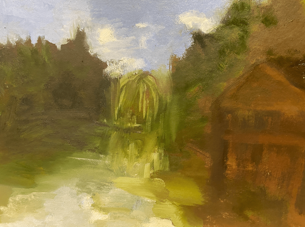
Here is the image with a little more working. I quite like the way the boathouse turned out, and the darkness of the hedges and shadows on the left. But the willow tree at the back is all wrong – too big, given the distance away.
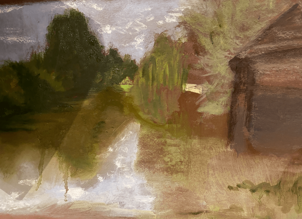
Next I started on the Assignment. I took a larger board and painted it the same dark red/brown colour. I used a photograph which I took with a ‘panoramic’ setting, the idea being to get the ‘wraparound’ effect you have as you look down the river with the banks almost enclosing you. This time I measured out a ‘golden rectangle’ and drew the correct lines for the golden ratio within, so that I had the key lines for the painting, including the upper line for the horizon. This I planned to be high up in this way with the idea that the sky would be seen mainly in the reflection. , rather than ‘wasting’ a lot of the painting on a rather boring sky (I do find some blue, cloudless skies boring in some strange way, or at least sickly with so much green. I spent quite a lot of my early years wondering what everything would look like if the sky were pink, which is strange because I knew nothing about the colour wheel or complementary colours in those days).
This is the first version of the sketch, although it isn’t a very good photograph (there is a shadow to the left). I tried to get the darkness of the left bank and the different blocks of different shades/tones of green – including the mysterious green triangle in the bend of the river that you can only just see in the distance, the willows next to that and their reflection, then nearer the grey green tree (I think also a willow but not a weeping one) and the dark boathouse more to the foreground. There is one place where a little landing stage shows at the end of a lawn, and I tried to show that but it is too bright here. The sky is a provisional blue, although I still wondered what colour it should be to get the feeling of the place. I quite like the colours on the water here.
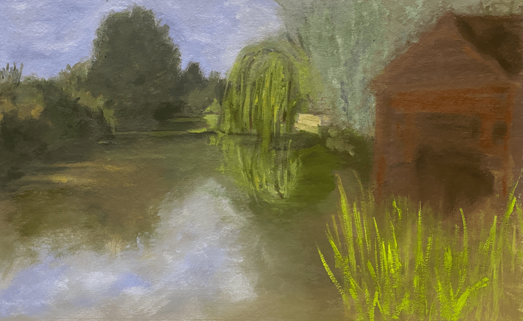
In this next version I have been working quite a long time and I am afraid I forgot to take photogrpaphs – perhaps because I had started to see how badly it was going. I have painted in the boathouse, and started to paint the water plants (which may or may not be marsh lillies, but I never saw them with flowers. For them I used a bright green, made by adding cadmium yellow, in a nod towards aerial perspective (although this is spoilt I think by the brightish green I have used at the back. I have worked on the reflection to the left and it is not too bad, but it lacks spirit. The colour of the sky is rather sickly and improbable.
Finally here is the ultimate version, where I have tried to add some detail, and correct mistakes I had perceived in the perspective and so on. Underneath the boathouse is darker, and I have added some definition to the grey green plant in the middle area. I have struggled some more with the reflection of the willows, although not with a very satisfactory result.
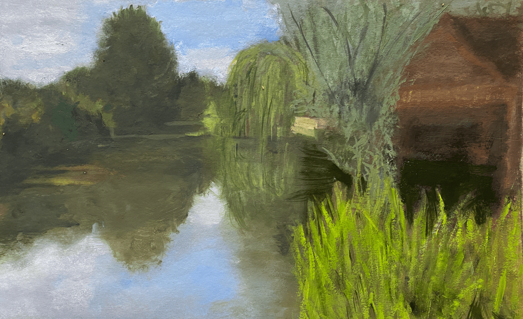
I was reviewing this piece and writing the blog while visiting family in Spain. It was a relief to be unable to continue messing around with the painting without tangible results – this made me work out what went wrong and to think about what I would do differently, to get the kind of painting I imagined here. But it was frustrating not being able to start again for two weeks. So I have used the time to plan out a new painting as follow:
- Emphasizing the wrap around feeling of being almost in the river – the Ivon Hitchens effect.
- Using the red green colour tones, throughout including a slightly pink sky and avoiding blue.
- Using dark lines to indicate some areas – the lines of the river bank perhaps (from thicker to thinner), the boat house and perhaps some of the different kinds of plant on the bank.
- Using a more expressionist style, in general.
- Emphasizing the different areas of the sections of the painting, with different colours, as with the Scottish colourists.
- Using some white or very light areas to indicate more reflections – for some reason the reflections have not worked in this painting, and I am not quite sure why – they have in the past, including on the drawing of the same scene that I did for the third assignment in Drawing 1.
