The instructions for this Part ask you to review your progress in the course: “reviewing what you’ve achieved so far and reflecting on which projects you’ve enjoyed most. Which tasks have you found the most challenging? What areas require more practice?”
I started by reviewing my tutor’s report for Part 4, as I have for every report. With this report my tutor’s comments have been very helpful and insightful and also very consistent with earlier parts, with the same points recurring, and this was no exception. So reviewing this Part helped me to think about the course as a whole.
Report on Part 4.
I was very pleased with the overall comment, which was:
“This has been one of your more successful subjects. The landscape and outside depictions are working well. There are personal interpretations coming through and this gives some strong narratives to your work. Landscapes more than townscapes show more inventiveness. You are handling paint well through semi-abstraction and the colour schemes gives atmosphere to the landscapes. Technically, you have improved with perspective and depth as well as composition.”
I believe that I have always been more successful with landscapes, particularly of the natural world. In Drawing 1 I focused on townscapes (which lend themselves more to drawing, I think) and feel as if I had some success in developing my understanding of perspective, as evidenced by my tutor’s report on Part Three. In this the painting course, I took the chance to develop my treatment of landscapes which was one of my key objectives of embarking on this degree because I felt that I had a tendency to paint in the same way rather repetitively (sun on the river with stormy skies kind of thing). In this part of the course I have painted many different kinds of landscape in different ways, so I am pleased about that.
For ‘View from a window‘, the tutor commented “the first piece is confusing with the depth because the distance looks like it’s all the same plane. However, with the luminosity of light
it does contain some atmosphere. The second attempt is much better with depth. However, the hedge is quite dominating with the tonal values. Compositionally, the framing works well.“
I agreed with these comments; first time with this kind of subject for a while, I had forgotten things I used to know about perspective and the painting is shallow and 2 dimensional, which improved in the second version with some practice. It is also quite right that the hedge is dominating – it does in real life, because it badly needs cutting, and there is lots of new, bright green, growth – but I should have toned this down for the painting, because this was a view from a window not a study of the hedge.
For Hard/ soft landscape, the comment was “I think this piece is finished. It has rawness and
bleakness which gives a convincing atmosphere to the landscape. You have worked well with being semi-abstract and omitting every detail. The colour scheme works well to add to the atmosphere.“
I was surprised here, but pleased as this piece (as I noted in the blog) was a response to the recurring comment that I tend to overwork everything, and my better paintings are ones that I do quickly and stop early, an observation that is very much reinforced by this comment. Here I prepared the board with a brownish purple, and very much liked the colour as a kind of summary of the landscape. I drew the basic lines of the reservoir walls and road, blocked them in very roughly and gave the merest hint of the shape of trees on the horizon. It seemed to me that I finished it impossibly early – but now I look at it again, I realise that the tutor is right and this is quite a successful image, however unfinished it seemed to me. Finally, I had managed to simplify the image and lose details, bringing the painting down to the essence of the landscape, I am happy about that, because I feel as if I have been striving to do that all along.
For Linear perspective‘ she observed “very convincing perspective here which draws the viewer into the image. You have been sensitive with your colours and this gives a narrative to the light of day. The buildings have good detail which contrasts well with the more organic application of the trees. A good technical piece.”
I was pleased to have these comments, because I struggled with this piece – feeling that I overdid it with so many houses in the terrace, making it look impossible, but perhaps that did contribute to drawing the viewer in.
For Aerial perspective, the observation was “well done for persevering with this piece. The first attempt is clunky, but the final is quite sophisticated. With more highlights of the two trees, the light of day and form comes through. The reflective elements of the water have been rendered well. The depth and perspective are also convincing, and you have worked on this with the correct tonal values.”
I really enjoyed doing this, even though it is a rather gloomy image of a wet, muddy day (one of those almost monochrome days of deepest winter). I thought the final image was quite good and I am pleased that the tutor thought so too.
For Mood/atmosphere– although some exciting marks are coming through, the work has become a little too muddy (3rd piece). The 2nd piece is the most successful with the movements of the sea and the contrasting colours. The 3rd piece, the water becomes too solidified, so the fluidity becomes lost.
For the Menorca piece (something that I did in preparation for the Assignment to test out the use of red/green colour contrast and also to test out doing a painting in thirds), the tutor commented “the contrasting colours work well and there is a sense of harmony with the colours used. This about your format- landscape would show more movement and compositional technique (rather than portrait format) the water has movement. But the mountains, could have more highlights to show the forms and textures.“
This comment is absolutely right – strangely I struggled with the mountains and I should have persevered still more to get the highlights. I don’t know why I wanted to do it in landscape – I think it felt better for doing the thirds, or perhaps it was something to do with the slice of the image I wanted to paint. However, I recognise that landscape would have made for a much more sophisticated painting. I am glad that the colours worked, I really like the combination here.
For my attempt at Painting outside the tutor commented “well done for getting out there because it gives a more honest portrayal of what you see. However, although this piece has been painted sensitively, there is no actual focal point so at the moment, it looks like a background. You did mention that there needs to be a focal point- this would give some narrative and composition to the work. There are some diverse marks which are expressive and with this process and some focal point, the piece can work.”
This is absolutely right again, it does indeed look like a background and there is no focal point. It is difficult, because the focal point was intended to be the bend in the river on the horizon, which you can’t really see, but I need to think about how to portray that when I rework the assignment.
For this problematic Assignment “I can see why this piece is unfinished. The last piece in your blog has elements which are not united. For example, the brown building is quite
muddy, the shrubbery in the foreground is a different tonal value to the other tones you have used so it looks superimposed and generally the right hand side contains too many disparate techniques. However, if you divide the painting down the middle the left hand side works very well with the reflections of the water being extremely convincing. It’s a matter of balancing the right hand side with the techniques you have done on the left. Overall, though, you are nearly there, and it could be a harmonious, serene and calming piece of work.“
I found this insight amazing. The picture looked so terrible to me, and yet my tutor was right, once you looked just at the left side, it was serene and indeed, convincing. I had got in a terrible mess while painting the details of the other side, and had done everything in a discordant way, forgetting what I had learnt during the course about simplifying and so on. When I arrived home from Spain, from where I sent the assignment, I took a palette with severely limited colours following my plan as detailed in my assignment blog, and with the intention of just overpainting while I decided what to do, painted with the two colours on top of what was there. I mixed only these colours, except where I mixed them with white which I used to entirely replace the blue in the sky and reflected in the water. The result is below, and even though it is not finished with some of the old version, such as the willow tree still there, too bright and still too stark a contrast between the two sides (and I have still to work on the focal point, as pointed out by my tutor with regard to the piece I painted outside, see above), I already like it hugely more than the original Assignment piece. I had been planning to repaint, but when I saw the tutor’s report I preserved the left hand side of the painting and painted on top.

There is much to do here in terms of rectifying the points noted above, and I will endeavour to tackle these with more repainting before I submit for assessment, as this is still not finished. But meanwhile, I have, thanks to my tutor, learnt an important lesson. Always look at what you have done and work out carefully what is wrong before you start again, because it can be that you can rectify the problem, rather than (as I would probably have done here without this advice) started all over and replicated some of the problems of the previous version. I had started to have rethinking the painting as recorded when I submitted the assignment, in terms of making it a study in red and green, for example, but it had never occurred to me that some of the painting was worth saving.
Thinking about the course, Practice of Painting, as a whole
Overall, I feel that the comments on this Part reflect very well the things that I have learnt in this course, although there are other things I should note. They vary as to whether I have managed to overcome or at least ameliorate the problem during the course, or whether I still struggle and must work on in the next part. These are:
Simplification. The need to simplify the image that one is trying to paint, making it achievable and removing all unnecessary details that are not part of what I want to get across in the painting. I feel that I have improved my ability to do this – the painting of Farmoor Reservoir in Part 4, for example, exemplified this, while the final piece for Part 4 exemplified the converse, which is what caused the discordance of the right hand side of the painting.
Referring to artists. To think about the ‘style’ of the painting, with some kind of reference to art history, is also important. I find it hard to do this without becoming too imitative, as when I tried to mimic Emil Nolde or the Michelle painting I used in Part 3. But I think it is something that is improving. It is clear when there is no reference to any kind of previous work, the painting becomes rather lost, or at least if there is such a reference it is a great help (as I found painting fruit and thinking about the style of Euan Uglow and Robert Dukes; painting a red pear, and the lemons, taught me a huge amount).
Brush work. Think about brush work as a way of representing dimensionality, painting in different ways and angles is something I keep forgetting to do, but I realise made a big difference in the class I took on the Scottish colourists, and also the still lives of fruit, thinking about the micro-details of the way that the colour formed and the light fell on to the planes of the fruit and using colour accordingly.
Outlines. Avoid heavy lines around things, particularly people’s faces (a fault I encountered in Part 3 a few times), unless it is a deliberate attempt to paint in a certain style, such as that of Cezanne or indeed the Scottish Colourists.
Writing about art. I believe that I have learnt to write about painting in a more appropriate fashion – something I struggled with in Drawing 1, with the transition from social science (in which I work) to humanities. I was pleased with some of the essays I wrote here, such as the discussions of Still Life in Part 2, and Chiascuro in Part 1, or the Review of the David Hockney exhibition (Part 4).
Avoiding overworking. I have learnt the importance of stopping a painting before it is overworked. However, that doesn’t mean sadly that I don’t continue to do this – as in the Assignments for Part 2, Part 3 and also Part 4. I am trying to stop doing this but it is hard – feeling that I haven’t finished, that I must something complete something that I should abandon (“a work of art is never finished, only abandoned”, an insight I derived from John Banham’s wonderful novel The Sea.
After Part 4, I realise that I also get this feeling when something has gone wrong, as in the Assignment for Part 4 – thinking that I can save it by continuing to paint on – whereas what I should do is look far more carefully at what is wrong with the painting, and paint over where it has gone wrong. Sometimes – but not always – it would be better to start again, as I did in Part 2 where the piece of work I shall submit for assessment is actually a quick painting completed after the over-crowded, over-thought, over-complicated Assignment Piece.
Theories of colours. I feel that I have more sophisticated ideas about colour after this course. I found the series of Exercises on the theory of colour time consuming but worth it, understanding far better why some colour combinations work, some end up as ‘broken’ colours, saturation and desaturation and so on.
Part 5. Personal Development
Project Different ways of applying paint
Throughout these exercises, I geared my efforts towards my ultimate aim of this section, to paint darkness (although there were a few diversions on the way, because the exercises were interesting). This was the plan for my Personal Project for the Assignment, and it made sense to me to use the Exercises as a way of starting to work towards that.
Exercise. Impasto
I was fascinated to read about how other artists have used impasto, because I admit that I have never noticed this at all really while looking at paintings. Indeed, I have been rather adverse to paintings with either layers of paint or objects in the paint, perhaps because it reminded me of the collages one (or one’s child) was forced to do at school, which generally look pretty ugly. Or perhaps it seemed to me that it took away somehow from the purity of oil painting, which seems to me (that is, used to seem to me, my views have changed a lot as I have worked through this course) like the highest form of art. Now I feel more open to the idea.
The painting I focused on was Van Gogh’s Starry Night, reading various sources including this rather helpful blog produced by Old Holland paint. I realise that he has a very specific intention here, which is to highlight the stars and moon – bringing them to the fore of the painting, and perhaps creating highlights and reflections in the three dimensional layers of paint. I read about this – and then tried to replicate the effect, but without copying. So closing the laptop and trying to remember the painting, while also remembered the image in Part Four that I did of the sea, and thinking about how impasto might have helped here):

I am loving the use of impasto here. It is indeed giving the moon type light a three dimensionality which surprised me. And actually it has made the sea excitingly three dimensional also. I like the colours too. I am definitely a convert to impasto.
Exercise Dripping, dribbling and spattering
I read around the topic of Jackson Pollock, using the very useful MOMO reports of his various exhibitions there. I started off with oil, using orange solvent as dilution. I wanted to splatter on colours to make darkness ‘from the bottom up’, with ever thicker layers of paint as follows. I tried a different manner of putting paint on, with the dripping technique suggested. Given that I just don’t have the space in the kitchen where I paint to throw paint around, and it is no longer the weather for working outside, this seemed a viable alternative.
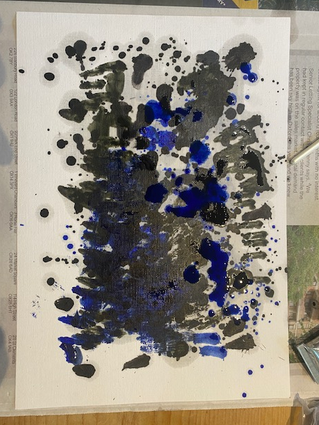

I had started with blue and the grey that seemed to most closely resemble ‘eigenlicht’ (see below) and shortly brought in red, with the aim of bringing creating, over all a kind of purply black darkness.
I probably liked this one the best – the red splodges have a flower like quality and I like the blue behind the darkness (it doesn’t look dark enough, but it did in real life as opposed to the photograph).
This is the final version, and although I still like the blue showing behind the black, I feel I probably went too far; it is beginning to look like black/grey paint. So if I respond to the question in the course notes ‘how do you know when you are finished?’ I would probably say ‘I didn’t, but now I realise that it was half an hour ago (which, incidentally is true of much of my deliberate painting). I do note however, the problems that I have photographing these dark images – the penultimate one here was actually much better in reality, whereas this last one looks better in the photograph than the actual version.
I felt here that I hadn’t really got the paint fluid enough to drip sufficiently, say in the style of One: Number 31, 1950, and decided to try with acrylics. Water is after all cheap and harmless, and acrylic flow improver is also OK, whereas by this point I was practically choking on orange solvent (which is supposed to be benign but isn’t).
I wanted here to get the sense of tangled undergrowth, but to start with a far darker background than Pollock. This is my first attempt. I painted the card a mixture of burnt umber and bone black, and while it was still a little wet, I flicked paint on sap green heavily diluted with the flow improver. This looked rather good when it was wet, but I was rather disappointed when it dried. Also, because I hadn’t had the space to paint with the kind of abandonment that was required, I have actually included it in the exercise below, where we were asked to paint with natural forms. I had tried to direct the painting a little with orange sticks, and the strange thing was that although I had applied the paint randomly, it seemed to come out in some kind of pattern.
Project Adding other materials
Research point 2:
Find out what you can about the Abstract Expressionists and, in particular, the style of
painting called Tachism or ‘Action Painting’. Look at the work of those artists who developed
this style of spontaneous, expressive painting which worked by the artist making large
gestures and exploiting accidental effects. Look at the work and ideas of Hans Hartung,
Franz Kline and Jackson Pollock, amongst others.
This research point was a bit of a shock for me. For me, abstract expressionism was a move away down the modernist line towards the abstract, but still bore some resemblance to the represented object, epitomised by Ivon Hitchen’s later paintings where the blocks of colour wrapped around the dark centre of the mill pond for example, still bear some relation to the environment in which they were painted. For other painters such as Kandinksy, who I believe also fall into this description, there is a kind of progression through their career as an artist, moving from away from the representional but evoking (perhaps just to me) something of of the flavour of the earlier paintings. Although I shy away from the purely abstract part of the term, I am comfortable with the ‘expressionist’ part of the description. I have always seen Howard Hodgkin, one of my favourite painters of all time, as one of the most perfect protagonists of the genre, given his desire to paint feelings and emotions, such as the feeling you have when you look out of the window in the morning. As the critic Andrew Graham-Dixon put it: “Howard Hodgkin paints emotional situations, Cezanne painted apples.” (Wroe, 2001). His focus on mark making, and the technical process of making seemingly spontaneous brush marks – paintings that could actually have taken years to create – seemed also to me to qualify him for this category.
However, I note the Tate’s description is:
“Abstract expressionism is the term applied to new forms of abstract art developed by American painters such as Jackson Pollock, Mark Rothko and Willem de Kooning in the 1940s and 1950s. It is often characterised by gestural brush-strokes or mark-making, and the impression of spontaneity”
and realise that I may have always slightly mistaken the term, or at least the emphasis on the New York painters of this period in its normal use. For these painters, I like this delineation of the work of Kline and Pollock from others in the genre Hopkins (1979):
“The uptown intellectuals were all more conceptual in approach, more specifically image-makers, while Kline, Pollock and de Kooning were more truly expressionist, creating primarily through gesture. These three painted, one could easily imagine, as if their very lives depended upon it, with no time to revise or ruminate. Spontaneity, velocity and an immediately apprehendable passion saturated their work.”
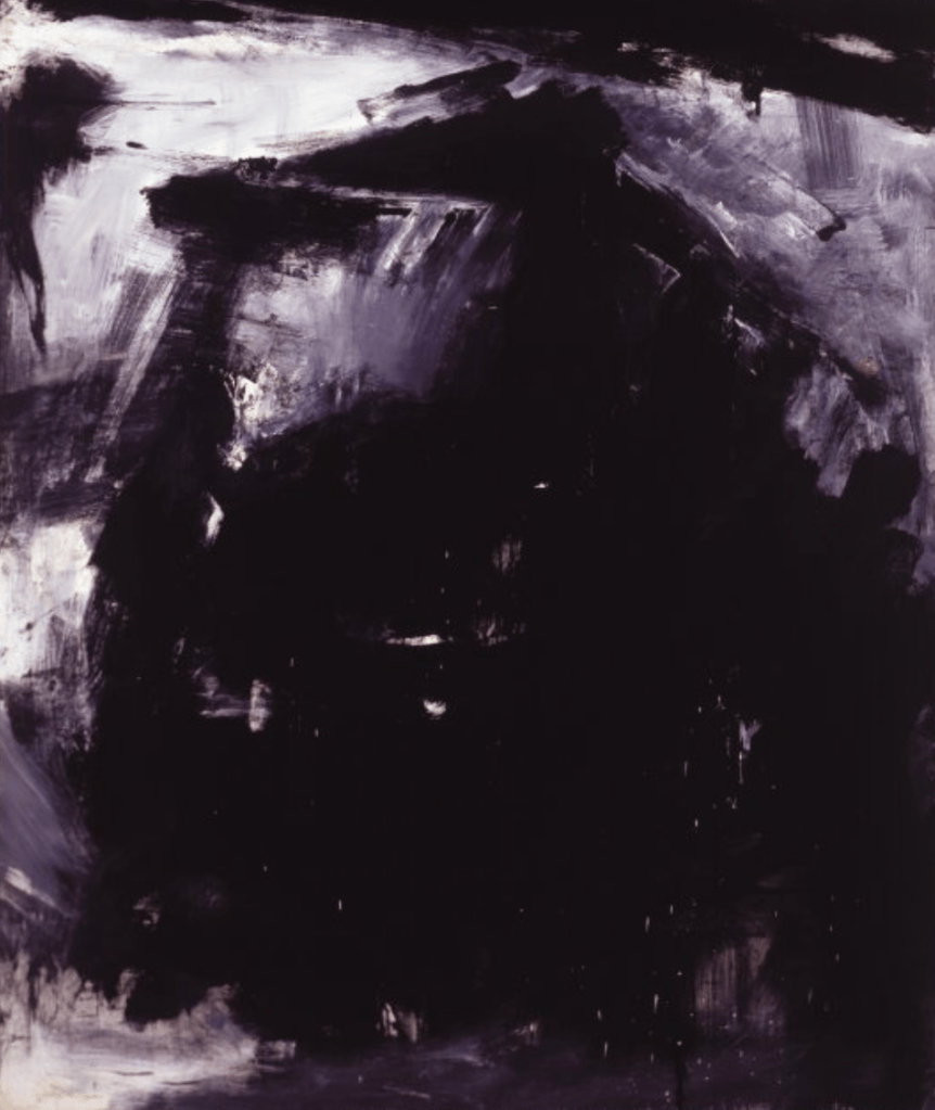
For this research point I looked at Franz Kline in particular, as I had focused on Jackson Pollock for the exercise on paint splattering above. The painting by Franz Kline in the course notes appealed to me, as it looked a little like a painting of darkness.
Kline (1910-1962) was firmly in the ‘action painter’ genre. Like Kandinsky, he started off with recognisable landscapes and cityscapes, and ‘Hot Jazz’, this lovely bar room picture which is so incredibly full of movement it feels like you can already see the beginnings of ‘action painting’ although this is not technically so.
It seems after this, his pieces became progressively more abstract, with many of his figures based on “locomotives, stark landscapes, and large mechanical shapes of his native, coal-mining community in Pennsylvania”. It seems that “This is sometimes only apparent to viewers because the pieces are named after those places and objects, not because they actually look like the subject” (Christov-Bakargiev, 2004: 57). Later he dropped representation and moved to entirely abstract pieces, with the figures replaced with lines and planes, reminiscent of Cubism. He painted in monochrome, in black and white “to depict negative and positive space” and although he seemed to be turning back to colour in his last years (he died prematurely of heart failure at the age of 51) he was sometimes known as the ‘black and white painter’.
support: 101 1/2 x 75 inches (257.81 x 190.5 cm); framed: 104 x 78 1/4 inches (264.16 x 198.755 cm)
Collection Albright-Knox Art Gallery, Buffalo, New York
Gift of Seymour H. Knox, Jr., 1959
I quite like this image, but I think that is partly because it is very dark and I am focusing on darkness. I can well see how it might relate to his youth in Pennsylvania, and be a distant memory of locomotives or mines or some mechanical object of industrialization. It is a huge painting, so I can see I would be even more likely to think that if I saw it in real life. But I am not sure that I would make these conclusions if I had not read anything about it. I think I would look at it and feel perhaps fear, and dread – these are the emotions that it invokes. A massive black hole, the brutal solidity of steel, the desperate dirtiness of coal – these are the kind of things that I think of when I look at it, knowing a little more of the context. It is not a comfortable feeling.
I am beginning to realise that my view of painters like Kline – and Pollock and the abstract expressionists that are most famous as such – is more subjective and more brutal than for other works of art. When it comes to representational painting – even genres which I positively do not like, such as the pre-Raphaelites – I can admire the skill of the portrayal – a Rossetti mouth, for example. For more abstract work, such as the impressionists or Seurat I can admire the capturing of the moment, the originality (for its time) and the flooding of light and colour, even if I personally do not like it (I very much dislike puntillism and Seurat, for example – but I can see it is a fascinating and informed technique). But with abstract expressionism – I love Hodgkin so it seems to me great, and for Kline, I find it very hard to judge. There is nothing here that I really like, although I can see the huge black and white paintings would be very impressive in real life and in their temporal and spatial (American) context.
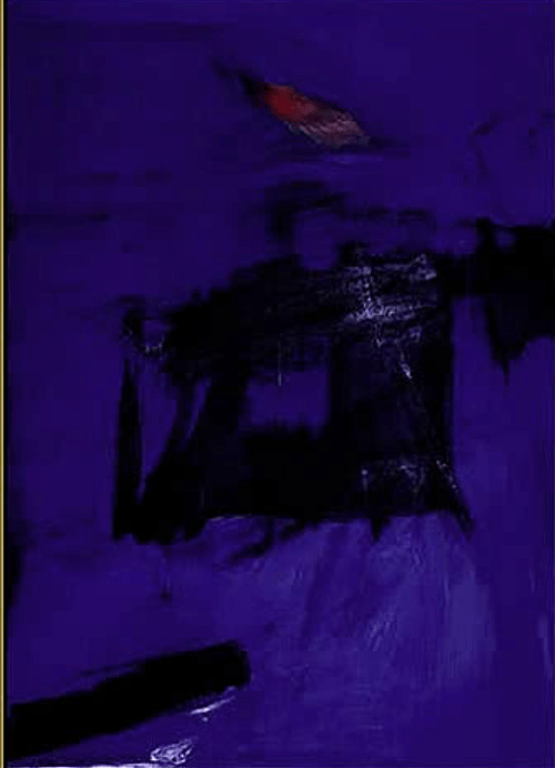
However, what would have happened if he had lived longer? I do very much like this much later painting (indeed one year before his early death) because the translucent yet darkened blue is very much what I would love to achieve myself. Indeed, in the NYT review of a 1986 retrospective of his work observes:
“The show ends with the 1961 ”Scudera,” perhaps the last work Kline completed, in which a great blue wind is threatening to cave in a black square. When Kline died he had clearly just begun. “
Private Collection
Similarly, as Hopkins (1979) put it in his review of an exhibition of Kline’s colour paintins in the Phillips Collection in DC:
“This is a magical painting, an ascension which one can easily imagine inside the dome of a Borromini church. At the very end of his life the color and everything else came together for what may be his greatest painting, a work that one can describe, even in these positivist, hardheaded times, as spiritual. “
It is difficult. I do know that I am very influenced by colour, which changes my reaction to works of art. .A long time ago I asked a friend of mine, a talented artist but at that time making his living from framing, to frame a huge art poster that I had bought, for the arthouse film Querelle, by Fassbinder, with two huge, graphic male faces kissing, red tongues to the fore (at the time and still, quite a shocking image), on a vivid blue background. I asked him if he liked it and he – clearly hating it but wishing to be tactful – said ‘Blue is always nice’. Here I feel as if my instinctive reaction to the colour may be informing my response to this particular painting. Kline rarely painted in colour until the end of his life, although he did squeezed everything possible out of black and white alone as the New York Times (1986) observed:
“Kline seems to have wanted black and white to be everything – earth, air, fire, water. At times he seems to have tried almost to will black and white into color: The 1958-60 ”Cupola” superimposes numerous layers of black and white in a furious effort to open them up and explore the possibilities of gray.”
Overall, I remain uncertain about abstract expressionism, although I love the Scudera image above. I note from the Tate notes for Hans Hartung: “Hartung developed a vigorously gestural and linear style in the early 1930s. Believing that painting should record and evoke his immediate inner experiences, tensions and energies, he rejected observation and memory as possible starting points and relied instead on spontaneous feeling and direct physical action.” (Tate notes). To me, memories and emotion are tied up with visual images, landscapes, objects, scenes and most of all colours. It is hard to be really drawn to the black and white images of Kline, outside of their temporal or geographical context.
Exercise Mixing materials into paint
For this Exercise I wanted to experiment with sand, because I quite often want to paint sand – so this seemed like a useful – if obvious – way to do it. It turned out that sand is quite a difficult thing to get hold of in the middle of a city, although I kept my eye out carefully on walks and so on. Eventually however I managed to procure three varieties of sand – some ‘scatter sand’ from an art shop; some builders’ find sand from a sack in someone’s garden – and some much coarser sand that a friend provided, which to be honest looked more like small stones, and I couldn’t see having any place in a painting.
In this sketch for one of my paintings of darkness below, I tried the art shop sand, but it seemed to have no effect at all. I think when it says scatter sand, this must be for sprinkling on top of wet paint – and I don’t like that effect. This is the builders’ sand below – and here I do quite like the result; it looks kind of three dimensional, without looking so obviously like sand:
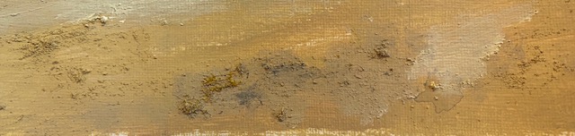
I like the effect here (in close up), and will add sand to my arsenal of materials. I can see that on a bigger painting the coarser sand could be an option, but it would have looked out of place here on A4 paper.
Project Towards abstraction
I feel as if all through this painting course, and particularly the last landscape section, I have been moving towards abstraction. I welcomed the idea of going a bit further down that line. It seems as if for subjective views of painting, that everyone finds their own place in the modernist line between classic representation (although that in itself would be a controversial label) and the all white painting. My place on the line is rather nearer the abstract than I have achieved in general hitherto on this course.
Exercise Abstraction from study of natural forms
For the natural forms, I took one of my dripping paintings from the Exercise above and used a stick to encourage the paint to go in certain directions. The strange thing here is that I had done this painting (sap) green on dark brown, with the idea that I would come up with a good way to paint a dark abstract hedge or clump of trees. What I found interesting was that it came out far less abstract than I had envisaged. Whether this was just luck, or my inner self resisting unconsciously the shift to abstraction, or some natural formation of paint particles I don’t know, but this is the result:

Although this was a disappointment for the actual exercise I was doing at the time (due perhaps to my difficulty in getting enough liquidity into the paint), I do like it as a use of natural forms. Here it is at a later stage, when it was dryer and with less light coming into the camera (I am realising as above that taking photographs of representations of darkness is almost as difficult as taking photographs in the dark, as below), which I like even more:
Assignment Five: Darkness
I decided some time ago to focus on painting Darkness for Part Five of the course. I have been fascinated by the idea of representing darkness for many years now, and also tackled this theme in this same Part of Drawing 1. There I wrote an extensive discussion of the topic, focusing on work by Hopper, Schilliaert, Sterne, Doig, Munsch and a couple of St Ives artists (such as Le Grice), all of whom’s treatment of darkness I love. I experimented with some of these treatments myself, but always working with drawing media (soluble graphite, pen and ink, pencil and so on) and almost exclusively working with monochrome tones, as you might expect for a drawing course, rather than colour. However, I noted there that some of these artists have explored colour, in very different ways, when tackling Darkness.
In this Part of this painting course, I want to take a different approach, tackling directly the question of the colour of darkness. I also want to follow the theme and instructions for this part of the course by becoming more abstract than previous work I have done.
Variations on darkness
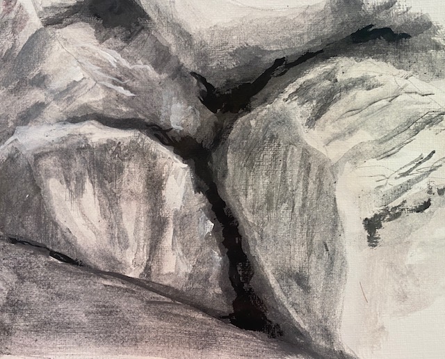
There are so many different kinds of darkness. Aside from that ‘black on black’ kind of darkness in the countryside when you first leave the light of indoors into some unlit environment, and gradually start to discern shapes of things, there are all the other times that you see darkness primarily as a contrast with something else; the darkness between rocks in a pile near the coast for example, as here, in a photograph I took in Whitby in Yorkshire:
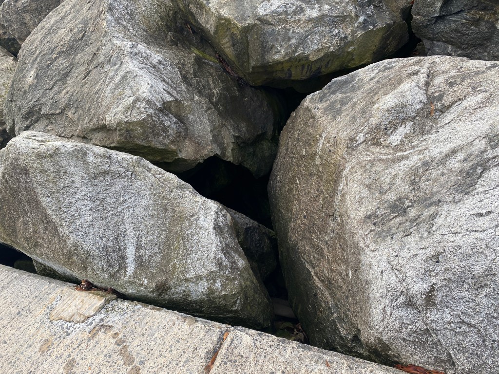
In this very simple painting of the rocks – using graphite solution of black, grey and white, so no colour – you can see that the darkness, when it is nothingness, purely the absence of something, then it is relatively easy to portray the effect:
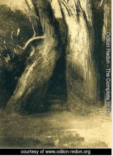
A similar darkness occurs at the base of a hedge against the river, and sometimes in the gaps between trees in a forest, as portrayed so brilliantly in Redon’s ‘Two Trees’.
There is the darkness when you come into the house from a sunlit garden, and your eyes take a little time to adjust so that you are blinded by the light; the darkness when you shut your eyes or draw the curtains and turn off the lights; the darkness behind wardrobes or under furniture. There is the blackness of a deep pool or river.
It is perhaps the darkness that comes when you shut your eyes but not too tightly that you get the most exciting variations. I find this especially when at the dentist, when you are given those dark glasses to wear and lightly close your eyes underneath them. If there is a source of light, you see different colours – only, in my experience, a couple at once, but they can be very marked and beautiful. It may be because I last went to the dentist after painting all weekend, and I was thinking about colour anyway, but it seemed to me that I saw really interesting veiled colours and shapes.
There are also huge variations in the way that darkness is portrayed by artists. There is the misty mysterious darkness of Schilliaert; the rich, embossed, swirling blue darkness of Van Gogh’s Starry Night; the dim, blue-purple darkness of Munsch’s painting of the same name; the solid black of Doig (with strange green shapes just discernible when you look closer); or the thick almost glossy black of La Grice. There is the almost luminescent blue darkness (well I think it is darkness, who in his painting Scudera achieves the kind of veiled luminous blue that you sometimes see when lightly closing your eyes, see above) of Franz Kline (1961, referenced in the course notes), and the warm brown darkness of Hedda Sterne in her painting of ‘Moonlight’ in New York.
What is the colour of darkness?
If you search online for ‘what is the colour of darkness, you arrive at Eigenlicht (Dutch and German for ‘intrinsic light’ , “the uniform dark gray background that many people report seeing in the absence of light” Common scientific terms for the phenomenon include “visual noise” or “background adaptation”. (Hansen and Fulton, 2000).
Certainly as pointed out above, this concept cannot encompass the huge variations of colour in the work of artists that have treated the subject.
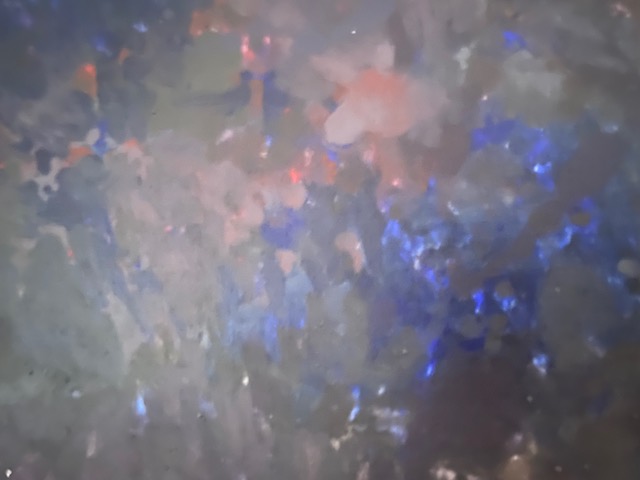
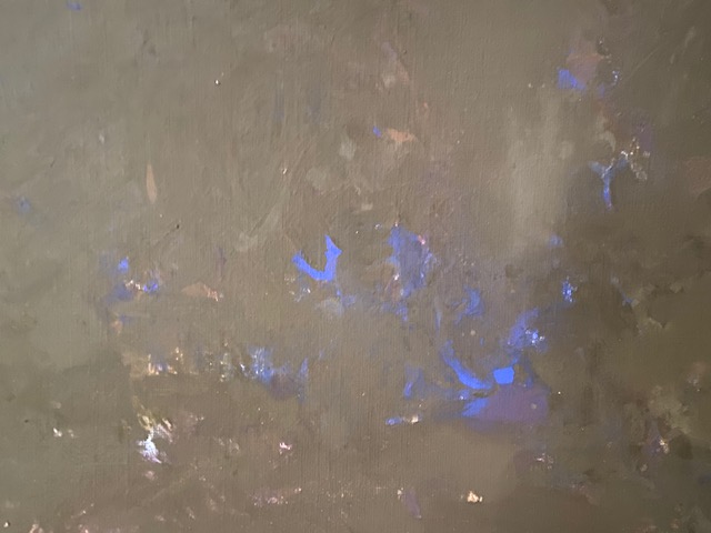
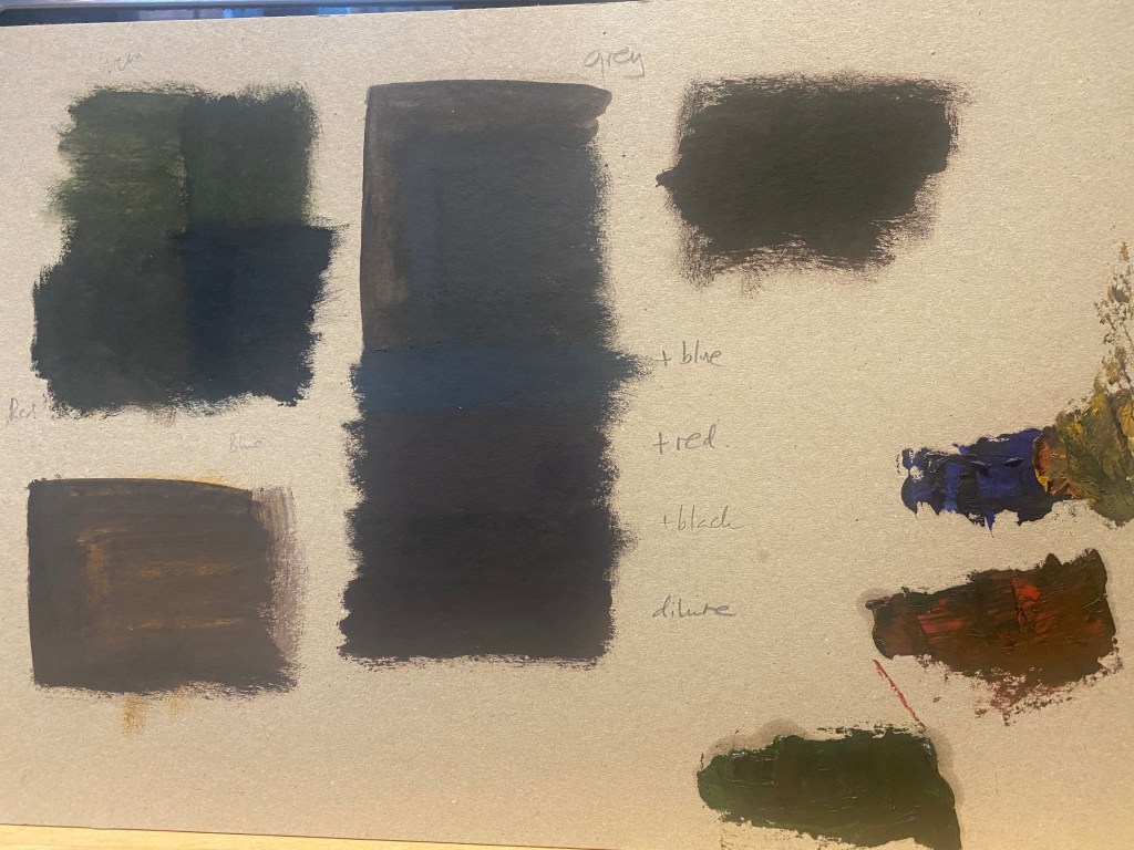
I experimented a little below. What I found most interesting was that the grey oil paint that I had (shown at the top in the middle) was, indeed, more convincing than the black (bottom right quadrant in the shading at the top left), and much more convincing than the green or brown tinged splodges on the left of the card. The ideas about impasto (explored above) gave me other thoughts, over on the bottom right here although not dark enough, but suggesting the start of some interesting possibilities.
Capturing Darkness.
One of the tantalising things about representing darkness is the extreme difficulty and perhaps the impossibility of photographing darkness. In the past, with previous phones, the camera has never been good enough to capture more than the darkest of images, as with the photograph of the dark beach I drew in Drawing One:
And if not completely dark then extremely grainy, as in this second image:
On the one hand this is exciting, because you are painting something which you do not have the capacity to represent with a photograph – sometimes the images you can take on just the camera of your phone are so good and so striking (especially of sunrises, for example) that it is hard to see what a painting can add. I feel the same about those images taken by satellite or in space of the moon, earth or solar system. What can I add to this beauty? But here with the unrepresented darkness, there is plenty of scope for interpretation and imagination.
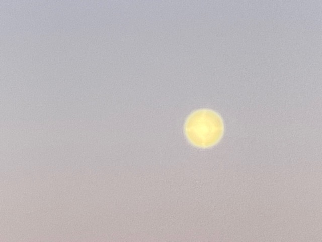
However, last time I bought a telephone I went for the 11 pro plus or whatever it is called precisely because of its sophisticated claims of being able to take pictures in the dark. And indeed it can – for example, look at the contrast between the rocks in the photograph from Whitby above. But the problem at night, when there is any source of light at all (even or perhaps especially the moon) is that often it takes such a good photograph, you no longer can tell that it is at night. Take this image of the moon at night in the countryside in Murcia, taken in the summer of 2021:
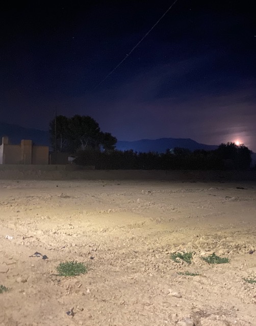
It is lovely, and it was lovely to look at the time, but the two images were quite different. There is far more light in the photograph (even after I have edited it to make it darker, as I have here) than there was in reality, while at the same time the moon was visible with incredible detail in real life, you felt as if you could see the craters (an illusion?) but in the photograph, it looks blurred and rather like a streetlight.
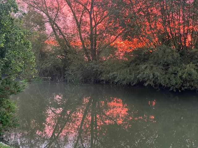
Likewise take this image of an autumn evening after dinner, taken of the River Cherwell outside the Cherwell Boathouse restaurant, with the punts lined up for the night. It was lovely then and lovely in this image – but again, it did not look this way in real life – far, far darker.

So it seems that the darkness remains illusive, which emboldens me still further to try to paint it. I want to try to capture the lovely purple light and the clarity of the image of the moon of the first image, and the orange glow and rich blue of the second image, without turning away so sharply from the reality of darkness as my camera has done.
The Colour in the Darkness
To develop a series of paintings on this topic, I decided to approach it through the lens of complementary colours. As the image of the almost perfect darkness of the hole between rocks in Whitby, darkness presents in a monochrome way – as contrast to something else, most usually light of some kind, or the effect that light creates when reacting with an object. But generally scenes of darkness are distilled to a few colours, as many of the parts of the scene – say, green grass for example, cannot be seen. Indeed this is generally the role of darkness, to simplify objects to silhouettes, for example, or the landscape to mere hints of mountains on the horizon. I have not really thought about this before, but it seems that darkness simplifies colours too, perhaps always resulting in some kind of monochrome effect (monochrome in the sense of opposite colours, rather than black and white). The images that I most wanted to try to portray all seemed to fall within this theme; the purple and yellow of the moon in Murcia; the blue and orange/brown of the boats on the river Cherwell, and this image of the sunrise taken by the river on a morning walk:
As noted above, pictures of sunrise like this are often so attractive it is hard to think of how to improve upon them in a painting, but here I want to go much more abstract, and follow some of the techniques of abstract impressionism discussed in the Exercise above.
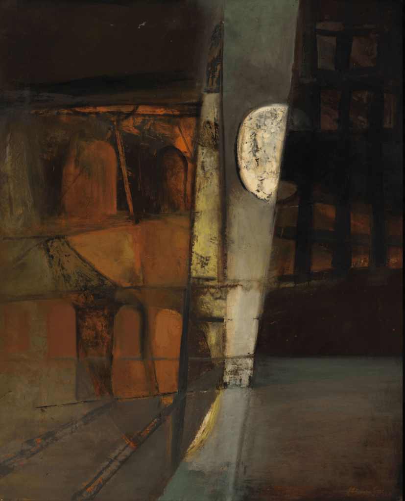
Purple and yellow
I started with this scene and sketched out the horizon, simplifying the details (although they are quite simple already) to the stark looking building on the left (it is actually the side of a perfectly normal family house in the campo, but in the dark it has acquired a sense of mystery), the trees and hedge with the wall in front, the mountains (a different shade of purple behind) the purple sky and the sand to the foreground. As noted above, I mixed sand with the paint to get the textural appearance in the foreground, which I like. Unfortunately, I forgot to take photographs (I found myself completely engrossed in the painting), but here is the the first one that I have:

Overall, I was pleased with this image. I was annoyed with myself for painting it in portrait, as the image lends itself to landscape orientation, and this is not the first time that I have done this. When I started it was just a sketch, but it became quite developed later on. I like the inky black of the trees and the grey of the building, but the other colours are a jarring note – a little sickly, I think. The colour of the sand is wrong – it needs desaturating (mixing it with a little purple perhaps) and the lighter parts too light. I think the purple is wrong. I mixed phtalo blue (red shade) because I found to my surprise that I only had cobalt blue in good quality acryllic, which was running out, so I was trying to spare it) with crimson – and there is definitely too much red in here, introducing the sickly note. It looks better in the real thing than in the photograph, but even so, I believe it is too light. The texture on the wall against the house (I am not sure if it is wall, or a kind of ‘steppe’ in the soil, a quite common way of delineating fields in this part of the world) seems wrong too, and perhaps I might use some of that coarser sand for this. The final thing that is wrong is the moon. I have followed the photograph, where the moon appears as a kind of diffused light, but in reality the moon was hyper-clear, as a perfectly round disk, a yellow light and some crater like appearances. I wanted to replicate this, perhaps following the technique of Hedda Sterne, another painter with some abstract expressionist heritage, although also surrealism, whose life spanned a remarkable 1910-2011. She was Romanian, although she moved to New York in the early 1940s and like the painters discussed above, is associated with the city.
Before I redid the painting therefore, I looked at some of Sterne’s paintings. I avoided her surrealist work, although some of it is lovely, and focused on those that the colours and effects that I wanted. The most obvious one is this one, called Moonlight, painted a few years after her arrival in New York as a refugee in 1941:
This is somehow for me a warm painting, while the effect I want to achieve is colder – at least for the sky of mine. But when I looked at her sky, I realised that it was a cold grey, and the moon itself has some of that cool pink, so it is what I want – it is the surroundings that are warmer, with that rich orange and ‘brownstone’ (that identify the painting straightaway as New York, in my view), and that is in part why the contrast works so well. To me it is completely beautiful. I love the barely discernible windows (or are they?) and doorways (but are they?), and the effect of the moon is lovely – just what is needed, the effect that seems to be what one sees in the moon, but is so impossible to capture in a photograph.
Looking at her other paintings, I realised that some – while less on-topic, had the colours that I wanted. These were from her landscape period in the 1960s, in contrast to her architectural city scapes, or the organic lines and wandering landscapes of the 1990s (which are also lovely, but I was trying not to turn this into a research point).

I painted a large MDF white, with two coats and let it try. I painted the sand in lines to start with, going from darker and warmer to lighter and colder to try to introduce some arial perspective. For the sky, I was very careful not to introduce any red, indeed the only red I used was Sienna Red, but rather made the darkest parts of the sky a mixture of cobalt blue and burnt umber, a combination I have used many times to get my favourite shade of purple. For the very darkest parts I used Paynes grey to replace some of the blue – this colour always surprises me with how much blue it contains. At this point, and after drying overnight (these boards seem to take a long time to dry) the painting looked like this:
This looked wrong to me – the yellow (raw sienna at the base was too yellow, the top bands (lemon and naples yellow) also, and you can’t see the lines between the bands at the top so it looks like three equidistant divisions rather than getting thinner as intended.
However, I decided to leave it until I had decided what to do, and proceeded as follows. Here I have painted in the house to the left and had the kind of hedge, and rough wall extend into the distance although it seems to fall off the edge of the painting so that doesn’t look right. I have merged and shifted the yellow bands, and added some sand to the paint, and it looks a bit better but still not right. I used perylene green for the trees and the hedge, although it is so dark you can hardly tell – I like that, because it is how it is in the dark, you know things are green but you cannot see the green.
Next I painted in the mountains that you can just see in the photo, behind the trees/hedge and building, using a bluer purple. I actually really like this effect, although you can only just see it. Then I painted the moon, using a small coin to make the disc shape. I wanted to try something Hedda Stern like, but after trying (and failing) to photograph the moon left over from the night before in the early morning, I realised the extent to which it seems to have a lemon yellow in it, as well as a yellow closer to raw sienna.
So I tried to introduce a little of that colour here, against the titanium that I had used before. I realise the moon is big, but I decided not to worry about that – the moon that night was worthy of attention, it attracted attention and dominated the landscape, so although it is non realistic here – it is somehow more realistic than what I am able to capture in a photograph. It has, in Platonic terms, the form of the moon that I saw.
I also looked at some more Sterne paintings, particularly the one ‘Horizon’ shown above, and decided that whatever the photograph told me, these were the colours that would improve the integrity of the painting with regard to the sand in the lower part.
So here is the final result. I am much happier with this. I still wonder about the Sienna sand at the base – and whether I should paint it over or even dispense with it altogether. I had tried to paint the image roughly in thirds, with the sand forming around one third, but I am not sure this has added much to the painting. It is a difficult decision, so I have left it for now to see what is my tutor’s view. I have, however corrected a couple of mistakes in the last version below.
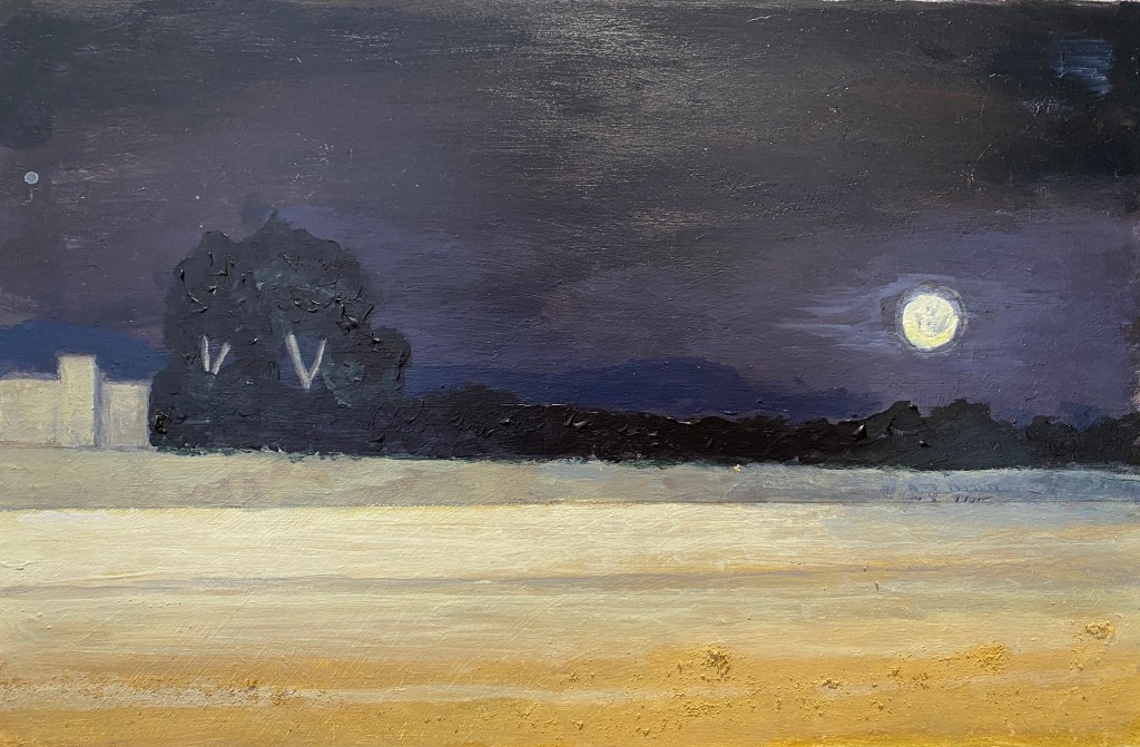
I feel that I have captured something of the darkness here, in terms of the colours, the perfection of the moon, the brooding haze (more usually associated with daytime) of the mountains and the monochromicity of trees. As I am beginning to realise generally happens when you try to paint a dark image, the darkness has distilled the colours to the bare essentials. In day time, there would have been so many more colours to be seen. Have I captured anything of the place? I like the simplicity of this image, and the stark elements – the emptiness of the sand, the brutal concrete of the building and the wall, the emptiness of the sky and the landscape in general. In this part of inland rural Spain, you are never far from the harshness of of the land and the ruthless living it yields.
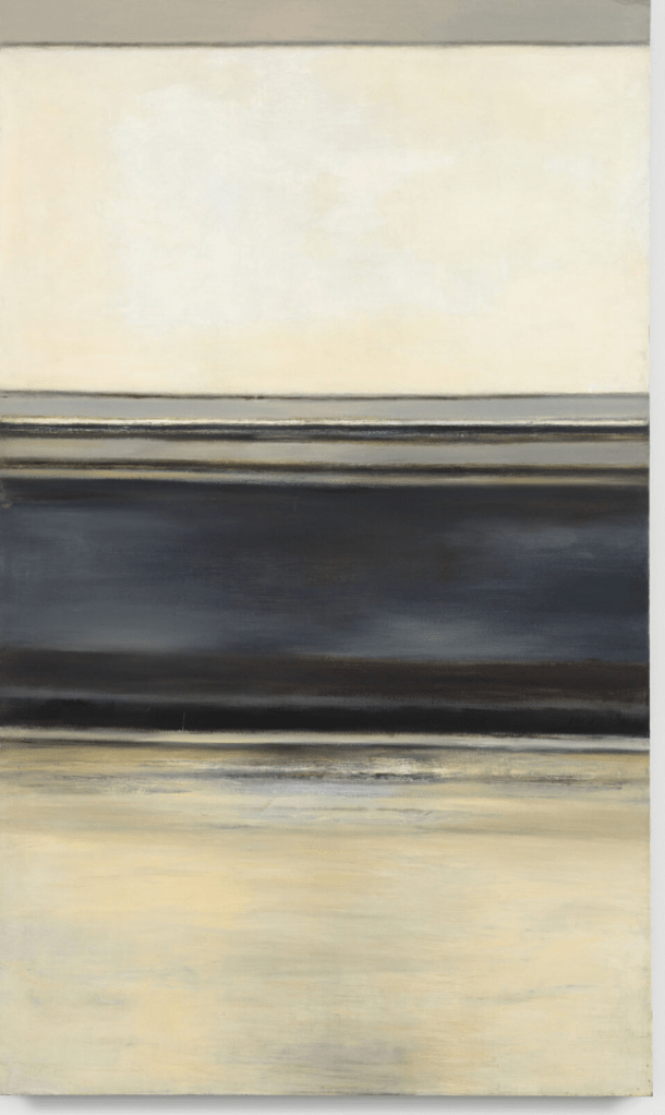
Blue and orange
Next to the river scene and here I used oil on A3 grey card.I looked at a couple of Doig paintings before I started. One, the most obvious, is of course the White Canoe series which I have stared at many times before. The other was a less frequently seen painting, an early painting of Doig’s, the Milky Way that I noticed on my book case, depicted on a birthday card that a friend had sent, which seemed particularly relevant to my needs:
These are also trees on the river, although in this case, “The tree line in Milky Way is a mixture of what I could see from my working space in my parent’s barn and other sketches I made of Northern-looking pines and dying trees. The idea was the trees were illuminated by city light or artificial light from afar.” (Peter Doig in Amar, 2013). My trees are also illuminated, by light behind me, although evidently very different sort of trees. What I didn’t realise from looking at the card, that I saw in the actual image, is that he has a tiny figure of a girl in a canoe. I am not trying to copy here however, just taking inspiration, and I have my own boats.
I painted the background blue black, and after much thought placed the horizon/river bank more or less two-thirds up the painting. I started to paint the trees and hedge at the top (simplifying along the lines of Doig’s image).
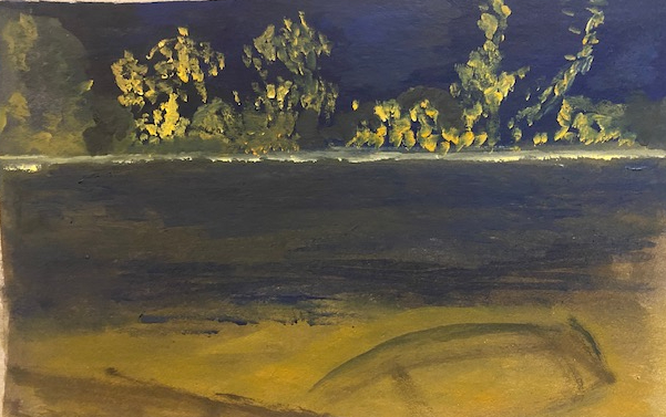
I carried on by trying to get the lovely reflections that there are in the actual photograph. I became fascinated by the tree trunks and branches, they are beautiful, almost like the skeletons of the image, and I wanted to capture them. I rejected the idea of the punts in the foreground – I am not keen on punting and wanted more of a generic boat, a boat which you might take on a journey rather than the pleasure-seeking punt, with more of a Doig’s ‘White canoe’ feel about it. The boat in this first photograph is too large, and the diagonal quayside is spoiling the symmetry of the painting, introducing a jarring element. (also jarring in this photograph is that the horizon is not straight, but in the actual painting I hope and trust that it is. I have mixed the blue with the brown (raw umber) in some parts to generate a purplish blue black effect. I have used Old Holland Indian Yellow / Orange lake extra, which is a gorgeous colour but is – in spite of what it looks like and how the tube is painted – is rather more yellow colour once you start mixing. I quite like the mustardy feel of the painting but it is not quite the orange/blue theme I had intended.
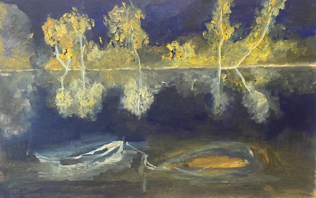
I decided to remove the quay, and that I wanted more than one boat to continue the slightly ‘procession’ feel of the trees, which I believe has come here from looking at the Doig painting. Painting over the quayside gave a brownish tinge to the water, making it look translucent in this part of the painting which I like – the feeling that you get when a river or stream is shallow over stones – although I don’t believe that is the case on this part of the river. I started to put in the two boats: as you can see, the left one has worked reasonably well, but the left hand side has to go. Here I have painted a light line to indicate the horizon as Doig did in the painting above, but I decided that this is not right for my darkness and have painted most of it over.
Here is the next version. I have put some more blue (this is ultramarine, mixed with grey and black). I have repainted the offensive boat, having them both more or less the same direction (which they would naturally do as they floated) and tied to a buoy or something under the water. I like the roughness of the two boats, but it doesn’t seem right to have such approximate images in the foreground. I decided that I had to tidy them up, and I also wanted to give them some kind of reflection. I took photographs of rowing boats on the canal on one of the dog walks, in order to fasten on some kind of generic image of a simple rowing boat, and worked on the boats as below.
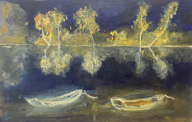
I tried to maximise the orange in the boats, and also the white which picks up on the skeletal tree trunks. I quite liked the feel of translucent water under the boats, but I felt that they should have reflections, so I added these as below.
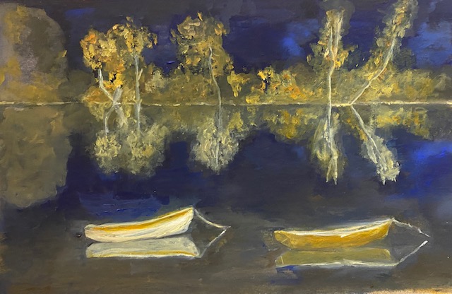
I quite like this final image. I think there are some mistakes – the painter of the left boat is a little thick, the reflections of the trees are by no means accurate. But I do very much like the colours – which is what drew me to this photograph in the first place – while retaining more of the darkness, I think than the photograph has done.
Red and Green
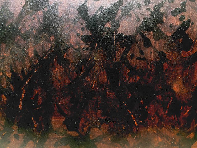
For this painting, my third set of colours, I decided to move further towards the abstract expressionism route. I wanted to get some of the feeling of Scudera, Kline’s lovely blue painting. I wanted to turn to my third image of darkness, the fiery red autumn sunrise that I saw behind the trees on the river a couple of weeks ago, into something more abstract than I have done hitherto. For this reason I took the photograph shown above, rather than the (even) more dramatic images to be seen that day, such as this:
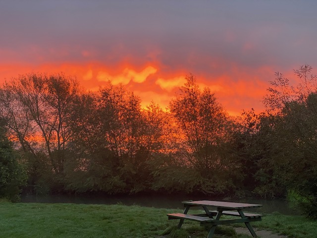
I could not see easily how this could be abstracted, whereas I had more ideas about the image I chose – I felt that this one would look like a forest fire. Indeed it looks so much like fire that when I tweeted the image I had some concern that some of my friends in the West Coast of the US might be offended, so traumatic were the fires last year.
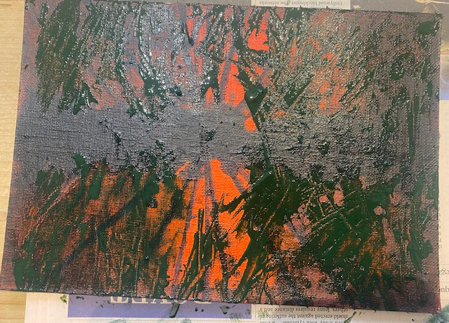
I started off by painting a small canvas bright cadmium red light, as below. Then using Perylene green (I started with Paynes Grey, until I realised it was adding a blue note that I absolutely didn’t want, so just used it for a bit of desaturation), I painted a line across the centre and diagonal lines coming out from the centre, making sure to reflect them in the middle line. The middle line I developed with multiple layers of Perylene green paint, so that it became textured, as a kind of hedge across the middle.
I stupidly forgot to take photographs, for which I can only apologise – I suppose at least it shows that I was painting quickly and with absorption, as abstract impressionists should. I poured the paint rather than painting, mixed with flow improver, and kind of massaged it into shape with the brush. Once the dark lines and shapes in the centre had dried (which took quite a long time), I dripped sap green as I had done before the Exercise above, and started to manipulate the paint with an orange stick, again as I had in the Exercise, hoping to create something of the ‘natural form’ effect as I had before. I did this all over the painting, leaving slashes of colour in the middle. The first effect seemed too red, so I spread some of the darker green – heavily diluted, this time with water to fade the colour – with a fan brush over the edges of the painting.
I worked on this for a while. The final work is below, although once again it is proving really difficult to take a photograph without some reflection of light, so the actual image is darker than this. However, I do like the purplish colour of the top left corner, which does seem as it is in the photograph.
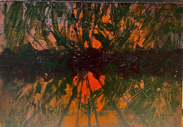
Overall, I do quite like this. When I finished I immediately started painting over another board to start again, because I felt as if I hadn’t really achieved what I had intended. This has nothing of the mystical elegance and simplicity of Scudera. But when the paint had dried I started to like it a little more. It does have some feeling of mystery and somehow for me it has something of the feeling of that dark morning, suddenly (it seemed) illuminated by fire. People’s reactions to it were good, even when they had not seen the original photograph. I do wonder if it is fine art, rather than a painting? I do sometimes think this when looking at abstract expressionism (I remember going to an exhibition of Patrick Heron, and finding that rather than cards, mugs were the way this work looked best). However, the whole exercise was a thought provoking process, and I am sure that I will continue to have ideas for my (as yet) blank red board. Although, on reflection, I believe that the most exciting thing to do, if I had time and sufficient supplies of Golden Acrylic paint, would be to paint the same image on a huge board. This might enable some really interesting colour and textural variations at the margins and in the greenery, and would be (I think) an exciting painting to have on the wall.
Conclusion
Overall, I have enjoyed this project and feel excited by some elements of what I have done. I have achieved a little of what I wanted to achieve and feel that in these last three paintings, I have taken (progressively) some more steps towards abstraction, one of the things I wanted to achieve. I am a little nearer to knowing what is the colour of darkness, in that it is partly about finding the colours that you want to find – but also partly about the way that the darkness sharpens some colours while muting others. In my travels across the wheel of colour, I believe I have revealed some of the infinite possibilities of finding some kind of beauty in darkness, Ultimately, I could probably have achieved such variation by pursuing Kline’s path, by squeezing every last possibility out of black and white and all their combinations. I have to admit, that I would, ultimately, have achieved more perfection. If you look at the picture of rocks in Whitby with which I started this project, you are seeing perhaps – in nothingness – the most perfect dark, perhaps true Eigentlich. But darkness is more than just absence of everything. It seems that it distills the visual world, simplifying objects, people, landscapes – and colour. I am pleased to have explored a little of this darkened, yet colourful world.
References
Amar, Adeline (2013) ‘Peter Doig’s Milky Way’, National Galleries of Scotland (following Doig’s 2013 exhibition there ‘No Foreign Lands’, 3rd August to 3rd November). Retrieved 22nd October, https://www.nationalgalleries.org/art-and-artists/features/peter-doigs-milky-way.
Christov-Bakargiev, Carolyn (2004). Franz Kline, 1910-1962. Italy: Skira Editore. p. 57. ISBN 8876241418.
Hopkins, B. (1979) ‘Franz Kline’s Colour Abstractions: Remembering and Looking Afresh’, Art Forum, Vol 17 No. 10.
New York Times (1986) ‘Art View: Franz Kline – A Legacy in Black and White’, Jan. 19, 1986, Section 2, Page 29 of the National edition. Retrieved 15th October 2021 https://www.nytimes.com/1986/01/19/arts/art-view-franz-kline-a-legacy-in-black-and-white.html
Wroe, N. (2001) ‘The Colour of Emotion’, the Guardian, 24th March, 2001.
