
Project 1. Basic Paint Exploration
For this part, I used acrylic paint. I have used both acrylic and oil in the past, and prefer the latter, but for the purposes of exercises I did not want to have to wait for things to dry. It was exciting to be using colour again after two years of Drawing 1, when I had hardly painted.
Exercise 1. Getting to know your brushes.
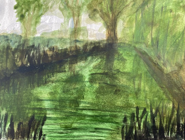
Here I started to get in the mood of paint by painting a small landscape in my sketchbook (Moleskine, A3, painting sketchbook). I used acryllic (it doesn’t seem possible to use oil in the sketchbook, as I would never be able to close it). It was a long time since I had used acryllic paints, and it felt very strange – as if I had forgotten how to paint, and the result is very naive; I have completely forgotten how to do ripples, for example, although I suppose it will come back. I wanted everything to be green – as this is how this part of the river is – but that meant that the sweep of the willow which looked nice when it was first painted disappeared, and the reflections of the trees have lost form – I realised afterwards that obviously this should have been done with a darker wash on a transparent background, rather than vice versa. I used a large flat brush, which was good for the hedge and the reeds (with the edge of the brush). The final result is not good at all, but at I have started to get into the feel of painting again, which I guess was the idea.
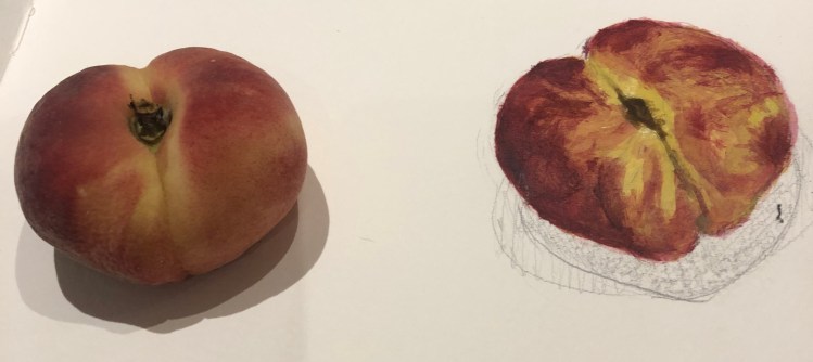
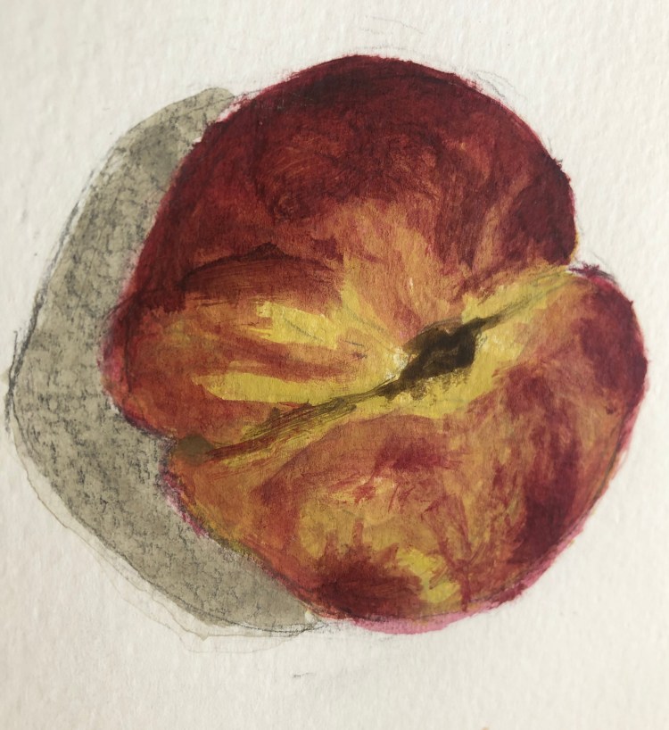
The next thing I painted was one of those doughnut peaches that have started to be available over here (it is a Spanish variety, called chato). The shape isn’t quite right – I need to remember how do make things more 3 dimensional (this is too large at the top right), and my shadows are somehow always wrong, I just don’t seem to get that right. But I was pleased to have immediately mixed the right colours, from my fairly limited selection of acryllic paints. I chose cadnium yellow light, crimson (which I mixed with raw umber for the darker parts) and yellow ochre. I used a dry brush and pressed hard agains the paper for the dryer parts. The edges are a bit fuzzy – partly because of the paper but mainly because I am using a large brush, I need to look out for that.
After experimenting with various brushes, I painted a banana. This little image had a troubled time because someone ate the two bananas that I was using as a model. I used the same yellow and mixed with raw umber for the darker parts, and the raw umber was with Paynes grey for the ends, and a touch of sap green for the stalks. I remembered how many colours there are in everything, even in these seemingly uniform bananas.
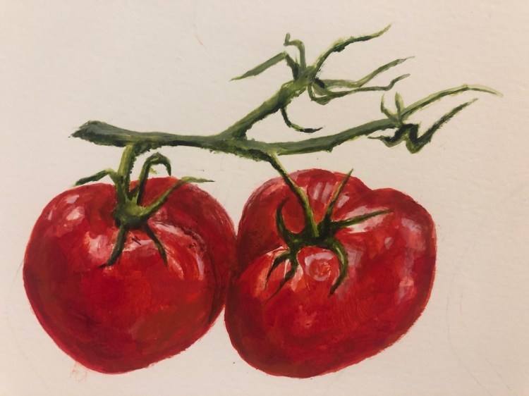
Then I painted two tomatoes, using Perylene Maroon and Caldmium red light, mixing them with my fingers, using mixing white for the reflective parts. I enjoyed using these colours very much and these were fun to do. I was quite pleased with the result; they are not right of course, but there are places where they appear to have the slightly plasticky appearance that some tomatoes have, and I like the crease in the one on the right.
Exercise. Applying paint without brushes.
As instructed, I tried a range of methods to apply paint, blending with the fingers, with a sponge, cloth and ultimate a set square from an old maths set – the result is below. I learnt more from the process than the result, for example that if you blend wiht the figure the colours merge and soften, but is you do it with something hard you can get some really strong tones. – and also do firm lines and even curves (this was by rotating the setsquare). On top left of the page I was just cleaning off the set square with water and then drying on the page, and it looks remarkably like a blood stain. It was fun to do.
I also tried some pastels with water blotted on top. I hate pastels, the colours always seem so blurry and soft and the colours merge so easily. These were a box of Unison pastels rescued from the house of an elderly aunt that I am clearing to sell. So they were dusty and old and the names of the colours couldn’t be read – but then the colours looked just like I always expect pastels to look, similar colours and as if they are viewed through a fog. To be honest, they rather reflected my aunt’s use of colour.
I then did a tomato with the setsquare that I used earlier, to try another technique. I quite like this although it took a long time to get it anywhere near the tomato shape and the shading seemed impossible. But I quite like the orange and red patches – it gives it a richer, fuller feel than the more accurate ones, and the tomato is indeed the queen of fruit.
Project 2. Transparent and Opaque.
Tonally graded and Overlaying wash
I used acrylic paints for these exercises, and now I come to do the blog I realise that I have used the results of the first exercise for the second exercise (because I overlaid some of the tonal washes with the other colour, and stupidly forgot to take a photograph in between), so I have blended the exercises.
I used two blues – a deep cobalt and a phthalocynine blue, because I didn’t have any ultramarine. Some of the results are here
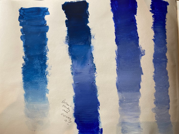
These are opaque washes, blended with white paint (it is the mixer white, so should be good for blending) – the first bar is Prussian blue, going to white – and the third and fourth are deep Cobalt, going also to white. These worked reasonably well, although as the exercise instructions note, you must work very quickly with the acrylic or it does dry out.
The second bar along is the blended wash, going from Prussian blue to cobalt. Here I found it really difficult to blend in the middle – I need to try this exercise with oils, but I got some idea of how the process works.
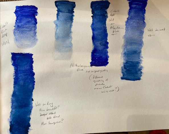
The second page below is with transparent washes, and this time Cobalt blue (the first bar) and Phthalocynin blue (the second). I like the look of these much better, which is strange in a way because the colours are not so deep, and this was especially true when I got to the overlaid colours. Of the four bars at the top of the page, the third and the fourth bars are ‘wet on wet’, and the blending was much easier, although I think because the cobalt blue was a better quality paint, it ‘won out’ over the Phthalocynin, even though the latter was a darker colour. I like the appearance of the third bar in particular. Even nicer is the ‘wet on dry’ bar underneath, where I really love the merging together of the colours, seems beautiful.
Overall, although I am quite familiar with blending in the opaque way, the transparent washes technique was new to me and I plan on using it extensively, also for oil, and I have signed up for a class on ‘working from dark to light’ on 31st July with the OCA tutor Kevin Ashcroft, which I detail in the blog post for the Assignment of this part.
Monochrome studies
For this part I took an image that I have focused on all summer, which is some trees in the middle of a field of barley. I walked though this field all through the lock-down period and beyond, so I saw the barley growing everyday and the changing colours and shape of the trees against the barley and the sky. I found it fascinating how very dark the trees looked, and even more so the darker the barley became.
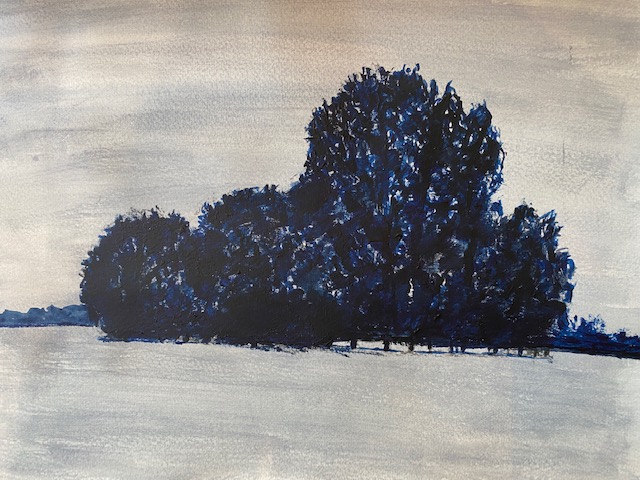
I did this exercise in acrylic again, although I am yearning for oil and will use that for the assignment. Here I used a light grey wash as instructed and an opaque Prussian blue for the trees. I left some lighter parts (because you can see the sky in some parts of the trees). I quite like the effect here, the problem being in that some areas the blue is lighter, and the fact that I don’t remember why is a clear lesson that I must try to complete the blog or write more in my sketch book at the time. It may have been that I was trying to do as instructed in the exercise and have some lighter areas to represent less dense foliage. Anyway, I don’t like that effect so much – I think it should all be dark and that even darker than this would be better, the kind of purply brown-black that the silhouette of trees sometimes appears as.
The second image had the opaque image as the background, and the Prussian blue wash on top, where I have tried to paint the negative spaces to create the image. This is not very successful at all – I suppose the negative spaces between the trunks gives some idea of what the image is supposed to be, but overall it is not a success. I need to try this exercise again. I think some of the problem comes from having used the wrong image, and possibly also the wrong colours – particularly in the second, the dark blue and the grey are somehow rather sickly together. But actually, looking it now some weeks afterwards, this image is embarassingly bad.

At the last moment, I decided I had to have another go at this exercise. I took a photograph of some trees on an island in the middle of the Thames from Port Meadow in Oxford, and zoned in on the trunks themselves and the water below. I painted a board with a thick mixture of raw umber, mixer white and Mars black, and then drew the outlines of the trunks with charcoal, ultimately painting the negative spaces with perylene green acryllic paint, having just discovered a tube of it that I had forgotten that I had.
This result was much better, and I really like the technique.
I used the same colour with a slightly lighter wash for the water, and a much lighter wash for some shadows on the trees. I will definitely try this again and other points during the course, and believe that I might attempt again a fallen tree in the style of Redon, that I tried unsuccessfully in Part 1 of Drawing 1. I love this colour of paint, and will try to get it in oil too.
I think I have learnt the difference between the two techniques, and will bear in mind that I have to learn more about both of them in the exercises to come.
Project 4 Working on different coloured grounds.
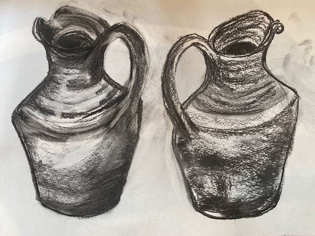
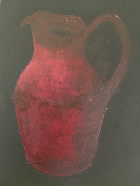
Here I took my subject as simple jug (which is red). I prepared two backgrounds on canvas board – one white, and one black. I drew the jug a few times in charcoal, for example as below:
First, I painted the jug on a black background and the result is below, although I find this image quite impossible to photograph – the dark surface reflects the light however you position it with respect to the windows. I tried to use the background as the darker areas. I found this really hard, not helped by the fact that I don’t have a really good drawing for the jug here, and however I adjusted it, it seemed to get worse. I like the kind of dark mystery of it, and that it seems to almost grow out of (or into) the background, and the ‘black hole’ in the centre (although in retrospect, I wonder if that should have a touch of red in it, because perhaps it makes the painting look unfinished). I like the way texture of it looks and the lines that go around the jug to the right, and the pleasing glow to the left where the richness of the colour indicates the only piece of light I really allowed here. It is not in the end successful, but there are some nice elements and I will definitely do this again, but make sure to pay more attention to the drawing before I start painting, because where you have an opaque smooth background like this, it is more difficult to repair any mistakes.
Second, I painted the jug on a white background. I used crimson as before (in the tomato sketches), with Paynes grey and some mixer white to adjust the tone. I tried to leave white areas for the reflective part, but after much staring at the image, I decided they were actually mostly a paler red/pink.

I am quite pleased with this image. The reflections look more or less right to me, and on the right side under the handle, where the reflection is on a darker part of the jug, I am especially pleased because when I looked at the colour in real life and on a photograph, I thought I would never get it right, it felt impossible (this is one of the things I like about this course, that sometimes it seems impossible to do what you are asked, and you usually can get there if you spend enough time and concentrate enough). However, I have had one or two problems with the drawn image (it is better than the previous one, but there is a problem with the handle) and I did not dare do a shadow for fear of ruining it – it can be seen by the previous exercises that I am really bad at shadows, they nearly always come too dark, and I need to learn how to do them properly.
Overall, I have found this exercise useful. I am glad that I used a simple image like this jug, and the stark contrast of backgrounds. I think I have learnt something, and will be able to develop this technique for the future.
