Before I started the assignment, I attended a two hour course on 31st July taught by Keith Ashcroft for OCA, called ‘Working from Dark to Light‘. It seemed almost made for this assignment, and it was very good. So I tried to put into practice this experience, as well as the various exercises in the rest of Part 1.
In the workshop, Keith worked from an old photograph (in fact, from a 1970s slide) of some children swimming in a pool which seemed that it was on a ship (in fact one of the participants confirmed this, as he had worked in the navy). The image can be seen in this padlet below:
The way Keith worked was to mix the paint 50/50 with the solvent (studio safe orange solvent), starting with just raw umber to indicate the darkest parts of the painting – in his case the steps of the pool for example. To do this, he used a black and white version of the slide, to indicate the darkest and lightest areas, a technique that I think I would have benefitted from when painting the jug in the last exercise in the coursework. He then layered up with similar mixtures of the colours – so quite a transparent wash, but layer upon layer. There were useful tips about the colours and paints, and the paper that he used as well, although I found myself unable to find the Seawhites paper treated for oil painting, which sounded really good.
I decided to use this technique to do the assignment, but for this, as suggested in the course notes I chose a landscape. This was a photograph of a barley field, hedges and trees, although not the same one that I had used in the coursework (in fact, I roamed far and wide with the dog to try to locate the site, but in vain). Here the tree was part of the hedge on one side of the field.
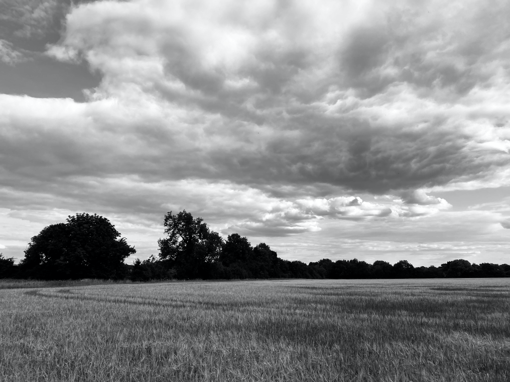
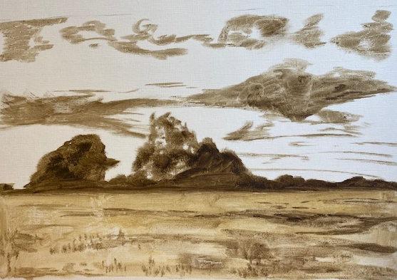
I edited the image as in black and white to indicate the darker areas, as above. On a treated A3 ‘canvas’ surface paper for oil painting (although not the Seawhites version that Keith Ashcroft had recommended, which I can’t seem to buy online), I used a 50:50 Michael Harding raw umber paint: solvent to block in the darker areas – the trees/hedge, the blue sky in the left top corner, and the darkest clouds, as follows:
I then started to add the paint. I discovered at this point that I had a strictly limited palette, as some of my paints had dried out for lack of use, or at least I could not remove the caps, which comes to the same thing as far as using them. The colours I did have were ultramarine, mars black, titanium while, raw umber, burnt umber, naples yellow and a small amount of chrome yellow. I could open the phthalo green, but not the much more useful sap green.
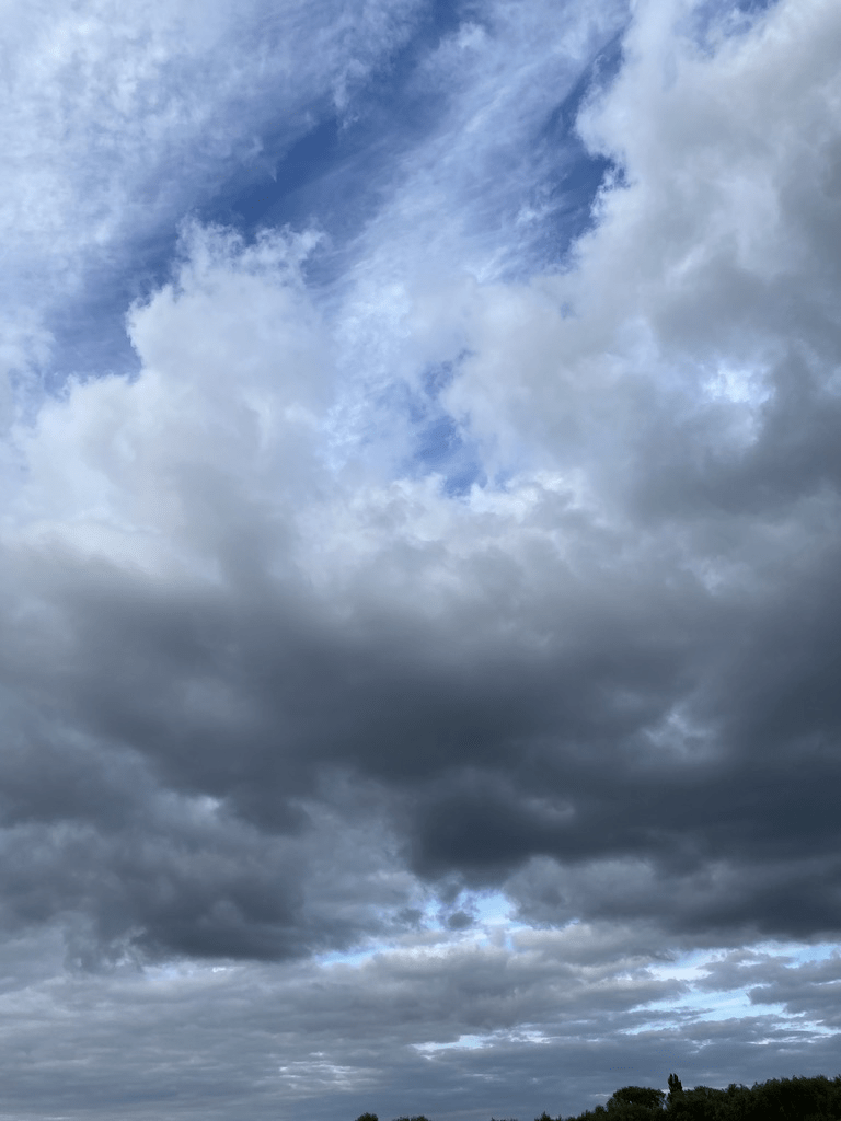
I started to layer up with fairly thin, transparent paint as Keith Ashcroft had done, layering up particularly with the hedge and the clouds, where I used a grey mixed with the black and white and just a hint of the raw umber. I tried to capture the shadows of the darker clouds on the barley. For the sky, I could really have done with some cerulean blue for the lower bits of the sky visible through the clouds – in this image, there was a distinction between the almost cobalt at the top and pale cerulean nearer the horizon which is an odd note in some landscapes, but not as marked as it can be (see below).
This was the earlier stage of the painting:
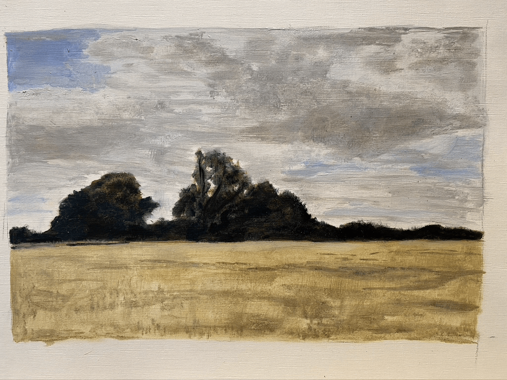
I decided there was too much brown in the cloud, that the painting strokes were too horizontal, and there should be far more rounded marks for the fluffy parts of the clouds. The marks I had started to make for the barley were not working, so it required more paint layers and more filling in of the base – where the paint should be darker. The sky needed to be bluer, with proper clarity and generally the image needed lightening, particularly the sky, with more attempt to get the shape of the clouds. I made some attempt to mix a light cerulean colour for the lower parts of the sky.
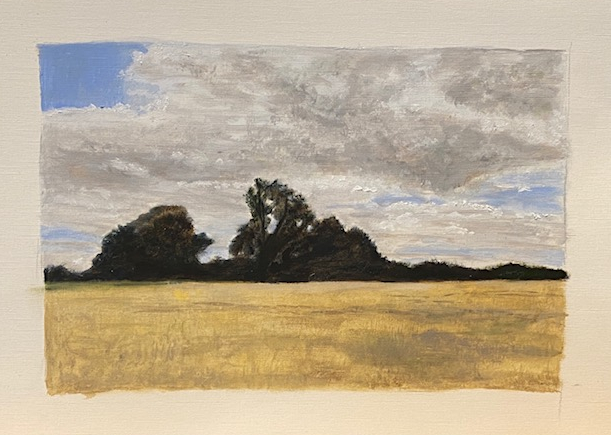
Here is the final image. It is not that I believe it is finished, it is just that I don’t believe I can carry on without making it worse, indeed I fear that I might already have done so by overworking the cloud. I know from experience that clouds should be painted quickly, with light strokes and I was worried that I had got a bit lost in the details. Interestingly and annoyingly, because the converse is normally the case, it looks better off camera than it looks in this image.
Overall, what works well here and what doesn’t? I am pleased that I had tried the technique that I learnt in the exercises and in the short course; that is, the tonal washes and layering of semi-transparent paint. I will aim to develop this further during the course. I think the painting looks like what it is supposed to represent, as instructed (my natural inclination with skies is to go more abstract), and although my attempts to paint a cornfield ultimately failed, it is reasonably apparent what it is supposed to be, and I like the shadows from the clouds. Overall, the painting has a lightness about it of a summer’s day with a breeze and some coolness, which I like, especially in the lower part of the sky. There are parts of the hedge and the trees which look like that kind of messy foliage from a distance, with some layers and depth, although not enough, and they make a stark contrast against the sky and the corn, which is how they do in real life.
What doesn’t work? Well, it is not a particularly exciting image, and I am not sure why I chose it – it is not the sort of thing I normally choose. I think I had a vague idea that with the dark hedges and the shadows on the barley I could get some kind of chiaroscuro effect, but really that could not be so here – this is just a difference in tone and colour between different elements of the landscape, and I am not sure that I could make the shadows for this particular image dramatic (as, say, Georgio Chirico or even Paul Nash might do) without disobeying the instruction to be representative? I think the clouds are heavy and overworked – and I could have done more with the layering of the hedge, and I could have spent more time learning how to paint corn, and also to pay more attention to the hedge side in the middle of the painting, where there was some corn growing against the hedge. Most importantly, it would have been good to choose an image with more perspective and dark and light areas, so that I could indeed have achieved some kind of chiaroscuro effect.
Overall however, I enjoyed the exercise – planning the painting, picking out the dark areas, mixing the colours, and applying the techniques to the painting, and I believe what I have learnt will be useful throughout the course to come.
