My initial idea for this assignment was to carry on painting lemons, or other fruit, in the same style as the lemons that I had done earlier, perhaps in a bowl. However, it seemed to me that this was a rather easy way to tackle the assignment and I should try something different – that I hadn’t done already – and challenging. Given that it was during the days between Christmas and New Year, 2020, the forthcoming departure of the UK from the EU was very much on my mind, and I started thinking about the stockpile that we had made in anticipation (I have never stockpiled anything before, even during the first lockdown of the coronavirus crisis, as we live very near the shops, but for Brexit, to which I am passionately opposed, it feels somehow legitimate). I started thinking about how precious things like olive oil are going to become, now that it will be more difficult to trade with the countries that produce them. So I decided to try to produce a version of those seventeenth century still lifes, portraying riches from foreign lands – because it seems rather possible that we might once again think about European goods in the same way. I remember as a child that we had just one tiny bottle of olive oil, that was used sparingly and would be replenished whenever my father travelled for work. So now the ten or so bottles of olive oil that we have in our cellar seem very precious to me, and I thought might make a good subject for a still life.
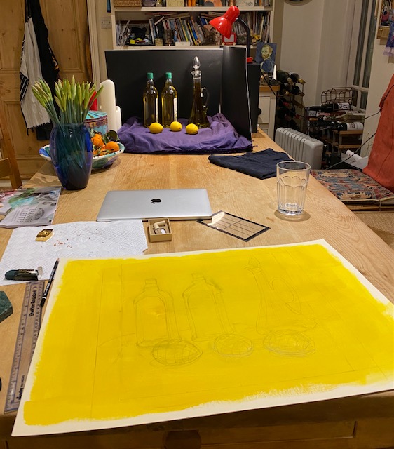
I selected a couple of bottles, the same, and a flagon of oil that I keep standing by the cooker, and stood them in a line. The idea is that even plastic bottles of oil are now very precious – and a flagon on its own would be no good – without the capacity to fill it up, so even the plastic bottles become objects of interest. I wanted some lemons too, that eternal symbol of foreign luxuries from sun-kissed lands, so selected three and arranged them in front. I wanted the dark background of classic still life, so made a kind of box of black card, and laid the oil and lemons on a purple cloth, as I had an idea that would be the right colour to paint them against. I shone a light (balanced on a box) down on the bottles. I should say that I tried many variants of this image and drew all of them, but in the end this seemed the simplest and best.
I took a sheet of A3 card, and painted it yellow (in acryllic), thinking of the way that I had prepared the image of a pear in Part Two, painting card in the colour of the pear and then painting the background (in that case a murky green) around the drawn image. I then started to draw the oil and lemons, shown in situ here.
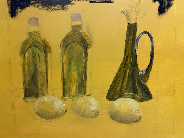
I then started to build up the image. I mixed the colours for the oil, with yellow ochre, yellow cadmium, sap green, burnt umber, paynes grey, mars black and some naples yellow to lighten. The oil in the flagon (which is actually an old decanter meant for wine) is extra virgin, so is greener than the oil in the bottles which is a mixture of refined and virgin olive oil, so it is more yellow. In Spain, the refined olive oil used to be the smart and precious one – while the extra virgin was the rough unrefined one that anyone with a few olive trees in their campo had easy access to, but of course now we consider the less refined the more valuable.
This is an early version after starting to paint. I actually like this image somehow – the flagon is the right shade of darkness and there is a nice feel of the way it looks as if the base is slumped on the table, which is how it looks in real life. I like the lemons here too, in some ways they look better than the final image, for all I have worked on them so much. the shape of the bottles too is somehow also more right.
Here is the next image. I first started painting the background in Paynes Grey, being scared to go with full on Mars black. But I have never realised before how much blue there is in Paynes Grey, and it created a really jarring note, against the otherwise harmonious yellow, green, gold, image, so I mixed some Mars black with Naples yellow and painted over in the subsequent images.

The painting went through various iterations after this, not necessarily for the better. One huge issue I faced was what colour to paint the background to the lemons and the lower part of the oil bottles. I actually really liked the vivid yellow, it made the whole image sunny and bright and reminiscent of mediterranean feelings, so much part of what we are leaving behind with Brexit. In some ways I wish I had left it this way, but of course it looks unfinished, and at the time I couldn’t think of a way to make it less so. Looking at it now however, I think I could have finished it like this, even if it meant painting over the yellow acryllic with oil paint, it would have looked fine once the yellow border was clipped off, and if I were to do it again, that is what I would do.
However, I didn’t and my first thought was to try a kind of rusty red, the colour of mountains in Murcia where we go every summer. But this looked terrible and I wiped most of it off. Although my initial thought had been purple, which would have been complementary to the yellow – once I had this yellow image in front of me this felt like the wrong colour somehow, it seemed to have nothing of the spirit of the painting as it developed. This is partly because the yellow was all set to disappear, so it would have become a completely different painting.
My next two thoughts were orange – to keep the sunlit feel of the current background – and blue, to represent the European flag (even in my most allegorical moments I considered a pile of stars or at least some stars some where in the painting), But this would have made it more like a cartoon or propaganda or something which was not my aim. So I messed around mixing paint for a while, trying both options on opposite ends of the painting, and ultimately ended up mixing the two to get a kind of broken gold, which is what I ultimately used. It seemed reminiscent of those still life paintings with their rich brocades and tapestries, while also retaining something of the meditarranean flavour.

I did try to replicate the cloth that I was using, using a more purplish shade for the shadows in the cloth. This hasn’t really worked, however, and I think it would take a lot more time to do this – the final result is more abstract than I had originally intended.

Finally, I looked at this image and allowed myself one last chance at improvement. I picked the middle lemon, which is completely wrong – too cuboid, without the foreshortening that is should have because it is half turned towards the viewer. I also think all three lemons lack depth and the shading on the lower half should be darker. Here is the final result; the middle lemon is better, but I can see further weaknesses now – an adjustment of the flagon for example has somehow made it look wrong and that now needs correction. .
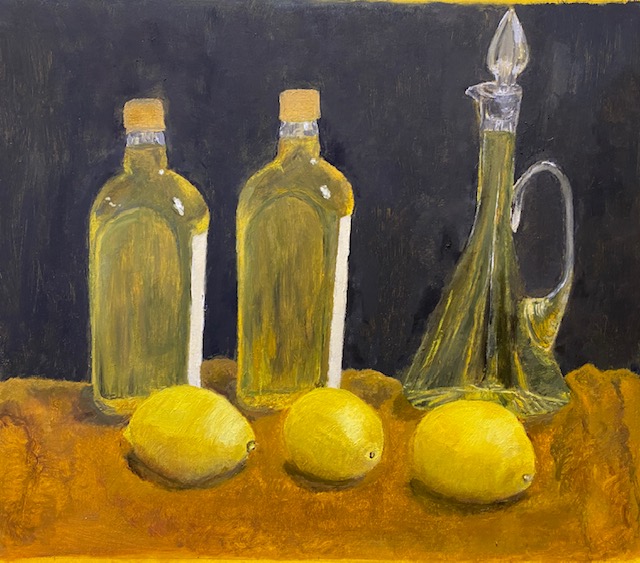
So what went right, and what went wrong? I had a lot of ideas about this piece, and I think it was a potentially interesting subject. The dominance of yellow was the right idea, and I like the colour of the lemons and the oil, tinged with gold in the two bottles – emphasising the idea of liquid gold. The top of the bottles are nice and smooth, but the lower parts lack depth and perspective. Looking back on it, the composition to me seems wrong, and I realise that although I spent a lot of time thinking about it, I should have carried on until I found something more imaginative. I think instead of the two rows I should have made some kind of grouping of the bottles, flagon and lemons, and perhaps chosen three different kinds of olive oil and container. Another grouping would have enabled me to create sense of depth for the bottles; here, the three dimensional base is difficult to show as the lemons are in the way. I also regret the card that I used to paint on – which was slippery (even in spite of the undercoat of acrylic) and made it hard to layer the paint without leaving it to dry for a long time, which I did not have the scope to do. The lighting could have been better too – I painted this in my kitchen which is full of light from all sides and the ceiling too – a darker environment with light shining on the bottles and lemons would have made for a more dramatic image. There are some touches of light here which I have endeavoured to portray, but this would be so much more an interesting painting if there were strong shafts of light.
As with some (but not all) of my previous assignments, this image looked better at some of the intermediate stages, and I wish in some ways I had preserved the dominance of yellow – leaving the yellow border against the final image gives some idea of how that might have looked:

However, a more general lesson for me is that if you are not using contrasts of light then you must try to use colour to achieve variation and dramatic effect in a painting, and I will make sure that I remember that in future assignments, having failed to do so in this and the previous one.
A few hours after completing (I thought) this assignment, I realised where I had gone wrong, a realisation that came from re-reading my tutor’s report on Part One. I should have thought more about other artists work when thinking where I was going with this assignment. Of course, I had the cultural reference point of the Dutch still lives, but I made no attempt to replicate the style of these paintings, nor was I even aiming at that – but in fact I had no aim, no ideal in mind at all. I had looked at various more recent paintings in the process of the painting to get ideas for various elements, particularly the background) For technique I drew on what I learnt about Dukes and Uglow in the external class I did and in my painting of lemons and the red pear, and indeed I was initially seeking some of their simplicity of style, although those ideas became dissolved in the final choice of subject, which was a bit more complicated.. What I should have done was look at more recent paintings for ideas for the kind of painting that I was aiming at – a style, a certain mixture of abstract, expressionism or realism, naive style and so on. Indeed, one such target was literally presented to me in the course work – the interior of Van Gogh’s bedroom at the start of the Project Drawing and painting interiors on page 70 of the course notes, with the letter from van Gogh to his brother:
“This time it simply reproduces my bedroom; but colour must be abundant in this part,
its simplification adding a rank of grandee to the style applied to the objects, getting to
suggest a certain rest or dream. Well, I have thought that on watching the composition
we stop thinking and imagining……”
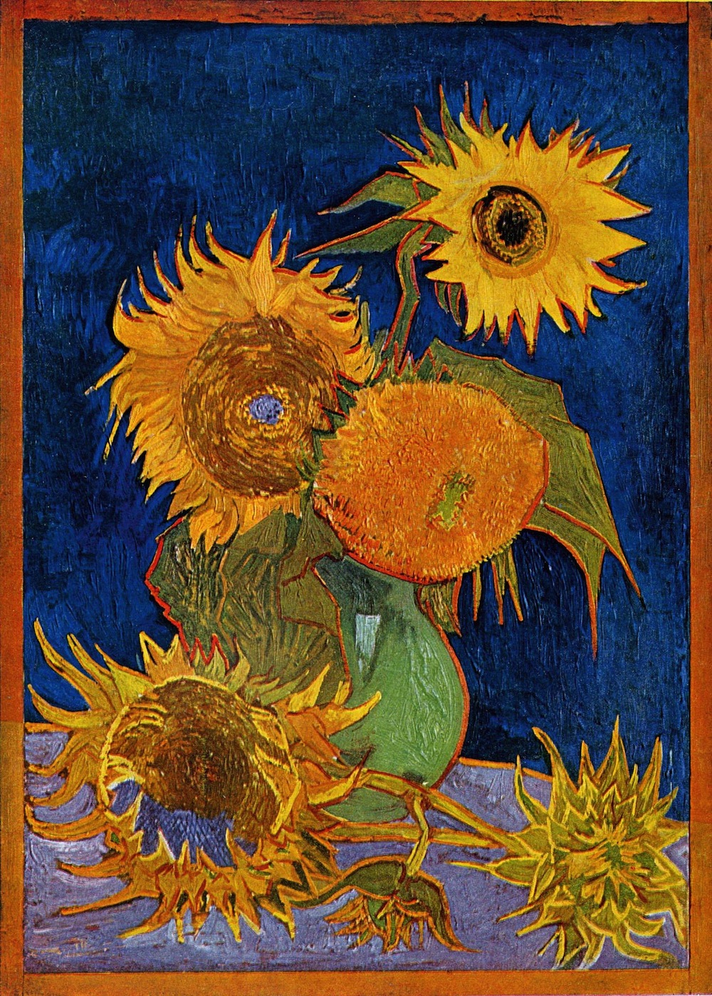
I think this could have been one approach to this painting – one that I should have seen, but got too lost in the composition and my own painting without looking outside (indeed stopping to think or imagine). I could have gone with my original choice of purple (possibly even this lighter lilac) for the bottom half of the background, and done everything with colour – green, yellow, gold and purple, a more limited palette than he has used here – but fitting everything together in a harmonious whole, without trying to faithfully represent what was there. I might have thought about one of the Sunflower paintings – either with a dark background, such as this powerful image below (which indeed even has the lilac base):
or this one, with my alternative idea of a yellow background for yellow objects:


In the time that I had allowed for the assignment, I do not believe I could have achieved anything like the same density or textural build up with the oil paint, but I do believe that would have benefitted from choosing some kind of target style like this and sticking with it (as I did when painting the lemons, for example, limited aim though it was) rather than changing my mind so many times during the course of the painting.
.I am not sure whether this is a kind of post-hoc rationalisation for a journey not travelled (and therefore not put to the test), originating with dissatisfaction with the painting that I actually produced. So I will submit this assignment now, but if I have time in the coming days I will try to see what this might look like. Meanwhile, I hope that I might have finally learnt the lesson of looking at artists’ work whilst trying to create my own because I don’t believe that I will progress without that.
Addendum
After completing the assignment as above, I could not resist to try out the ideas I mooted in the conclusion. So I took a (much smaller) board and painted it yellow as before. As this was a test, I took just two bottles and a lemon, and built up the painting as before, but much more quickly and this time with the second of the two sunflower images above in mind, in terms of keeping yellow as the dominant colour throughout, with variants in different parts of the painting.

I used the same colours here, although a little less of the very dark green in the oil, as this is less ‘extra virgin’ than the oil in the flagon and there is more light in it. The shadows are too dark here I think (they are a mixture of sienna, paynes grey, naples yellow and a touch of cobalt) and I have lightened them in the image below.
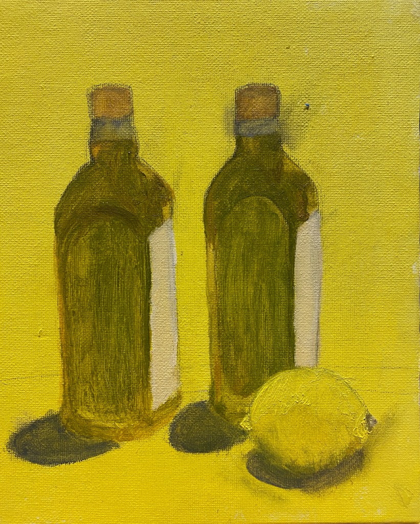
The next phase was tidying up the drawing (the pencil had smudged over the background) and painting the background (the yellow here is the original acryllic background with which I prepared the board). This time the background is a lighter version of the cadmium yellow that I used for the lemon, and the surface on which they are standing is a kind of dirty broken green, a combination of yellow, white, the olive green and a little sienna, in an attempt to replicate the background in the Sunflowers painting.

This is not finished. Indeed I remain even now undecided about the two backgrounds. I wonder about painting the bottom surface a vibrant colour like the orange in the painting by Charlotte Verity that I looked at during Part 2, or lilac as in the Van Gogh painting of his bedroom in the course notes (or indeed in one of the Sunflower paintings). I wonder about painting the background black as it was before, or a rich purple (for the sake of colour complementarity) or midnight blue, as in the earlier Sunflower painting above. However, it feels like a basis for something nice, and expresses what I wanted to convey. There is a (limited, I realise) sense in which it is informed by previous paintings – even the calm stillness and evenness of tone of Morundi as well as the colour combination of the Sunflower paintings, although of course, there has not been time here to do anything like the build up of paint (and indeed, I am not sure that this would be the right thing to do with this painting, bottles of oil are, in contrast to ‘sunflowers, such smooth and non textured objects). By being more simple than the earlier piece, I think the idea of the painting – the value of products of the Mediterranean sun – comes across a bit more. The philosopher Luciano Floridi (a professor of the ethics of information) always says that ethics is like salt – you need some everywhere but you only need a little and it is very cheap. I think there might be an analogous statement about oil and lemons in situ – that they benefit all forms of food, most things taste better for their presence (actually in this case, particularly in Spain, quite a lot is generally used!) – and it is cheap, but not, sadly, in the UK going forward. There is another link between the idea of olive oil and lemons as products of the sun and that of sunflowers here. As an article in Artsy. net put it:
‘The Symbolist poet and critic Gabriel-Albert Aurier wrote of …..the artist’s [Van Gogh] “obsessional passion for the solar disc, which he loves to make shine in the blaze of his skies, and, at the same time, for that other sun, that vegetable star, the magnificent sunflower, which he paints over and over, without wearying, like a monomaniac.” Van Gogh responded that they did indeed represent an idea: “gratitude.”’ (Thackaray, 2019).
Although this painting took only a day, and is far smaller and less detailed than the assignment piece, and there remains indecision about the direction it should take, so is still blessed misleadingly with some of the charm of the journey not travelled, I prefer it to the earlier assignment piece.
Reference
Tess Thackaray, ‘Why Van Gogh Fell in Love with Sunflowers’, Arty, June 20th 2019 https://www.artsy.net/article/artsy-editorial-van-gogh-fell-love-sunflowers.
